



Local biodiversity: the impact of investments finally measured
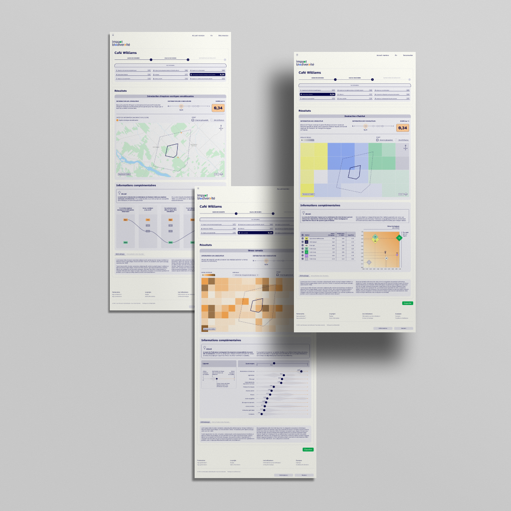
Local biodiversity: the impact of investments finally measured Major Quebec financial institutions are partnering with the Biodiversité Québec research team, the Canadian Parks and Wilderness Society (CPAWS Quebec), and the Quebec Centre for Biodiversity Science (QCBS) to create a tool unlike any other in Quebec. Designed for investors, it calculates the impact of their projects […]
A report redesigned with pop colors

A portrait of downtown Montreal highlighting graphic charts Montreal centre-ville wanted to rebrand its annual report by offering a creative, visual interpretation of its data, moving away from the traditionally text-heavy format. For the eighth edition, Voilà: redesigned the report around clear, vibrant charts designed for clear interpretation. Design as a tool for clarity The […]
The harvest calendar in the Qikiqtait region

The harvest calendar in the Qikiqtait region In 2025, Voilà designed and implemented an interactive seasonal harvest wheel for the Qikiqtait region. Commissioned by the Arctic Eider Society, the static wheel was later adapted into an interactive experience at the request of the Canadian Museum of Nature for one of its exhibitions. The harvest wheel […]
2025 Progress Report on the Climate Plan for Ville de Montréal: from understanding to popularization
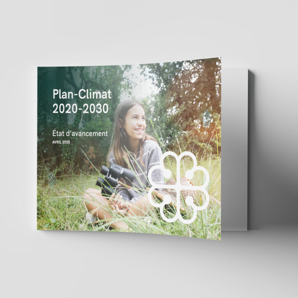
2025 Progress Report on the Climate Plan for Ville de Montréal: from understanding to outreach In April 2025, Bureau de la transition écologique et de la résilience (BTER) commissioned us to present the 2025 Progress Report on the Climate Plan ahead of the Montreal Climate Summit. With the 2020-2030 Climate Plan halfway through, the BTER […]
Establish government-wide data visualization standards
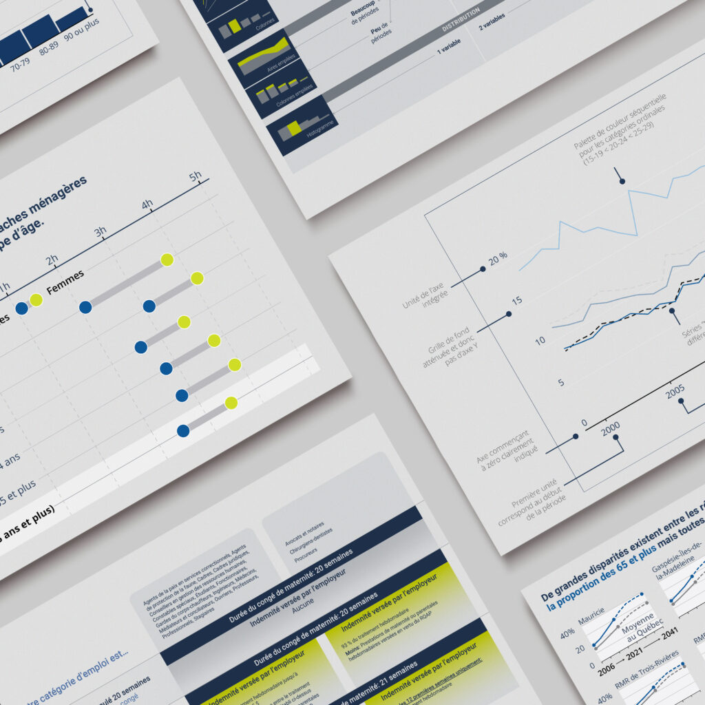
Establish government-wide data visualization standards The Gouvernement of Quebec asked Voilà: to create a data visualization style guide to equip the whole Québec.ca’s website with a common visualization language. The result? Greater clarity and accessibility of the information shared with the general public Created to be useful The style guide is structured by function and includes […]
Futureproofing communities
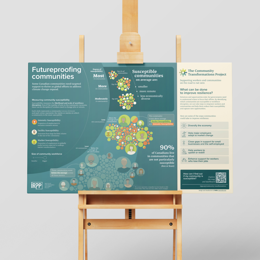
Future-proofing communities The Institute for Research on Public Policy (IRPP) has developed an interactive map in collaboration with The Community Economic Development Network and The Energy Mix about Community Susceptibility in Canada. They were seeking Voila:’s support to produce a static infographic that summarizes the key messages. Understanding the findings This project analyzes the impact […]
Creating a narrative to explain the impact of Economic dynamism

Creating a narrative to explain the importance and impact of Economic Dynamism In collaboration with the Economic Innovation Group, we clarified the nature and impact of economic dynamism in the United States. The result is an interactive that presents its history and how it has behaved state by state. We aimed to create an experience […]
Highlighting the positive results of a multi-sport program in Quebec

Encouraging young Quebec women to regularly exercise Nine out of ten teenage girls in Quebec do not meet the recommended 60 minutes of physical activity per day. A recent study demonstrates the benefits of Fillactive‘s program on teenagers’ physical and mental health, helping them to increase time spent practicing sport in a sustainable way. We […]
Moving to a net zero future in an uncertain world

Moving to a net zero future in an uncertain world CPP Investments, Canada’s largest pension fund, is committed to achieve net zero in their portfolio and operations and they wanted to communicate their plans to a larger audience. We worked with them to craft an interactive explaining their commitment to all Canadians. https://chezvoila.com/wp-content/uploads/2024/07/CPP-Net-Zero-EN-vignette-animee-ajustee.mp4 A guiding […]
Tracking Canada’s progress toward Net Zero emissions

Tracking Canada’s progress toward Net Zero emissions Is Canada on track to meet its 2030 emission reduction goals, and how far might it be from a path toward Net Zero? The Canadian Climate Institute conducted an independent assessment of Canada’s emissions reduction plan and came to us to showcase the results. Clarifying the structure Before […]