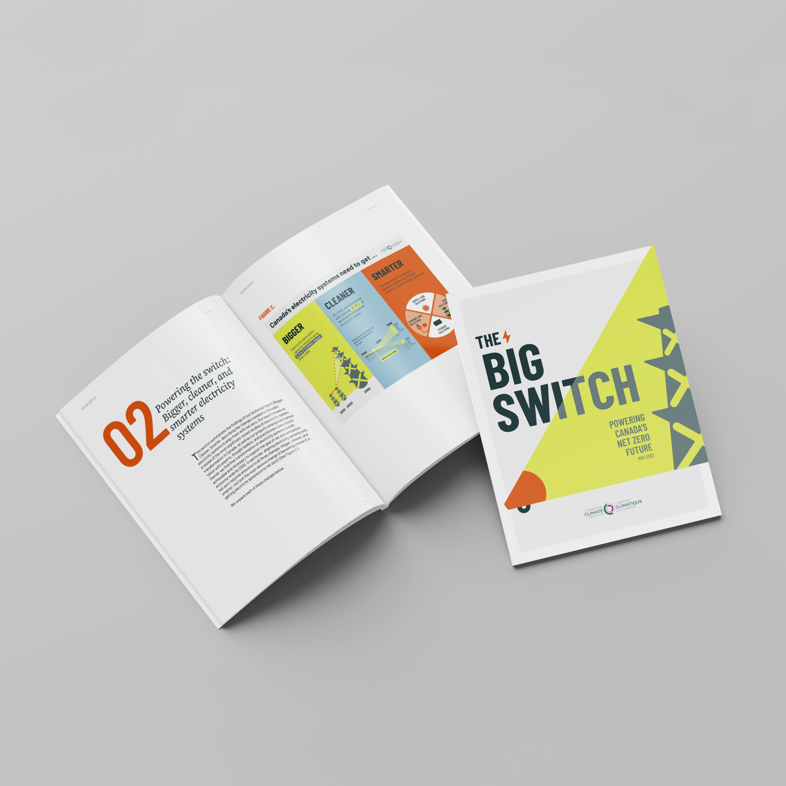
Achieving net zero in Canada will require a Big Switch
In its new report, the Canadian Climate Institute lays the groundwork for a new electricity policy, exploring “the changes needed in Canada’s electricity systems to align them with net zero”.
The challenge for Voilà: was to create compelling visuals that illustrate both the Institute’s message and the nuances that accompany the careful and rigorous work of climate science.
A strong symbolism for necessary conversations
Responding to the client’s intention to further the policy debate necessary for this change to occur, we used the symbolism of the megaphone that highlights the challenges and solutions identified in the report.
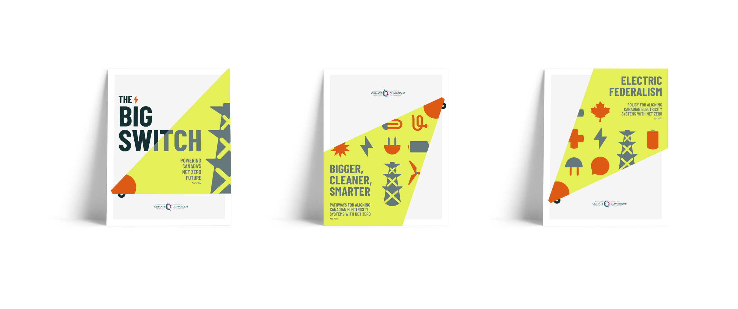
By creating an array of icons to represent the issues at hand, we had all the tools to create a memorable cover. On the left is the summary report cover with a large headline and strong image. Center and right, the two technical reports that delve into the details, as suggested by the many small icons.
Finding the right balance between impact and nuance
On the one hand, this report has a strong message and wants to communicate it unequivocally. On the other hand, the calculations are filled with nuance.
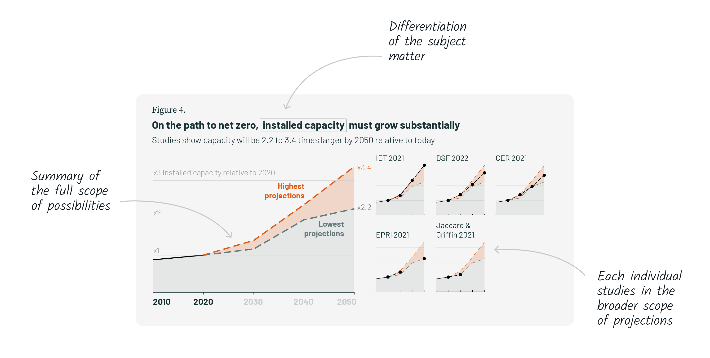
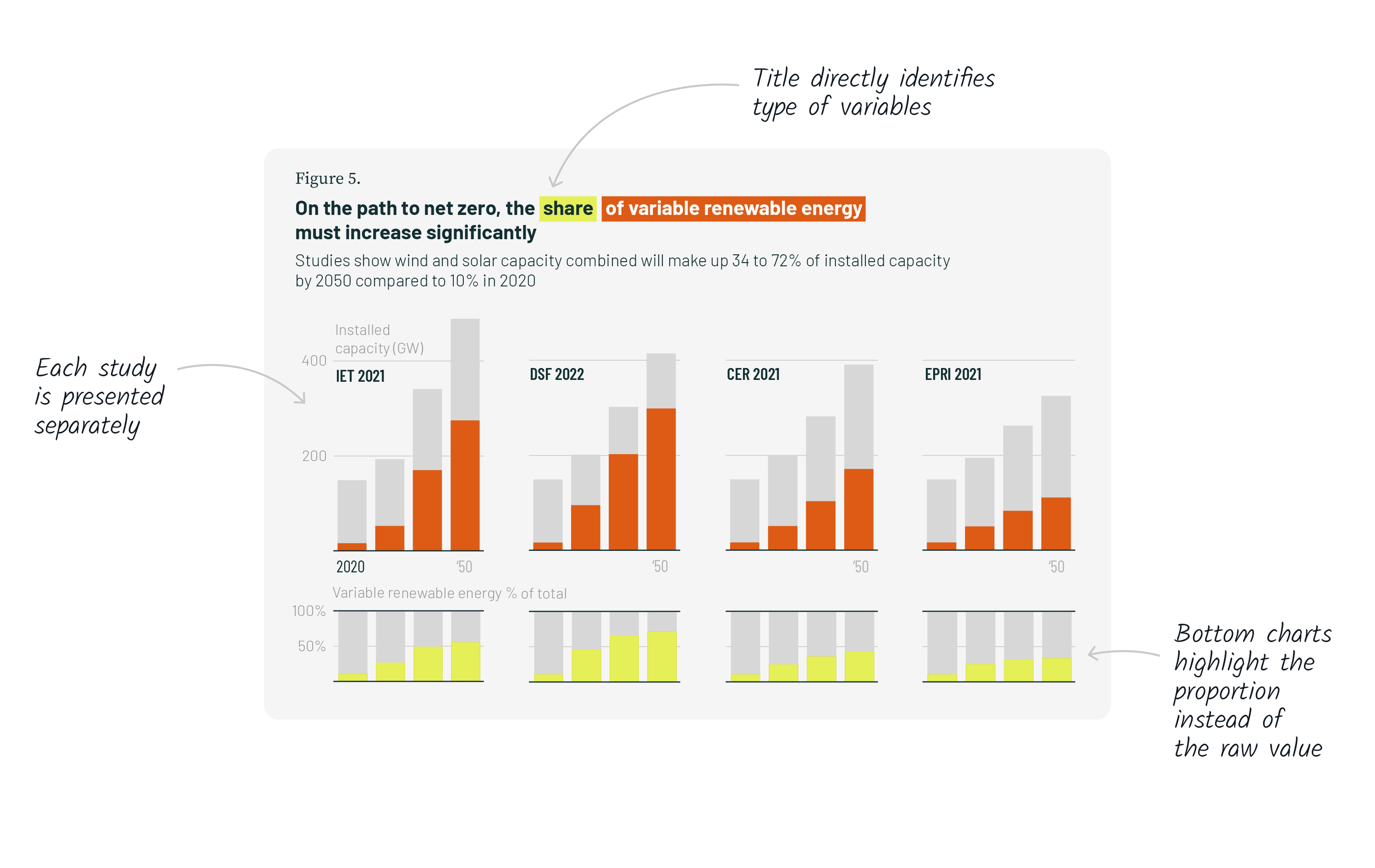
We navigated this fine line on a chart-by-chart basis. For example, when the focus was on climate science and the modeling done by the Institute, we aimed for clarity, often by using “small multiples” to break down the information in a more digestible format.
This first chart focuses on the amount of installed capacity that needs to be added to our grid in order to meet our energy needs. It shows the projections based on the minimum and maximum values of all the studies and how each study fits into these overall projections.
The format of the chart allows for the understanding that the future can take different pathways based on how you model it, but that there are imponderable, minimum amounts of installed capacity that everybody agrees on.
This column chart focuses on increasing the proportion of renewable energy that will be required in the canadian energy landscape. It shows the evolution over time of our energy needs and the proportion of renewable energy required. All studies predict that the share of renewable energy will increase regardless of the increase in our energy needs.
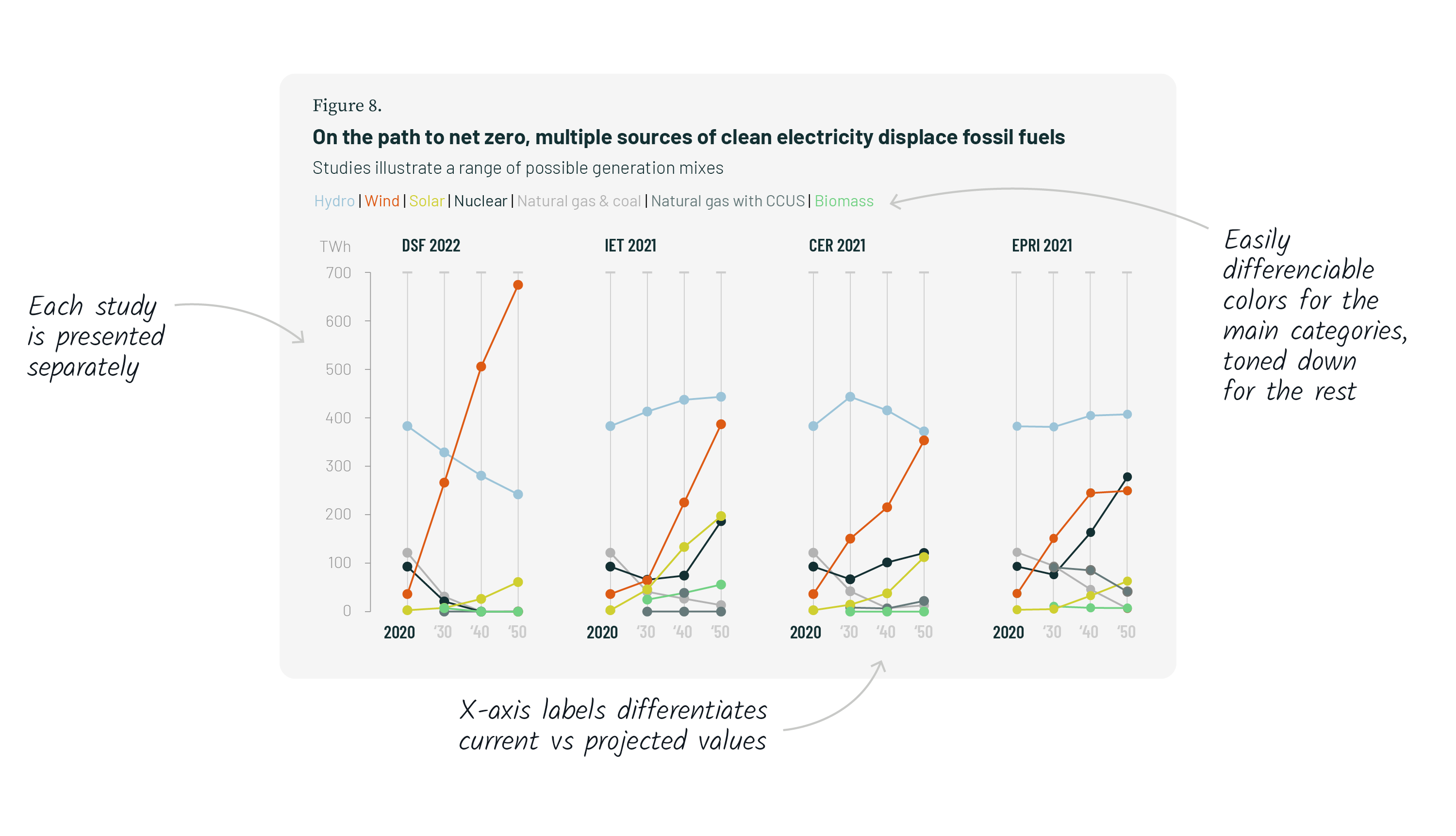
Finally, this line chart shows the different types of clean energy that can be used to phase out fossil fuels. Each study considers a slightly different combination to replace fossil fuels, but there are clear trends: wind and solar must grow, hydro and nuclear must be maintained, and the others will play only a marginal role.
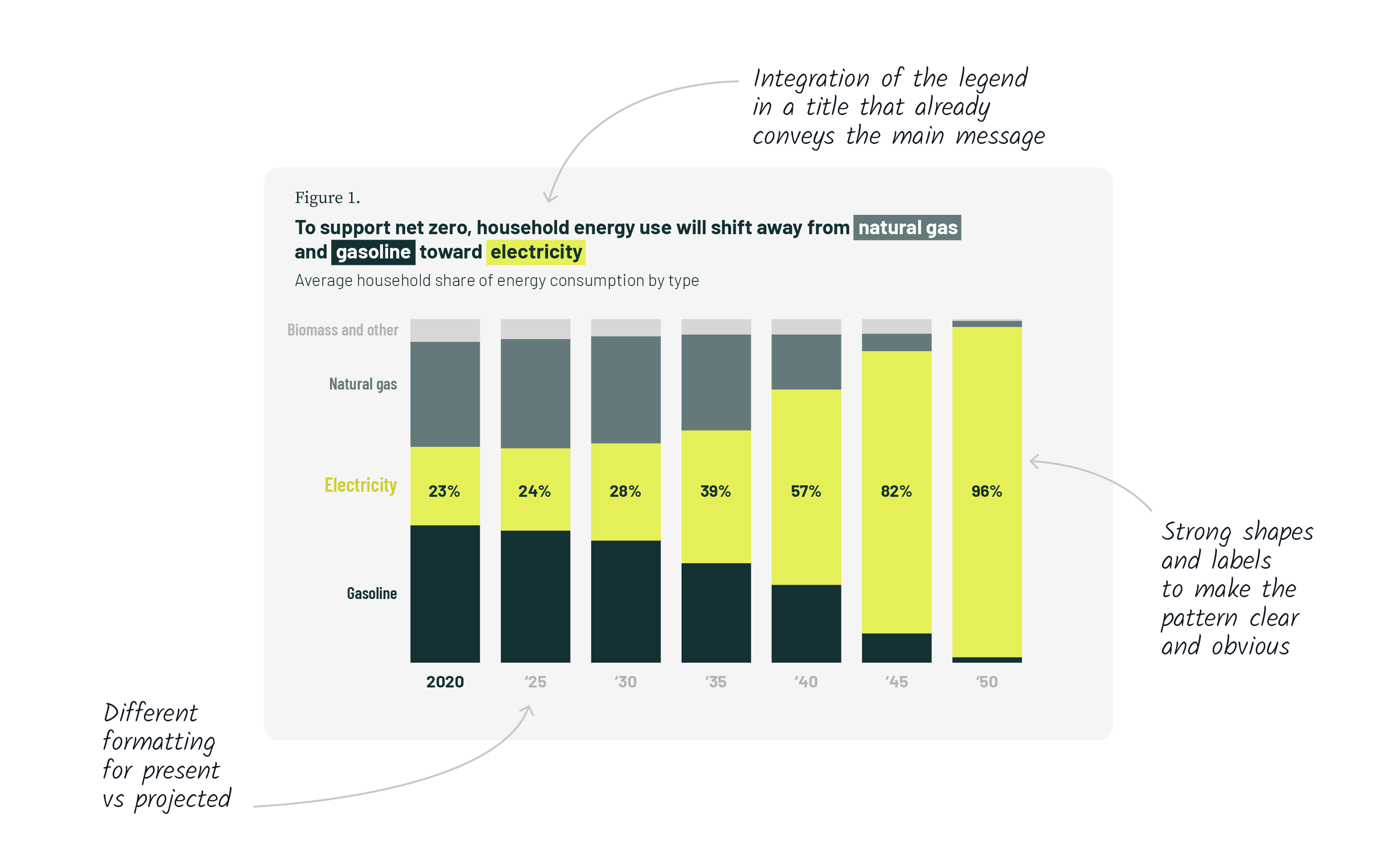
In this study, when the focus is on the main message, we aimed for bold colors and larger shapes to convey their message loud and clear.
This chart quickly became the poster for the report’s main message. With a clear trend and a strong visual movement, it resonated with the megaphone from the report cover as well as with the idea of light shining forward, towards a cleaner future.
It is worth pointing out that this chart breaks one of the data viz convention, which is to put the most important series at the bottom of a stacked column chart, so that its change over time can easily be compared. Here however, the comparison year over year is less important than the general pattern.
Telling a clean(er) story
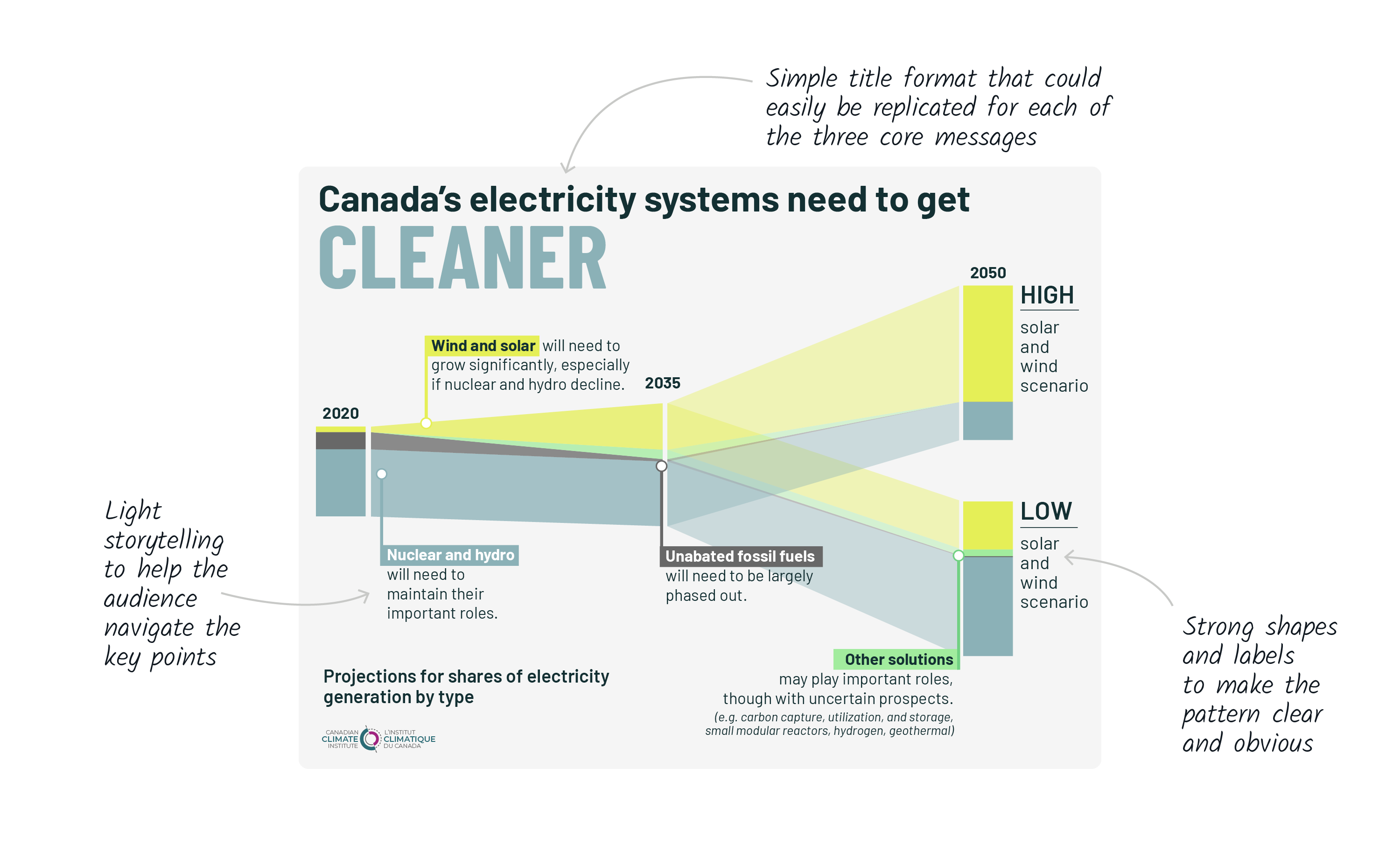
We also created more complex infographics illustrating the three core messages from the Big Switch: bigger, cleaner and smarter electricity infrastructures.
For those infographics, we created unusual shapes that would catch the attention of a reader and pique their curiosity.
They show patterns that work in a detailed format as well as in a more simple version that could be presented alongside its two counterparts.
Take the “cleaner” infographic. It starts in the present, emphasizes our only path forward to 2035 with the phase out of unabated fossil fuels and finally illustrates the roles that our two main sources of clean energy can play by 2050.
There are no numbers, no axes, no percentages, only simple shapes, telling a visual story.
One bite at a time
We also adapted some of our static visuals in an animated format. This provides an opportunity to tell a story in a sequential way, building up anticipation and focusing the audience on each new piece of information while building up a more complex narrative on top of them.
Each animation starts with a clear message and a playful animation of the signature megaphone/spotlight. This prepares the audience for what they are about to see.
Then, we built each visual in the same sequence, first setting up the stage with empty axes and gridlines, and then filling it up with the data.
A colorful presentation
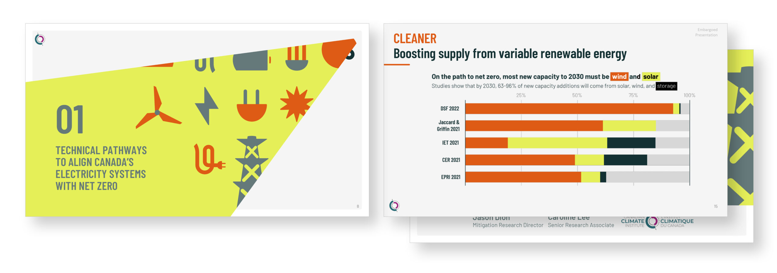
The electronic presentation that often accompanies these reports is often the only contact a certain audience will have with the content. It is therefore important that it be of the same level of clarity and quality as the report itself. We applied the visual identity and adapted the graphics to this medium.