The Institute therefore called on Voilà: to produce, among other things, an electronic presentation with static and animated visualizations.
A glimpse into the presentation’s visual identity
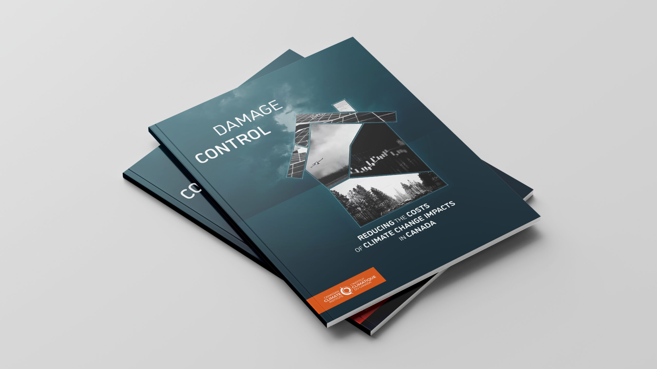
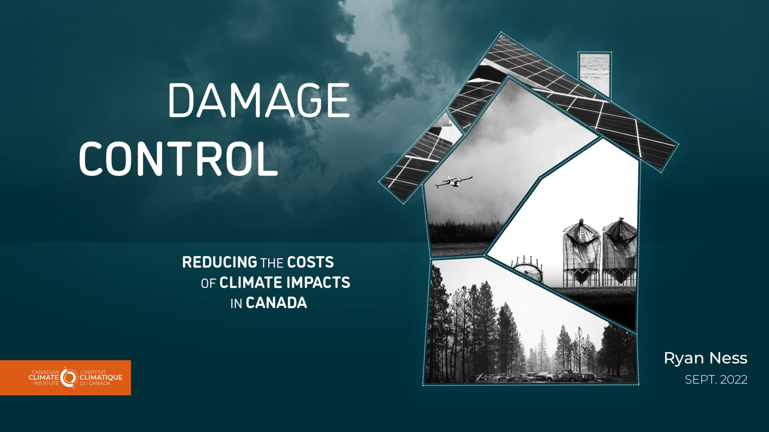
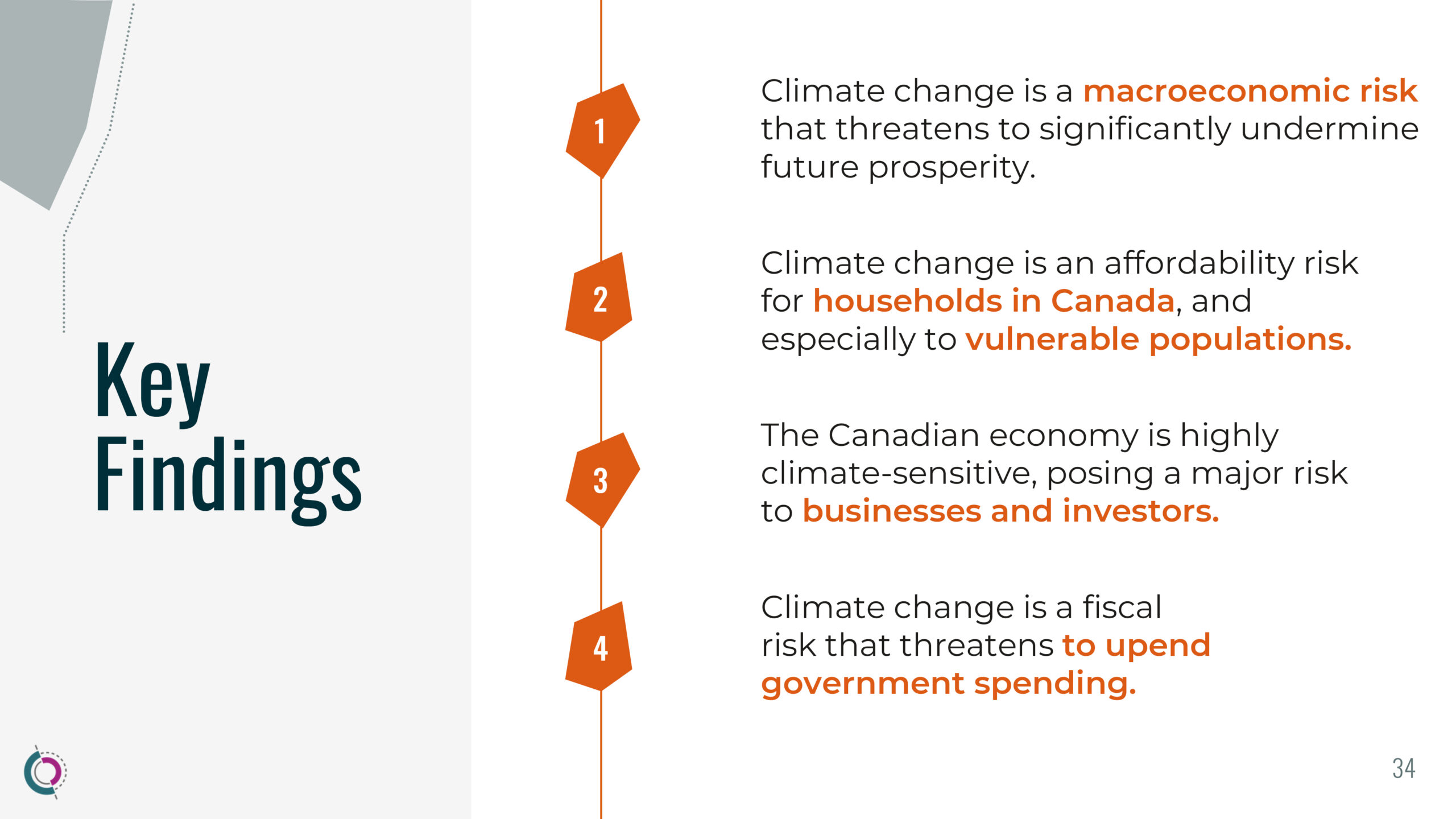
Inspired by the visual identity of the same series, this latest report uses the symbolism of the house in the form of a collage to talk about households: climate change will hit them hard, and they will be the ones to pay the highest price.
The deliberately dark colors echo the urgency of the climate crisis. Inside, bright orange communicates the need to take action.
The dramatic effect is reinforced by the presence of ominous clouds in the background.
Animation as a storytelling tool
Animations play a major role in the project’s narrative, and even influenced the choice of slide design. Here are some of the principles we developed.
The illustrated narration: The shape of an iceberg appears first, followed by the text explaining the metaphor.
The unveiling: The graphic gradually emerges, and the message comes to life in a playful, striking way, catching the eye throughout the animation as we wait to discover the final results.
The Immersive “step-by-step”: Key messages appear and disappear as each piece of information is revealed. Nonetheless, a sense of progression is retained, thanks to the way shapes stay visible even as they appear and fade.
The classic “step-by-step”: In this last example, the graphic appears step by step, to help understand a more complex diagram in its entirety.
The summary slide
The animation ends with a slide summarizing all the data available in the section. It visually anchors the discussion that follows the presentation, better than a simple “Thank you” on the screen, by recalling the main points.
Consistent and memorable graphics
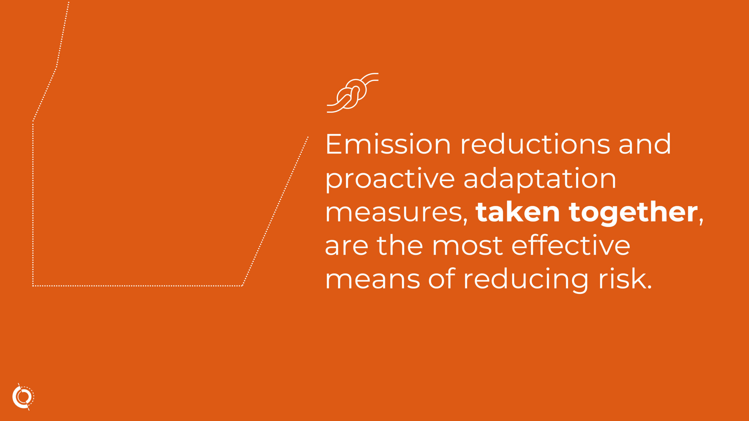
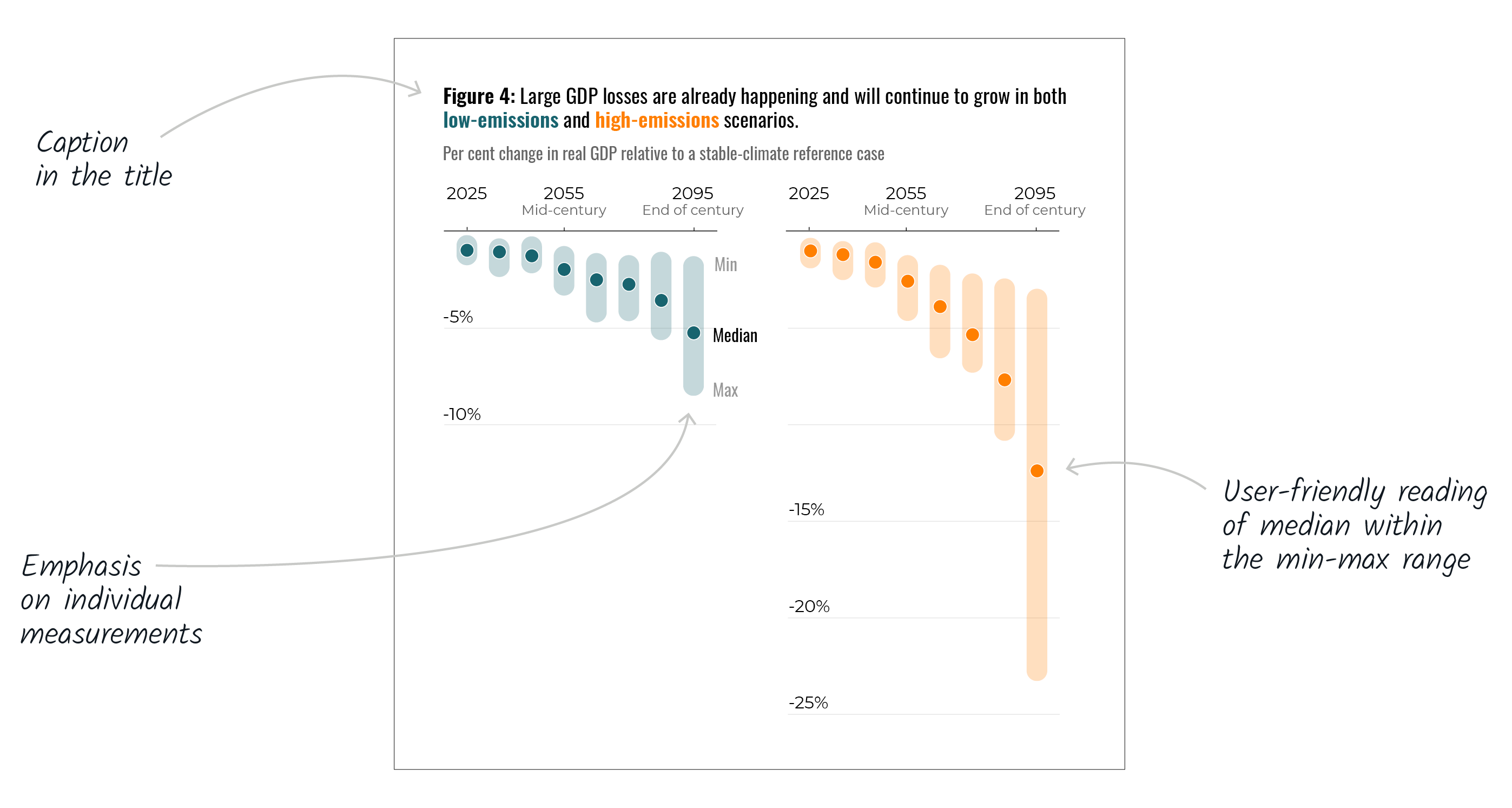
The message of this study is characterized by nuance and urgency. Thus, we have distinguished the scenarios using colors. Bright orange demonstrates the consequences of inaction in a world where emissions remain high, while green is used for the more optimistic scenarios, where emissions are reduced.
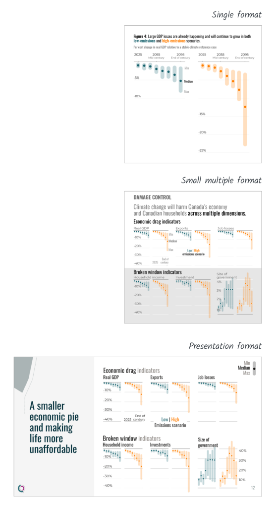
The dot plot shows the nuances, emphasizing each point in time rather than the evolution over time. The maximum and minimum of each scenario are shown in the background of the median. What’s more, this versatile format translates easily from a large chart to multiple small charts, as well as to electronic presentation.
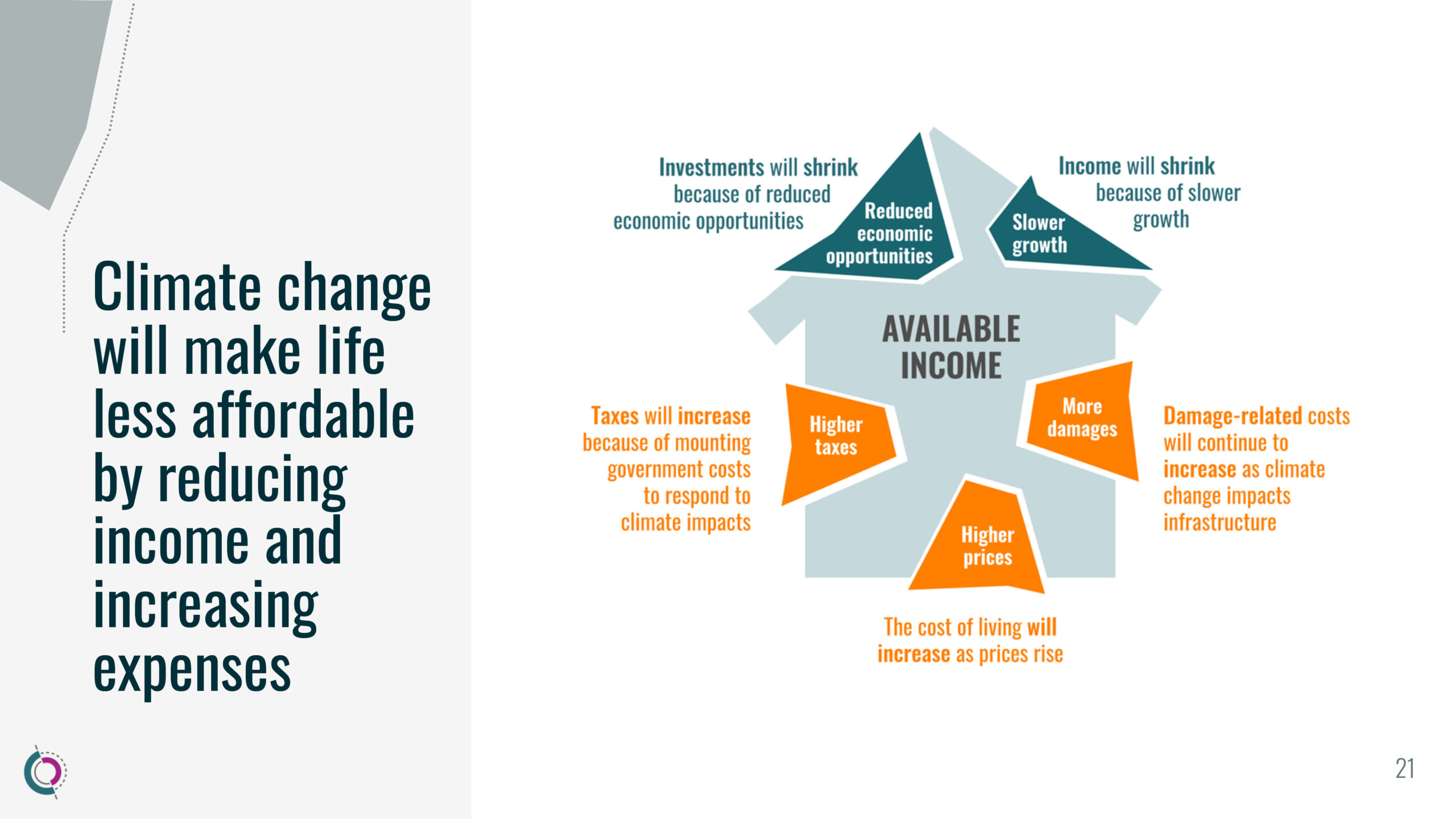
The infographics in the presentation are adapted from the report. Here, the visual shows household purchasing power under attack from all sides. The impact is reflected in the fragmentation that is shattering the structure of the house, the study’s flagship symbol.
Here is the complete presentation of Damage Control project.