
Revealing parents’ and students’ priorities
The Commission scolaire de Montréal asked us to help them present the results of a massive consultation on the review of their high school service offerings. The survey questions focused on the current perception of the offer and the preferences and aspirations of respondents for a revised offer. The format was an electronic presentation which was to be used by the project leaders during various meetings with stakeholders.
Strategy, resources and creativity
We held numerous meetings with the client during which we discussed the raw results of the survey. Our first task was to analyze the results and extract relevant messages. Some of the data cleaning work had already been completed by the client, allowing us to work quickly with organized data and analysis leads.
Once the messages were identified, we drew visual tracks on the whiteboard, allowing us to test multiple options quickly. The goal was to focus on finding the right concept for each message and to leave the execution for later. It also allowed us to cover a lot of material in a single meeting.
At the end of the meetings, the client used their data and our designs to implement them using their preferred tools. Twice they shared their work with us so that we could correct and refine it. We then created the presentation based on the graphic standards of the project. We adapted it for a big screen display while ensuring that the entire presentation was clear and consistent. We also suggested titles and progression of graphics to tell a coherent story.
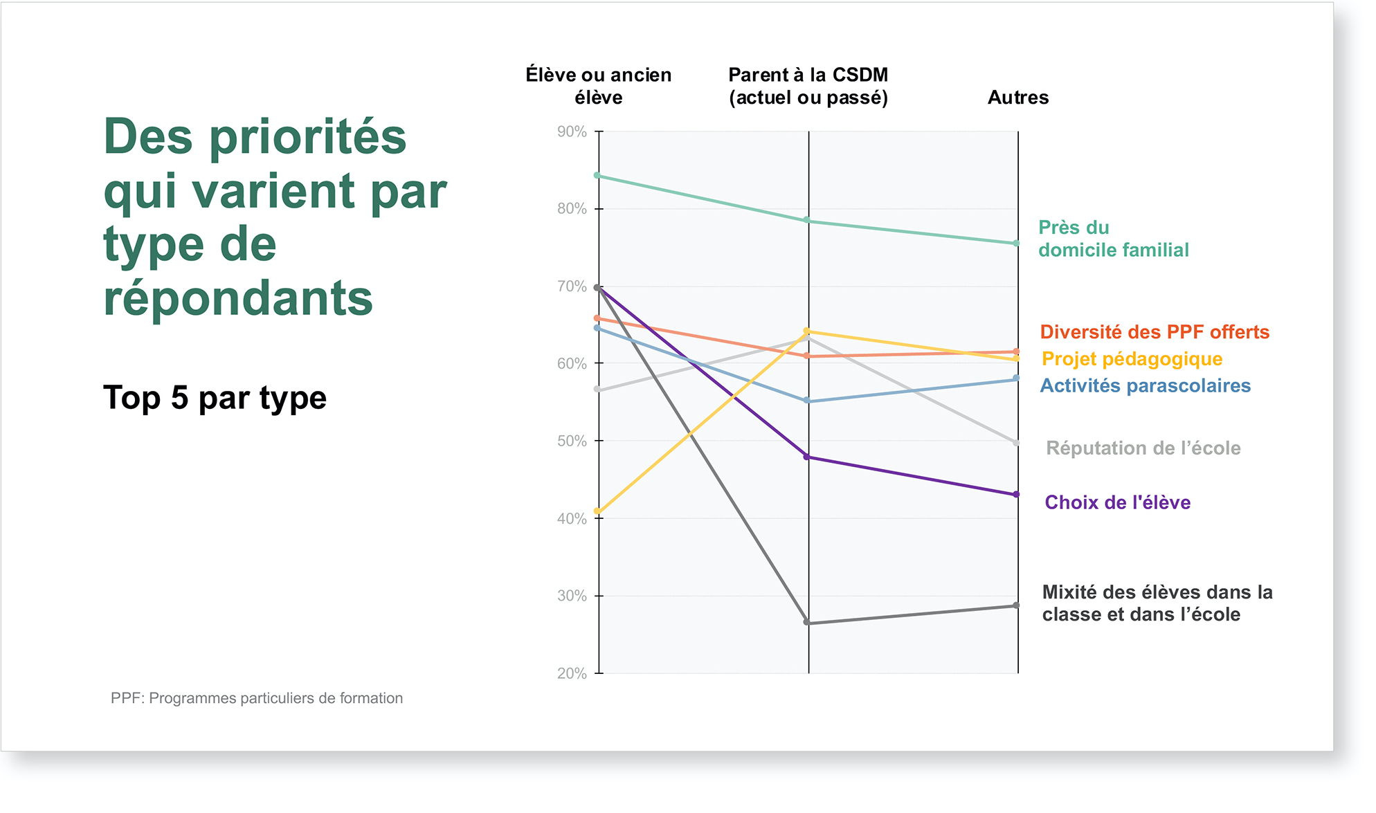
- The final document includes around 40 slides. We have selected four that we will explain in detail.
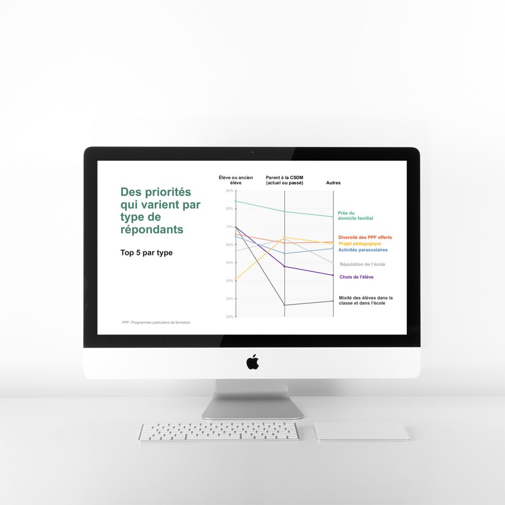
Revealing differences
There are as many views on what should determine the choice of a secondary school as there are respondents to a survey on the subject. It is therefore important to highlight the differences between different groups of respondents, such as parents, students and others, like education workers. It so happens that their priorities vary a lot, especially those of the students in relation to the two other groups.
- Parallel coordinates allow you to see the differences between categories.
- The position on each vertical line indicates the importance of the priority and the slope indicates the difference with respect to the reference group.
- Parents are in the middle because they make up the vast majority of respondents and therefore constitute the reference group. We can see that all the groups favor the proximity of their family home. Then the differences become visible, especially on the side of students who favor student choice and diversity, while these criteria are not part of the top five of the other two groups.
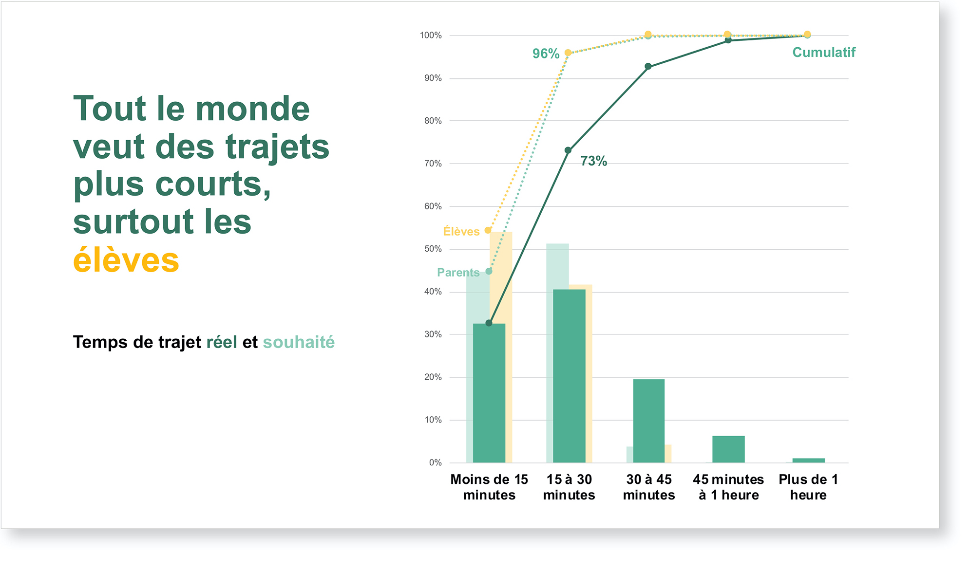
Cumulative preferences
Travel time is the first criterion for selecting a high school, but what about the time it takes for students to get to school and what would be the ideal situation? Both parents and students would like to shorten their travel times. 96% would like a commute of 30 minutes or less. At the time, 73% of the participants had commutes of this length .
- Our pareto graph shows both the current situation of the two groups, but also their desired situation. We can see the proportion for each duration, as well as the cumulative proportion of durations.
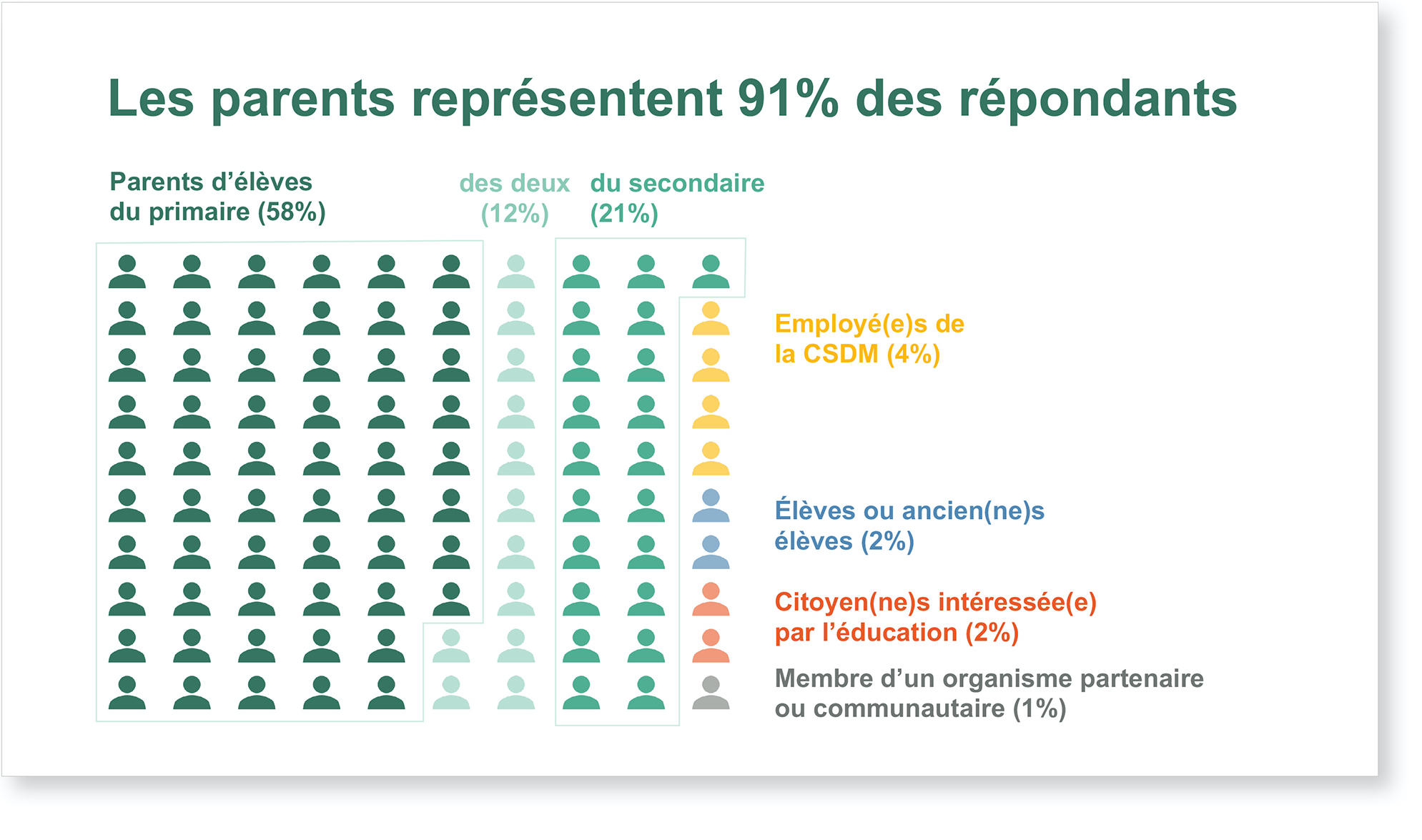
Respondents’ profile
As in any survey, understanding the profile of respondents is essential for interpreting the results. In the case of the present consultation, there were over-represented groups, but also sub-groups who provided a more nuanced picture.
- We have chosen to represent the respondents as a group of 100 people, differentiating them mainly by color. This made it easier to feel that the results represent real people and are not just numbers. Also, the visual of parents representing 91% of the respondents was striking, as it should be. The other groups also remained visible.
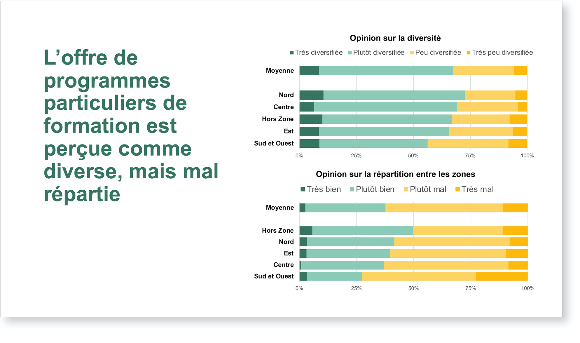
A gradation of satisfaction
The specialized programs are a major issue in the review of the secondary offer, because they are not equally varied and distributed over the territory. Users are therefore more or less satisfied according to their experience.
- The stacked bar graphs present the results in order of satisfaction, from left to right. This allows you to quickly see the sum of users who are at least satisfied. As each zone is different, the results are presented by zone in order to compare it. This becomes a crucial element of understanding when comparing these results to the distribution of specialized programs.
Tangible results
The presentation of the results during a consultation tour was a success according to the client. The slides covered all of the messages in a clear and concise manner, allowing the client to demonstrate the relevance of their own strategic directions. Clearly identifying the differences between certain groups enabled the client to adjust their own communication tools.
For the client, seeing their results presented clearly was beneficial, allowing them to adjust in the face of certain surprises, and to confirm their previous research. They were thus able to target the issues toward which their actions and efforts should be directed.
“The use of clear visuals will have enabled everyone, students, parents, teachers to have a common understanding … We recognize that sharing data, especially if it is easy to understand, greatly increases the credibility of an approach.”
– Maureen Hayes, project manager