The Ville de Montréal has identified eight high priority regions for the inclusion of new immigrants (“territoires d’inclusion prioritaires”). After more than a year of distributing funding that facilitates the integration of immigrants, they wanted to inform their partners of the nature of the projects funded.
The distribution of funding
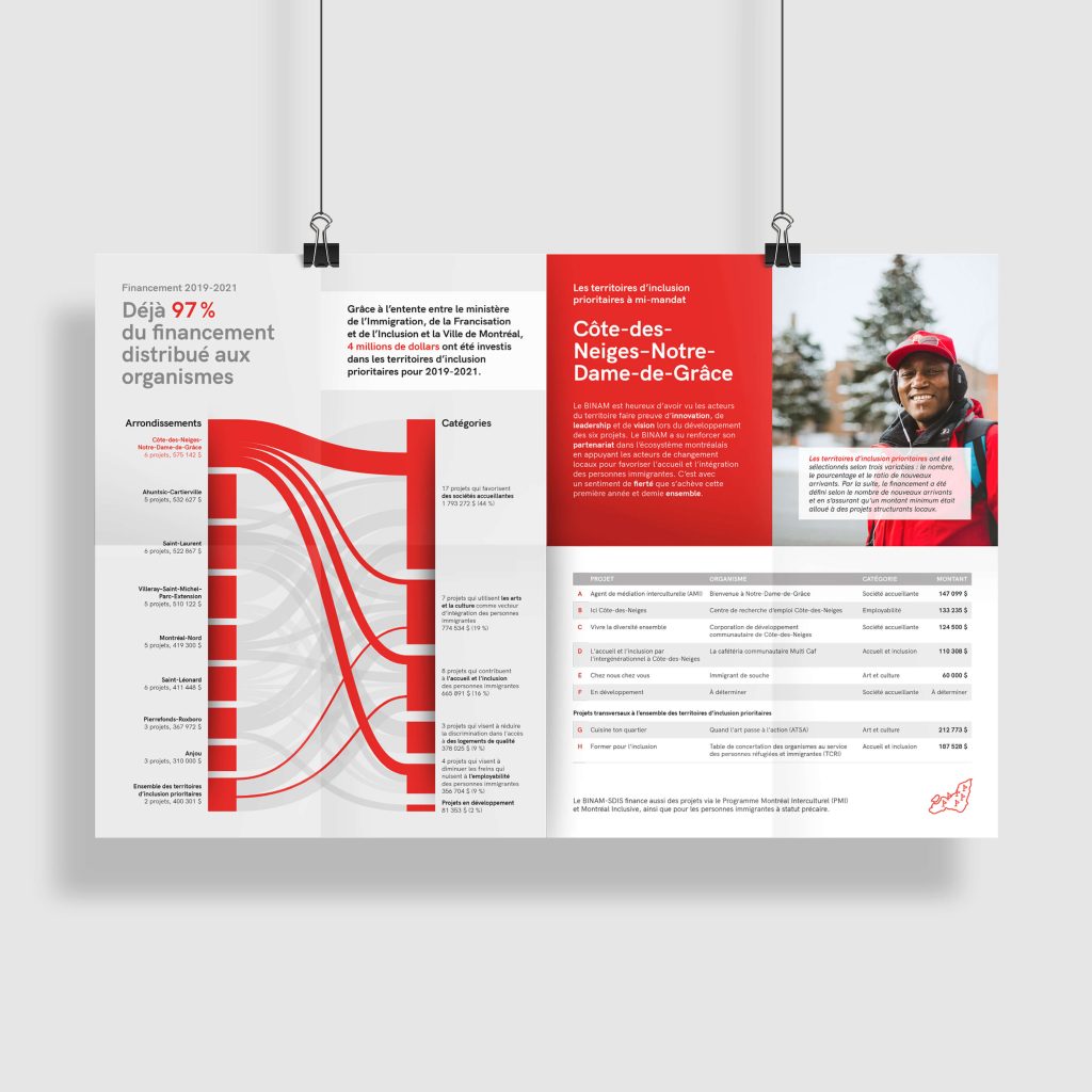
Each dollar distributed is associated with both a Montreal borough and a project category. So, the goal is not only to communicate how much funding has gone to each borough and each area of funding, but also how these two distributions are related.
The Sankey diagram is ideal for communicating data that changes state, such as funding categorized by region or subject. The visual is also elegant and eye-catching.
The bar height shows the total value of funding for each borough and each category. The exact numbers are also included for more precision.
The width of the curves that go from one column to the other corresponds to the amount of funding invested into a given subject in a borough.
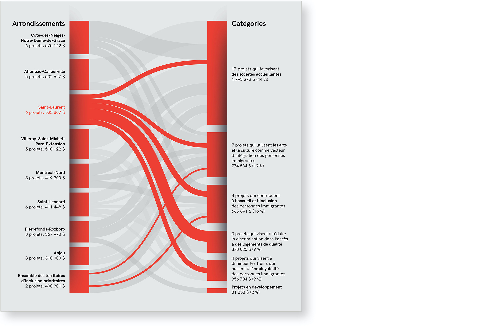
The star borough of each leaflet is shown in red. The other boroughs are shown in gray, therefore remaining visible in the background.
All boroughs
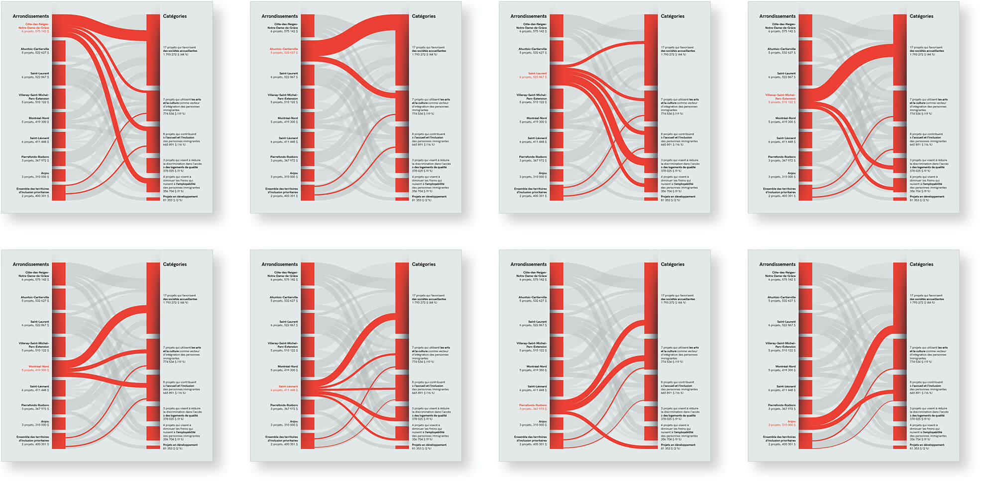
The Sankey diagram communicates the distributions well and quickly, but it is not designed for communicating the details of the allocations. For this, a table is needed.
The alphabetical numbering supports discussion by providing a way to quickly and simply identify each project. “You notice that project D …”
The table is separated into two sections to highlight that certain projects are common to all boroughs.
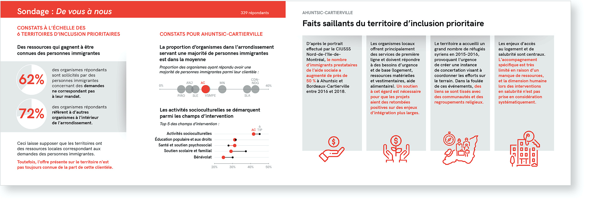
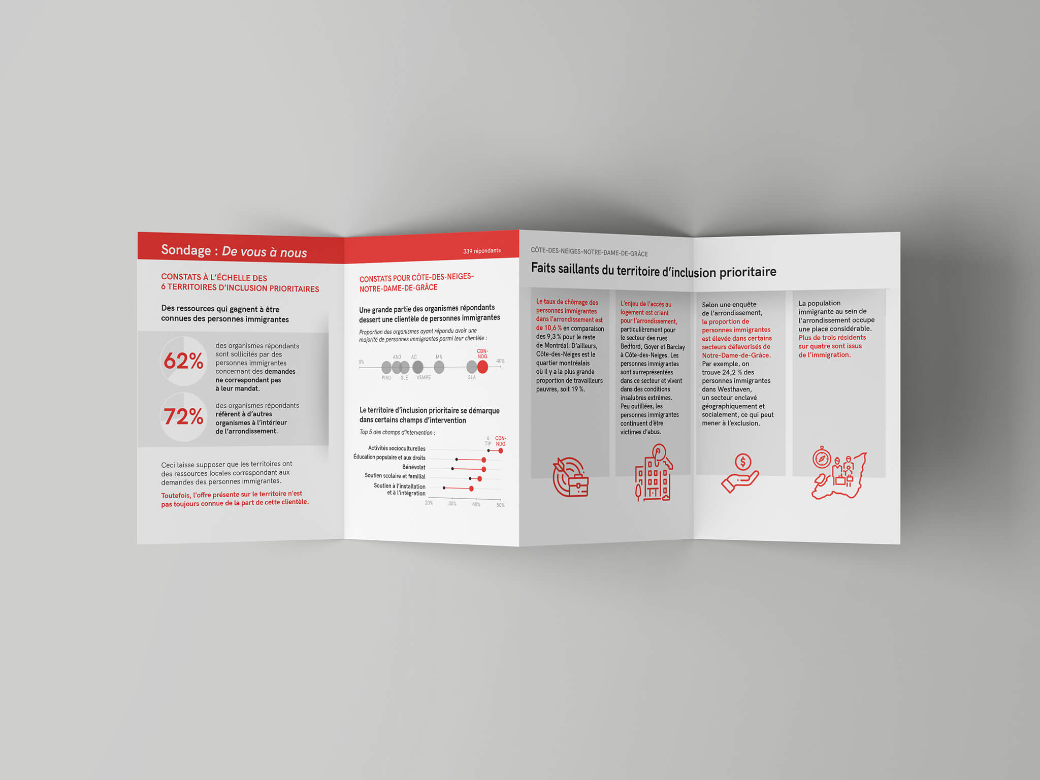
The survey
The Ville de Montréal also conducted a survey of its partners and wanted to take this opportunity to distribute the results. After analysis and discussion with the city, we have chosen the most relevant results to represent.
Pie charts are used to communicate single figures about resource use.
A dot chart shows the distribution of boroughs according to the proportion of organizations serving a majority of immigrants.
A dumbbell chart compares the most popular fields in the borough and the city average, revealing what sets this borough apart.
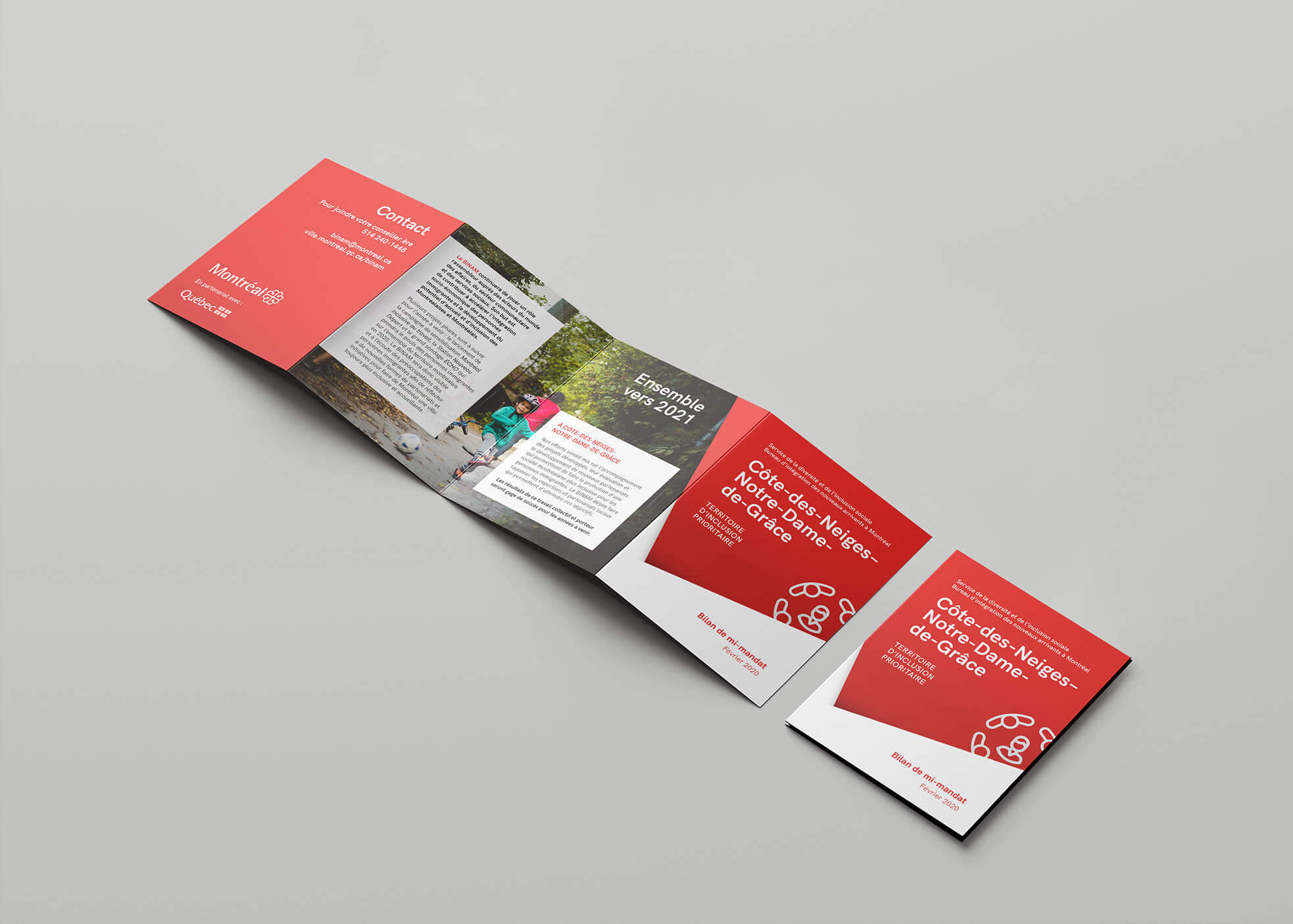
The format
Figures and more figures, summaries, a table, a graph… So much content, so much diversity. How to communicate everything in small doses to allow the public to absorb it easily? The client had a 11×17 poster (tabloid) in mind, printed double-sided.
We suggested using the same size, but folding the poster into a leaflet that would give us several options for section sizes, from the cover, to the poster inside. We were thus able to divide the content by theme.
Another advantage: once folded, the leaflet is much easier to transport and distribute. It is also more distinctive.
Historically, the East of Montreal is a region that has been less developed and less well served than the Center and the West. How can we mobilize political actors to restore equity?