Women smallholders in the financial inclusion agenda
The Consultative Group to Assist the Poor (CGAP) collected data on smallholder farmers in Mozambique and Tanzania. What they found was a gap between men and women, especially as they move up the income ladder. They approached Voilà: to visualize these findings.
Connecting four dimensions
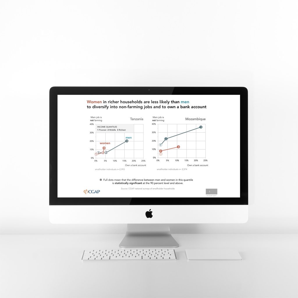
The publication standards of the CGAP are such that they had room for only one graph in their “brief”, a short version of their report for wide distribution. Developing this summary graph was the original reason why they approached us. It had to show two behaviours at the same time: the move from informal to formal financial services and out of farming, as the households grow, but also that the behaviour of men and women differ. This means four dimensions:
Gender
Income level
Main job
Bank account ownership
We developed a connected scatterplot because it allows the reader to follow the changes in behaviour of each gender across the three income quantiles, from the poorest (1) to richest (3) (we confirmed with the authors that there is social mobility that would justify the idea of a path from poor to rich). The two genders are then differentiated by colour and their evolution across income levels becomes visible.
The title helps the reader see the findings in the graphs.
The full dots convey statistical significance. This means that men and women do not differ in behaviour until they reach the second (Mozambique) or third (Tanzania) quantile of income.
The scales of the two graphs are identical (0% to 40%) to make the two graphs comparable.
All the text is horizontal for easier reading.
Because it is intuitive and consistent, the legend only needs to appear once, on the left graph.
Top expenses in slopegraphs
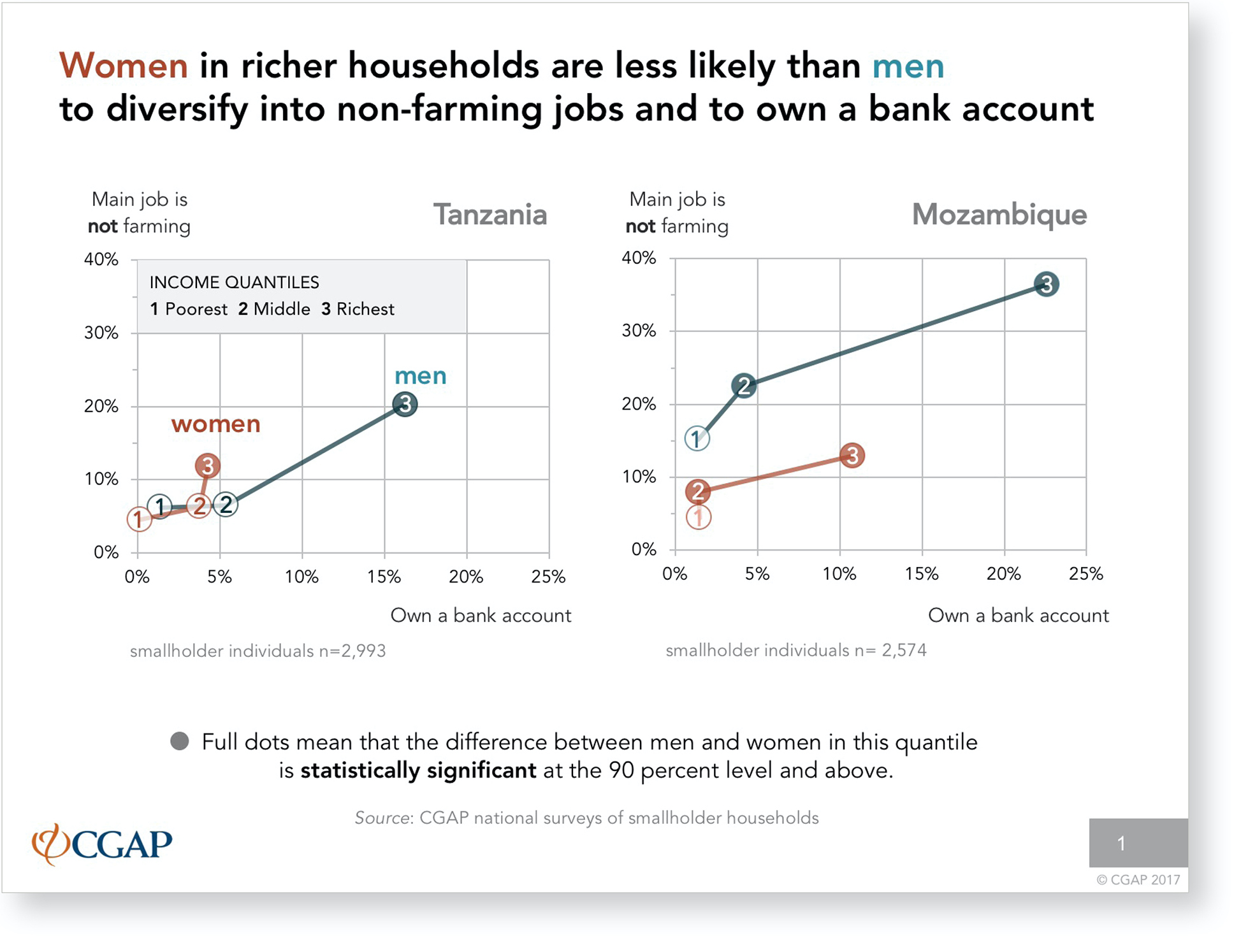
The information collected showed that men and women have different spending priorities in either country.
The solution is a slopegraph (below), a dramatic way to show the differences between the two groups in each country. The angle of the slope clearly shows that for the top two women expenses, there is a strong difference. On the other hand, the following two expenses are comparable, an information that also seems relevant. We removed the concept of “household” expenses though as it was not clear cut from the data and we simply stated that expenses are different across genders.
The colour coding of men and women is conveyed by the axis lines.
The lines are directly annotated, allowing for very subtle differences in shades of grey for the labels.
The data point for the largest women’s expense in Mozambique (groceries) exceeds the scale, allowing a greater range to show differences more clearly across the two graphs.
The two graphs share a common title to avoid duplication and clarify that we present the same measurement across the two countries.
Before
CGAP had tried to convey this information with pie charts, grouping the household expenses with shades of green. This means comparing slices across pies, a challenge for the human eye on top of the back and forth to connect the legend to the graph.
Scatter plot for transactions
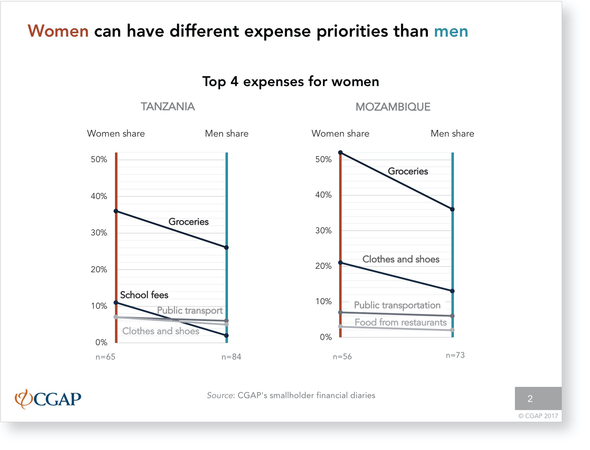
This dataset connects the number of transactions to their total value, while differentiating the informal transactions from formal ones. It also contains data on savings and borrowing, in both countries. We have the following dimensions:
Number of transactions for borrowing and saving
Type of transaction (formal/informal)
Annual value of savings and borrowing
Countries (Tanzania/Mozambique)
Gender
The message to convey is the difference between the two genders when it comes to these two types of transaction. Women save more often and in greater amounts. They also borrow less often and lesser amounts.
Our solution is a scatterplot with a line connecting the dot to the scale. This line allows us to differentiate the formal (full) and informal (dotted) transactions. It also creates a “box” that reinforces the overall message. For instance, in the example below of the Tanzania savings (top left), the Men box is clearly contained within the Women box, showing that men save lesser amounts and less often.
The legend is shown in direct annotations on the graphs.
All the graphs use the same scale to allow comparability across countries and measurements.
There is no grid, given that the lines already help to convey the dot value with precision.
Before
CGAP had developed bar graphs that showed the number of either type of transactions. The total value (not average, as they had initially indicated) is then conveyed in large numbers, with the size more or less proportional to their value. This means a lot of work for the reader to figure out the interaction between these two data points (number and total value of transactions).
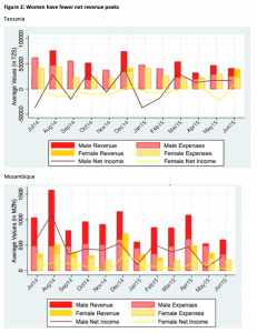
Revenue peak in line charts
The data shows that throughout the year of study, women have fewer revenue peaks than men.
Our solution retains the general concept while refining it. The income and expenses are now shown with triangles that form diamonds because the expenses are shown as negatives, which is more intuitive. They use very light colours to be less distracting that in the original. The net revenue is still shown as a line, colour-coded by gender.
A similar graph was developed for Mozambique.
Using the gradient function, we were able to differentiate the colour when the net revenue is positive.
The gridline is more visible because this is meant for an electronic presentation where the contrasts may be hard to see.
Before
The graph by CGAP uses line charts superimposed over bar charts representing the underlying net income and expenses. Because of the colour scheme, it is difficult to follow what is happening.
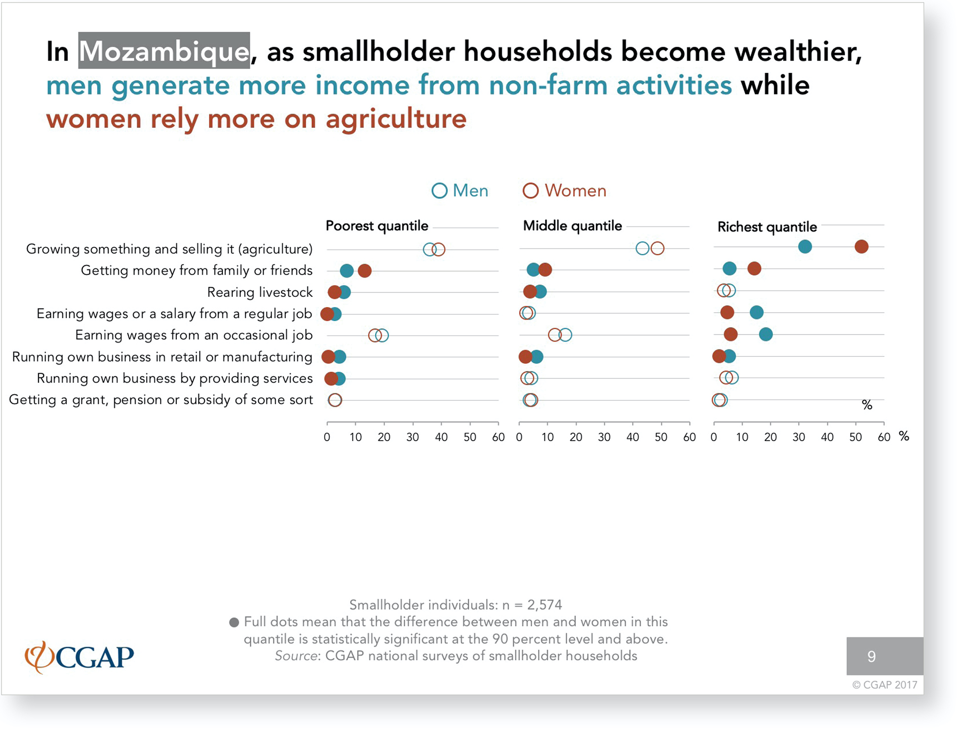
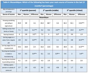
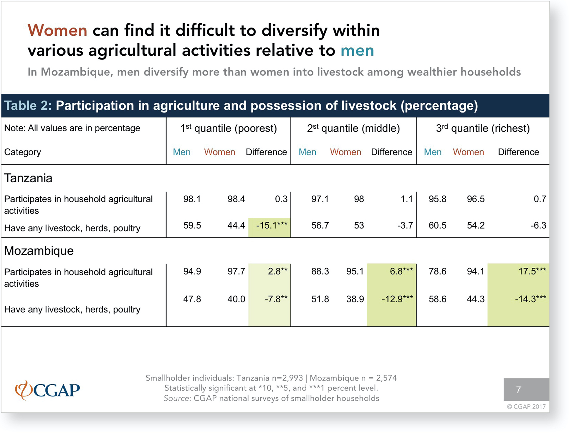
Dot plot for non-farm income
This table shows that as smallholder farmers grow richer, they tend to diversify their income away from agriculture. This trend is stronger in men than women.
We developed a dot plot to show the share of men and women that rely on each activity. In each of them, the share is highest for agriculture (top line), which is normal for smallholder farmers. What is interesting is to see where the men pull ahead of women and the answer is for all other activities, across income levels in Mozambique. This difference is statistically significant, as shown by the full dots. The reader is therefore invited to see how the blue dots (men) appear ahead of the red dots (women).
The three quantiles are shown side by side to avoid the repetition of the categories, which is important in the context of a slide for an electronic presentation.
There is no vertical gridline because the focus is on the difference between men and women, not on absolute values.
Before
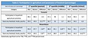
Tables
CGAP had a lot of results to show from their data collection and calculations, so they also use many tables across their report. Their structure is fairly standard: comparing men and women, and noting the difference, across the three income quantiles.
We removed the row shading meant to guide the eye. In such a short table, it was not necessary. We replace it with shading that is meant to reinforce the statistical significance, an important information in this context.
We also cleaned up the borders so that the three income groups are clearly delineated. The colour coding used across the report for men and women is repeated in tables.
For an intuitive reading of the data, we inverted the difference values by subtracting the men’s performance from the women’s. This way, negative numbers mean that women’s performance is lower than men’s. It is also how the numbers are reported in the text.
The alignment of the text and numbers is improved for clarity and legibility.