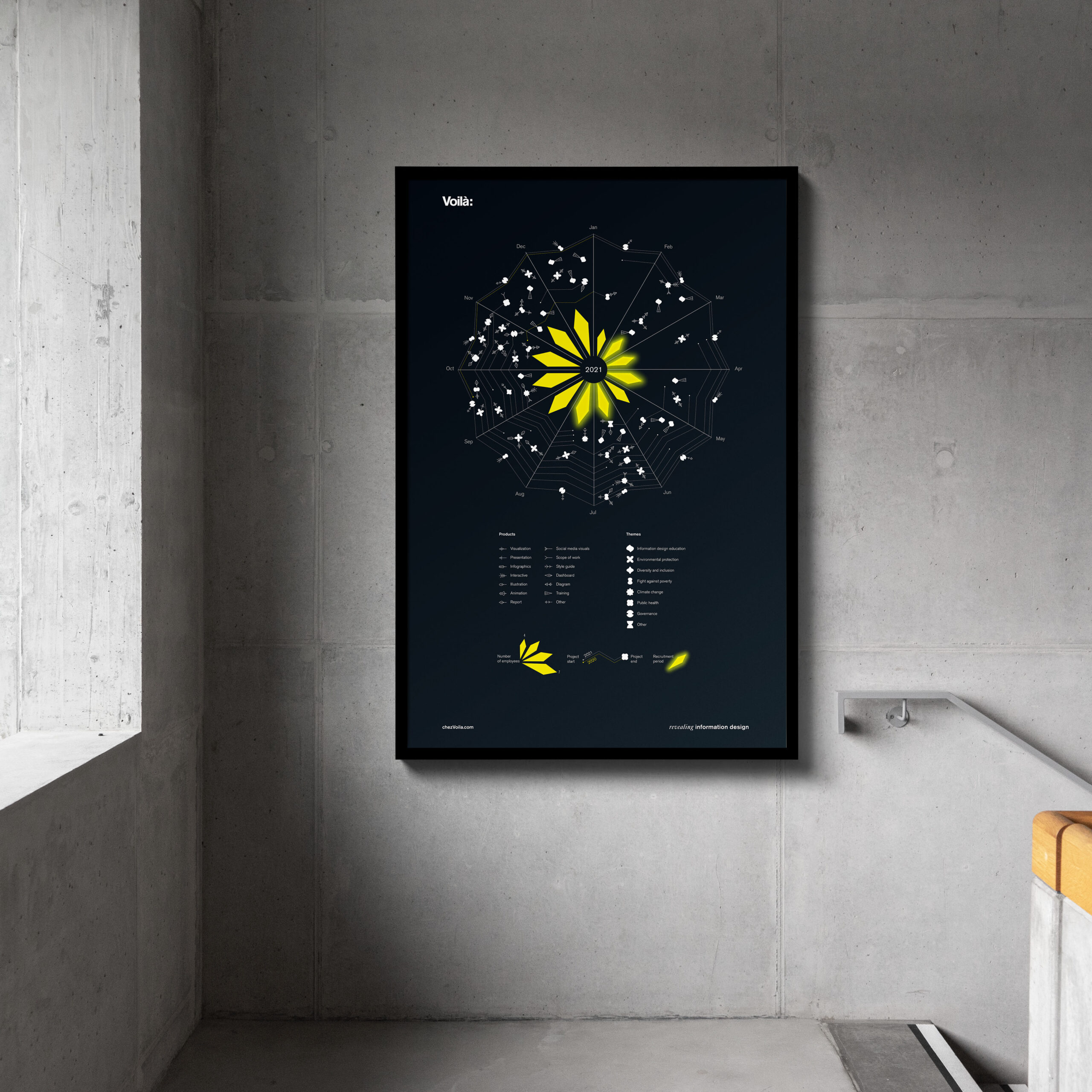
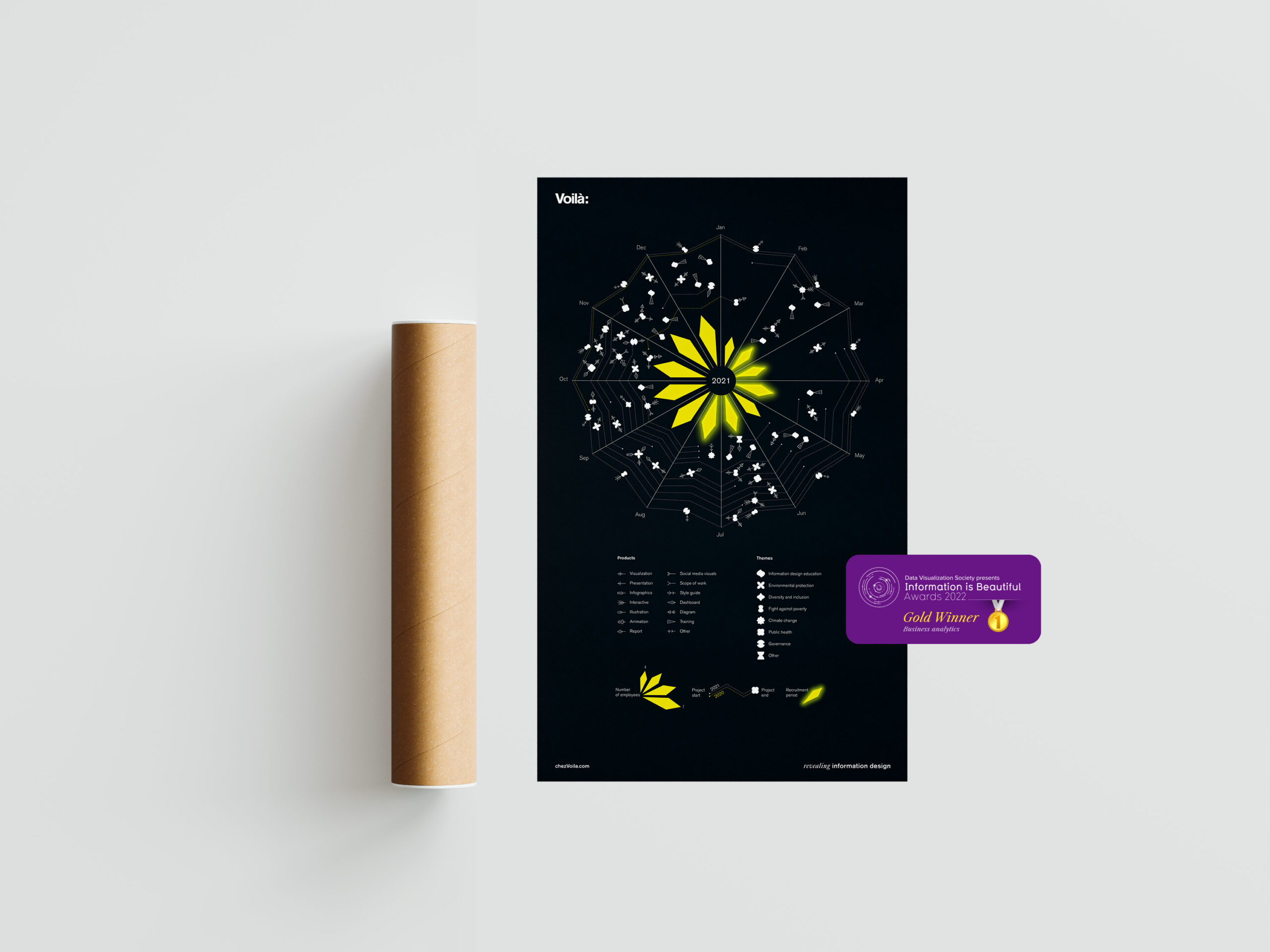
2021 was an exciting year at Voilà:, full of new projects and a growing team. Although we live and breathe information design, this was the first time we made a data visualization about ourselves. It was developed as a greeting card for clients, partners, collaborators and friends.
While we are known for clear analytical charts, we took this opportunity to develop something different and communicate another aspect of data visualization.
Playful rather than analytical
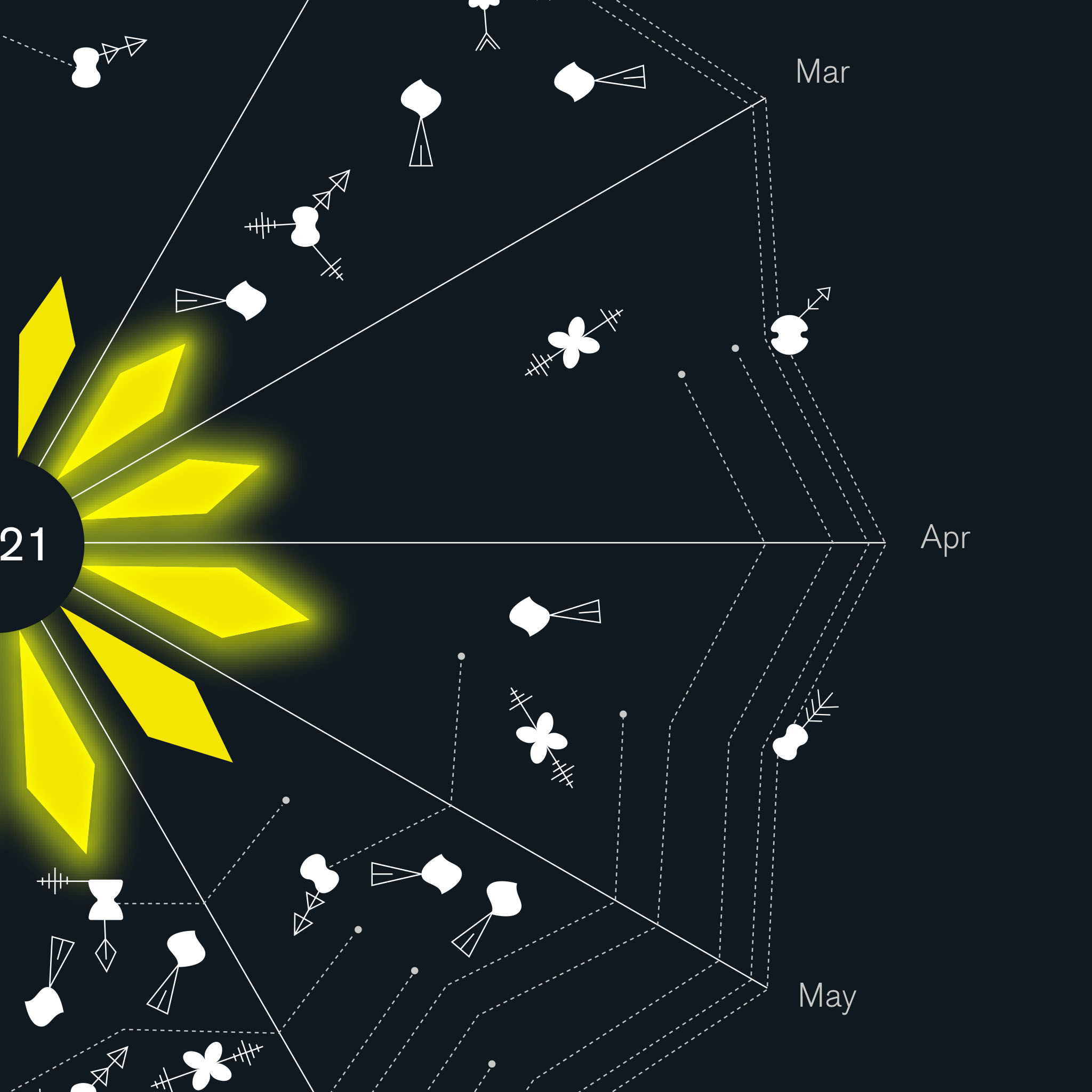
We took a more playful approach than usual. We created an image that clients could explore to try and find their projects .
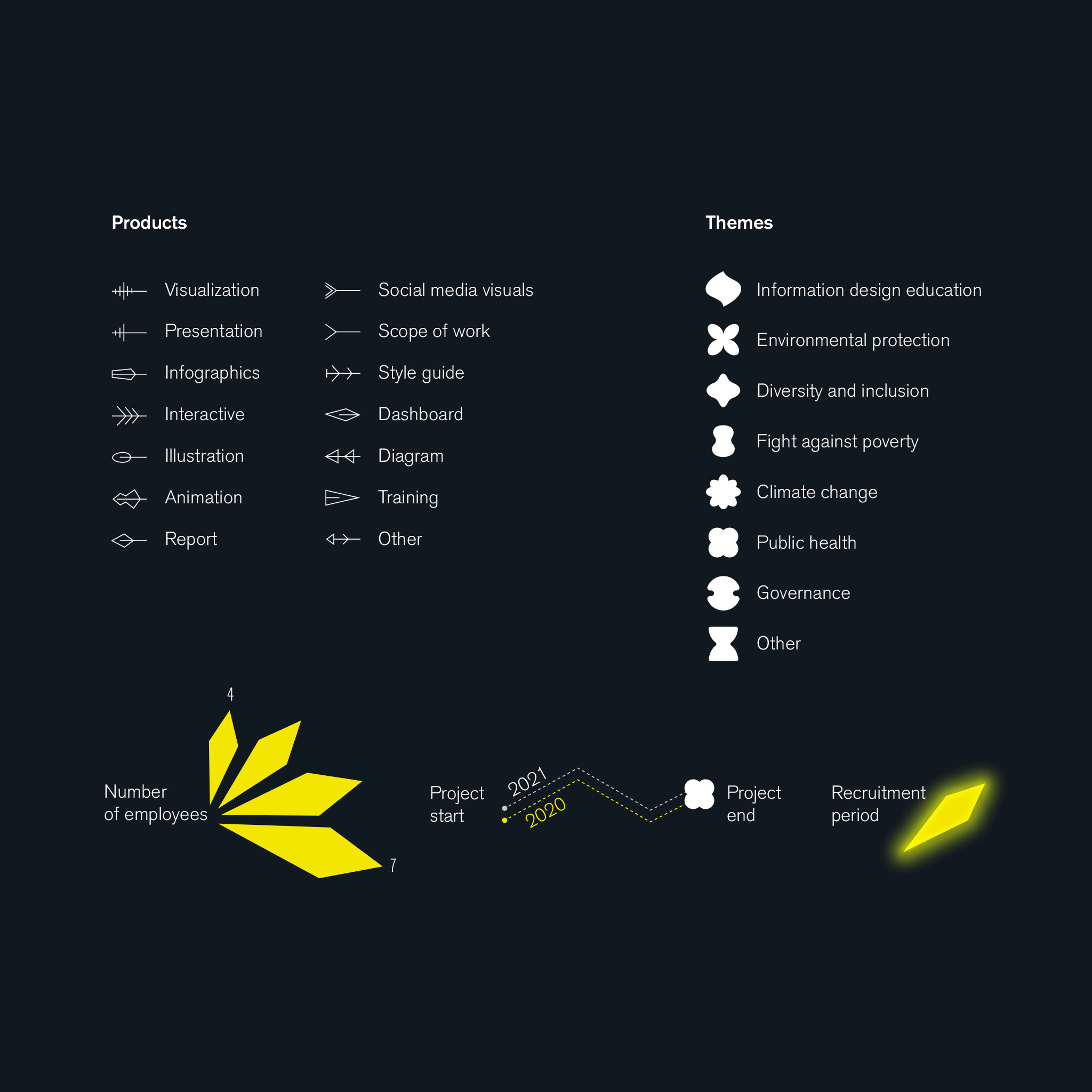
The general look is a spider web centered on a shining star that represents the growing team. The yellow lozenges of the star are getting proportionally bigger as we added employees during the year. The glow draws attention to the recruitment periods.
As the eye travels through the visual, it discovers shapes and symbols. Our limited palette of four colours (yellow, black, and two shades of gray) forced us to use alternative ways to encode so many themes and products.
Choosing the data, focusing on relevancy
Projects are more than a single point in time, so we decided to represent their duration with dotted lines.
The white organic shapes represent the theme of each project, such as climate change or diversity and inclusion. Pinned on those shapes are symbols representing the products we delivered for the project.
If you want to know a bit more about the journey of this project: