A new look at the performance of residential and long-term care centres in Québec
The CSBE had a new method for evaluating the performance of long-term care facilities, which highlights major disparities across the territory. We accompanied them in the presentation of their study results, which highlighted numerous points for improvement in order to reach a satisfactory level of performance that met the needs of the population.
The process and the data first
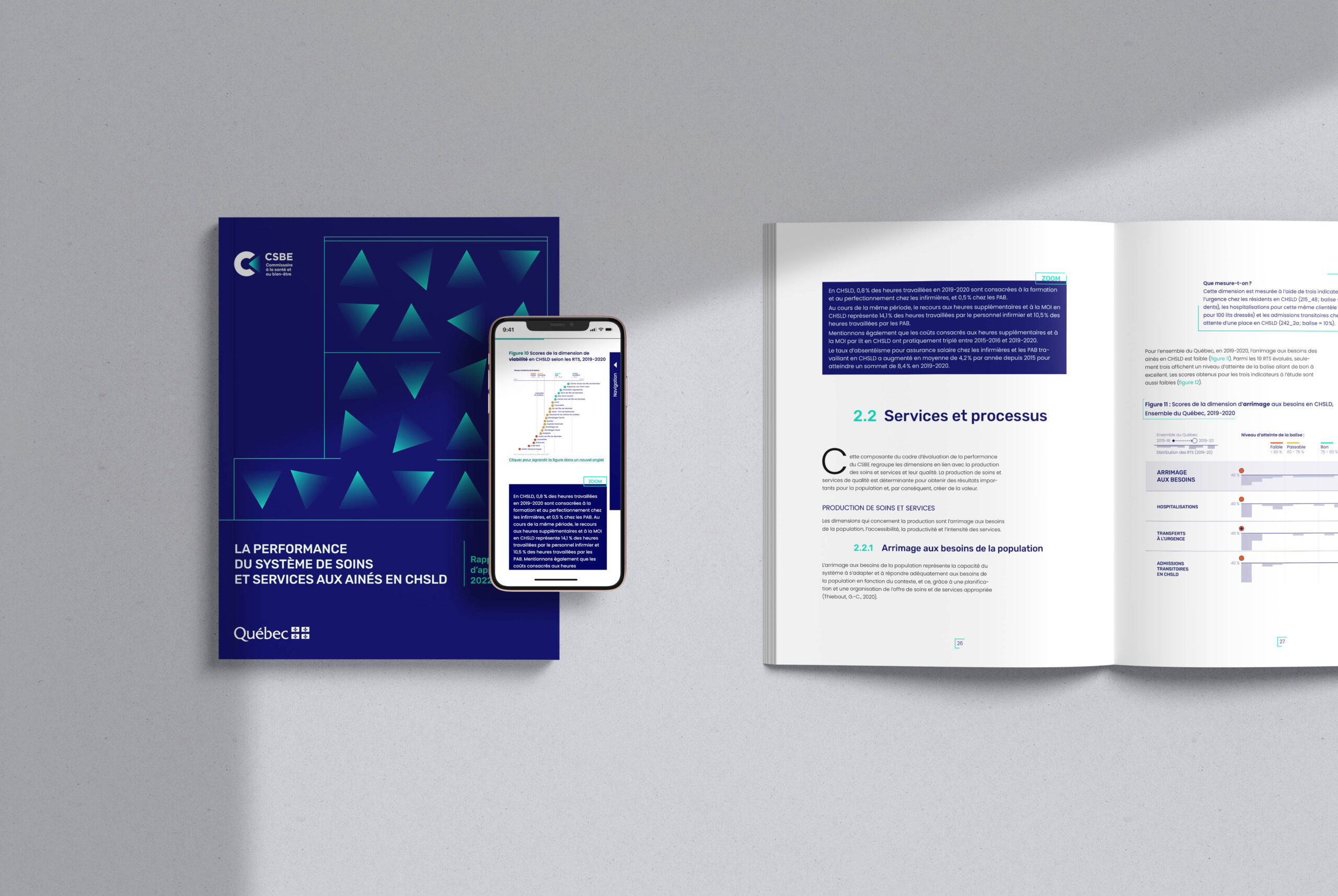
We developed a report (in French) and an html version of it with the mandate to push further the design and data visualization, while respecting visual identity of CSBE.
For the cover page, an eye-catching image that still hints at the scientific process and the data. The beam of light, which is part of the CSBE’s visual identity, is used here as a triple symbol:
22 beams represent the 22 Quebec territorial service networks (TSNs) at the heart of the evaluation.
These beams represent the lit windows of a home for the elderly, which is the living environment studied.
Their variable orientation highlights the variations in the numbers and research results.
The silhouette of a home is drawn with lines that occasionally break and resume, like a fragmented system.
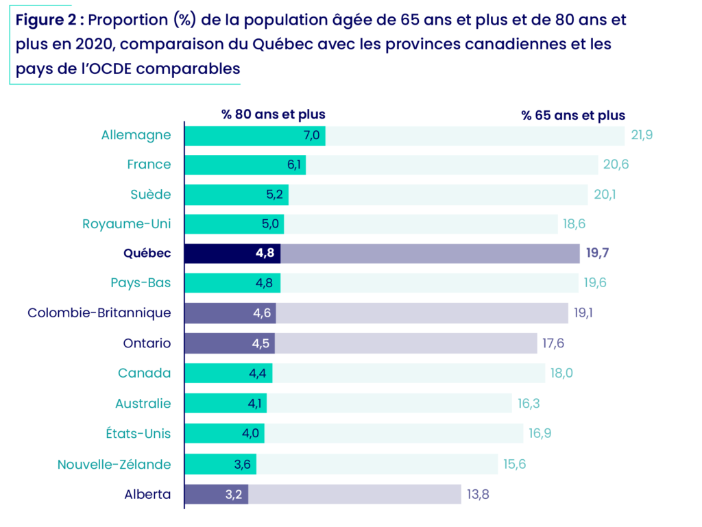
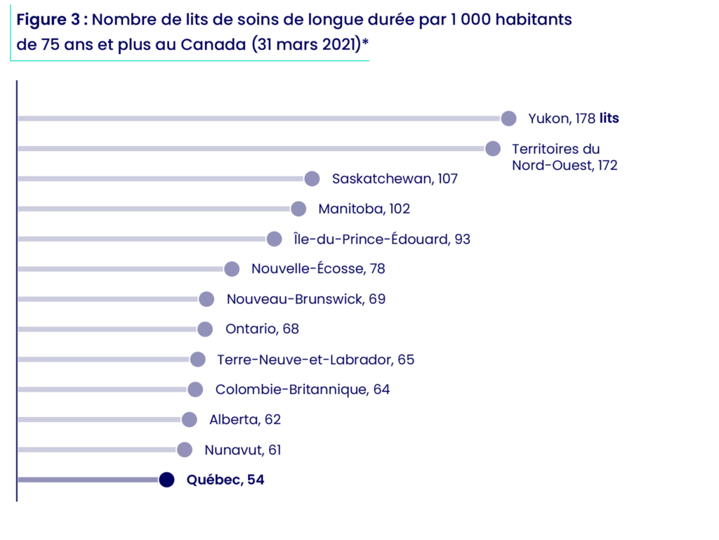
Tension between supply and needs
Some of the data in the report put Quebec in the Canadian context. Here we see the age of the population on one side and the number of beds available for their long-term care on the other. The darker shades make Quebec stand out.
Before
Two is better than one
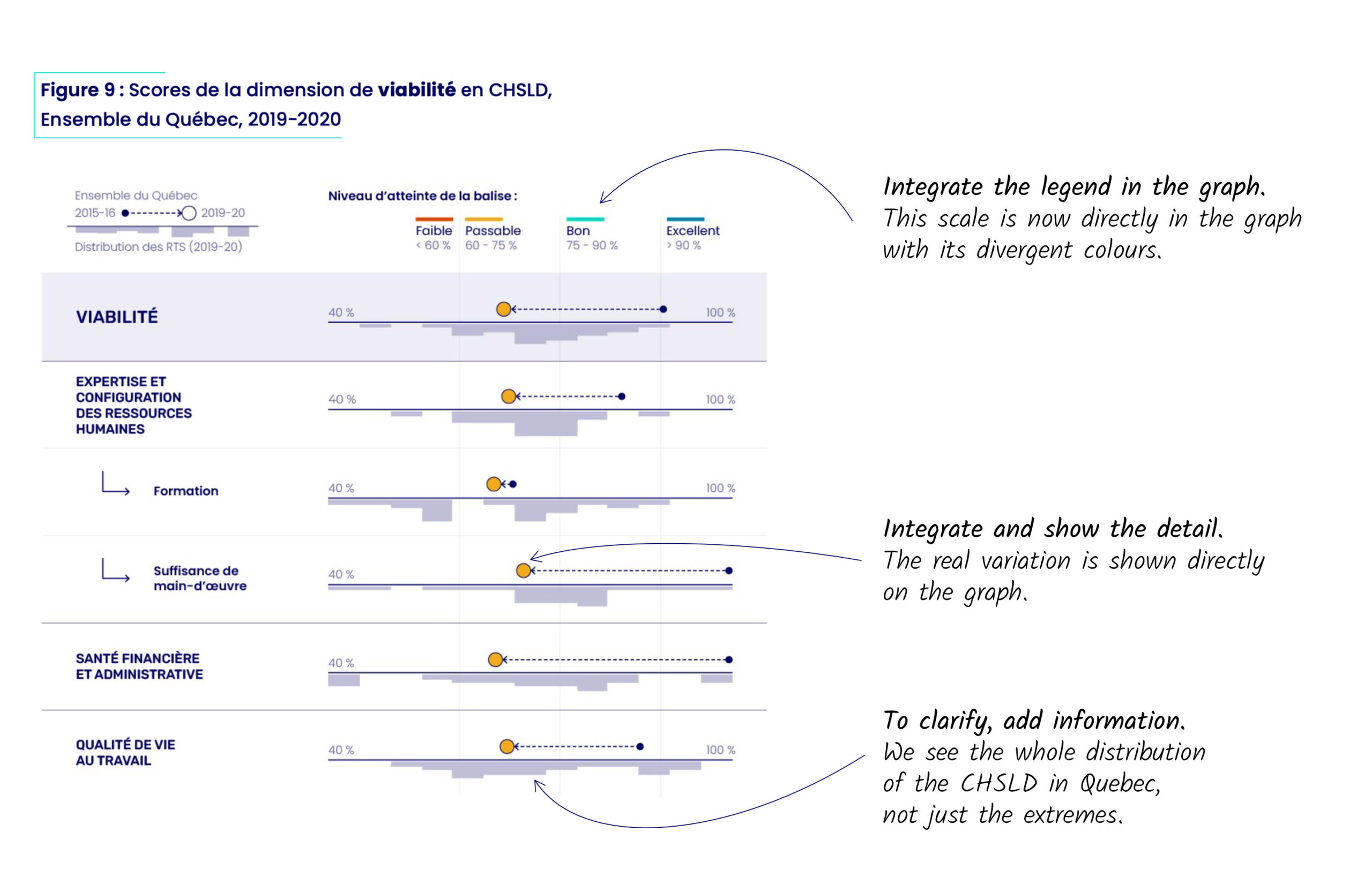
The report is structured around nine dimensions, each with sub-indicators. The objective is to represent their performance in a clear way.
The first graph below presents the scores in each of the sub-dimensions by separating two levels of information. Above, the current average score is represented by a colored point that is connected to the previous average score by an arrow, emphasizing the evolution of the score over time. Below, a histogram shows the distribution of scores across the 22 RTS, revealing their variability across the province.
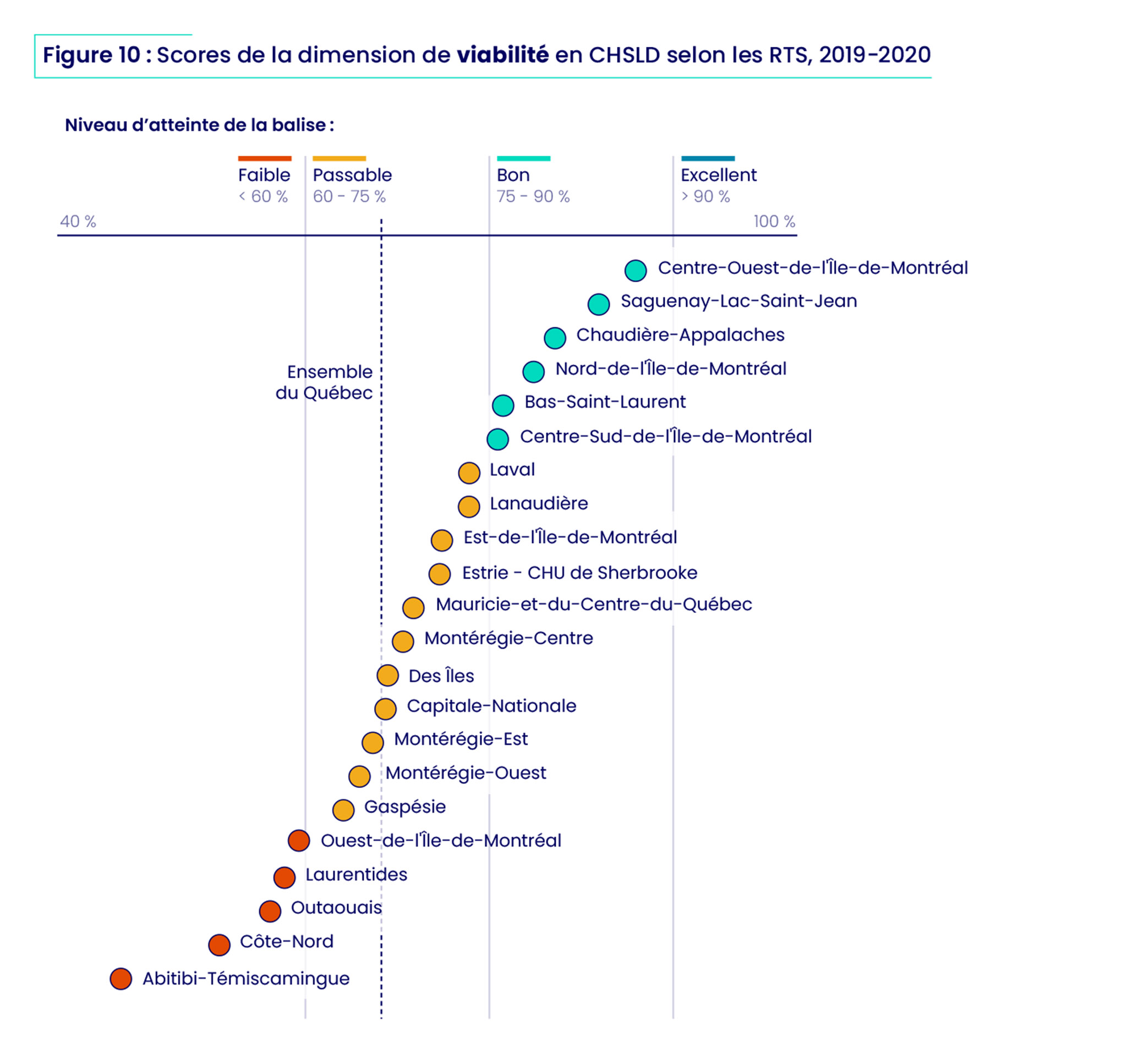
The second type of graph presents the compilation of results for the different regions of Quebec. The integration of the legend into the scale and the proximity of the category to the performance make it easier to read.
Before
Small multiples, big results
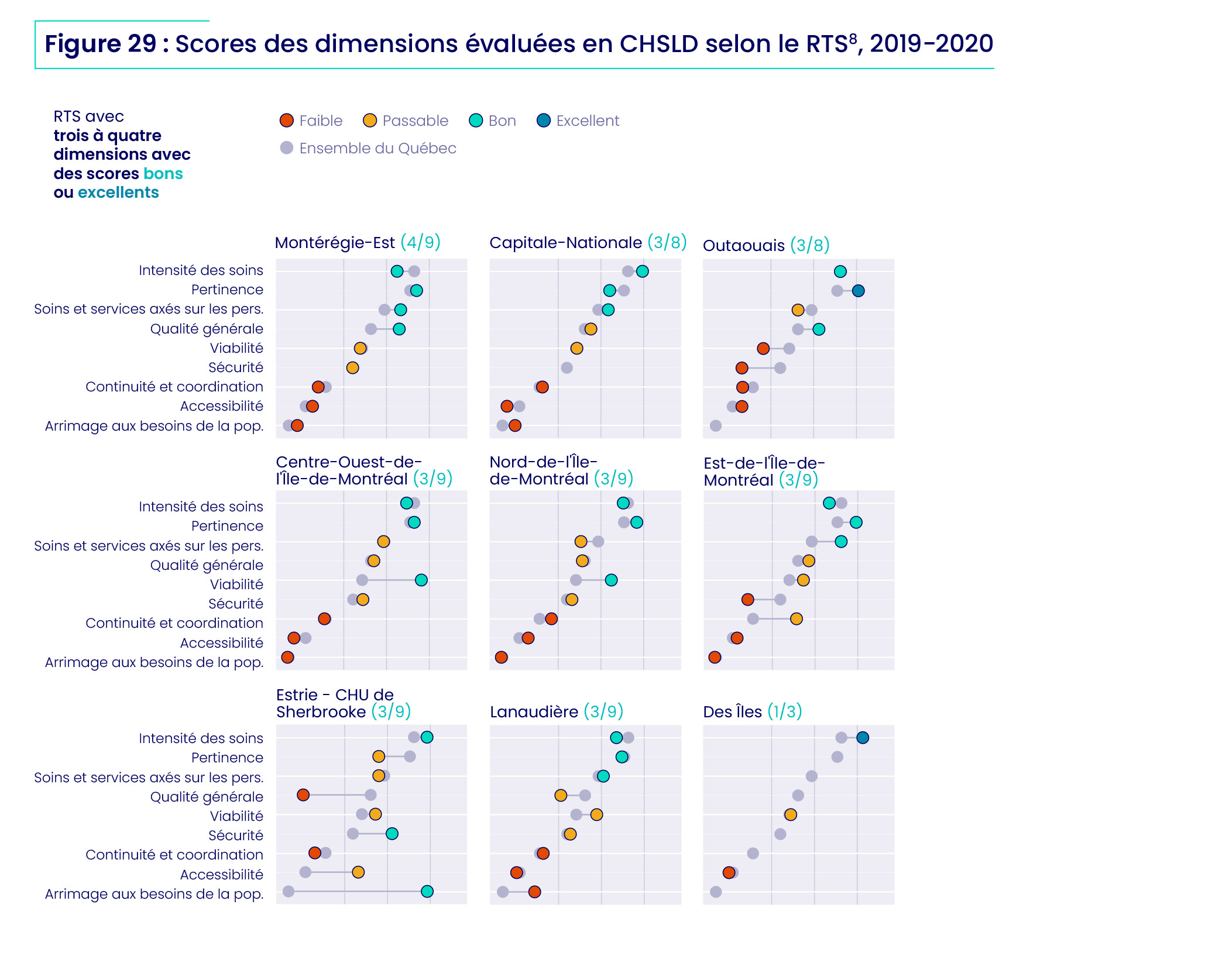
The report compares each dimension in each region to the Quebec average.
These barbell charts therefore allow you to see where each region is exceeding or not exceeding the provincial average. In addition, the graphs themselves are organized in order of performance.
Before
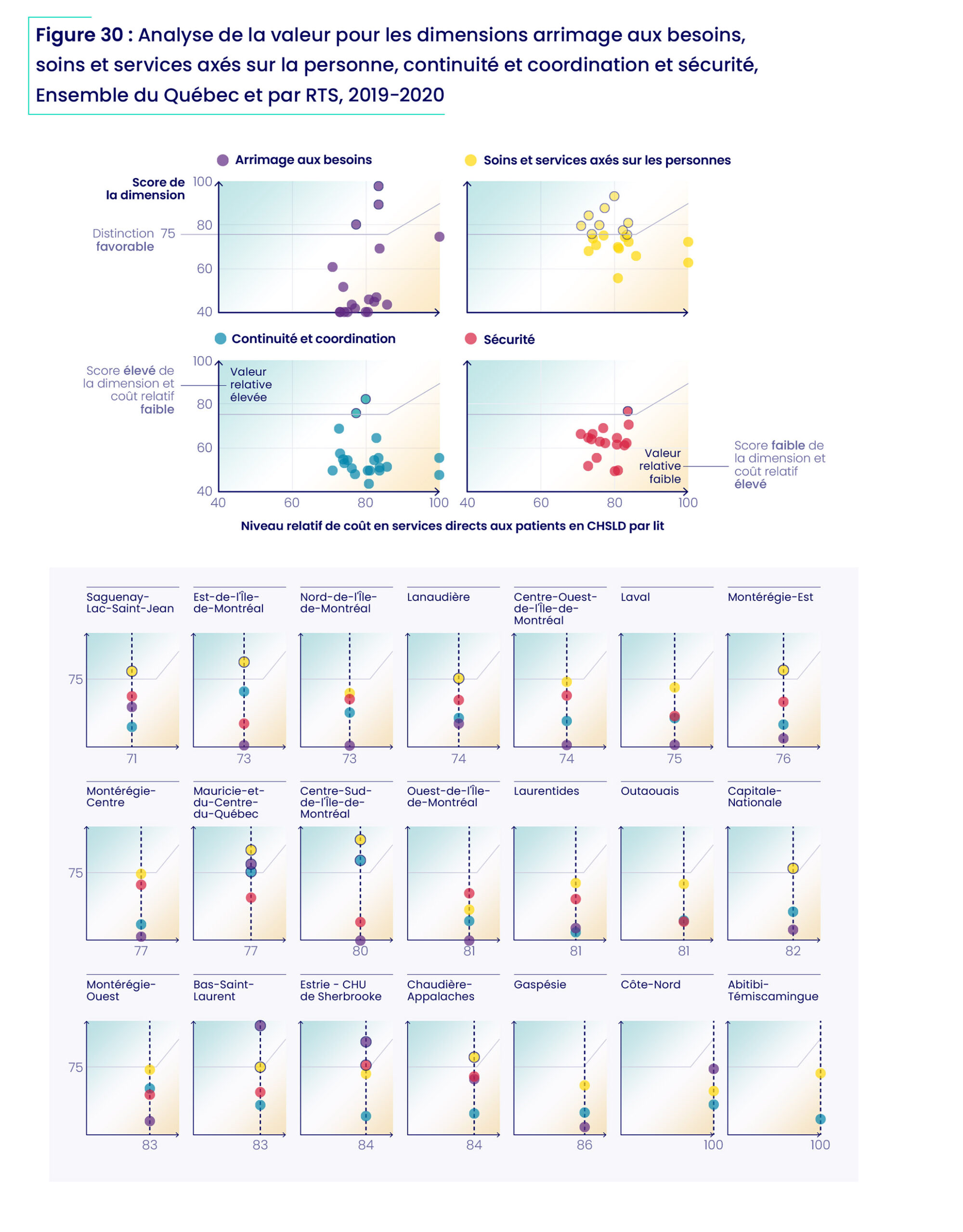
From complex table to clear chart
Some of the tabulated data were quite complex, as they referred to different concepts: annual variation and total variation. We therefore harmonized the data in collaboration with the client and presented them in a way that allows comparison of their evolution, in addition to highlighting the COVID period.