The University of Chicago Law School needed to get the most visual impact for a wide range of troubling statistics on the culture of detention that had taken root in the US justice system. The study shows with hard evidence that there is a complex systemic issue. The insights covered every step of the judicial process across multiple stakeholders.
An exercise in visual storytelling
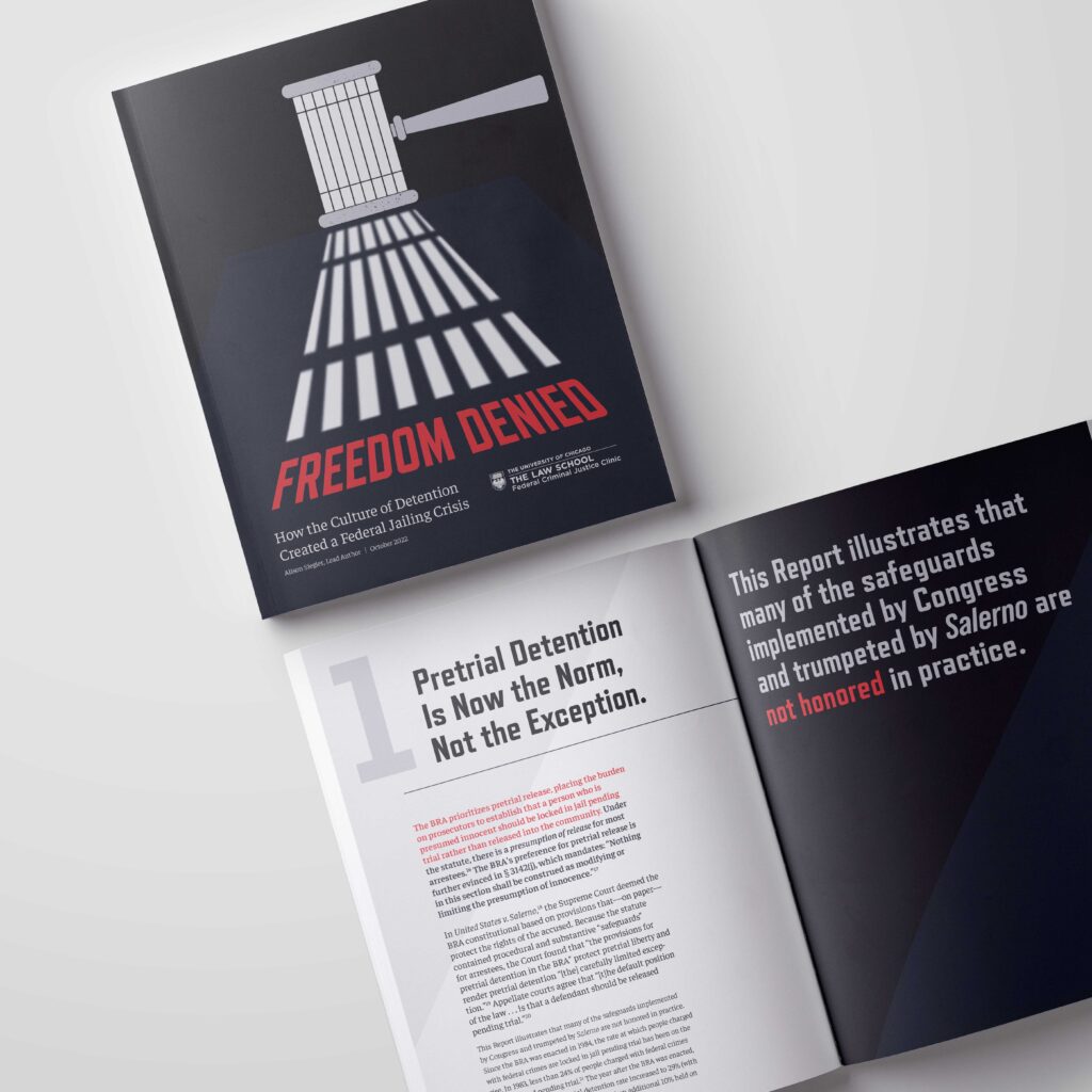
One of the main concerns was to create a visually unique and striking report. The insights uncovered by the Federal Criminal Justice Clinic of the University of Chicago are meant to be loud and catch the attention of the actors involved in those systems, as well as being a constant reminder of the gravity of the topic. To accomplish this goal, every visual element included in the report has components reminiscent of the concepts of freedom and detention and the report uses a striking color palette in black and white, with a careful use of red to accentuate key elements.
A few details to notice:
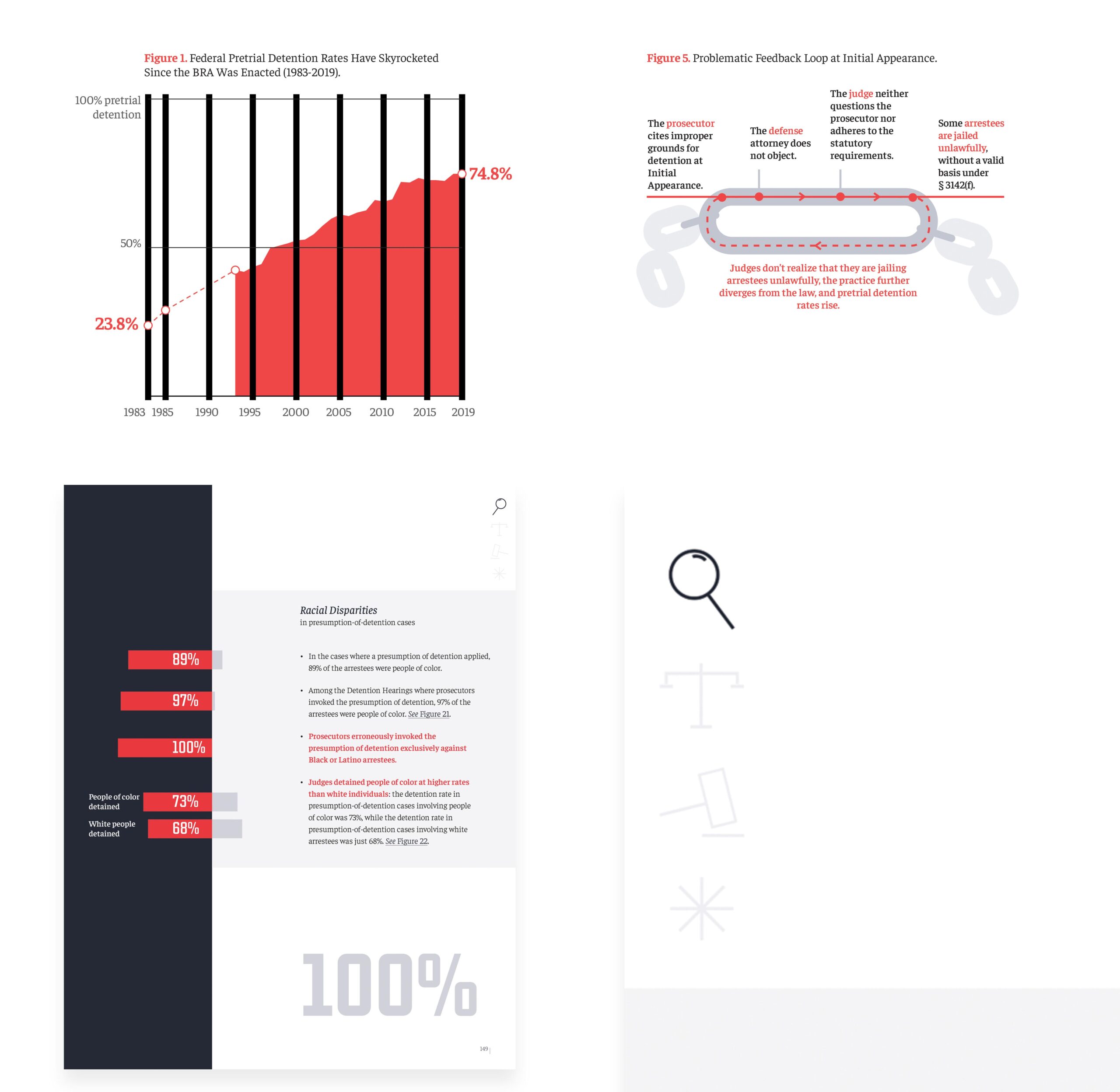
Figure 1 has thick vertical gridlines resembling bars
Figure 5 uses chain links to represent a cycle
A report based on a black and white layout with some red elements used to stress out the issues
Icons with strong justice symbology are used to help the reader navigate through the sections
Before
Highlighting what matters
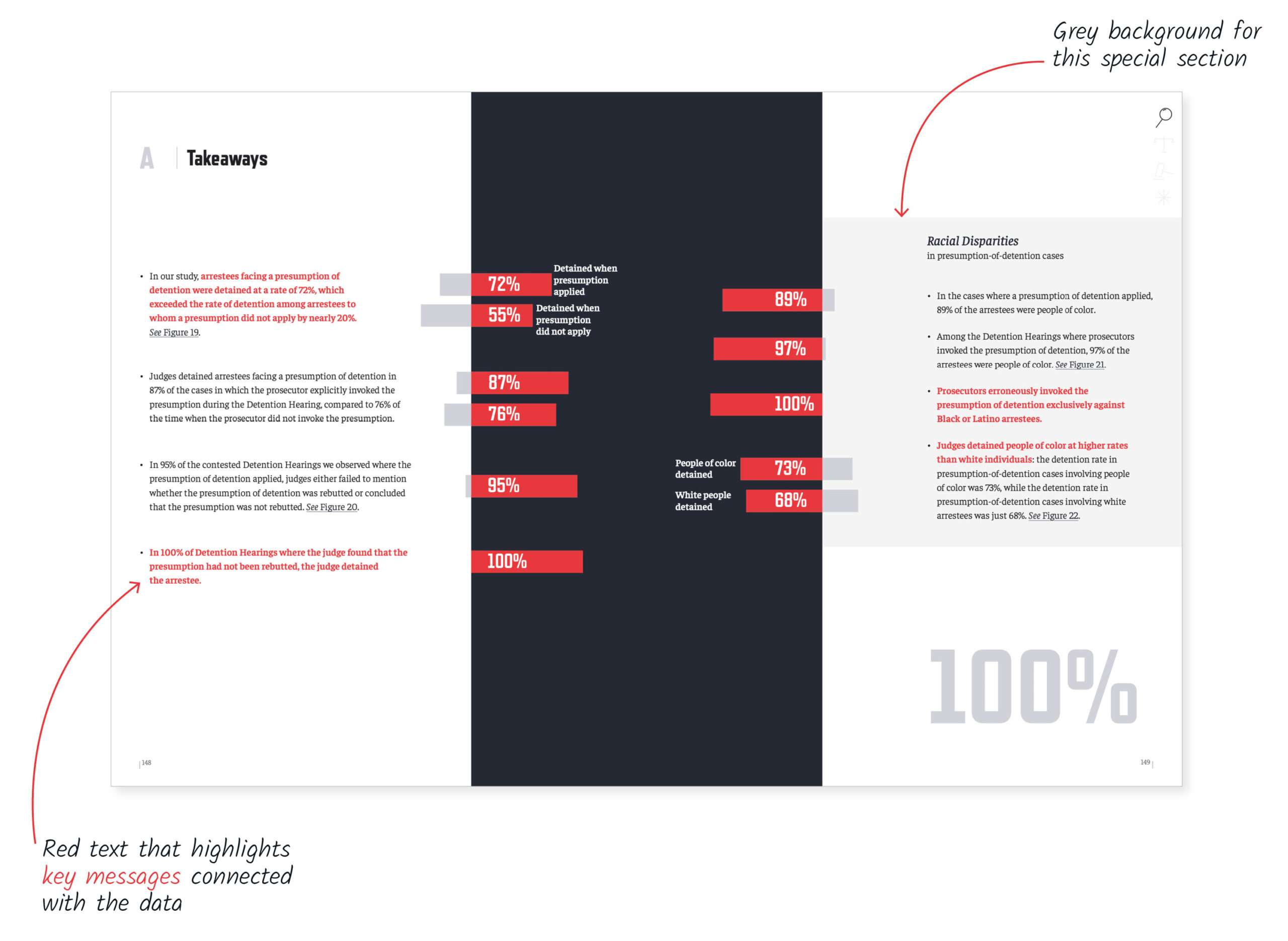
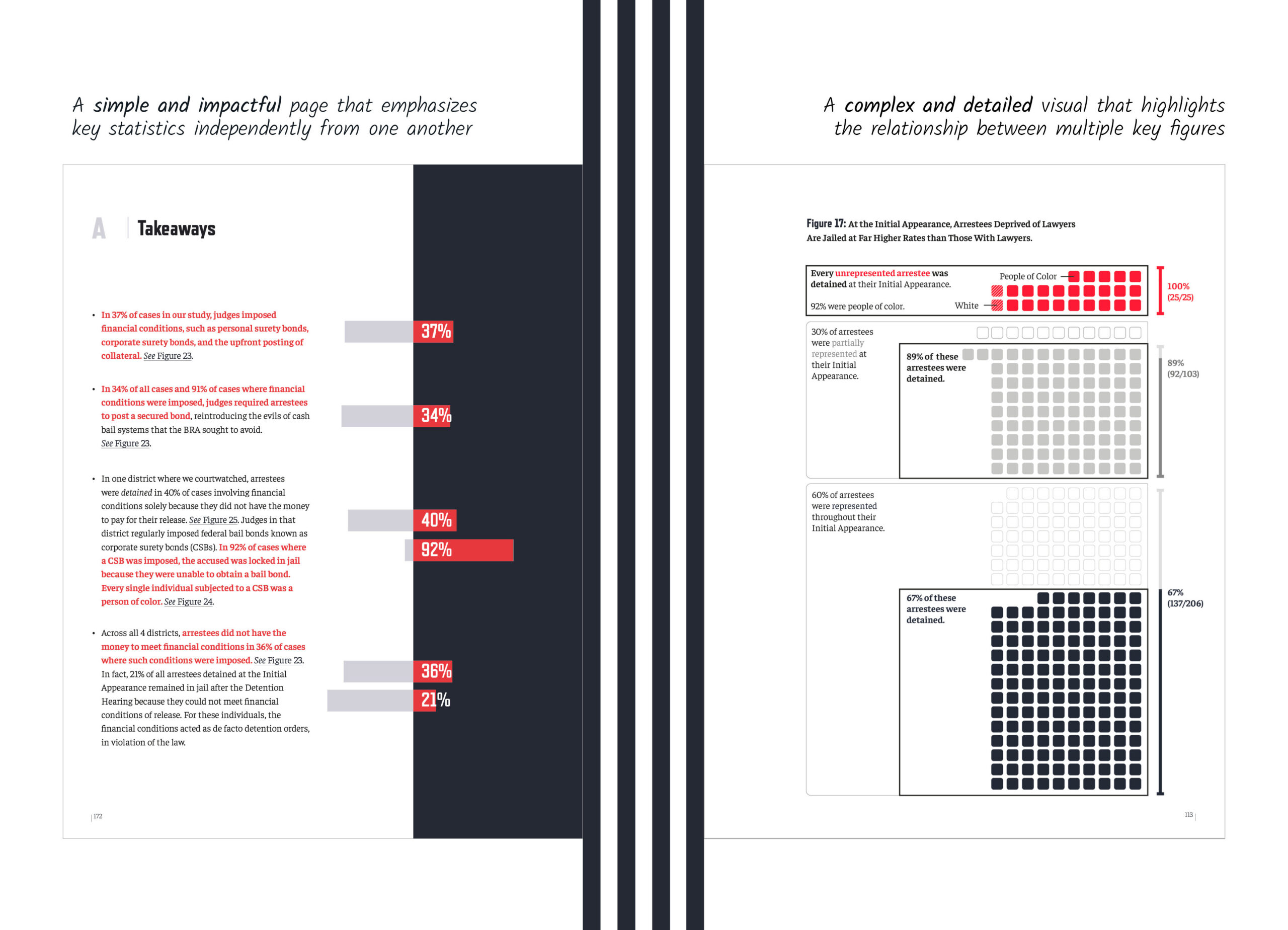
In a report of this size and density (280 pages), it becomes essential to visually highlight key information for the audience.
This is where visual hierarchies shine.
Several strategies are used through the document to achieve this. The color red, used to highlight data points is also used in the text to connect the relevant messages with the visuals.
Additionally, a particular attention was given to data showing racial disparities and we used a different background to emphasize this point.
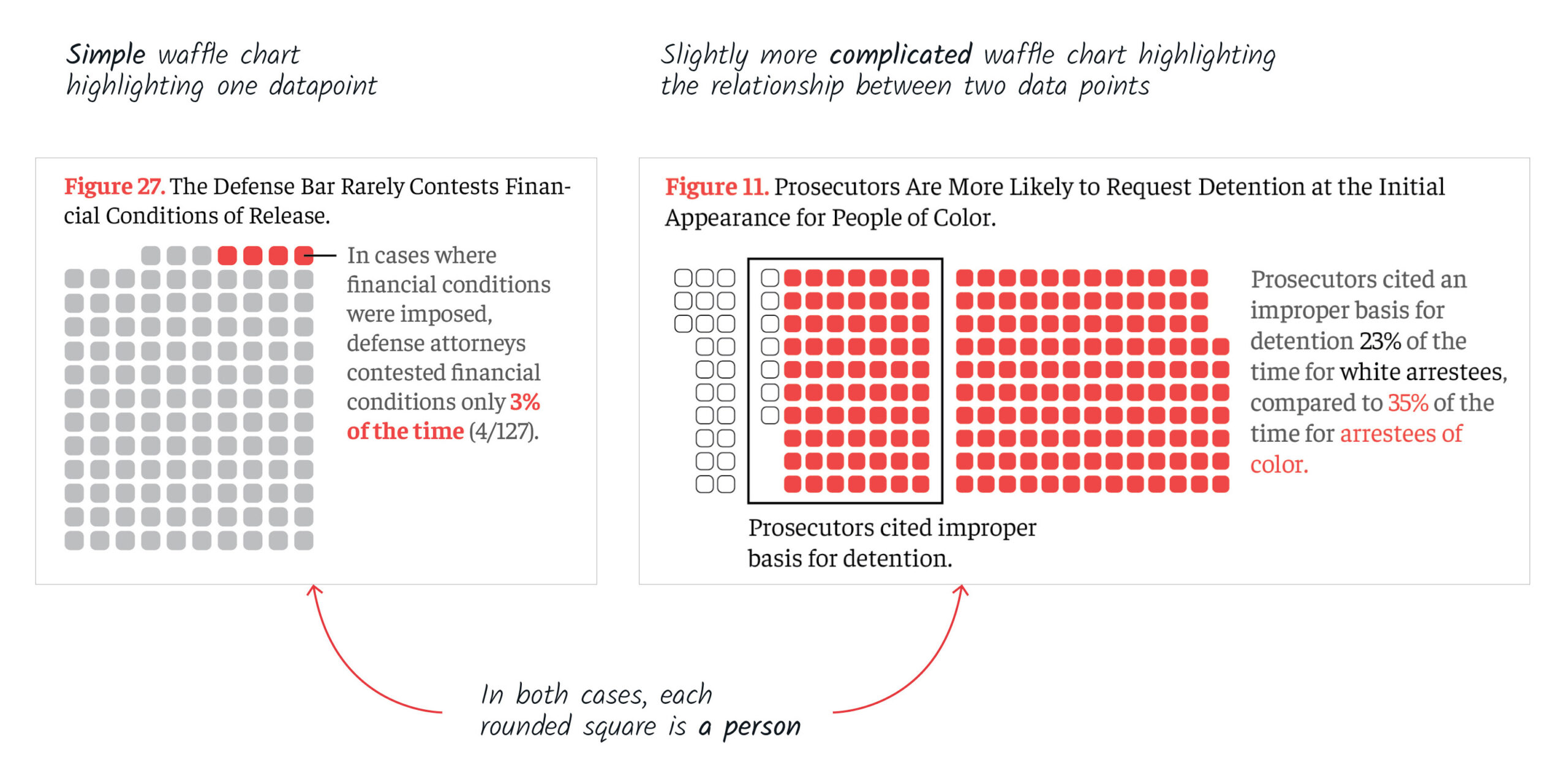
Showing the person, not the data
With a subject so deeply rooted in the individual experiences of the people victim of this culture of detention, the visuals in the report needed to make each of those humans visible, rather than “aggregating” them in one big column or bar.
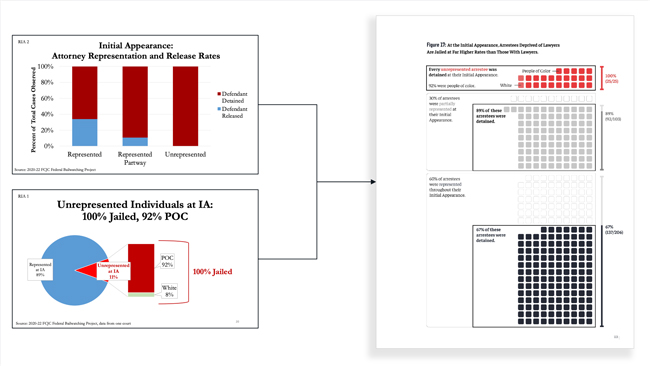
For this reason, the report makes extensive use of nested waffle charts, a combination of waffle charts and nested boxes with different colors to distinguish between subgroups while also keeping the people affected at the center of the narrative.
Avant
The balancing act
One of things that makes the research findings so unique is the effort that has been put into documenting systemic issues at every step of the judicial process.
To paint that broader portrait while keeping the focus on individuals, we created large, complex waffle charts and combined them with simple, impactful bar charts, all of which in a consistent layout.