Demystifying the costs of heat pumps for consumers
As part of a project aimed at increasing the adoption of heat pumps, the Canadian Climate Institute challenged Voilà: to design a web-based interactive to demystify the costs of heat pumps. The interactive needed to present the costs of different heating and cooling configurations, across five different cities across Canada, four building types, and three build years.
We focused on the consumer as our target audience, and built a tool that guides and engages the reader with playful interactive elements.
Choose your adventure
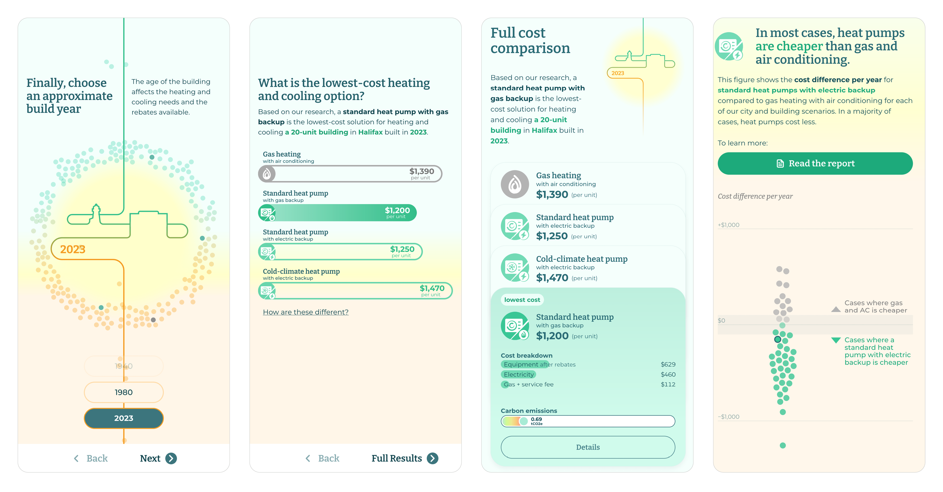
What better way to involve the reader than having them choose what they want to see? We start the interactive with a familiar quiz format, where we present choices one at a time. First, the reader chooses a city, a building type, then an approximate build year.
Fanciful illustrations, in the form of continuous line drawings, create visual interest with each choice presented.
The illustrations in this project are a playful way to achieve the tone the client desired. “Creative”, “human”, “playful”, “strong”, and “inviting” were some of the words present on the project’s moodboard.
Three levels of detail
For our consumer audience, we needed an approach that was not overwhelmingly data-heavy. We chose simpler and less analytical ways of presenting information whenever possible, and we present the information in stages.
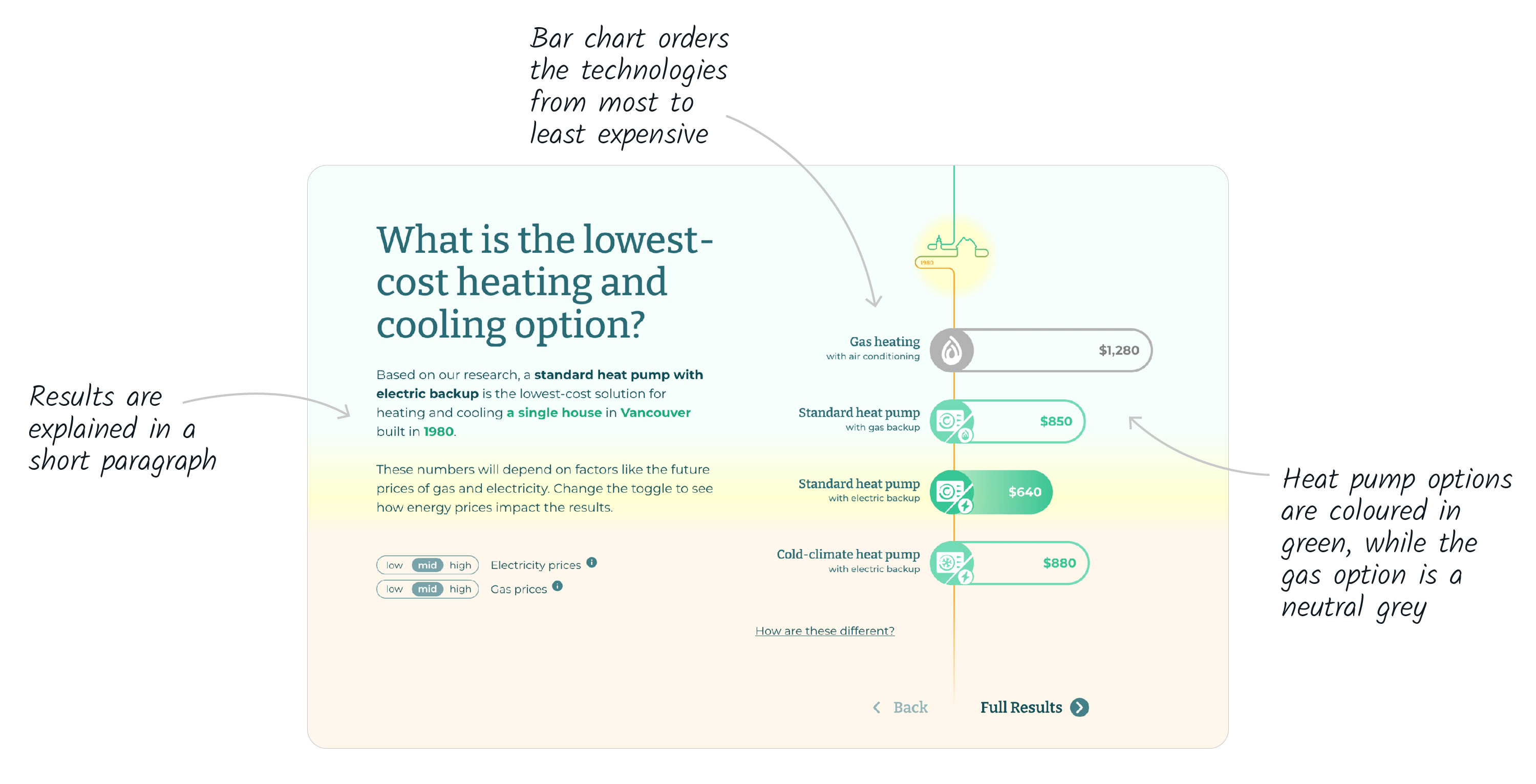
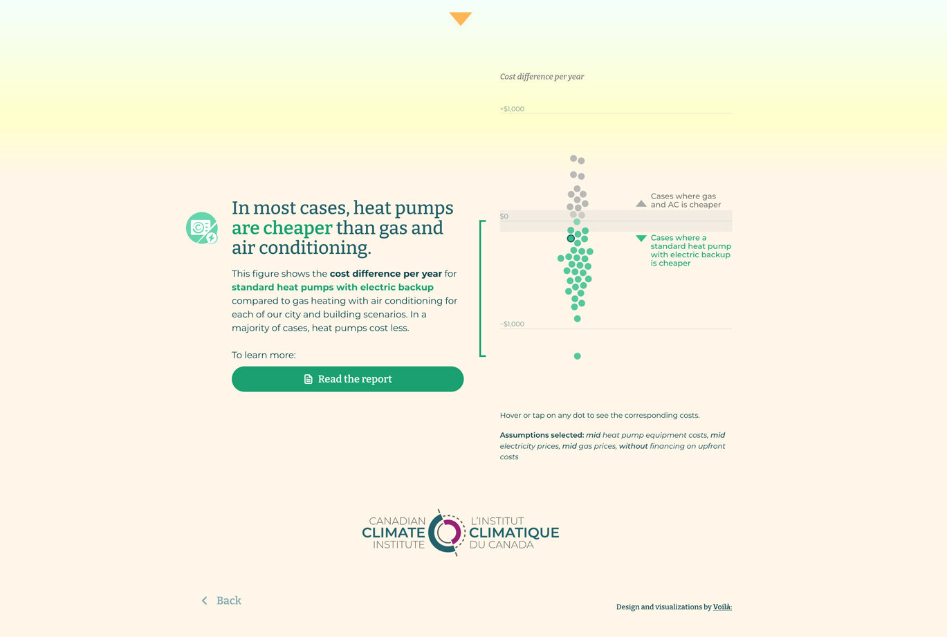
Up first is a summary slide, which appears after the reader makes their choices. This is the reader’s first look at the results, comparing the total annual cost for each type of heating technology.
The slide also introduces the reader to the nuances of these results: the estimated costs will change depending on how expensive or cheap electricity and natural gas are in the city. These assumptions can be adjusted with the toggles on screen, a hint of what’s to come.
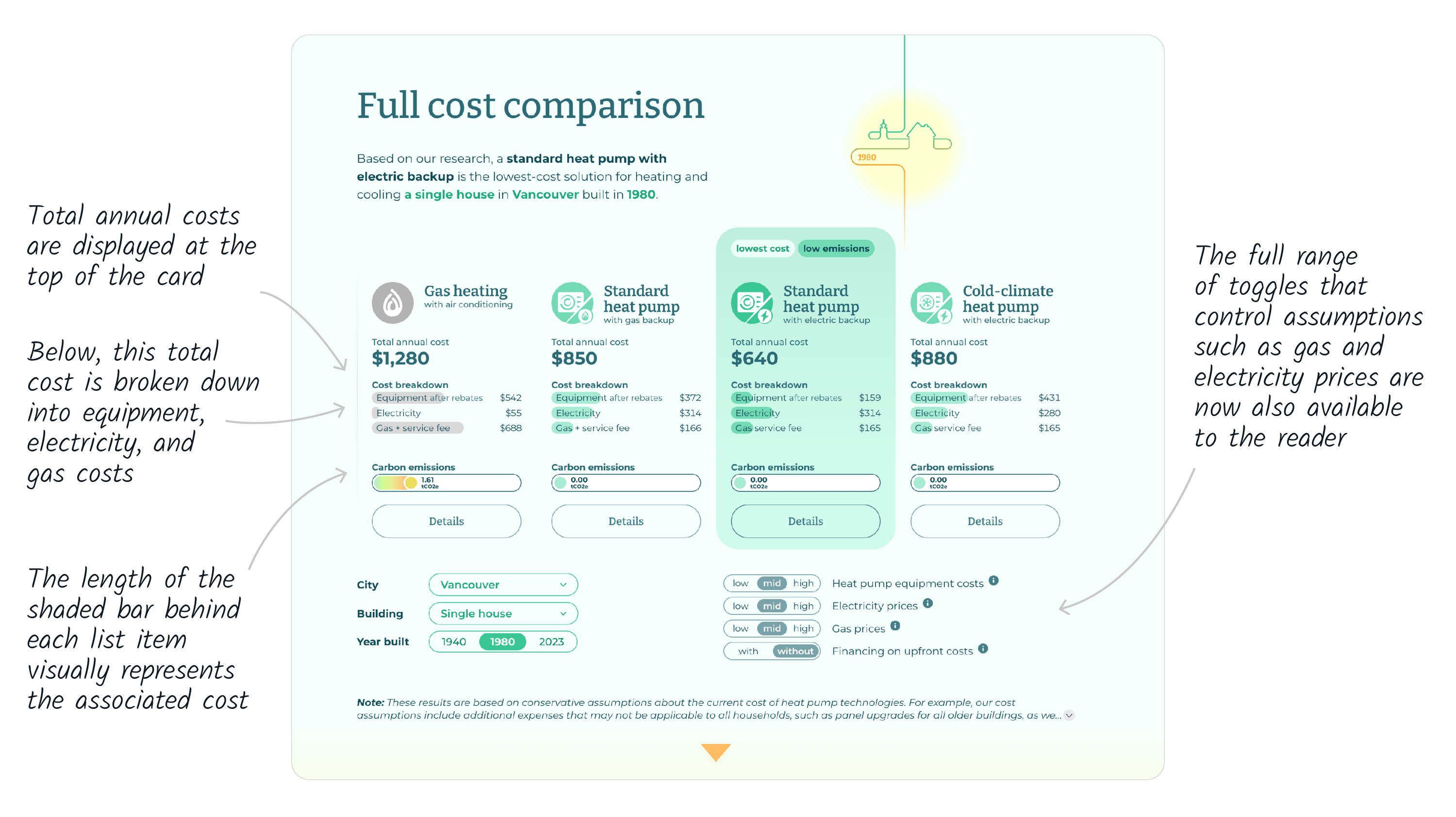
The second level of detail is present on the final results page.
Each of the heating and cooling technologies is represented by a card, which adds a breakdown of the total annual costs into its major categories.
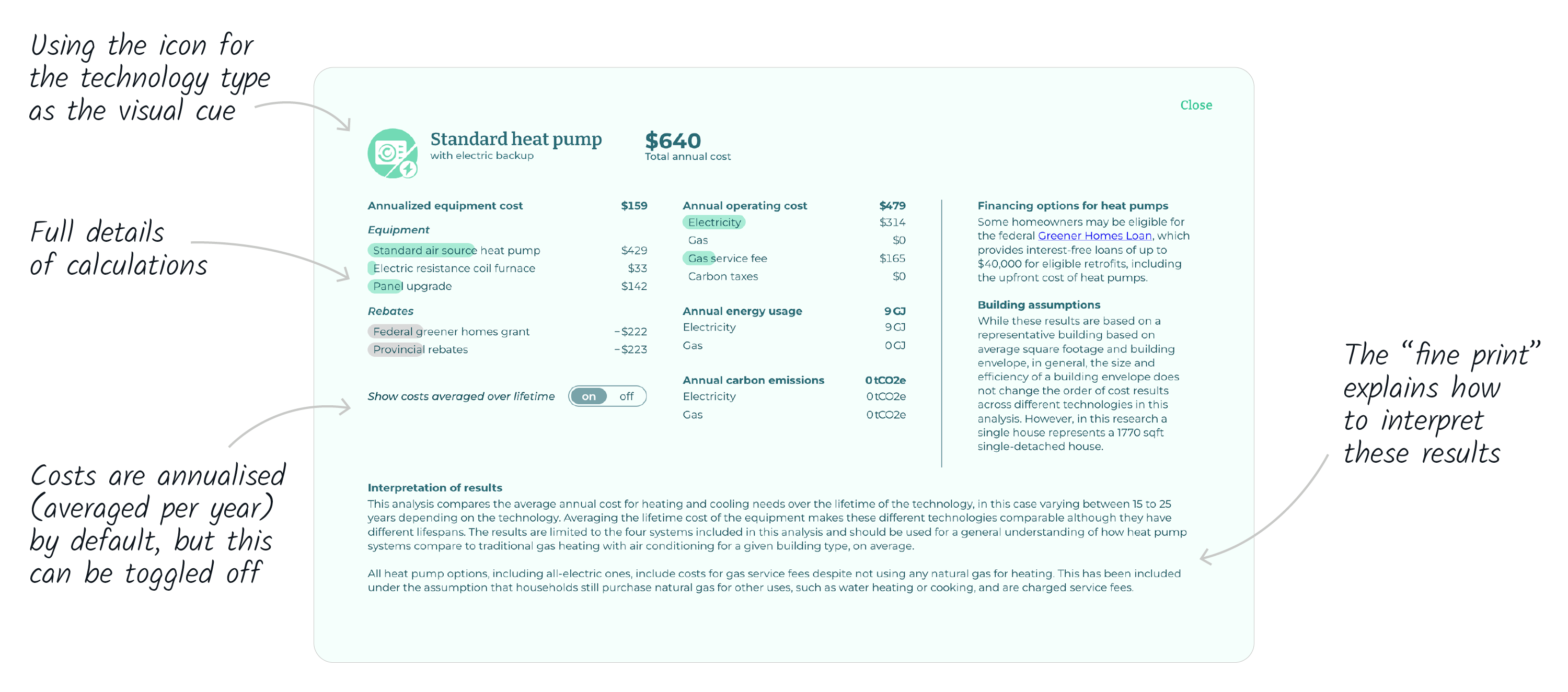
We save the finest level of detail for the most curious readers. The detailed line items, nuances, and caveats behind the costs presented are all found in the “Details” panel.
A guiding thread
Several elements in the interactive serve as a guiding thread, walking the reader through each choice they make.
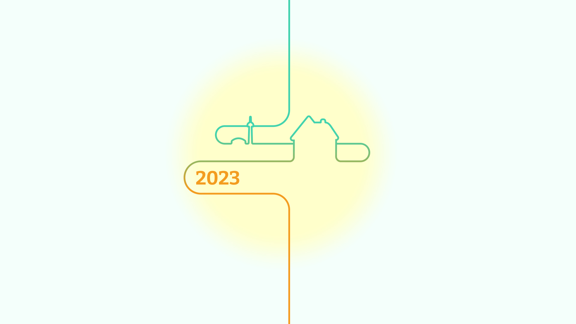
Because the choices of city, building type, and building construction year are cumulative – that is, the combination of all three is what determines the modelled cost – we designed our illustrations to be additive, too.
At any given time, the line “drawn” onto the page shows the combination of choices selected thus far.
The illustration makes a reappearance on the final result page, serving as a visual representation of all the choices made for a given result. This little icon transforms each time a new city, building type, or year is selected.
Bubbles in action
Just as the illustrations act as a guiding thread, the “bubbles” connect the parts of the interactive together.
On the landing page, the bubbles are a decorative element, encircling the main image. They move ever so slightly as if to suggest the rising motion of fluid particles, giving a nod to heat pumps and to heating and cooling in general.
On the quiz pages, we see the bubbles again, where they hint at the choice-making process. With each choice the reader makes, the possible results are narrowed down and some bubbles fade away, while the ones that match the selected choices stay. At the end, four bubbles remain, representing the four heating and cooling technologies discussed in the interactive.
The beeswarm chart at the bottom of the summary page uses the same “bubble” element to show how the reader’s results compare with all other choices possible.
On the move
Finally, it was important to design a functional mobile version to reach a wider audience, including people who access this interactive tool from their mobile phone.
Continue here to explore the heat pump calculator for yourself!
To learn more about how we presented these results in a report for a policymaker audience, head to our blog post.