Let’s have a quick look at the thinking process behind the creation of the heat pump charts and calculator, one of our most ambitious projects in 10 years, in collaboration with the Canadian Climate Institute.
First, we have created a visual identity. It’s based on the colour palette of the Institute, in line with previous projects. We picked a type of orange and teal to represent the warmth and coolness of heating and cooling.
That yellow row in the middle? It’s the comfort zone that heat pumps will bring you. The bubbles’ effect represents the flow of air and water.
Now, the charts from the report.
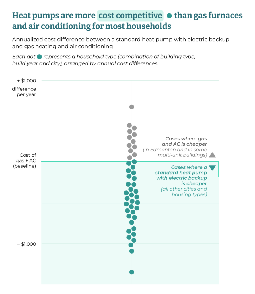
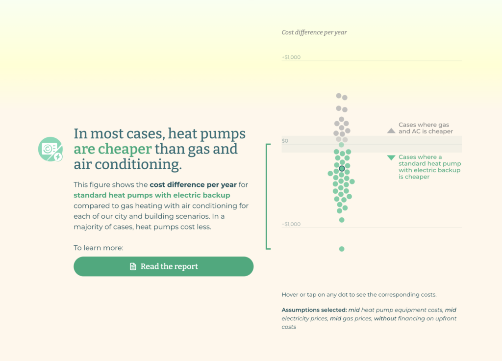
This beeswarm chart shows that heat pumps are more cost effective than gas and air conditioning in a majority of cases. It took a lot of attempts to get the text just right, as it gives meaning to the visual. If it seems simple, then we have succeeded.
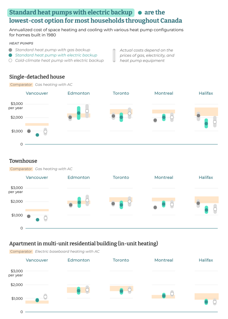
Next, a chart that shows the price ranges of all four technologies studied, across 5 Canadian cities and three building types. The point was to show that a certain type of heat pump, with electric backup, is the lowest cost option for most households. Yes, that’s the title of the chart because your title should say what you chart is meant to show.
To draw the attention to the standard heat pump with electric backup, we made it green, while the other two heat pumps are gray. The comparator, the gas heating with air conditioning combo, is shown as an orange band in the background so that every heat pump can be compared to its cost easily.
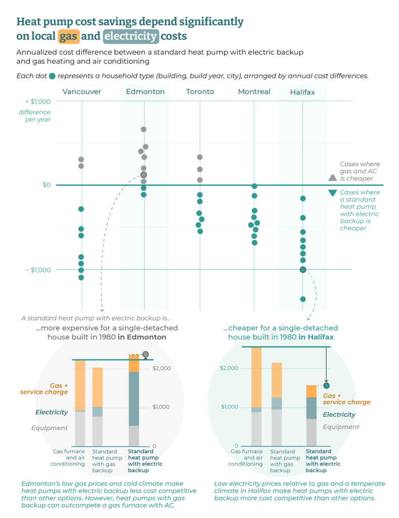
This next chart shows the circumstances in which a heat pump will be less competitive, namely in a cold climate with low gas prices like Edmonton.
A million little design decisions had to be made to make this chart work, especially with two inserts so rich in information. One of the things that convinced the Institute is the round background, which links the reference bubble to the detailed explanation. We came to this solution late.
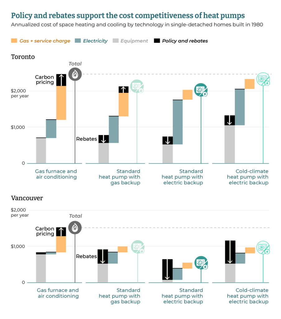
One more chart, this time to show that given their environmental benefits, heat pumps can be made more competitive through government interventions, with policies and rebates.
The challenge was to show the final total price, but also the individual impacts of the rebates (which decrease the cost) and policies (which increase the cost). Lots of back and forth on whether to show the two totals and we ended up showing only the net total. Note also how the policy and rebates are in high contrast black to attract the eye because they are the main point of this chart.
One last little detail is the white gaps on the baselines to separate the charts.
You can see all these charts and more in the full report.
And now, the showstopper: the interactive calculator.
The Institute wanted something both technical and playful to present a detailed, customizable comparison of the costs associated with different types of heat pumps. A dashboard of calculations that didn’t feel like work.
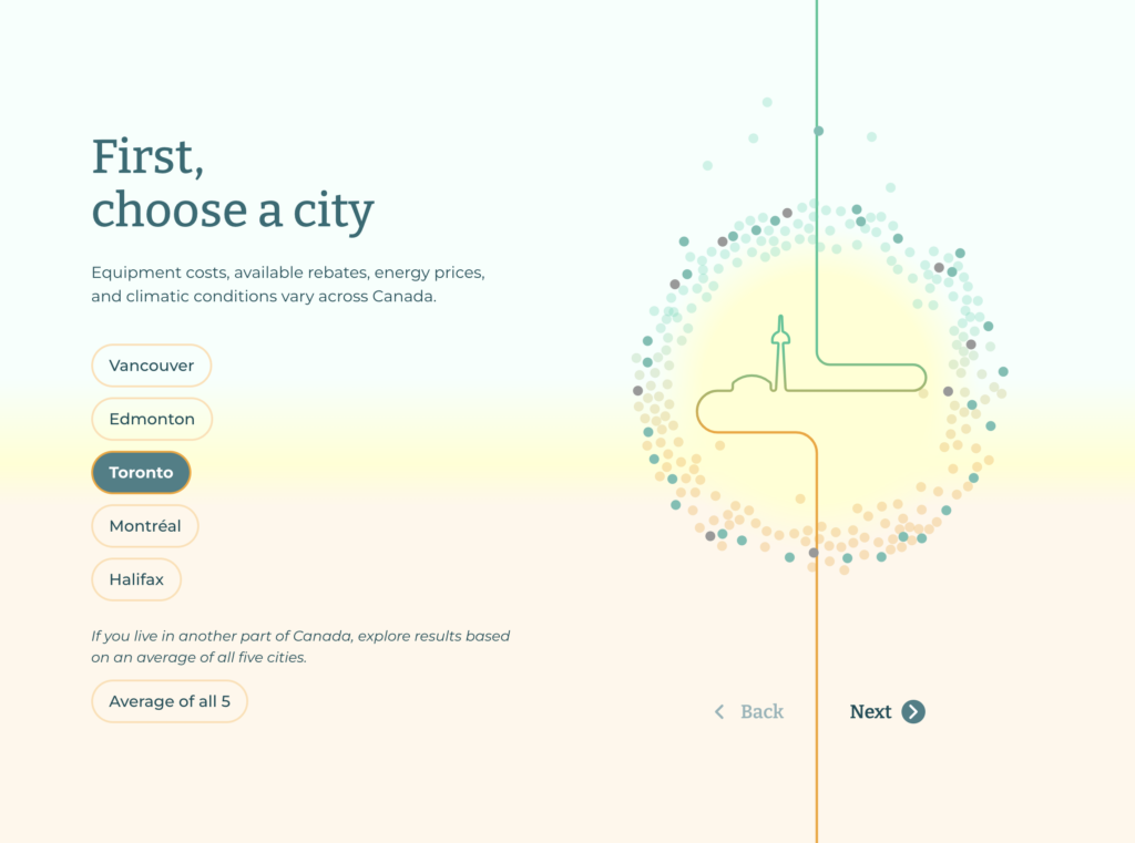
The vertical line that crosses the screen, echoing the pipes in a heat pump, turns into a city landmark based on selection. It took some time to find a recognizable landmark for each city, especially one that fits in a simple line like this.
And then you add a building type and the path combines the two selections.
The last step is to pick the year of build that will add to the rest.
Do you see how some of the bubbles are darker? They represent your current selection. They will be used as a transition to the next screen.
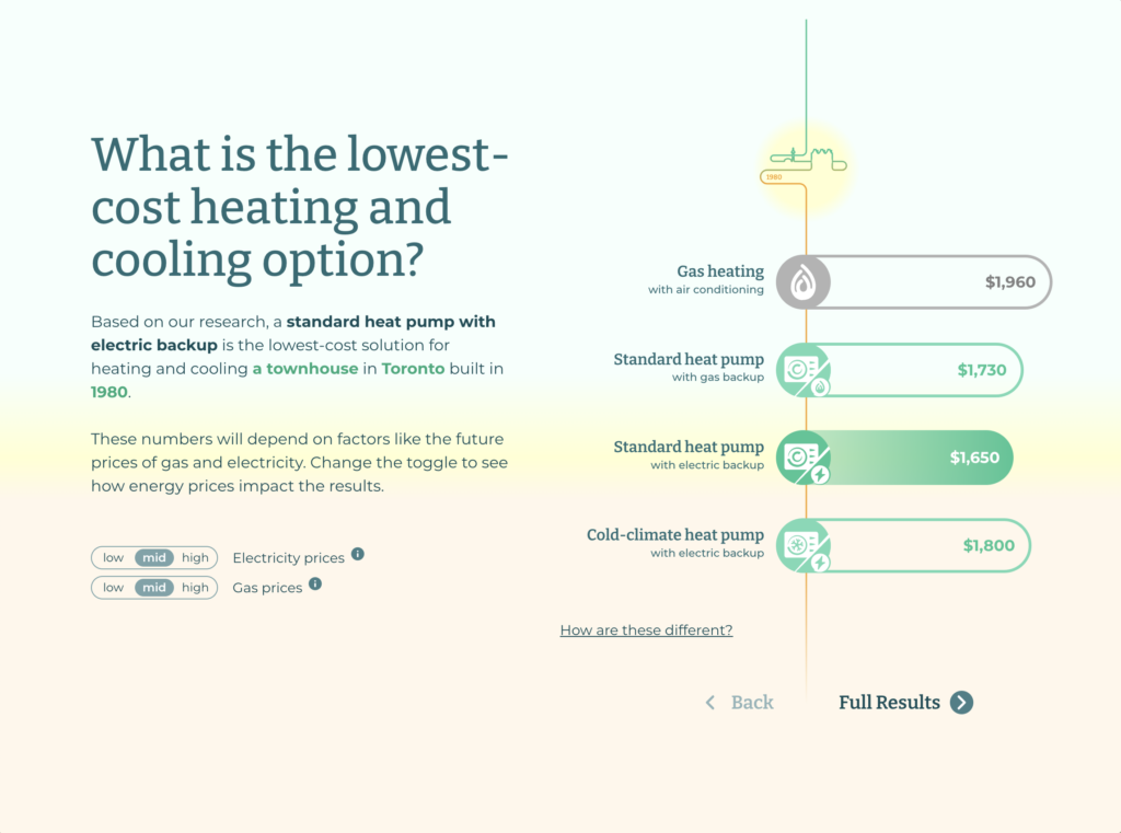
Now you get an overview of the cost comparison for your selection, with dynamic text. Note the small selectors on the bottom left that allow users to modify certain parameters such as electricity and gas prices.
A detail that took us some time to come up with is the gray for gas and green for heat pumps, to distinguish the two types of scenarios.
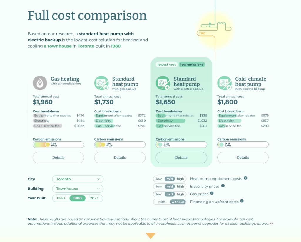
Want more details? Click on full results and get this full cost comparison. The cheapest option is highlighted, and also the one with the lowest emissions.
There are still toggles at the bottom that allow you to adjust the scenario you are exploring: such as changing the city, the building type, the gas prices, etc. This is the full dashboard mode.
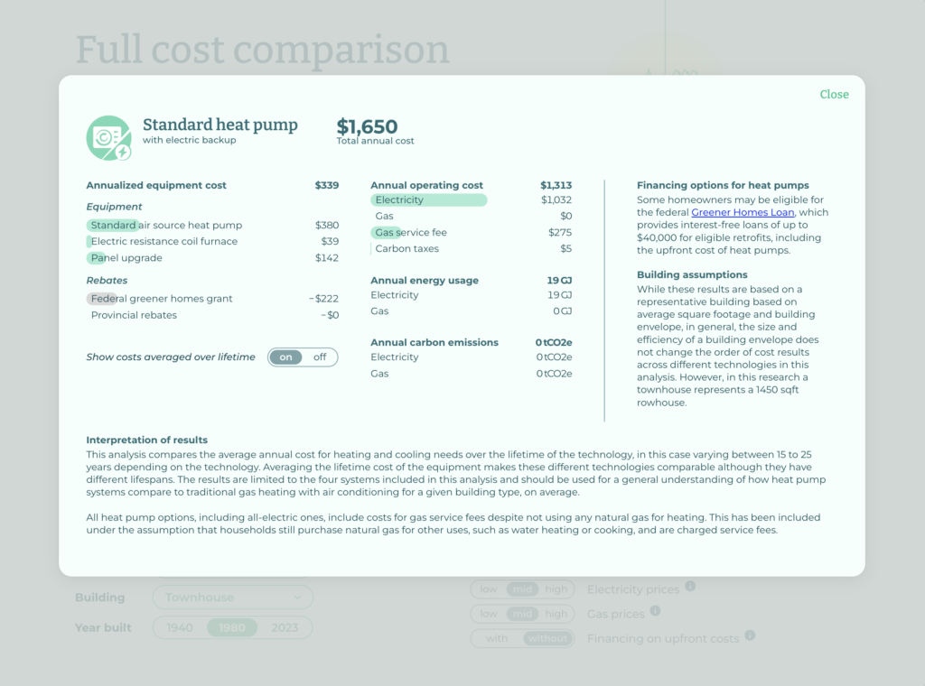
Do you want further details? Click on Details for any of the technologies. You can see the tremendous calculation work that the Canadian Climate Institute put in this, along with their assumptions. Truly impressive and very transparent.
At the very end, you get your selection in context, showing that heat pumps are a cheaper option in most cases. Not to mention their smaller environmental footprint. And since you made it this far, perhaps you’d be interested in the report? There’s a link for you.
It’s worth clicking to experience for yourself. There’s a smoothness through the whole experience that the images cannot convey.
Also: get a heat pump!
