Most of the time, the choice of scale is based on the data. Sometimes, however, the exercise is more complicated, as it was the case when the Société des établissements de plein air du Québec (Sépaq) wanted us to visualize the 4.5 billion years since the Earth was formed… over a 20-inch-wide panel. 4.5 billion years! It’s hard enough to imagine, so how do you present it all?
A big challenge
A number of obstacles soon appeared: the GIGANTIC time range, of course, but also an important amount of relevant events in a very small part of the scale.
The client wanted to situate several “recent” events that happened during the last 300 million years in relation to when the Earth was formed 4.5 billion years ago. For example, we needed to be able to distinguish a dot 7 million years away (the appearance of the first hominids) from another dot 20,000 years away (the last ice age). These two events are part of the last 0.2% of the geological scale.
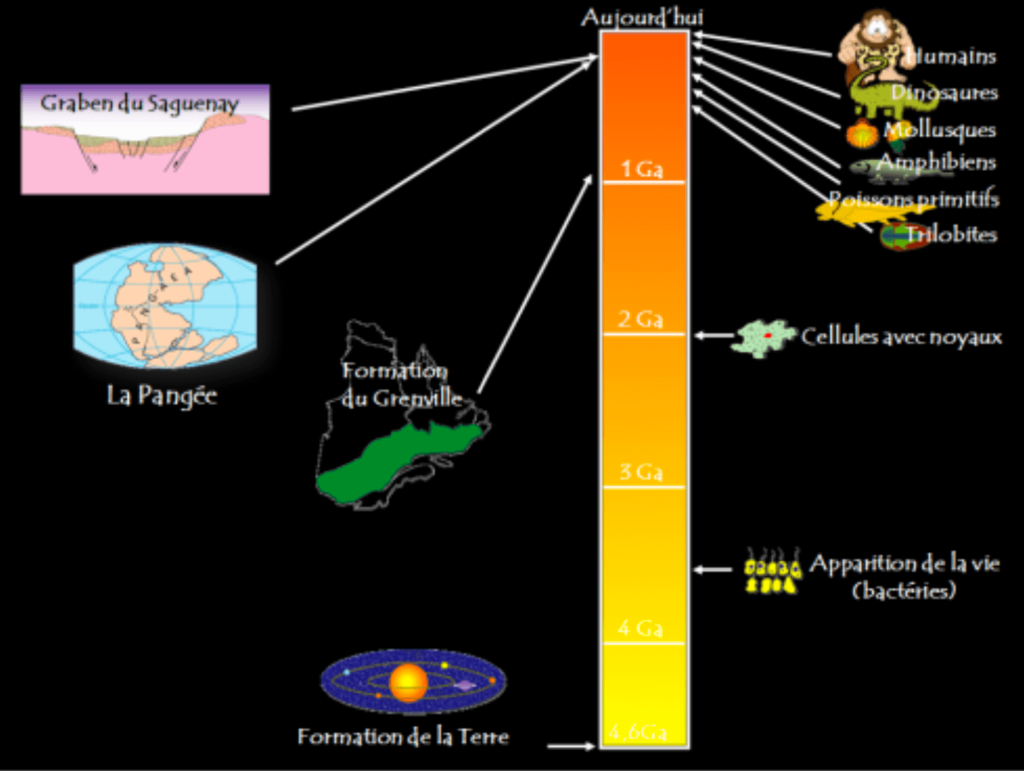
The representation of the scale previously used by the client was legible but it did not really respect the true gaps between each event. In the image below, the last eight dots should all have merged and be positioned on the “Today” line.
So we had to find the right shape and formula to avoid the traffic jam of the last 500 million years.
Finding the shape of time
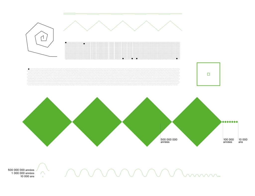
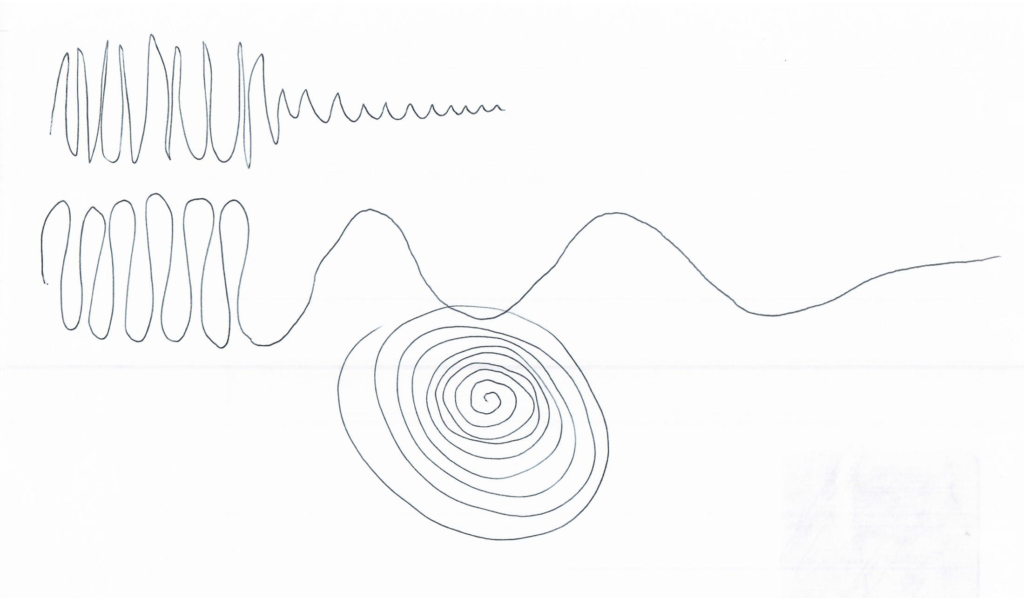
Exploration began with a spiral shape implying an ammonite, whose fossil is an excellent chronological anchor used in geology. The winding of the line was rather a good asset to give it some length, but it wasn’t easy to integrate text labels to name the various events.
All geometric shapes were eventually tested: square grids, diamonds, triangles… the problem remained the same: 4.5 billion years is a LOT of years.
Then came the idea of varying the length of the time units. A small diamond would represent 10,000 years, a medium 100,000 years and a large 500 million years. A scale within a scale, actually! However, drawing the diamonds in proportion to each other soon became impossible, since we’re talking about multiplying their size by 10 and then 500. Either the smaller diamonds had to be microscopic, or the larger ones wouldn’t fit on the panel.
The wave seemed to be a promising shape. The oscillations allowed us to tighten the length of the line a little bit by using again three sizes of wave for the three units of time, it all fitted quite easily! However, it was almost too compact… Having a 3-billion-year-old event so visually close to a 20,000-year-old event invalidated the purpose. We wanted to preserve the sensation of an extraordinary distance in time, to give depth to the image, to feel the unfolding of the course of time.
The solution: create waves
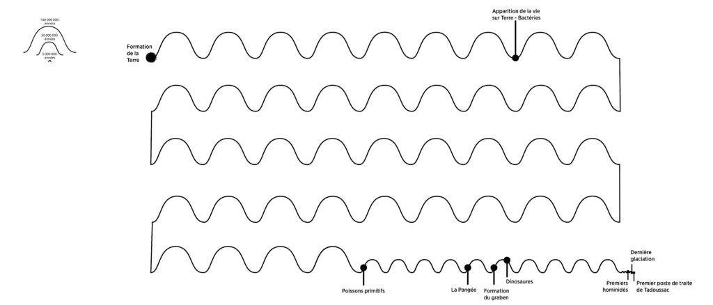
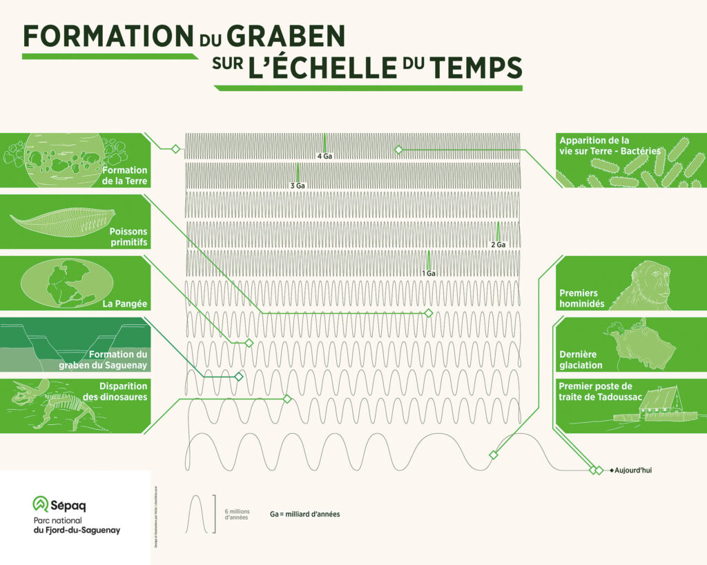
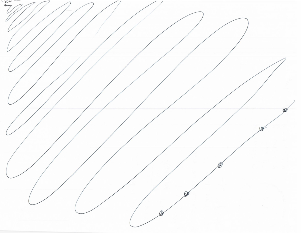
Another approach was chosen: keeping a single unit of time, by having one wave corresponding to 6 million years. To go back to the creation of the Earth, 750 waves had to be traced. And to create the effect of the first rows of waves moving away from each other—bearing in mind that 4.5 billion years is a lot of waves to trace back—we decided to tighten the first oscillations and then loosen them as we went along, so that the timeline unwinds up to today like a fine ball of yarn. And this is how the first Voilà:’s boustrophedon* was born!
This system worked well with the panel format desired by the client, and allowed us to elegantly add timestamps to place geological and visual landmarks.
*Ancient script whose lines ran continuously from left to right, then right to left.
In the end, it remains very complicated to represent a scale that challenges human understanding. There are subjects where the data go beyond imagination, and perhaps that’s not such bad news.
To see the whole project, click here!
Celia is a graphic designer at Voilà:. She enjoys the process of taking an idea and turning it into a beautiful and effective story. She analyzes as much as she creates, adopting a big picture approach as she searches for the details that matter.
