With the tangible impacts that infrastructures have on our daily lives, we leveraged the power of illustration to bring this message to life.
A physical reality
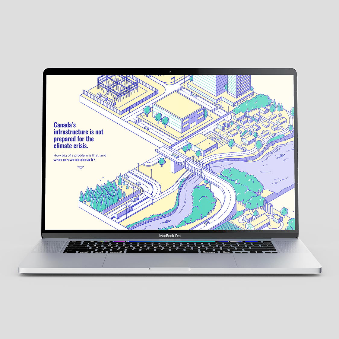
With this web interactive story, our objective was to draw people in and entice them to read the research report.
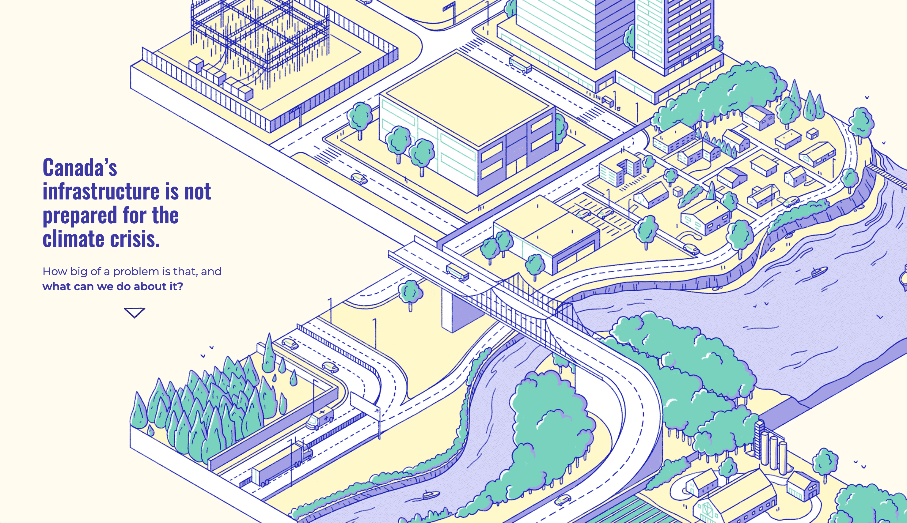
The story features illustrations of different types of infrastructure to match the research areas of the report: electricity, homes and buildings, and roads and railways. By reflecting the physical reality of these topics, the images highlight the importance of infrastructure in our economies and our daily lives.
It is through traversing these concrete examples in the landscape that the reader is presented with the main messages of the report: the costs of infrastructure damage due to climate change, the savings brought by adaptation, and the new opportunities to adapt and make better decisions on infrastructure.
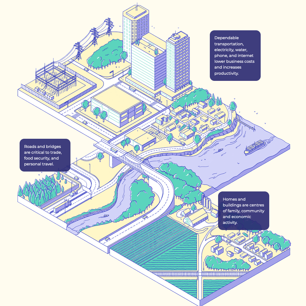
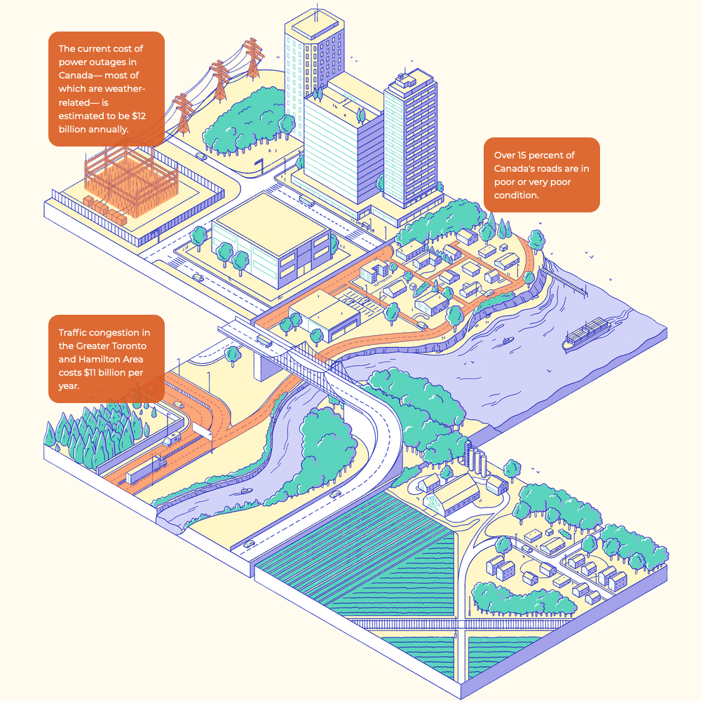
We used a layered approach to sprinkle in facts, nuances and detailed information. While the central image and the scrolling narrative provide the main message of the story, annotations on the image appear one at a time, with information that backs up these claims.
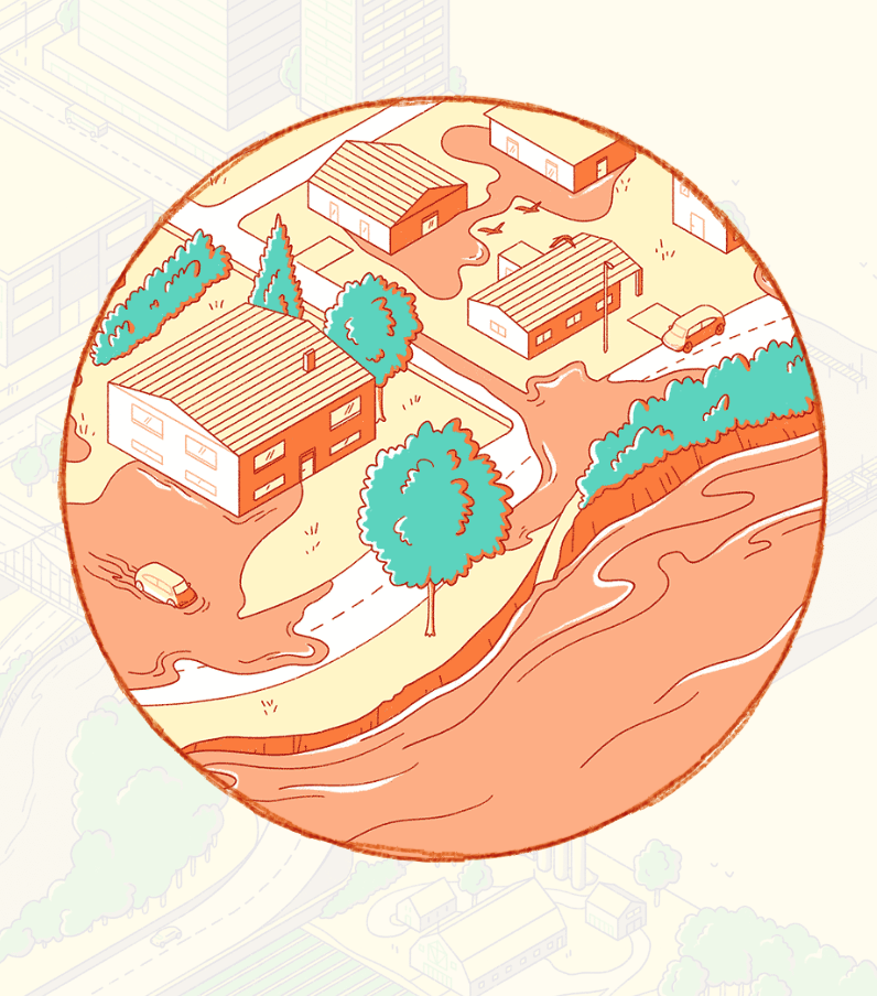
We chose a limited colour palette for this project, adapted from the palette of the Institute’s research report, to visually highlight the positive and negative messages presented in the piece. Throughout the story, a red-orange highlights the negative impacts of climate change on infrastructure.
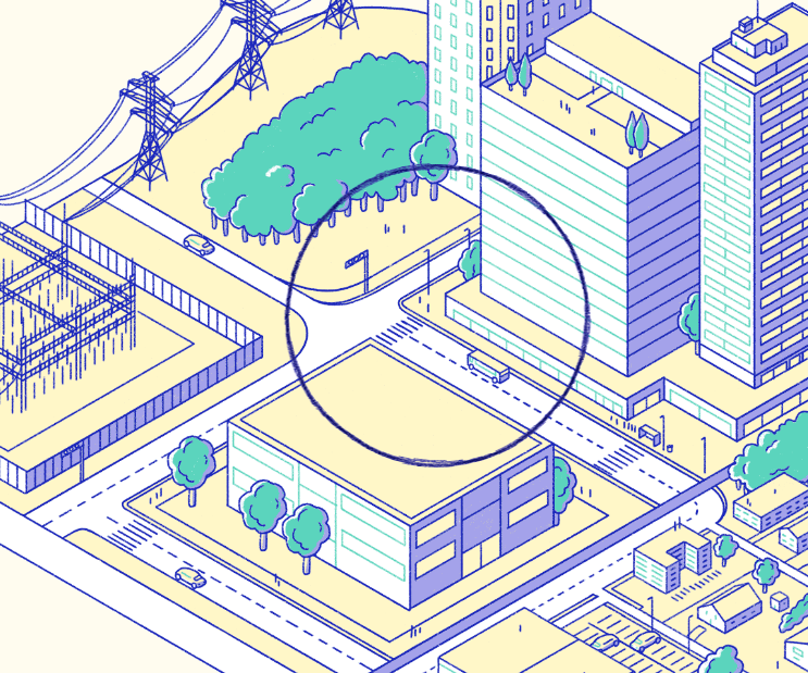
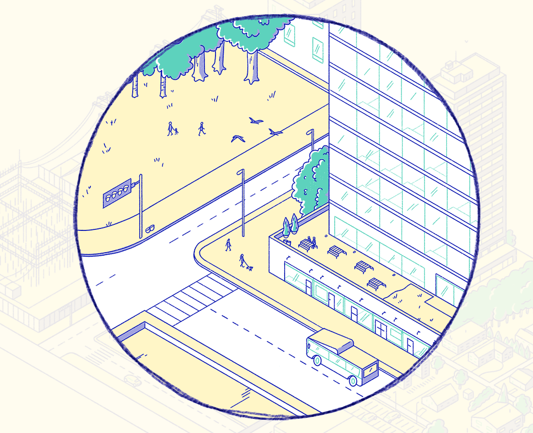
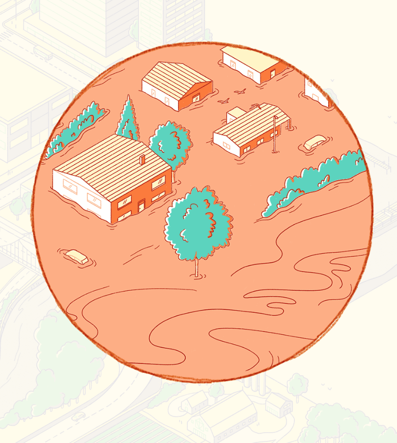
Zooming in
As the reader scrolls down the page, the central image pans and zooms into different parts of the landscape. As the narrative talks about one key part of the message, it relates it to a concrete example of infrastructure. A circle, akin to a magnifying glass, then appears on screen, containing a zoomed-in image that illustrates that particular example.
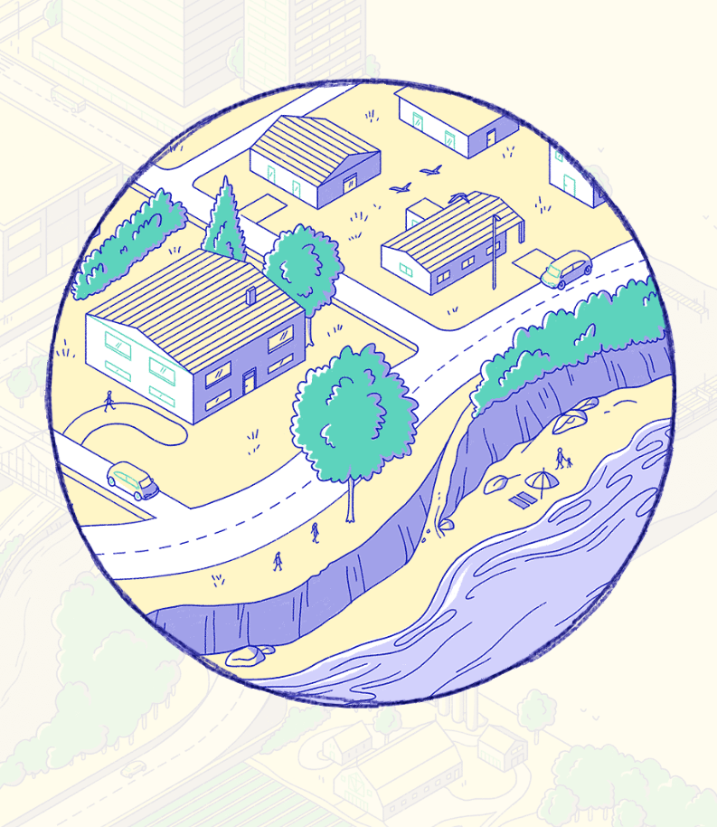
Scroll-bound animations
As the reader scrolls forward, the illustration comes to life, animated by the scroll wheel.
In these animations, colour is utilised again to mark the negative impacts of climate change. In the scene highlighting climate impacts on homes and buildings, the landscape turns a red-orange hue as the water level rises and inundates the houses.
Back to the report
To close the story, a little Easter egg brings the reader’s attention back to the report. The cover of the research report is seen on a desk in one of the office buildings in the landscape.
As the story comes to an end, the cover animates out of the building and faces the reader, inviting them to read the report and share it on social media.
Play Video about A zoomed-in circle shows the corner of an office building, with a desk and a plant visible through the window. The cover of the research report is seen on the desk.
The final interactive
Here is the full and final interactive piece. Scroll away!
How can we draw a picture of the difficult access to drinking water in the Middle East and North Africa by populations forcibly displaced in times of conflict?