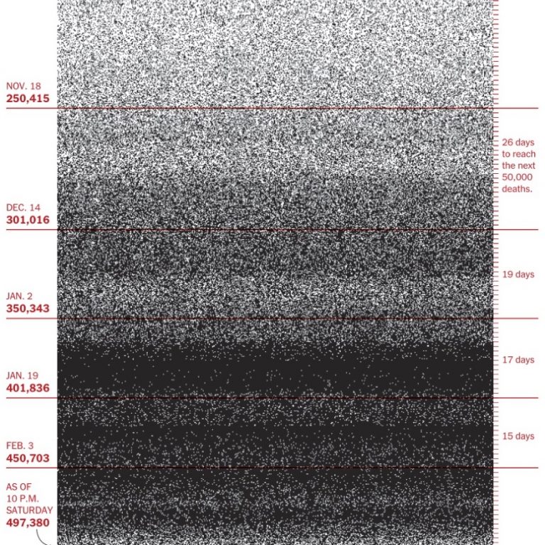
500,000 dots is too many The more I think about today’s front page of the New York Times, the more it is for me another watershed moment for data… Read the complete story
Retrospective 2020 The Holidays put me in a reflective mood. Or maybe it’s one month of John Lennon singing in my ears “So this is Christmas…. Read the complete story
How to tell the truth in charts A review of How Charts Lie, by Alberto Cairo Charts are never neutral; they are rhetorical devices. Their creators select the data, the framing, and… Read the complete story
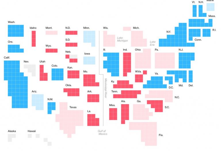
The case against electoral maps If there is one type of visualization that the world has been looking at lately, it’s US electoral maps. Ever since Trump paraded his… Read the complete story
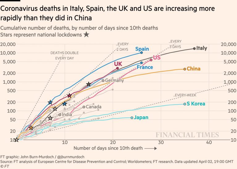
The best visualizations and charts (so far) to understand the coronavirus (COVID-19) Voilà: has not yet published a single chart about the COVID-19 pandemic yet, despite being specialized in data visualization. This is because the subject… Read the complete story
How we rebranded an information design firm How do you build a brand — which is meant to differentiate and associate — for a firm in a field that is still… Read the complete story
From Voilà to Voilà: Today is a big day at the end of a big year for Voilà:. After six years of operation, it was time to grow… Read the complete story
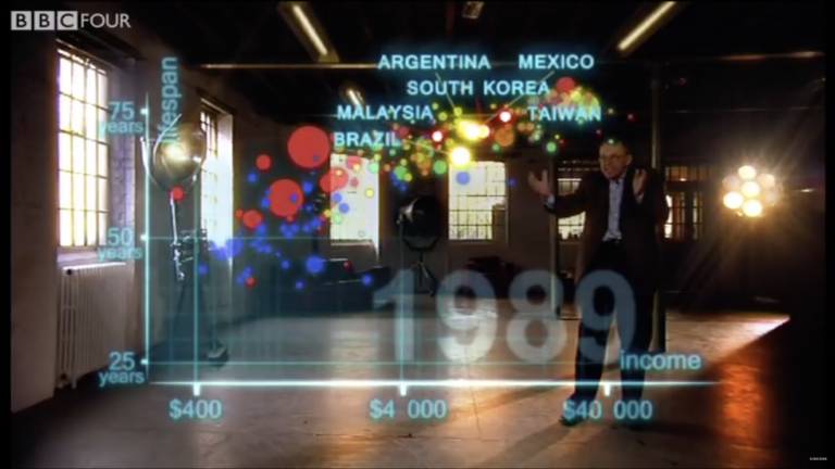
The genius of Hans Rosling, frame by frame Hans Rosling, a Swedish professor of global health, was known for his TED Talks that revealed him to the public eye. He famously used… Read the complete story
Dataviz Book Review: Show Your Work, by Austin Kleon Welcome to two of my 2020 resolutions: reading (and finishing) books and writing about the experience. A slow and distracted reader, I often neglect… Read the complete story
Voilà: 2019 Party in 5 photos What do you do when a company has moved into new offices, tripled its staff (!) and is turning six years old? You throw… Read the complete story