
If there is one type of visualization that the world has been looking at lately, it’s US electoral maps. Ever since Trump paraded his favourite map of the 2016 election results, the dataviz community and beyond has been discussing better ways to represent accurately the results of the election. But if anything, what the election night has shown is that maps are at best a minor and rarely insightful way of showing election projections and results.
Source: Map by Russ Walker
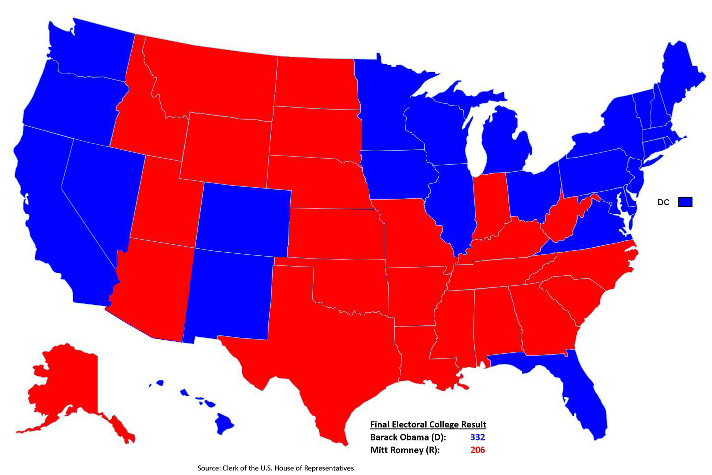
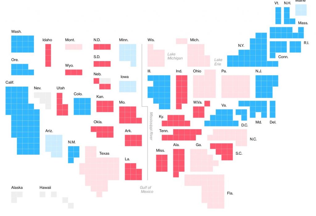
Let’s start with the map above. You may think it’s Trump’s favourite map, but it shows the results of the 2012 election where Obama was re-elected. Think about it: we cannot even tell who won the US presidential election from a US presidential election map, nor can we differentiate two such different results. The only thing that this map shows is the geographical distribution of the states won by either candidate.
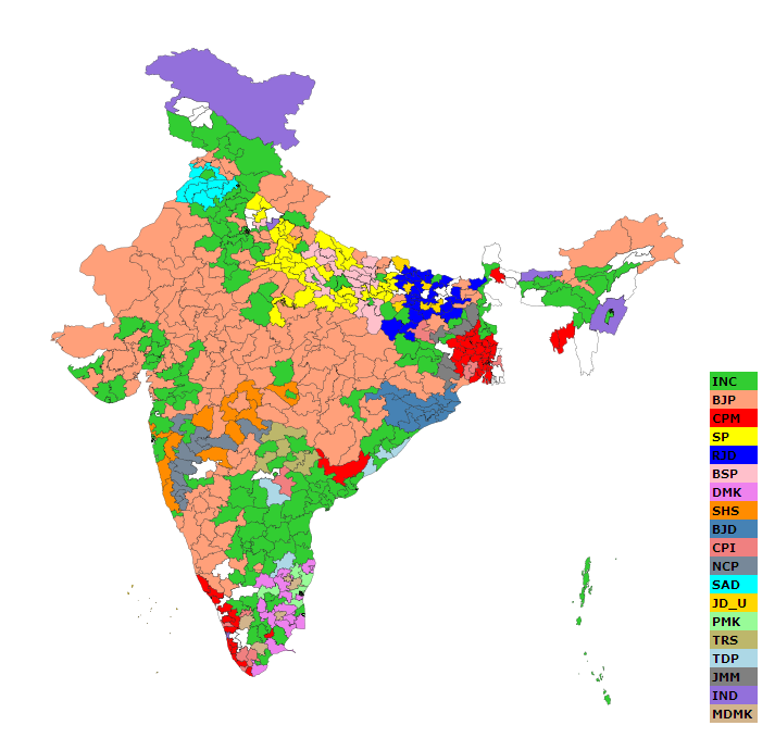
Now imagine that you are looking at an electoral map of another country for which you are less familiar. Chosen at random, here is a map of the 2004 elections in India. What do you see? Who won? Was it a close call? A reversal? What were the drivers of the vote? Because of the discussions around the US election maps, you are probably doubtful that the light orange are represents the winning party just because it covers the largest area. You’d be right because BJP finished a close second to the INC, shown in bright green. CPM finished third despite covering a very small area of the map.
Source: Map by Tejas81.
The one thing that you can take away, and it is an interesting point, is that the parties appear to be somewhat concentrated in geography (then again, who knows without vote shares?). But this point cannot be the one driver of how we present electoral results. And yet.
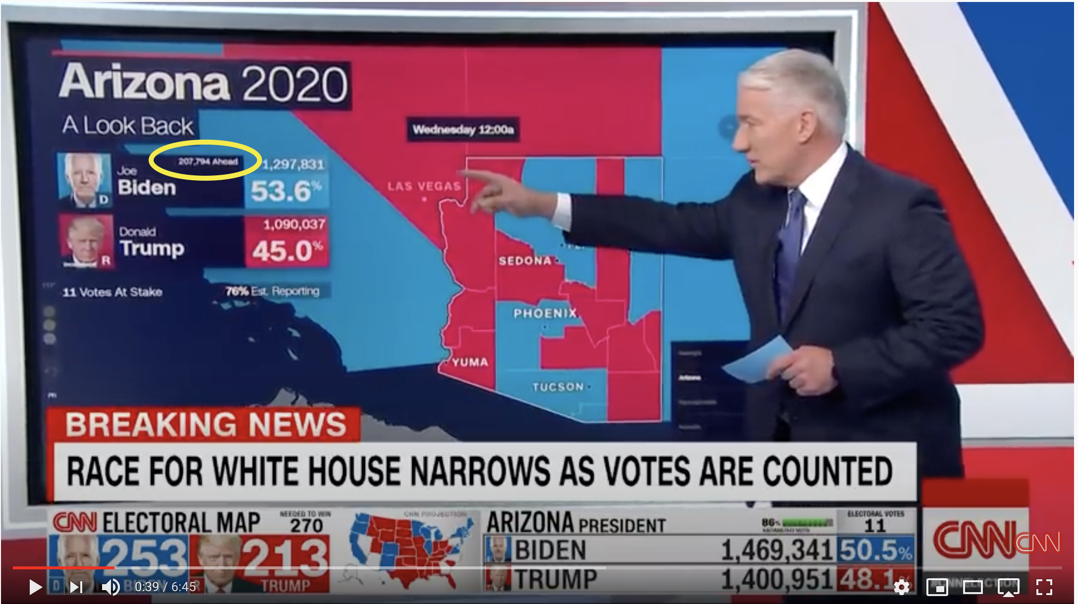
If you watched CNN on election night, you were faced with a barrage of analysis by an extremely skilled John King supported by an interactive map that he manipulated with the hands of a seasoned chef.
But notice how clumsy the map interface is in this video. At 0:30, King wants to show the evolution of the ballot difference over a few hours. He clicks and clicks to show a tiny number (circled in yellow below) change hour by hour, which he reads aloud. As if on the radio, our only real clue is the audio.
In the meantime, this information and more is visualized this way on the website of the New York Times.
![]()
Source: New York Times.
You can see the trend, the share of the vote, the share of estimated votes reported, all in four states and without a click. It would be a breeze to add the vote count differential to each chart.
Below is an alternative from FiveThirtyEight that shows the count overtime in a way that the map just can’t match. And the count is what matters, not the shape of the state or the county.
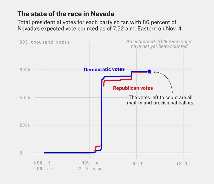
Source: FiveThirtyEight.
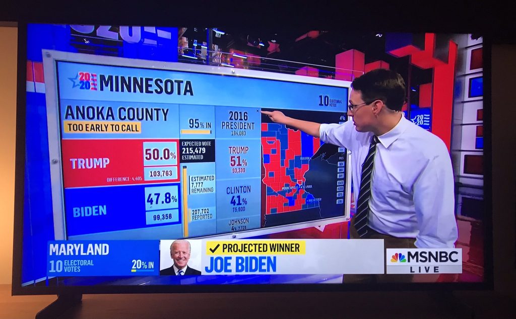
Back on CNN, we get an extensive analysis of what is going on in some key county in Florida, a swing state, while looking at this image, for which King flips between the 2020 live results and 2016 final results (shown).
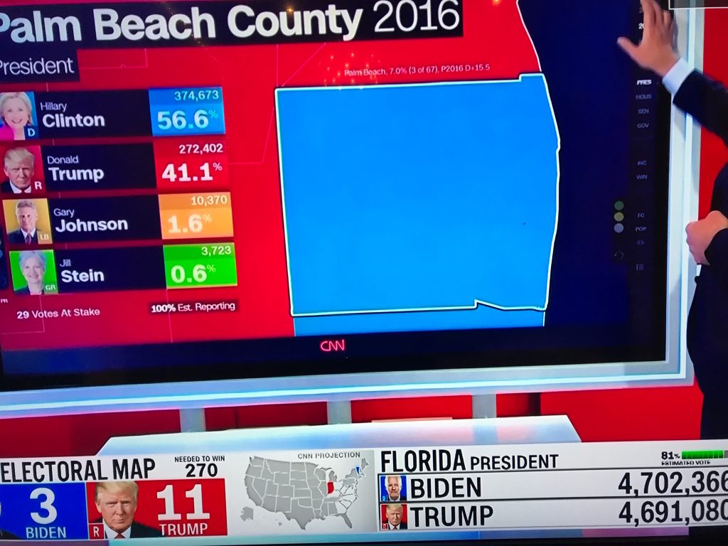
A big blue square. We want to know if the latest results are good or bad news, if this is a new trend, if this bodes well for one candidate or the other, if it is significant for the state’s results. We cannot see any of this. John King has to convey it all verbally, based on his extensive knowledge, while we are left looking at a big blue square.
CNN can show a larger view with many more rectangles showing counties in a whole state, such as this example from Ohio.
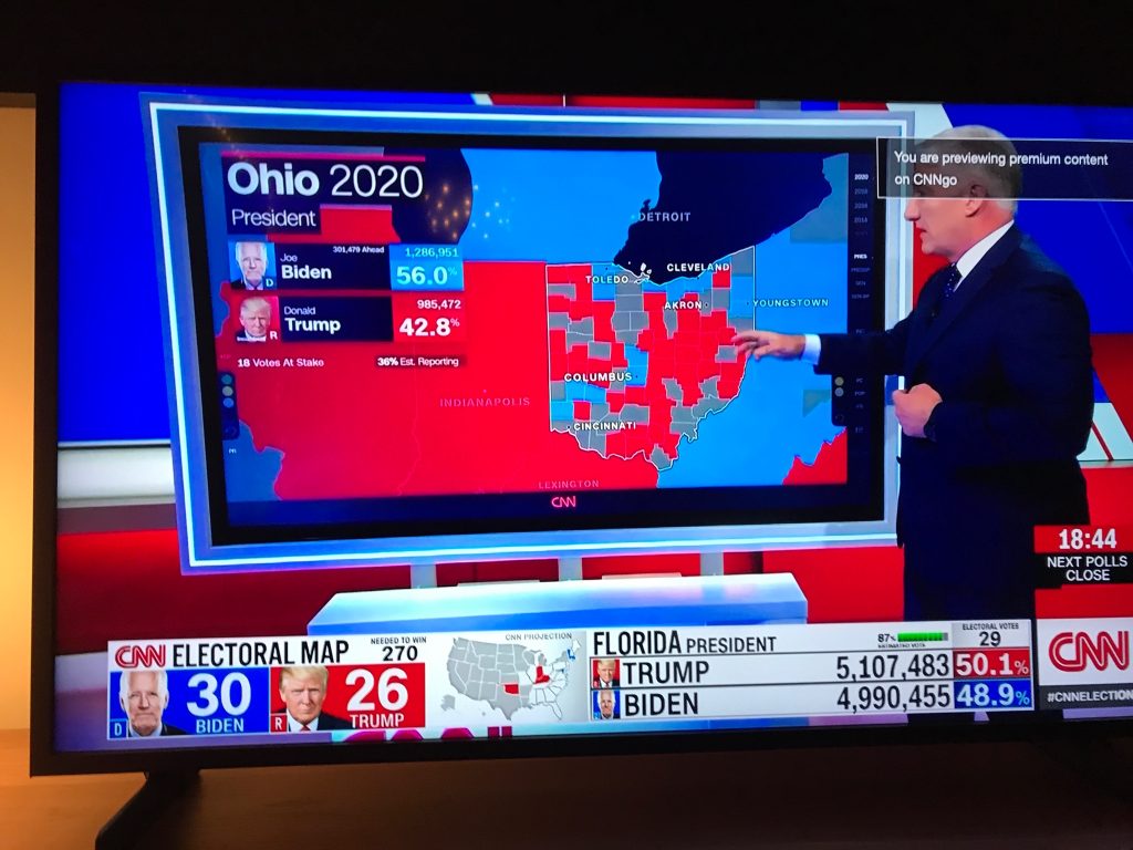
This map is no more helpful to know what is going on in Ohio. The size of each county/colour means nothing, as we know by now. The location means little. Some might say, based on prior knowledge, that the cities are blue and the rural areas are red. But how do you know this? While the city names are clearly visible, the circles that locate them are barely visible.
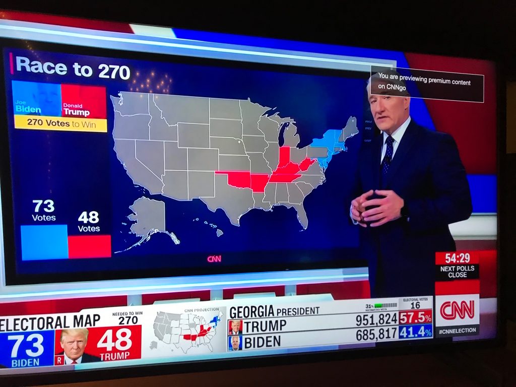
Once the results of each state is projected, they are coloured on the map. Again, this does not tell us much without prior knowledge. In the image below, a few states are coloured blue or red. Yet, John King was explaining that none of them were significant wins since these results were expected. That is impossible to see this on his map.
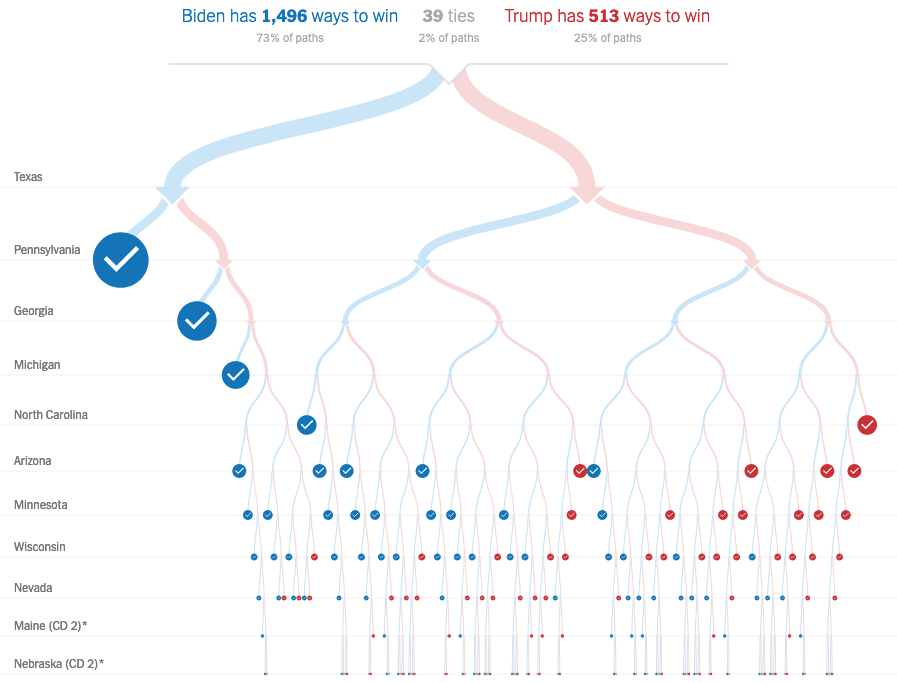
Here is a much more insightful way of showing the political meaning of the projections state by state.
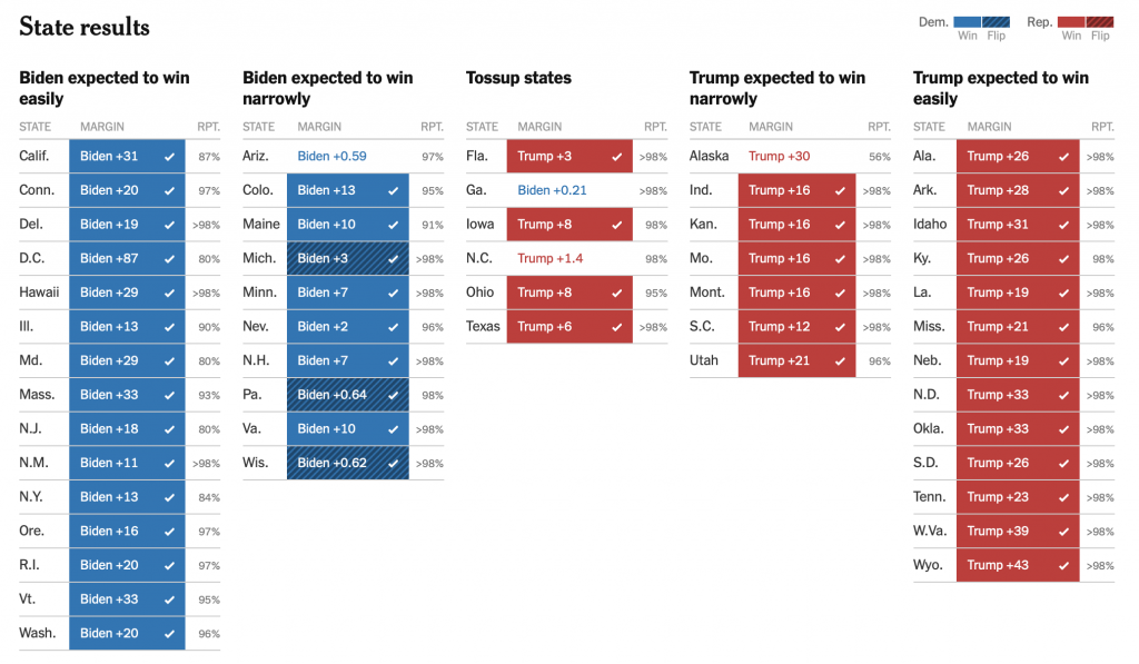
Source: New York Times.
The states at the two extremes are the ones that are expected to go to each candidate. So when they are projected, the audience will know that this is not a decisive call, that it was expected. The election will be decided somewhere else. The states in the middle are the ones for which it is hardest to make a projection. Each gain by a candidate is likely meaningful. The set up evokes two teams marching towards one another, making inroads in the other team’s territory. Nice detail: the states that flipped to the other party from 2016 carry a darker hatched pattern, drawing attention where data of consequence is shown.
CNN is not the only one to use live maps. This is Steve Konarcki on MSNBC, demonstrating a similar level of skills to CNN’s John King. His set up allows him to show the results from 2016, something very relevant. But why is it so hard to compare? The numbers are separated by another set of numbers, they are presented differently and are not even perfectly aligned with the 2020 results. The space on the right would be better used with a graph than with the county-level map.
Flawed solutions and alternatives
Let’s look at a few different takes on maps and how their attempt at doing better than the sate-level geographical map is limited by their attachment to geographical representation of a phenomenon that is not primarily geographical.
Some suggest that cartograms are a solution because they show the size of each state in proportion to the number of votes in the electoral college. Here is an example from Bloomberg.
Source: Bloomberg
Indeed, it does fix one bad feature of geographical maps: the size of the states is now proportional to their importance in the electoral college and not their area. But the result it not a very useful visualization. It is still impossible to know what the tally is for either party, it is unknown what states are upsets and which have expected results, etc. Who can see from this whether there is more blue or red?
Already, here is a more constructive way of showing states by the number of their state electors, by the USA Today.
![]()
Source: USA Today
By grouping the electors by candidates, we can see whether the number of electors is significant and whether the threshold of 270 votes is within reach for either of them.
Here is another classic from the New York Times which first appeared in 2012 if memory serves.
Source: New York Times.
Instead a frantic back and forth across a map, from one distant state to another, TV analysts could show the remaining states to project in order of importance and have a clear visual for the “path” metaphor that they use all night.
Another suggestion to fix the state-level map is to colour it mostly purple in proportion to the share of the vote gained by each of the two main parties, rather than a binary red-blue that shows the winner in each state. The goal is to show that the USA are not so divided politically as they appear.
Source: Purple states of America
The map serves it purpose but in a very limited way. First, it does not show in one view whether the polarization is increasing, as is the true question about the phenomenon. Second, it shows the data at the state level, obscuring the a more refined degree of polarization: the county. Here are a couple of histograms from the Financial Times that do a better job at both.
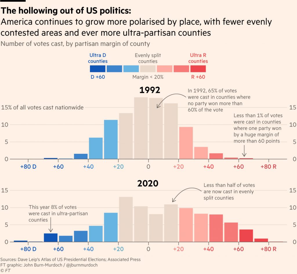
Source: Financial Times
But this map and these histograms only shows that the polarization is not very geographic. In fact, they are likely only capturing by proxy what is the real factor of polarization: population density. So denser states and counties are more democratic on average. Creating a graph organized by level of density will capture the real polarization in ways that the purple map doesn’t.
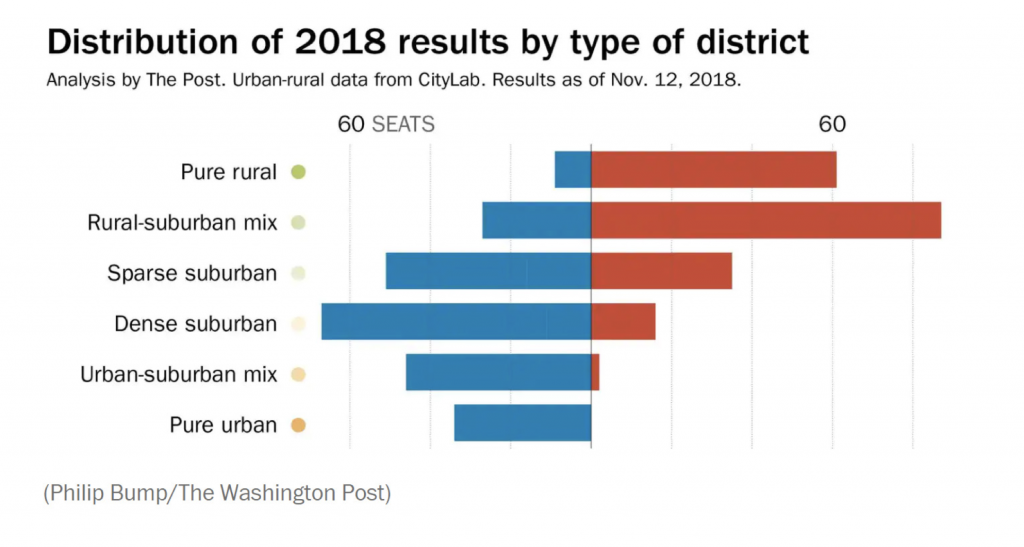
Source: Washington Post and Nikazen Center.
All of these methods seem beholden to the original map and miss the point by seeking a geographical illustration of polarization. When some people observe that Americans are polarized, they usually refer to the fact that voters are less and less receptive to the ideas of the other party. Voting for one party says nothing of how close you were to voting for the other. I find the graphs of polarization in the US Congress, such as the one below, much more telling since they truly capture ideology, and who the voters chose to represent them. There are other good ones.
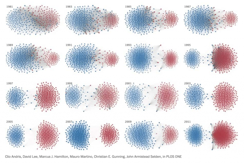
Source: PLOS ONE and Washington Post.
Another way to modify the state map is to represent the counties according to the size of their population rather than that of their area. There are tons of variations, but this one went somewhat viral around the 2020 election.
Congratulation @JoeBiden 🥳
The voice of the American people has been heard! #Election2020 https://t.co/UIyCcJKLLJ pic.twitter.com/kSpKRQSOLY
— Karim Douïeb (@karim_douieb) November 7, 2020
Now the dense areas that voted Democratic are finally visible in proportion to their large population and the red counties are no longer taking an exaggerated space. So, what does this map say? Again, it shows the geographical distribution of the voters, which is not very insightful to know who won, what are the drivers of the votes, who changed their mind, etc.
Why are electoral maps so popular?
There are reasons why people create and demand maps. They are familiar by now (there is a whole post to write about how complex and counterintuitive they actually are, but we got used to them). Their shape and subdivisions are familiar to some, like a sort of alphabetical order, making some political units faster to find. And with any path dependency, the familiar has an unfair advantage over alternative solutions.
There’s another potential reason for why it is used for live analysis on TV: it dazzles and it fills time. The constant moving around keeps people entertained, with information dripping in slowly. I turn on cable news on average once a year at home and my head always ends up spinning from the constant talking, saturated colours and non stop camera cuts. It’s a show.
CNN the last 24 hours pic.twitter.com/a0XJO7de0w
— Michael Kosta (@michaelkosta) November 5, 2020
I anticipate that it will take at least a decade before TV moves from maps to more useful and insightful visualisations. There is too much invested in the current system, both in the technology and in the knowledge. A lot of senior people and top stars are used to it and aren’t going to want to retool at this stage.
A less charitable explanation is that we like maps because they feed into our preconceived ideas about certain areas of a region that we know well. “Who did these morons/geniuses from the coastal elites/flyover country/rednecks voted for this time?” We generalize entire regions of the country and apply our ready-made thinking. Maybe it feels good, maybe it feels easy and simple and that’s why we crave it.
What are good electoral maps
Are all electoral maps useless? Of course not. First, they do show the geographical distribution of the vote in some ways. But they are at their best when they show the relationship between politics and geographical reality. An example that made the rounds during the count of the 2020 election is this explanation of the link between the soil and politics in the Southeast of the US. This is best revealed by a map. Click on this thread, it’s fascinating (and hopefully true, I don’t have any other source).
And this swoosh seems to show up over and over … pic.twitter.com/HL9SRbyIEU
— Latif Nasser (@latifnasser) November 2, 2020
Another such use of a map is the superposition of coal mines in Pennsylvania with the results of the 2006 election, suggesting some sort of correlation between geological reality and voters at the time.
🎵 I've looked at PA from both sides now
From political and geological and still somehow
(It's still unclear to me if there is a relationship between coal rank/grade and partisanship )
I really don't know PA at all🎵 pic.twitter.com/jZvi7MgK5s— Ben Forstate (@4st8) September 21, 2020
If you want to use a geographical map to explain electoral results, it is best to have something geographical to show about them. The principle by which you organise your data has better be the explanatory principle of your data, otherwise you missed on a great opportunity.

Francis Gagnon is an information designer and the founder of Voilà: (2013), a data visualization agency specialized in sustainable development.


.jpg)