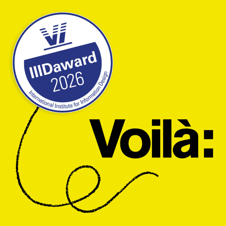
2023 retrospective
Every year, I write this retrospective for the future: I like to reread them a few years later to see how far we’ve come and to recall some memorable moments. I share it with you and salute the Francis of the future at the same time. Human resources The team remained stable at nine members, […]
Behind the scenes: The heat pump calculator
Let’s have a quick look at the thinking process behind the creation of the heat pump charts and calculator, one of our most ambitious projects in 10 years, in collaboration with the Canadian Climate Institute. First, we have created a visual identity. It’s based on the colour palette of the Institute, in line with previous […]
A look at 2022
In addition to our 2022 retrospective, we have prepared this visual overview of the year as a greeting card to wish you a happy 2023.
When the right visual is not a chart
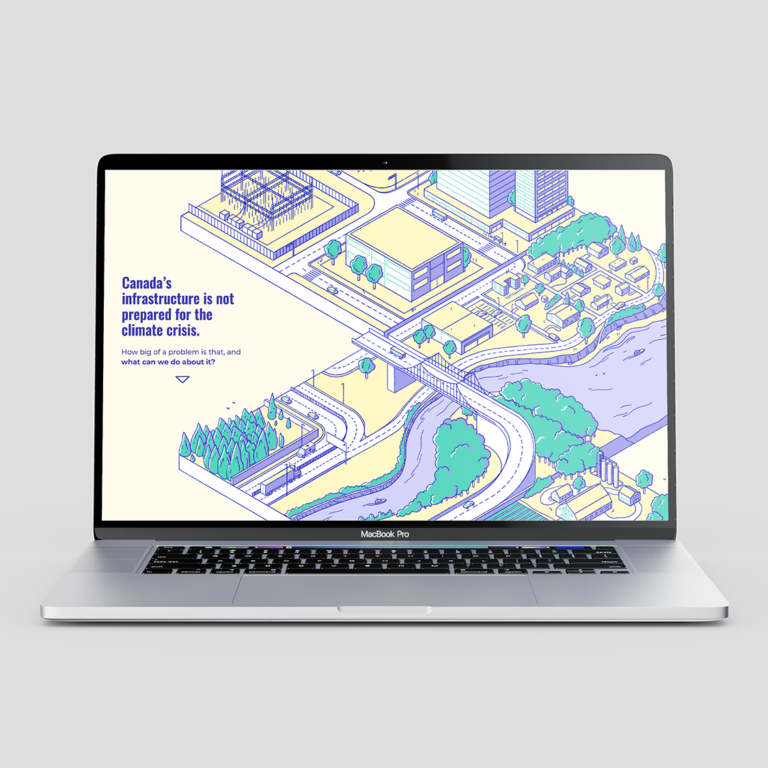
In dataviz, we often deal with numbered abstractions. But when the Canadian Climate Institute came to us with research about infrastructure, a topic connected to physical objects, we saw the potential for illustrations. So this is the story of how data on the costs of climate change turned into an ambitious scrollytelling with animated landscapes. […]
2022 Retrospective
These retrospectives are like books written one page at a time, once per year. I do it first to follow Voilà:’s progress, then publish it for all those interested in the evolution of an information design studio. Human Ressources We always start with the most important: the team. It has grown again this year with […]
Voilà: wins Gold!
Out of 1250 entries, Voilà: won one of the 10 gold awards at the Information is Beautiful Awards 2022, in the Business Analytics category, for the project “The Star of our Work” designed by Celia Albano and Francis Gagnon. The ceremony was held in Washington D.C. on November 30th. Silver went to the Growth Lab, […]
We are finalists!
For the first time in nine years of existence, we have submitted our projects to an awards competition. We sent six of them, covering the last three years, to the Information is Beautiful Awards, revived this year by the Data Visualization Society. ALL SIX made it onto the longlist. We were surprised and pleased, but […]
This dataviz has wings
I love it when great data visualization comes from unlikely places and so I have an amazing update on a project by Sandrine Huot, a PhD student at Université Laval in Québec City, and former dataviz workshop participant. And it challenges once again some of the current wisdom about data visualization. Sandrine has now fully developed […]
Another grim milestone, another data visualization
We are given another opportunity to reflect on the limits of data visualization to convey a tragedy by today’s front page of the New York Times, with a map of a million reported deaths. Source: New York Times First, this map doesn’t say pandemic one bit. It’s mostly a population map and could represent cable […]
International Women’s Day 2022
For International Women’s Day, we have updated our charts based on data from the Institut de la statistique du Québec and Statistics Canada. We start with the good news for women: their increased access to education has meant that for a little less than a decade, they have been completing a higher education degree in […]