This dataviz has wings

Francis Gagnon
May 21, 2022

I love it when great data visualization comes from unlikely places and so I have an amazing update on a project by Sandrine Huot, a PhD student at Université Laval in Québec City, and former dataviz workshop participant.

And it challenges once again some of the current wisdom about data visualization. 

Sandrine has now fully developed a visual concept to inform patients and medical personnel about the health condition of people with lupus.

Her charts report on the level of activity, comorbidity, age, medication, physic and mental health and they look like… butterflies.

Three drawings of butterflies with shades of lilac, pink and red on their wings and bodies. Some lean to the left, some to the right.

Let’s see how it works. 

  • Top left wing: level of lupus activity
  • Top right wing: Comorbidity
  • Bottom left wing: physical health (more lines = better)
  • Bottom right wing: mental health
  • Body shows 4 treatments
  • Under body, a number shows patient’s age.


Colours:

  • White; None
  • Lilac: Weak
  • Pink: Moderate
  • Red: High


Inclination: gender

  • Left: Man
  • Right: Woman
Image of the legend. Top left wing: level of lupus activity. Top right wing: Comorbidity. Bottom left wing: physical health (more lines = better). Bottom right wing: mental health. Body shows 4 treatments. Under body, a number represents patient's age. Colours as gradient legend. White; None. Lilac: Weak. Pink: Moderate. Red: High. Inclination: gender

I love this detail: while left inclination means male and right means woman, so no inclination represents a person who doesn’t identify with either gender.

Now, let’s look at how it works for one patient over four years.

I encourage you to flip between the legend and this image to become familiar with the encoding and gradually reveal to your eyes the journey of this patient (there were some surprises to me!).

Four butterflies side by side with an arrow at the top showing 2021 to 2014. The first has a remarkable red wing for high level of lupus activity.

It is likely that you won’t see the patient’s evolution right away. It will reveal itself as you become familiar. This may feel like a failure of dataviz to you if you believe that all good dataviz should be intuitive and understood in 3 seconds.

But there is nothing wrong with a dataviz that requires some acclimatation. Hans Rosling takes some 45 seconds to explain his moving scatterplots and they are considered a masterpiece. That’s because the effort is richly rewarded.

Sandrine’s goal is to have the butterfly adopted across the world for lupus patients and healthcare workers. She is working with the great Simon Coulombe on this. This gives the butterflies the potential to become familiar and intuitive to their target audience.

But why a butterfly? Because it is the symbol of lupus given that the most visible symptom is a butterfly-shaped red mark on the nose and cheeks. So clever.

Drawing of a you woman with red colouring on her nos and cheeks in the shape of a butterfly wings.

A humane approach to health data

Compare this approach to the paper published by Edward Tufte and Seth Powsner in the Lancet in 1994 with a similar purpose to provide a “graphical summary of patient statut to overlay the traditional medical record“.

Black and white graph showing the glucose levels of a patient since admission and whether it is above, within or below range.

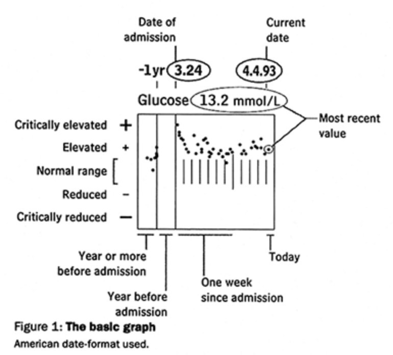
I don’t mean to put the two graphs head-to-head, they don’t show exactly the same thing. And no doubt, the Tufte approach was a huge step forward, compared with the hand-written files of patients. 

But we don’t have to stick to what was avant-garde in the mid-90s.

Tufte’s visual has nothing to do with the disease. It is rich, dense and a perfect summary of his philosophy: let the data speak, maximize data-to-ink ratio, and avoid chartjunk.

A clinical approach to dataviz, surely.

But much like dataviz, healthcare is meant for humans. Humans who are scared, hopeful, avoidant, well-intentioned and all that. What can we do to get their data to them in a way that they can receive it?

Do they like seeing themselves in black dots and thin lines? Is this how their condition feels to them?

In “PowerPoint is Evil”, Tufte stressed the importance of treating serious topics like cancer survival rates with respect, and he’s right about that. But what about empathy?

We have seen a lot of black used by the media in charts to represent the people who died. I’m afraid while this is a very prudent choice, it is perhaps too common an approach. A great equalizer, regardless of who died.

In these charts, we want to draw attention to their death, for sure, but what about their lives cut short? Are each of the people defined by their death, or did we lose something colourful and warm when they left us? Can this be conveyed too?

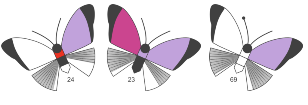
Sandrine used purple, pink and red; not exactly sober colours. It is not innocent: purple is the official colour of lupus awareness campaigns. Again, a link to the experienced reality of the patients.

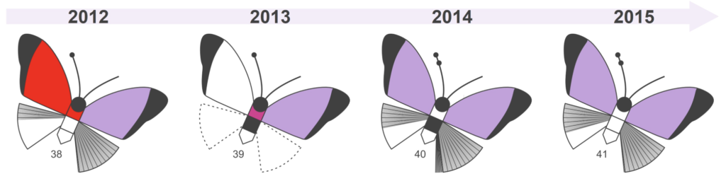
Sandrine’s goal is to bring a sense of lightness to the heaviness of the disease. Nothing wrong with that.

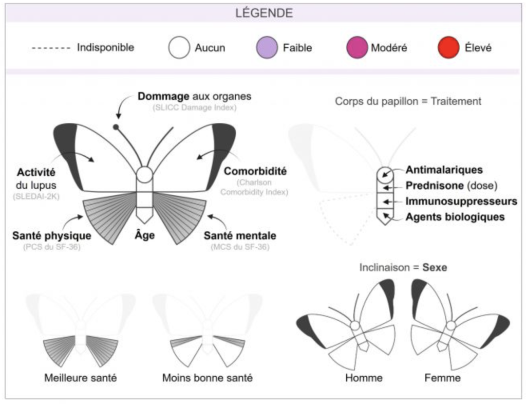
After she identified the most important clinical indicators of lupus, she went on to develop an attractive visual from the start. This is key!

Looking out

What I’m sharing here are not some long held beliefs but things that I learnt from Sandrine’s work.

As I said in the original thread last year, I would never have taken this approach. I thought it is entertaining but hardly insightful. I was wrong.

I learnt a lot from this scientist working on this unpredictable disease who was inspired to apply unconventional dataviz approaches to her research on lupus. 

It reminds me of Ed Hawkins, the climate scientist who created the warming stripes, a wildly successful dataviz. Freed from conventions and even knowledge, he was more able to innovate.

If I have a conclusion, it is that we should continue to look outside of our field for inspiration, be it the ideas of non-experts, or even output, conventions and innovations that have nothing to do with dataviz.

Francis Gagnon

Francis Gagnon

Francis Gagnon is the founder of Voilà: (2013), an information design company specializing in sustainable development.
Facebook
Twitter
LinkedIn

You might be interested

Do you like to be informed?

Share our discoveries and follow our work by subscribing to our newsletter.

We will be happy to help you reveal your worth. Here is how you can reach us.