Eyeo 2018: Conferencing in the age of the Internet Holding my plate, I spotted a participant eating alone. “Thanks for saving me a seat”, I said as I sat with him. As we… Read the complete story
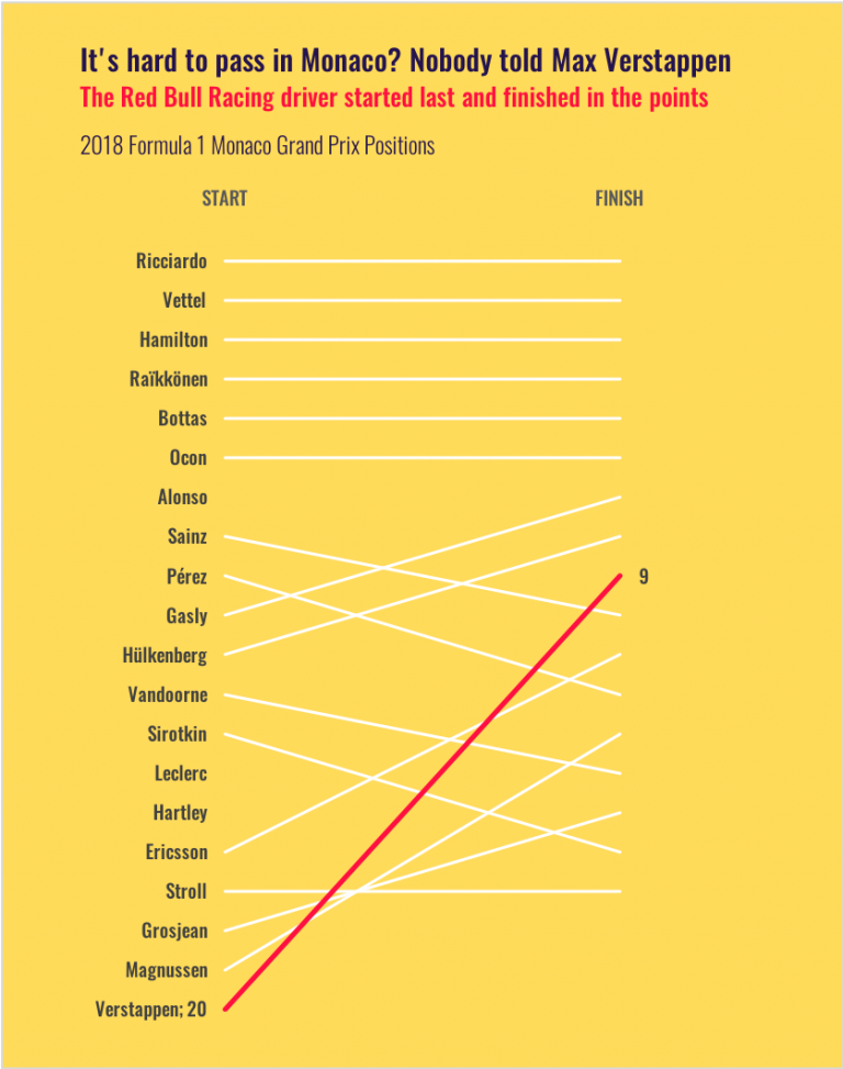
The upward climb of Max Verstappen in Monaco It doesn’t matter if you kick a ball, ride a horse, dance with skates or race down a hill: all sports tell the same… Read the complete story
The convoluted making of a simple chart Finding the right concept is my favourite part of doing data visualisation. It depends on understanding the topic, the message and the audience and… Read the complete story
5 tips for visualizing concepts What does banking look like, in one image? How about evaluation? And training? That was the easy part. Now, what about the need to… Read the complete story
When economists get excited about charts On Twitter, Matt Notowidigbo, Associate Professor of Economics at Northwestern University, has started a very interesting thread. I want to start a Twitter thread!(*) QUESTION:… Read the complete story
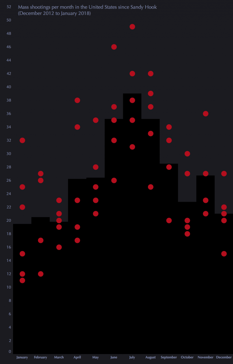
A targeted country When a mass shooting in the US appears at the top of the news cycle, it’s difficult to talk or even think about something… Read the complete story
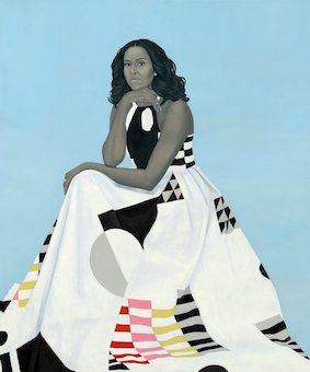
The colour palettes of the Obama official painted portraits The portraits of Barack and Michelle Obama were unveiled this week and one of their most striking features is their colour palettes. The one… Read the complete story
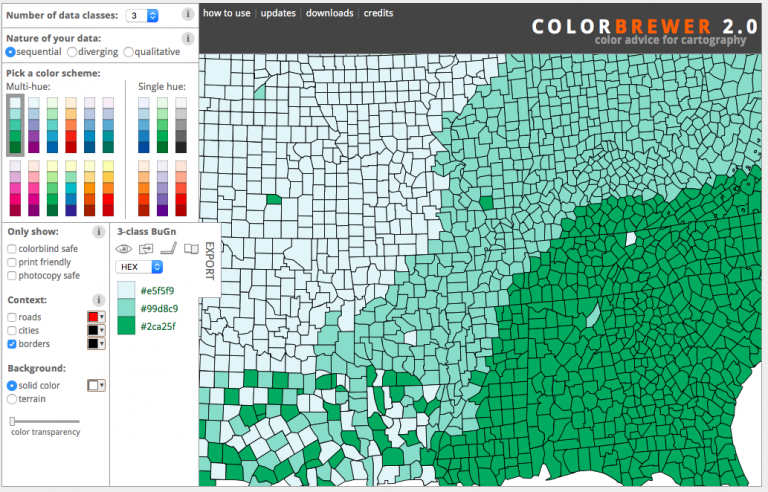
5 tools for getting a little better at colour for dataviz While organizing my colour tools, I thought of sharing a few of them here, some I’ve used, some new to me. The truth is… Read the complete story
This week on the PolicyViz Podcast: Yours Truly Oh, the pleasure of reaching a milestone in your career. This is one of those days for me as Jon Schwabish has finally relented… Read the complete story
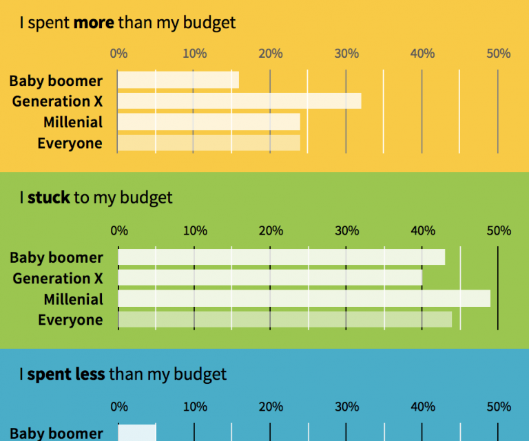
Remake: CNBC Holiday Shopping Graph My friends Ann K. Emery and Jon Schwabish have been discussing a graph published by CNBC about Holiday budgets. Ann reported that her husband… Read the complete story