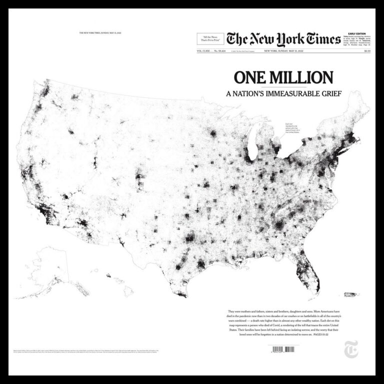
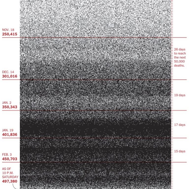
Another grim milestone, another data visualization We are given another opportunity to reflect on the limits of data visualization to convey a tragedy by today’s front page of the New… Read the complete story
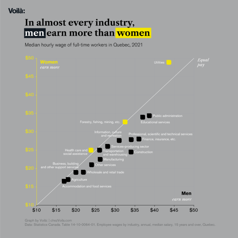
International Women’s Day 2022 For International Women’s Day, we have updated our charts based on data from the Institut de la statistique du Québec and Statistics Canada. We… Read the complete story
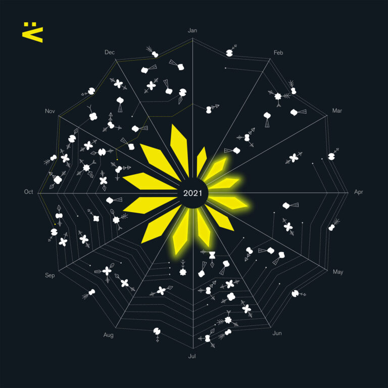
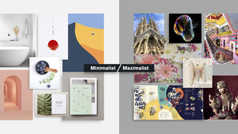
A look at 2021 In addition to our 2021 retrospective, we have prepared this visual overview of the year as a greeting card to wish you a happy… Read the complete story
Retrospective 2021 As bad as 2021 was at the global level, it has been good to Voilà:. As I reflect back, it is hard to believe… Read the complete story
How to get your design ideas through a client This article was originally published on Nightingale website. Read this article in French here or em portugues aqui. Clients are an easy target to… Read the complete story
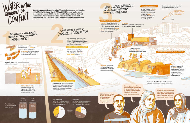
How an infographic became an illustration The latest project in our portfolio shows how an infographic request can lead to many places. It started like most projects, with a report… Read the complete story
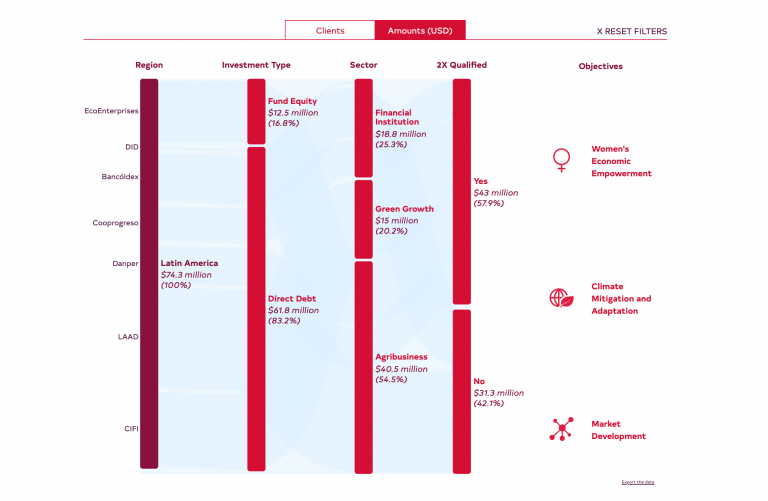
Our first interactive: the masked dashboard In the coming months, we will finally be updating our portfolio to better reflect what Voilà: has become over the last couple of years…. Read the complete story
500,000 dots is too many The more I think about today’s front page of the New York Times, the more it is for me another watershed moment for data… Read the complete story
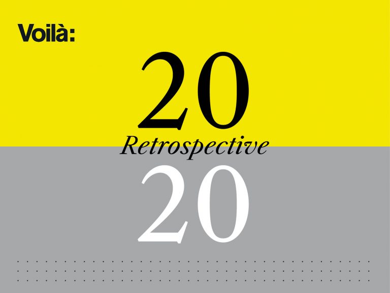
Retrospective 2020 The Holidays put me in a reflective mood. Or maybe it’s one month of John Lennon singing in my ears “So this is Christmas…. Read the complete story
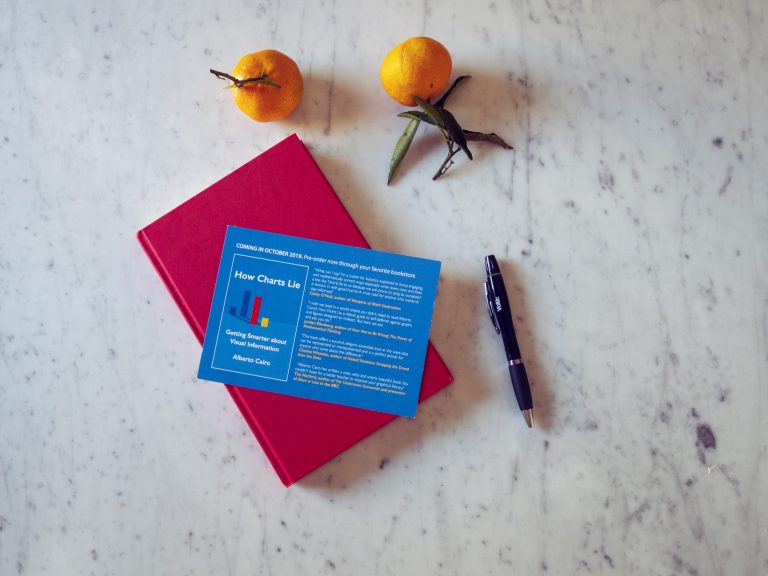
How to tell the truth in charts A review of How Charts Lie, by Alberto Cairo Charts are never neutral; they are rhetorical devices. Their creators select the data, the framing, and… Read the complete story