Another grim milestone, another data visualization

Francis Gagnon
May 15, 2022

We are given another opportunity to reflect on the limits of data visualization to convey a tragedy by today’s front page of the New York Times, with a map of a million reported deaths.

Source: New York Times

First, this map doesn’t say pandemic one bit. It’s mostly a population map and could represent cable TV subscribers. What does it say when your chart on the front page to represent such a tragedy looks so… generic?

2020 population distribution in the United States and Puerto Rico. The map is black with white dots representing where the population is located.
Source: US Census Bureau
Source: Shan He

Now there are charts that successfully convey, in their look, the underlying reality of the data. 

Take this classic by Simon Scarr for the South China Morning Post.

Column chart showing the large number of civilian casualties from the US war in Iraq and the much smaller number from the military. It is inverted so that the columns go down instead of up and it is red, so the overall effect is blood dripping.
Source: Simon Scarr

Bloody war, bloody toll, bloody graph. It’s visceral.

It’s also lightning in a bottle.

We need to grapple with the fact that many graphs look exactly the same, until you read the title/legends/labels. The same upward trend, the same bell curve, the same population map.

It’s fine when that’s the data; you gotta show it for what it is. But let’s be serious: this is not visual impact. They are banal and quickly forgotten images.

This compounds the central issue: trying to convey the tragedy of the pandemic through charts. 

Charts have their place. They show the progression, the analysis of the pandemic quite clearly. Look at the mind boggling work of John Burn-Murdoch.

But they are just numbers. 

We like to say that anecdotes are not data. But anecdotes can be better than charts at conveying large tragedies. Take Anne Frank. The journal of a single person did more than all the charts about World War II to connect us with this abomination.

There are other visual languages that are impactful, memorable. And that could have done much more mileage in such milestone COVID coverage. Like pictures.

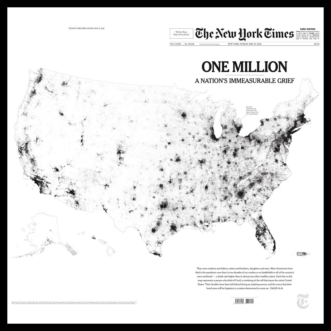
A major failing of the COVID coverage is the lack of defining pictures for the pandemic. It started strong with the exhausted Italian doctors, in February 2020. But then the graphs took precedence on the pictures. We lost the connection to people.

Ask yourself, what is the defining image of Tienamen Square, of 9/11, of the Syrian refugee crisis, of the Ethiopian famine. Now what is the defining image of the COVID pandemic? And then we wonder why people are moving on before it’s over…

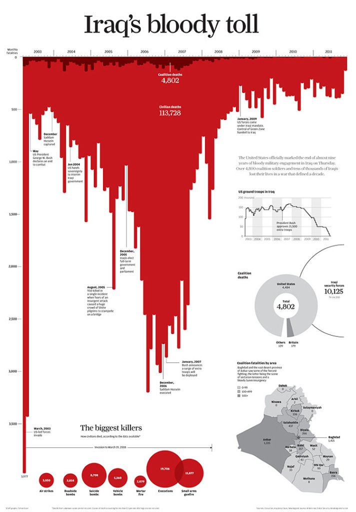
We mostly communicate about COVID with visuals that look like a finance chart, or a weather one, or a sports one. Worse: they look almost the same day after day. We grow numb. Even to our responsibility to visualize it.

Again, charts have their place. But they are not the right tool to pay homage, to provoke an emotional reaction to this immense tragedy. To plaster across the front page of a major newspaper to provoke a moment of reflection.

Now, to close, here’s a genuine question, not a rhetorical one. Do we need to convey the scale of a tragedy to provoke a connection? What difference does it make?

I’m watching the Netflix documentary about the Challenger explosion and I’m struck by how much this tragedy has nothing to do with its scale. Seven people died. But we knew them. And we mourn them.

Perhaps the scale of a tragedy is not a good lever of empathy. Perhaps what matters is our connection to someone. 

And numbers have no human connection to offer.

This post started as a Twitter thread. Head over there to see the reactions and discussions that ensued.

Francis Gagnon

Francis Gagnon

Francis Gagnon is the founder of Voilà: (2013), an information design company specializing in sustainable development.
Facebook
Twitter
LinkedIn

You might be interested

Do you like to be informed?

Share our discoveries and follow our work by subscribing to our newsletter.

We will be happy to help you reveal your worth. Here is how you can reach us.