What can we do?

See Andy Kirk’s own blog post about this topic. Truthiness was coined in 2005 and was awarded word of the year in 2006. We had almost gotten used to climate change deniers and vaxxers that challenge scientific consensus et empirical evidence. Now, it seems like daily we are asked to ponder what’s real. How many […]

How to create parallel coordinates in Excel

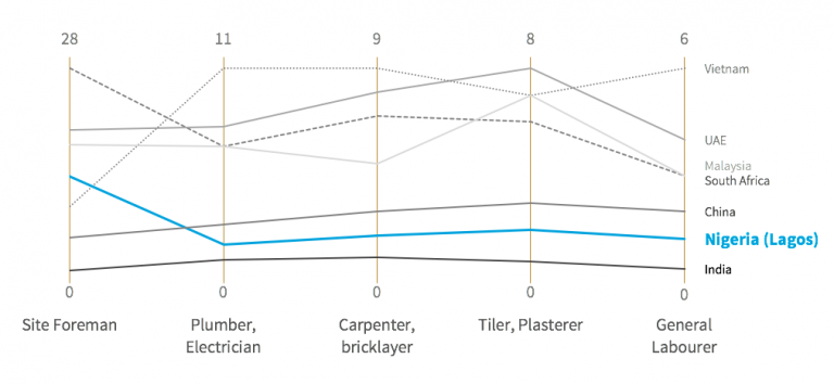
tl;dr: Draw a line graph based on normalized data for each category. What are parallel coordinates? Parallel coordinates resemble line graphs for time series, except that the horizontal axis represents discrete categories rather than time. While they can appear confusing at first sight, especially given our familiarity with time series, they can often be quite […]

Thank you, Hans Rosling

I have just learned of Hans Rosling’s passing and this is as close to a professional bereavement as it gets. There’s no doubt that he is among the few that brought me to the field of information design. Long before I was working full time in that field, I had been struck by his original […]

Interview: Andy Kirk’s favorite tweet and dataviz pick up lines

Andy Kirk, from VisualisingData.com, is very well known in the data visualization community, as shown by his 14,400 Twitter followers. He built his fame by giving public and private workshops and writing a book (he’s working on the next one). His monthly best-of has become a reference since he started it in February 2010. There are also the […]

13 facts you didn’t know about the Minard map

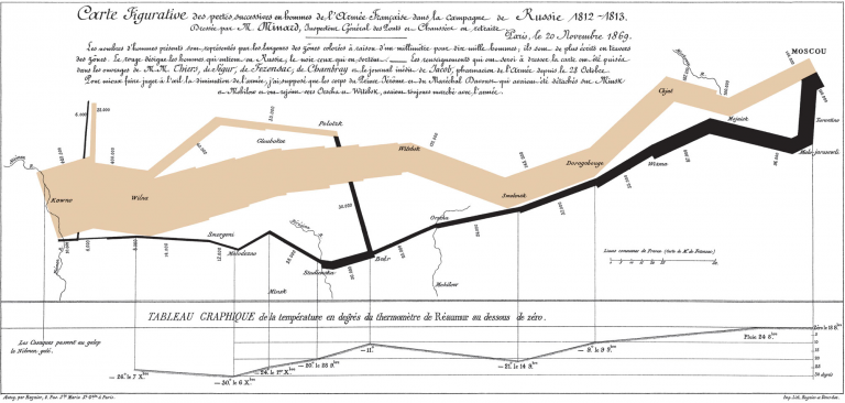
Source: Wikipedia. The map representing the Russian campaign of the French army in 1812 is a true celebrity of the data visualization world, mostly known for its spectacular features. Lines show the number, location and direction of the army troops. The temperature during the return from Moscow is shown at the bottom. The campaign was a carnage […]

Who took Google’s MOOC on data?

One of our data overlords, Google, organized a massive open online course (MOOC) called Making sense of data from March 18 to April 4. It was nowhere to be seen on my social media after the announcement, which is surprising given that I follow a lot of data folks. It made me wonder who had taken […]

Tapestry 2014: A New Language

The data visualization community seems to be looking for a bone to pick, but it hasn’t found one yet. At Visualized, it tried storytelling; at Tapestry, visual flourishes. In both cases, there was no real area of conflict between the different views and no blood was shed. Santiago Ortiz provided the reason why distinct approaches can […]

Visualized 2014: A Conference About Complexity

Imagine a forest: trees of varying sizes and types, leaves of infinite shades of green to red, trunks from brown to grey, rays of light, terrain variations, uneven ground coverage, the sound of the wind and insects, perhaps the movement of an animal in the distance. Now think of a spreadsheet of numbers and words, […]

Jon Schwabish on government graphs, HelpMeViz, and his own future

There are many reasons you might know Jon Schwabish. He’s an economist at the CBO whose graphs have been shown in Congress, a freelance trainer in data visualization and presentation techniques, the creator of HelpMeViz.com, and one of the organizers of the DC Dataviz Meetups. He tweets and blogs regularly, his guest posts have been featured on VisualisingData.com, AllAnalytics.com and […]

What infauxgraphics have in common with PowerPoint

Infographics get a bad reputation because too many of them get data visualization wrong. Just now Kim Rees pointed out to Visually that their “staff pick” had a bar chart completely wrong (it’s no longer a staff pick).  I had a look at said “infauxgraphic” and was pleased to see that it touches a topic I’m […]