How do you build a brand — which is meant to differentiate and associate — for a firm in a field that is still relative new and unknown by its potential clients?
This was the tension at the heart of the rebranding. Should we incarnate the field, at the risk of being generic among our peers? Or, should we differentiate ourselves, at the risk of being misunderstood by our clients?
We had a few things to work with. A track record of six years and a name: Voilà. The word represents what we are trying to achieve: to show and tell, to explain, to put the spotlight on something that matters. Also, it’s a French word used in several languages, which is fitting for a Montreal-based company with international clients.
The logo
I designed a fairly plain logo in 2013, though not for lack of trying to do better (see right). When the time came to update the identity, I sought external help. It started with Nathalie Houde, a brand strategist, who guided us all through this process and made us more creative, more daring than we would have been without her. Her work is now in the DNA of this company.
For the brand design, I chose Aanagram when their creative director Etienne Rochon told me that they strive to produce work that is “clever”. This term captures the essence of a lot of the work we do, but was missing from our existing branding.
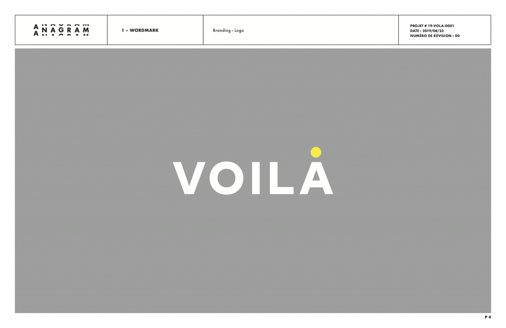
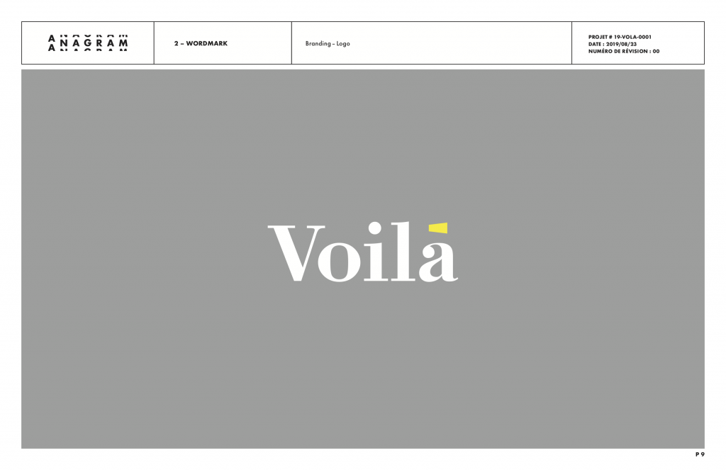
I shared with Etienne that I had considered adding a period at the end of “Voilà” to convey that it is not an exclamation but a resolution. The name represents the end result of our work, where everything falls into place.
Etienne came at it from a different angle. He suggested that “voilà” was not the end of the process, but the beginning of another. Instead of focusing on our process, we would focus on the result, where the story begins for the client and their audience.
And it was perfect.
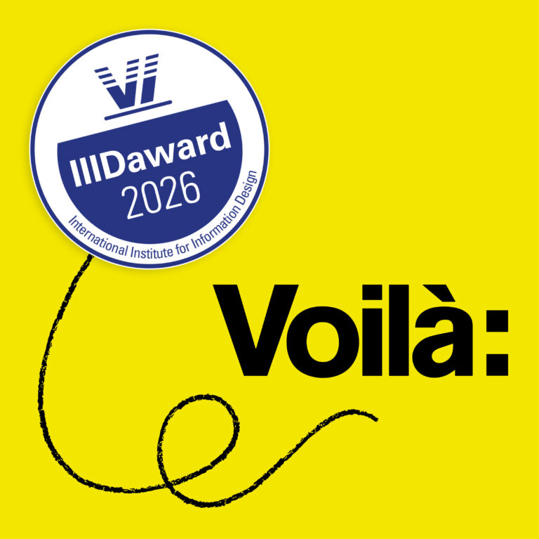
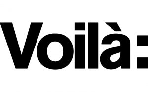
Solid typography (Akzidenz Grotesk) is all that’s needed. With its colon, the logo shows not an abstraction of the work, like most logomarks, but the work itself. A colon is the introduction of an explanation, the beginning of a demonstration. This is exactly what we do. It can also be used in front of our work and to draw attention to our clients’ stories, as we aim to do.
The voice and the descriptor
We worked with Benoît Faucher, copywriter, to find the “voice” of Voilà. We ended on something accessible, authentic and, of course, clear. We are curious and do not hesitate to ask questions.
Between the logo and the presentation of a company, there is the descriptor which summarizes as briefly as possible the nature of an organization while differentiating it in its field. We chose “revealing information design” because our mandate is precisely to help our customers reveal their value, just as we reveal the value found in data and complexity.
The word revealing takes double duty as it suggests that Voilà will help you discover information design. It is indeed among our objectives to publicize this area full of potential.
Nathalie’s reaction was keen: “The first version “revealing information design” is bang on in my opinion …”
The duck
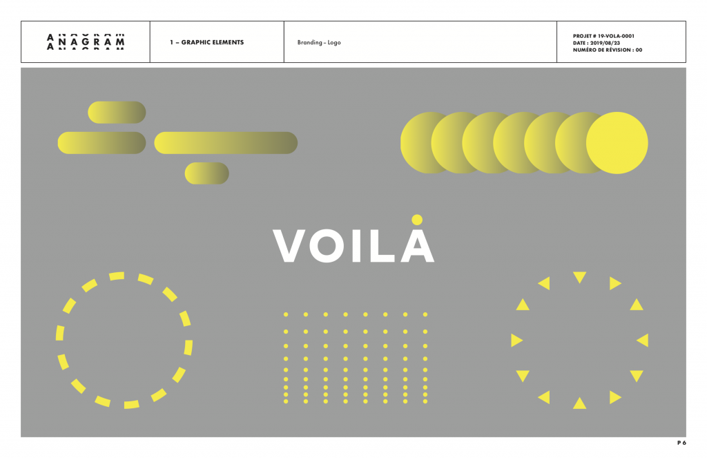
I also asked Etienne for a smaller mark, something that could act as an icon in certain contexts where the full logo would be too big or not necessary. I thought that we could use the “à:” because it contains what’s most interesting in the logo: the shape of the a, the accent representing our French language roots and the colon of course.
Again, Etienne surprised us. He combined the V with the colon to create what has become our mascot: the duck.
![]()
It now represents our own voice. We put it on our blog and our envelopes and our social media profile pictures. It is conversational, enthusiastic and fun, as we hope to come across.
The colours
From the start, I had put only one constraint on Etienne: the identity had to be green. It represents the environment and it is the colour for which the eye distinguishes the most hues, something handy in visualisation.
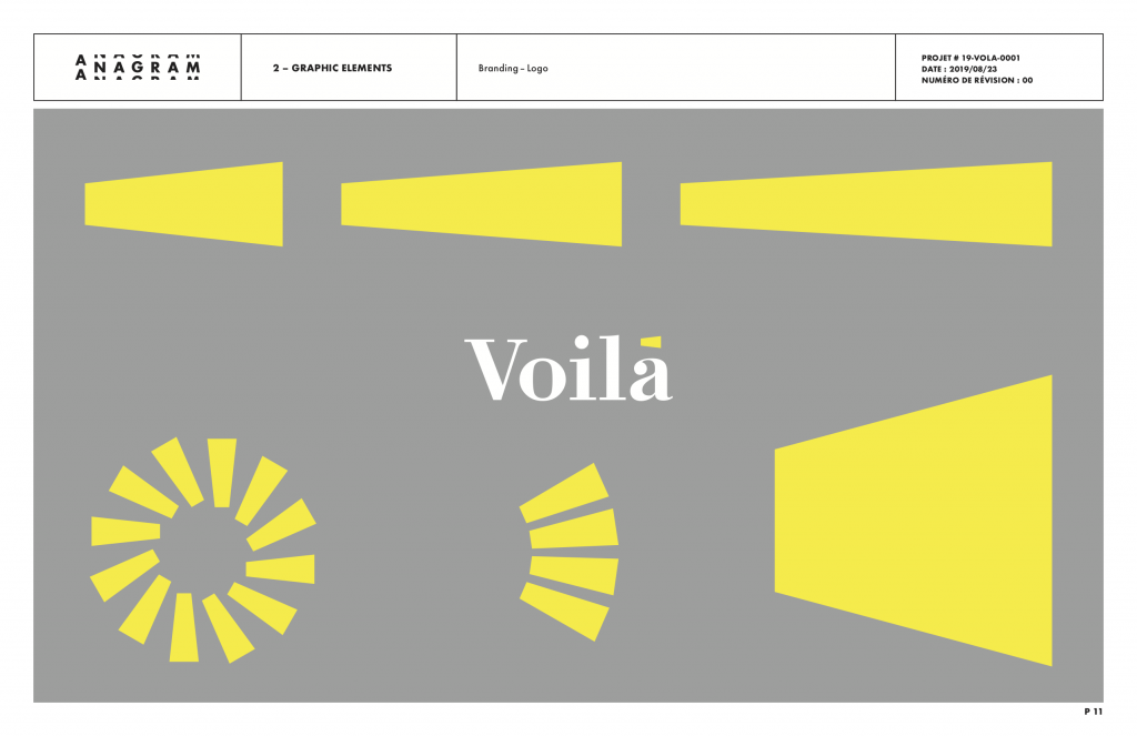
You know the drill by now: Etienne went a different way (I now suspect he made it a principle). He used yellow, the color of the light that we shine on data, and of the gold that we sometimes find in it. To me, yellow is also the default colour of the highlighter, one of our main tools (if figuratively these digital days) in doing research to understand the complex content of our projects.
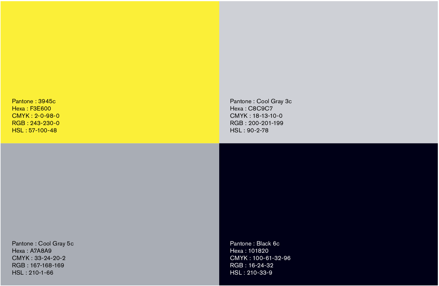
The rest of our main palette is black and grey because our brand is restrained so as to maintain focus on our work and clients.
So far, this is the story of how you should trust professionals when you hire them. But I also want to show you a few of the ideas on which we passed.
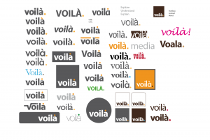
Rejected concepts
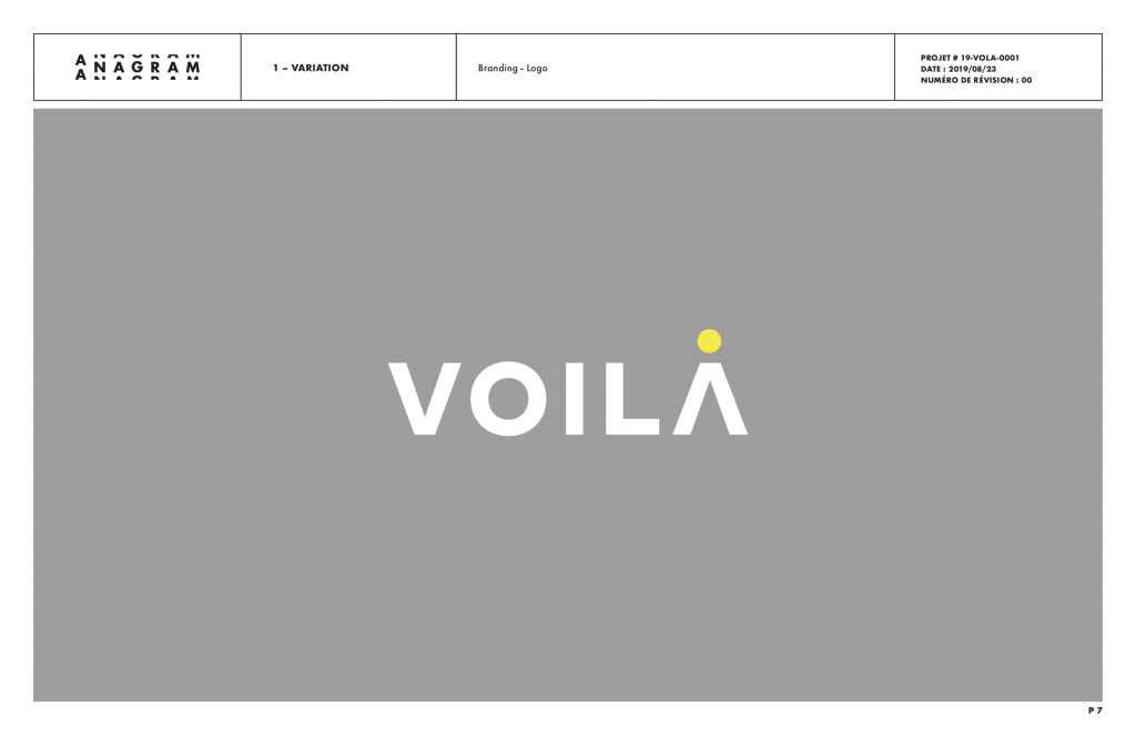
This was the most complete proposal. The colours are the same but this time the central visual is a yellow circle, which represents a source of light and a gold nugget. It is very polished, very professional and has potential. But it was too generic, it did not represent Voilà enough.
A slight variation had no horizontal line in the A, for added stylishness. But it was even less us as it introduced an element of ambiguity that goes against our purpose.
The next proposal used a serif font with a symbol for the accent on the a. It represents a megaphone or perhaps a ray of light. The multiple ways in which it could be used were interesting, but not as good as the previous one anyway. It looked like a magazine logo to us.
Then there was this proposal that played with the dot that I had envisioned adding to the logo. It did not click and we barely discussed it.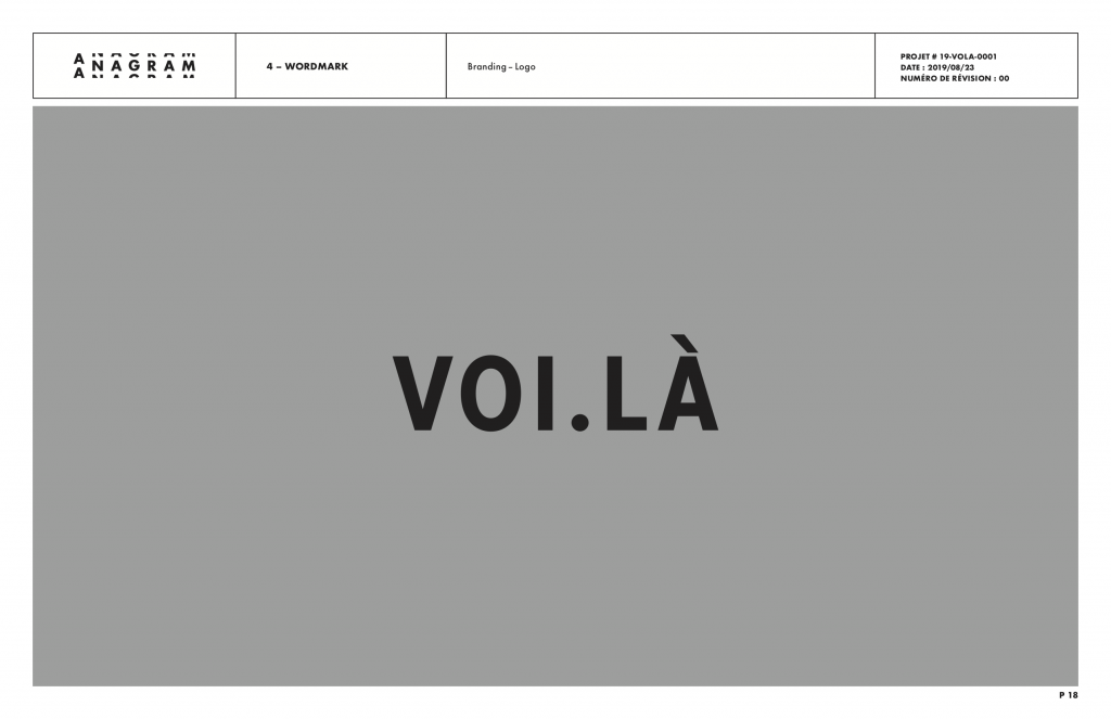
The concept that we chose was the fourth and last one that Etienne came up with, at the last minute. I suspect that all this work had helped the mandate percolate in his brain and the simple solution finally appeared. When I saw it, I knew immediately that this was it.
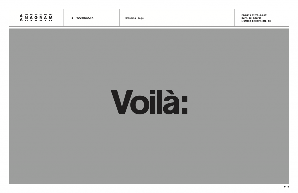
Nathalie, our brand strategist, who had slight doubts about the name Voilà up to that point, said “Now I love your name”. And it’s true: the colon brings it all together.
We are pleased with our new identity, but a brand is built through actions, not graphic design. So the branding work is just getting started and we are honestly excited about it.

Francis Gagnon is an information designer and the founder of Voilà: (2013), a data visualization agency specialized in sustainable development.