Voilà: has not yet published a single chart about the COVID-19 pandemic yet, despite being specialized in data visualization. This is because the subject is currently best left to the specialists. The data is much less reliable and comparable than one might assume and the subject of epidemiology is highly complex. If we do give it a go, it will be with the support of experts.
To understand the pandemic, we look to those who create graphs in their area of expertise or with the help of specialists. This is a compilation of the best work we have seen in the last few weeks.
Some are behind a paywall, but many of these masterpieces are available for free because the media are often choosing to make their COVID-19 coverage freely available in an effort to support public health. This is remarkable and yet another reason to subscribe to newspapers.
What is this coronavirus?
A good starting point is to understand what the SARS-CoV-2 Coronavirus is. This visual explainer from the New York Times (first published on March 11, 2020) does an outstanding job. You’ll understand where its name comes from, what is the purpose of its shape, how it can lead to death, but also how the immune system can defeat it.
It was created by their science graphics editor, Jonathan Corum, in collaboration with their resident virus specialist, Carl Zimmer. Corum always conducts his research with extensive care and his designs are elegant. His copy is a delight to the curious mind.
How does it spread?
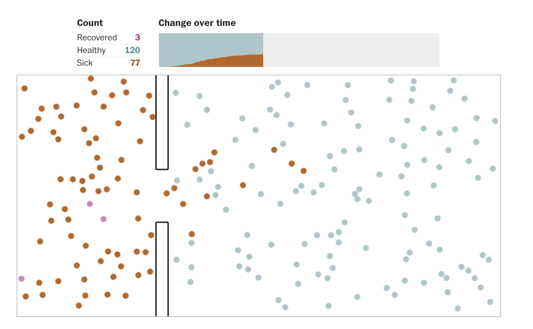
Have you been stuck at home for a while and are wondering if all of this is worth it? Is social distancing actually effective against contagion. The Washington Post has a wonderful visual explainer (March 14, 2020) by Harry Stevens about the mechanics of outbreaks. It makes it very clear that reducing contact dramatically reduces the spread of a virus (keep in mind that this is not about SARS-CoV-2 specifically).
One impressive technical detail: these animations are not videos. The simulations are generated from scratch every time someone loads the page.
The cherry on top: this is the most widely read article ever published by the washingtonpost.com. Yes, a visualisation.
What does “exponential growth” mean?
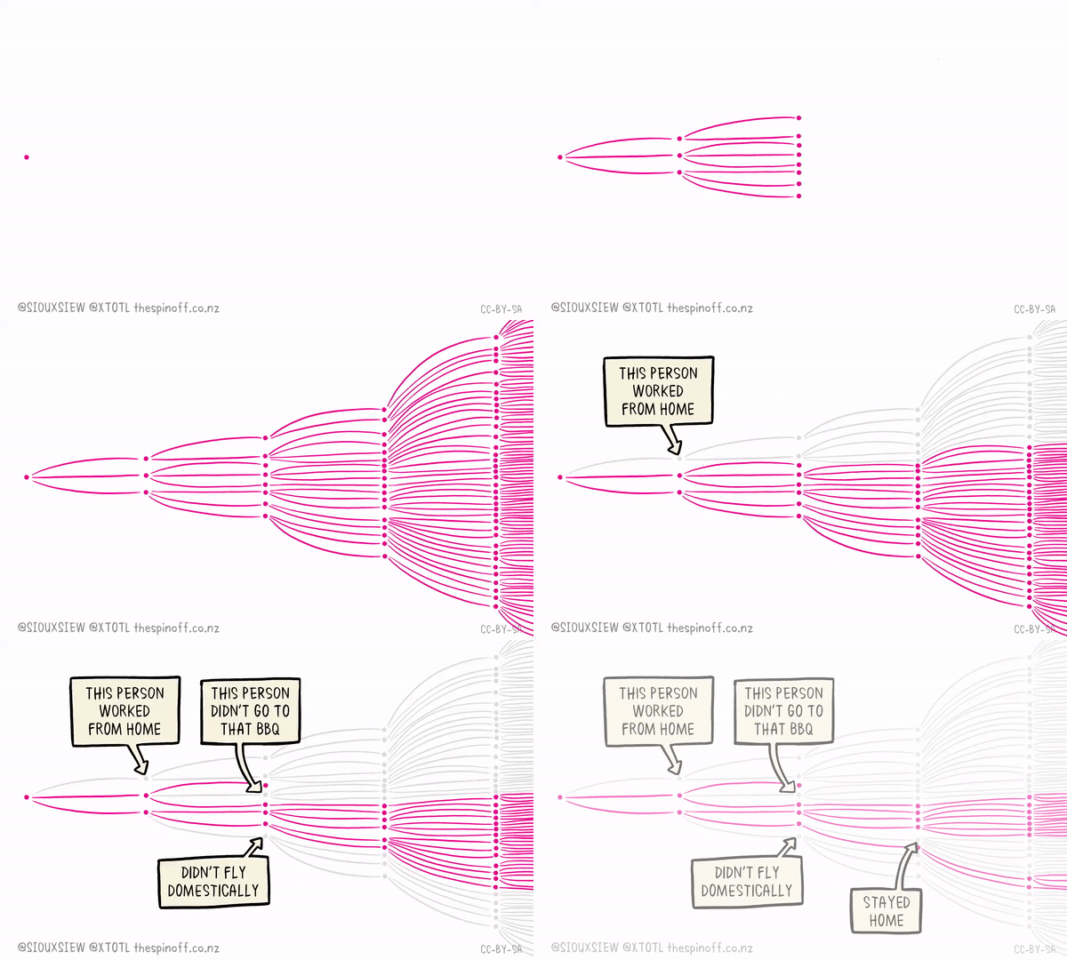
By now, it’s clear that we should stay away from each other. But what is the potential impact of an individual’s actions when it comes to effective social distancing? In an exponential growth scenario, the impact is surprisingly significant. This animation developed by Dr Siouxsie Wiles and cartoonist Toby Morris for The Spinoff in New Zealand drives the point home.
How did it start spreading?
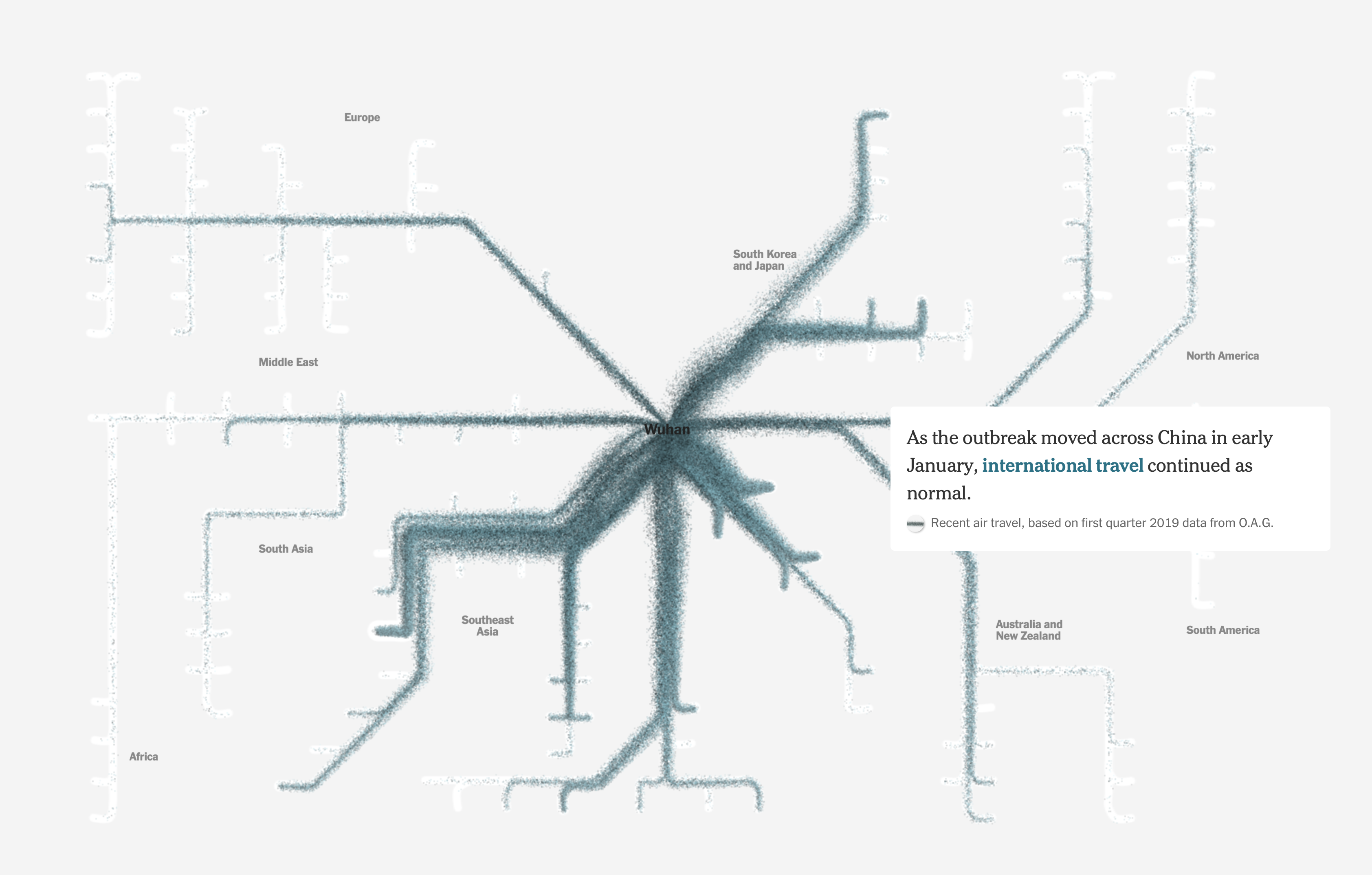
The exact origin of the SARS-CoV-2 Coronavirus is unknown at the moment but we know where people with COVID-19 first appeared: in Wuhan, a city of 11 million people in China (never heard of it? it’s larger than New York CIty, with 8.4 million people).
Jin Wu, Weiyi Cai, Derek Watkins and James Glanz at the New York Times did a breathtaking job of analyzing the movement of hundreds of millions of people to show just how it went from that megalopolis to the rest of the world. This is a technological wonder as much as one of design.
It is a “linear interactive” in that the reader controls the pace of change by scrolling, but nothing else.
The South Korean case
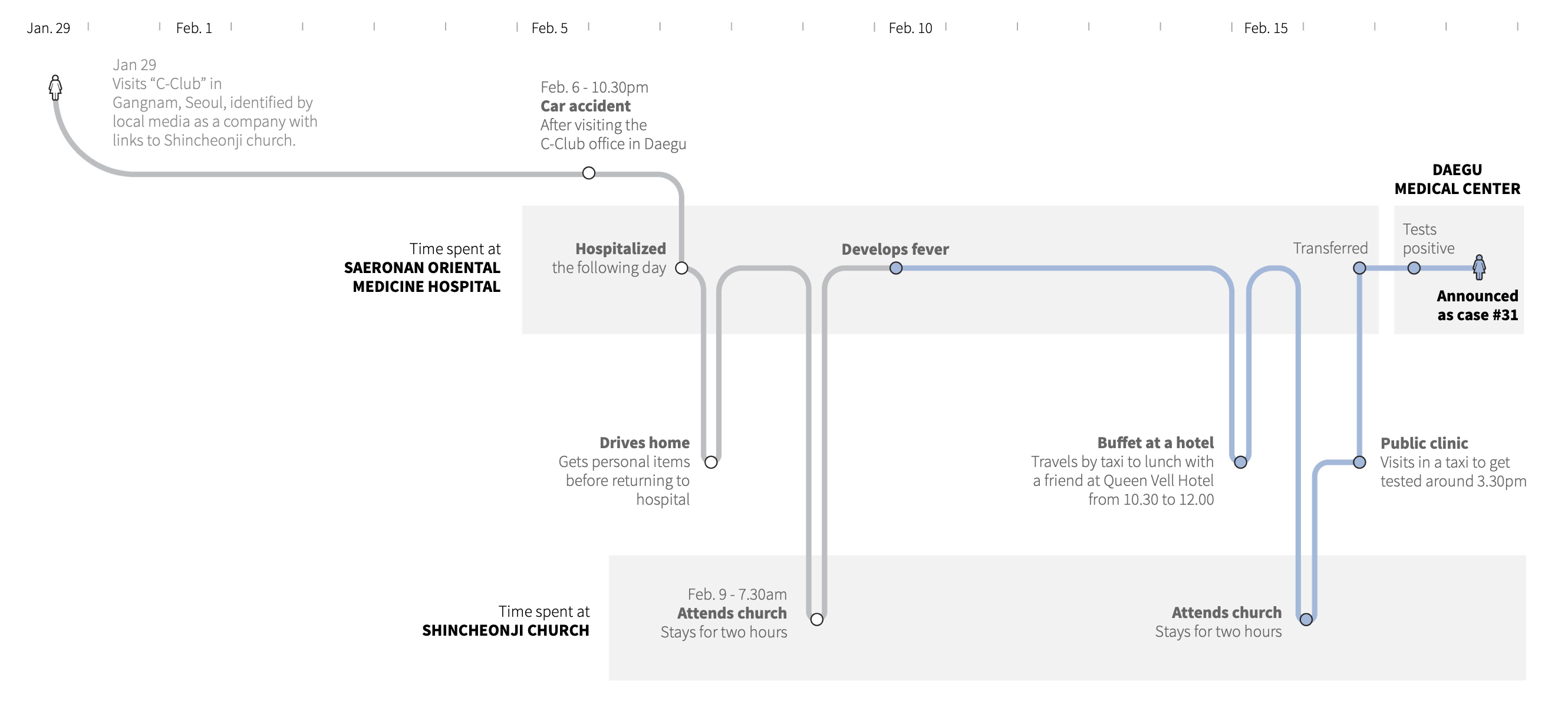
A short while ago, South Korea was all over the news because of its high (at the time) number of confirmed cases. What is so special about this country is that the outbreak exploded because of one person, nicknamed Patient 31. This visualization (February 27, 2020) by Marco Hernandez, Simon Scarr and Manas Sharma at Reuters tells her story with a very elegant timeline.
Why are we distancing ourselves?
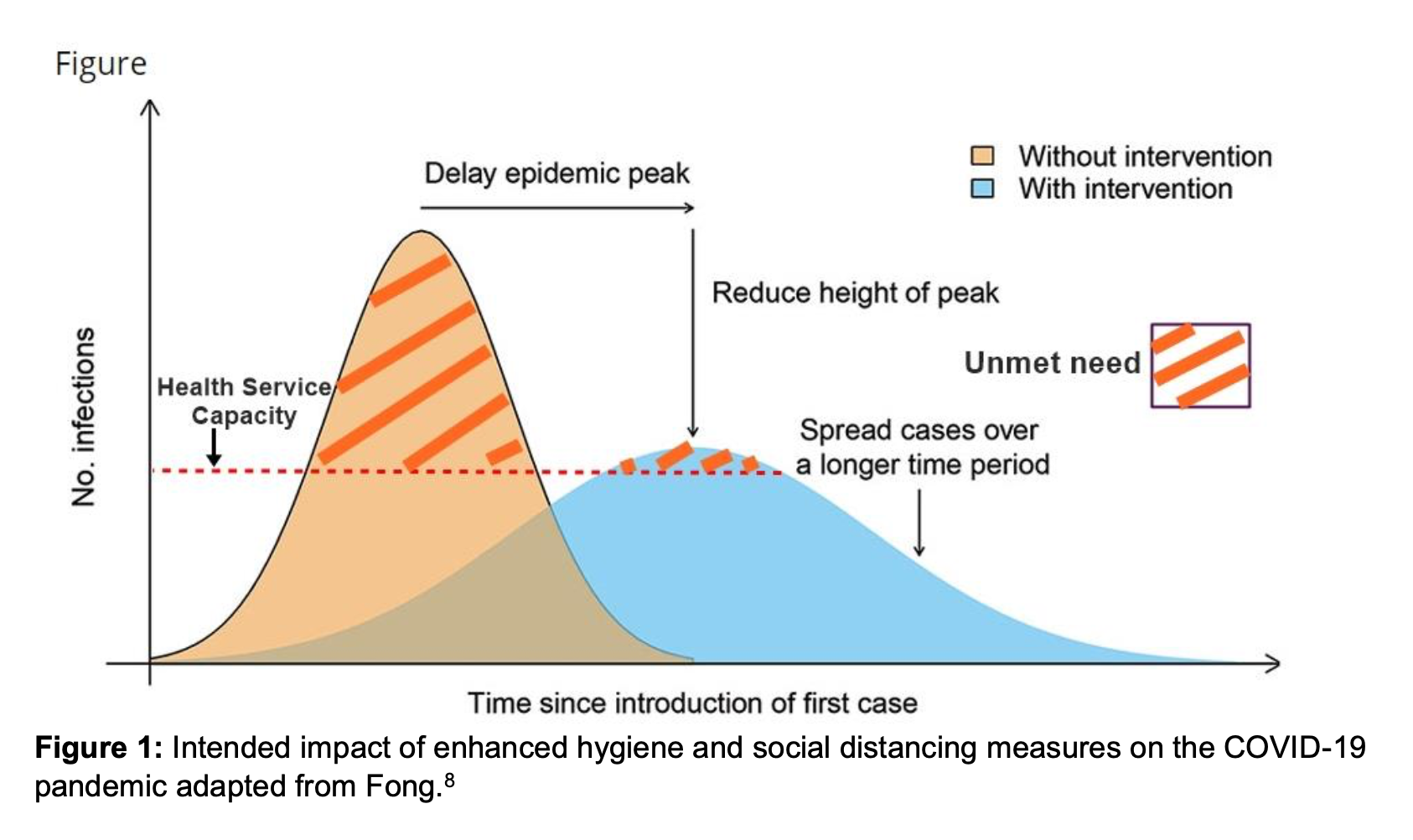
“Flatten the curve” may be the most well-known visual related to this pandemic. It’s a diagram with two scenarios represented as curves showing the number of active cases at any given time. It was first published by the Center for Diseases Control in… 2007. It clearly explains why we want to slow down the spread of the disease and remain within the capacity of the healthcare system.
Most versions do not differentiate the area above the dotted line (capacity), which I think is a mistake. The whole point of this chart is to say that it is bad to have cases above this line. In this version by Craig Dalton, published by Stephen Corbett and Anthea Katelaris on March 5, 2020, this area is called “unmet need”, which is a technical way of saying “more deaths and suffering”.
The linear explosion
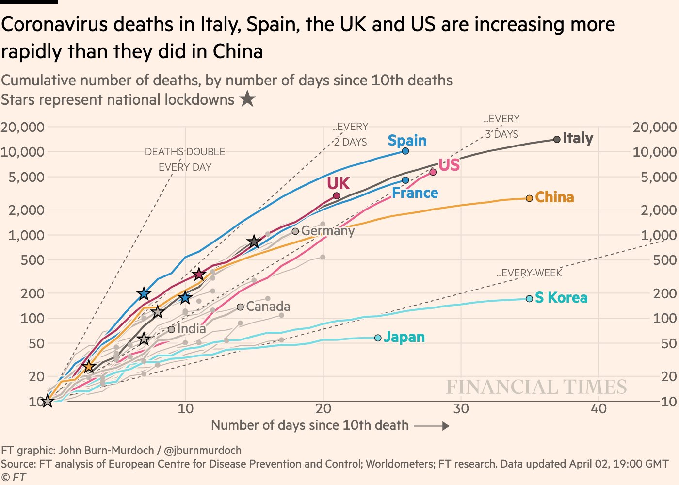
Exponential growth creates a steep upward curve on a chart with a “standard” linear scale. This hides the fact that its growth is actually quite regular, it grows at a fixed rate (like your savings) instead of by a fixed number. So, on a logarithmic scale a perfectly exponential curve is a straight line.
John Burn-Murdoch at the Financial Times has created a few charts that use a logarithmic scale so it’s easy to compare the progression of the disease in different regions, and also to notice when the progression slows down or picks up from its past growth rate.
Below is the version from April 2nd, but you can see the live version for free on the Financial Times’ website where there are many more interesting charts. Why the log scale? Why not adjust for population? John explains it all.
The economic cost
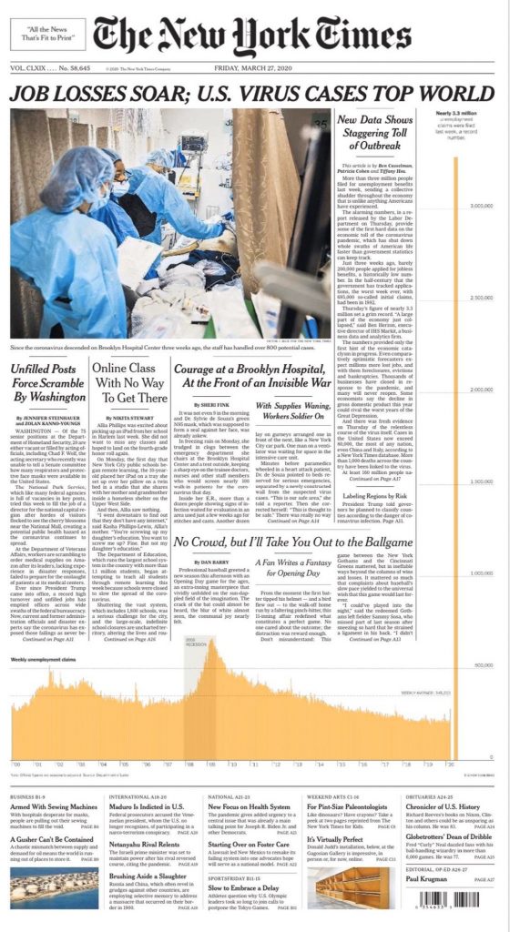
The economy is slowed down considerably by all this social distancing and entire industries have grinded to a halt. On March 27, the number of unemployment claims in the United States was visualized on the front page of the New York Times in a spectacular way. Sadly, the count has nearly doubled since then and now the graph would not fit on the page at that scale.
Special mention
Finally, a special mention for an illustration by a personal favorite of mine, Christoph Niemann, for the cover of the New Yorker of March 23, 2020 (published on the 16th). Evoking the shape of the coronavirus, he shows how an infected individual risks starting a huge chain reaction. Beautiful, elegant, evocative, clear.
I have never seen such a high interest in visualisations by a global audience and the experts are bringing their best game to the challenge.
What else have you seen? Share in the comments.
Francis Gagnon is an information designer and the founder of Voilà: (2013), a data visualization agency specialized in sustainable development.

