
Interview: Alberto Cairo on MOOCs, the future of education and infographics

Alberto Cairo It’s been a busy year for Alberto Cairo. In January, he started teaching information graphics and visualization at the School of Communication of the University of Miami; in August he published The Functional Art; and, from October to December, he gave his first massive open online course (MOOC) as a teacher. Having been […]
Dataviz MOOC Review: Brace yourself, enjoy the ride
That’s it, the MOOC on infographics and data visualization by Alberto Cairo is done, over, finished, completed. Phew. It was more work than I expected. It says four to six hours per week, but for me it was more around ten to twelve; less at the beginning and more towards the end. It was not […]
MOOC Weeks 5-6: UK Aid to India
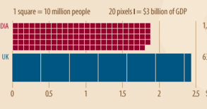
For our last assignment of the MOOC, Alberto Cairo decided to give us enough rope to hang ourselves: “do whatever you want”. I proceeded to swiftly spend half the allocated time deciding on a topic. Returning to aid, the subject of week 3, was a natural fit and I knew the data would be available. […]
MOOC Week 2: The politics of words
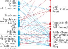
While I’m working on the assignment for weeks 5 and 6 of the MOOC, let’s have a look back at week 2. We were asked to provide a critique of a graph about the words used by speakers at the Republican and Democratic conventions for the 2012 election. As with most of what the New […]
MOOC Week 4: Unemployment in the US 1960-2012
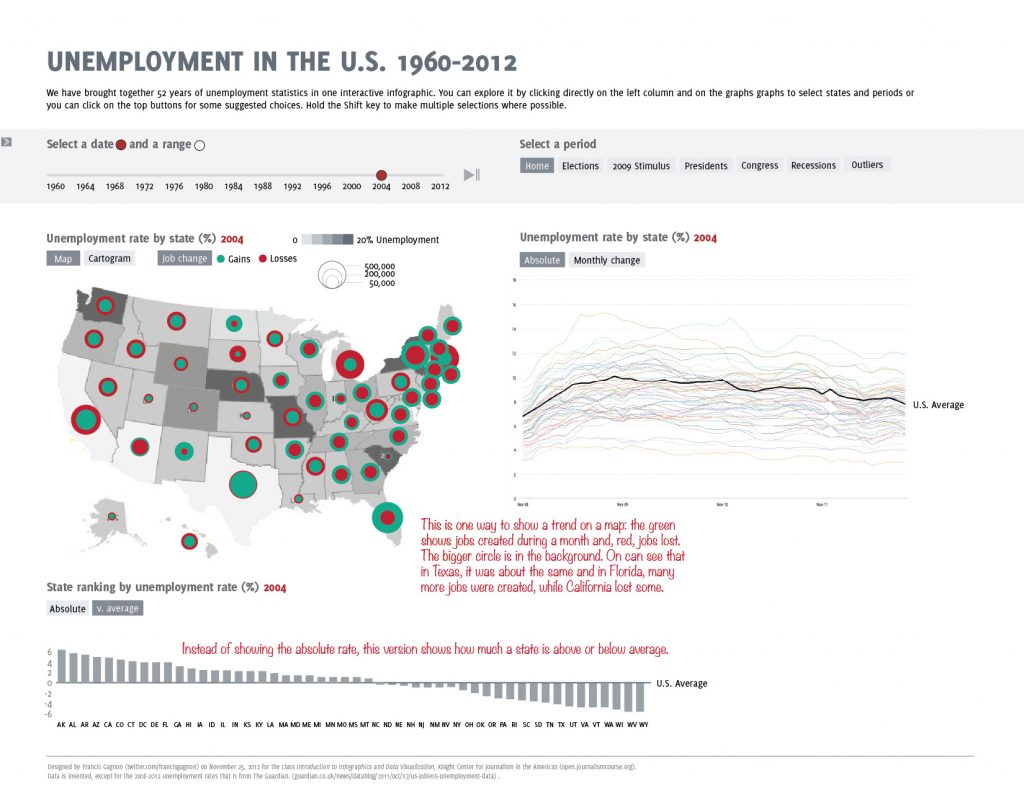
US unemployment data has been visualized over and over and over in the last year because of the election and recession. Not only is the topic important but the US Bureau of Labor makes the data easily available. It was not surprising that Alberto Cairo chose it for our week 4 exercise of the MOOC, […]
Week 3: Aid Transparency
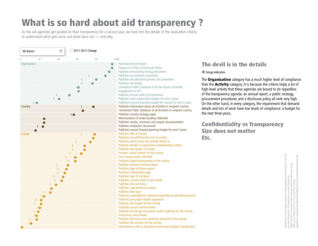
The third week’s assignment was right up my alley: aid transparency. It is even more disappointing then that I was not able to complete something worthy. The source data comes from the Transparency Index of Publish What You Fund and takes the form of a ranking of aid agencies according to their transparency score. I […]
All aboard the MOOC

When I first heard of the massive online open course on data visualization at the Knight Center of the University of Texas, it seemed the term had been invented for this class. I realized I was wrong when I saw the article in the New York Times: The Year of the MOOC and the Washington […]