US unemployment data has been visualized over and over and over in the last year because of the election and recession. Not only is the topic important but the US Bureau of Labor makes the data easily available. It was not surprising that Alberto Cairo chose it for our week 4 exercise of the MOOC, but it also meant that the bar was already set high. The data set, coming through the Guardian Data Blog, was comprehensive if not diversified.
My experience in the prior weeks led me to conclude that I should not spend too much time exploring the data and focus on executing a neat infographic. This turned out to be the wrong conclusion.
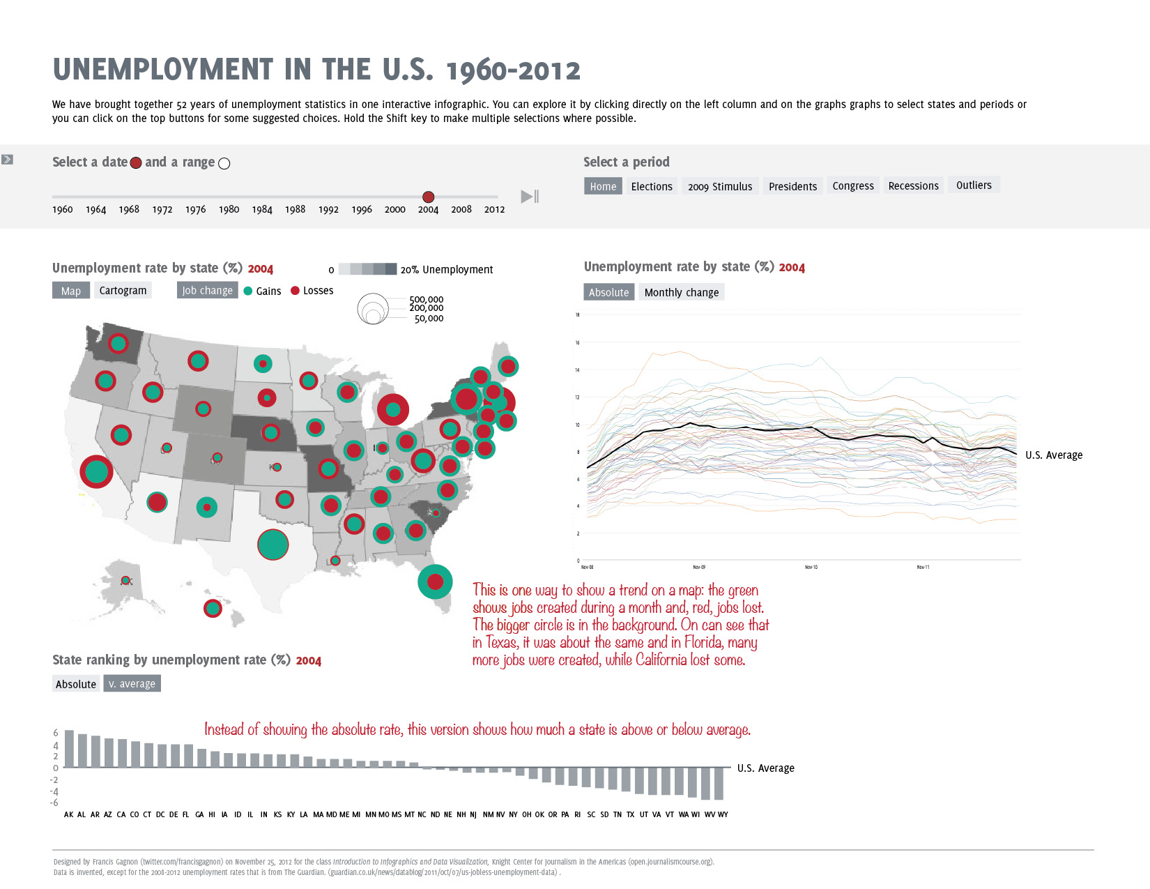
After a quick survey, the data seemed to lack in depth: providing four years of unemployment data immediately begs the question of what happened before those four years, especially since an economic meltdown had happened in the months prior. So I decided that my interactive graph would show 52 years of data (and it is available). I envisioned a basic visualization with multiple graphs that would allow the user to explore all the data and cut it in multiple ways – by state and by date. Here’s how it looks. I chose a grey color theme to keep the focus on the data-related colors, but it seems a bit dull although it might not be the colors as much as the fonts and design.
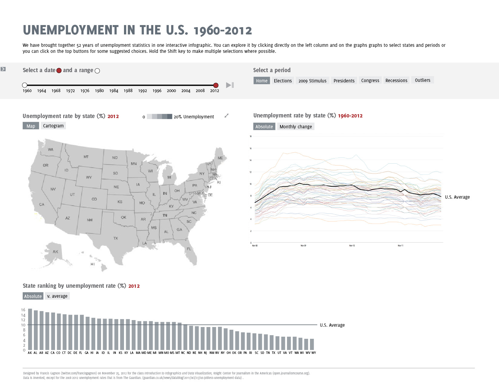
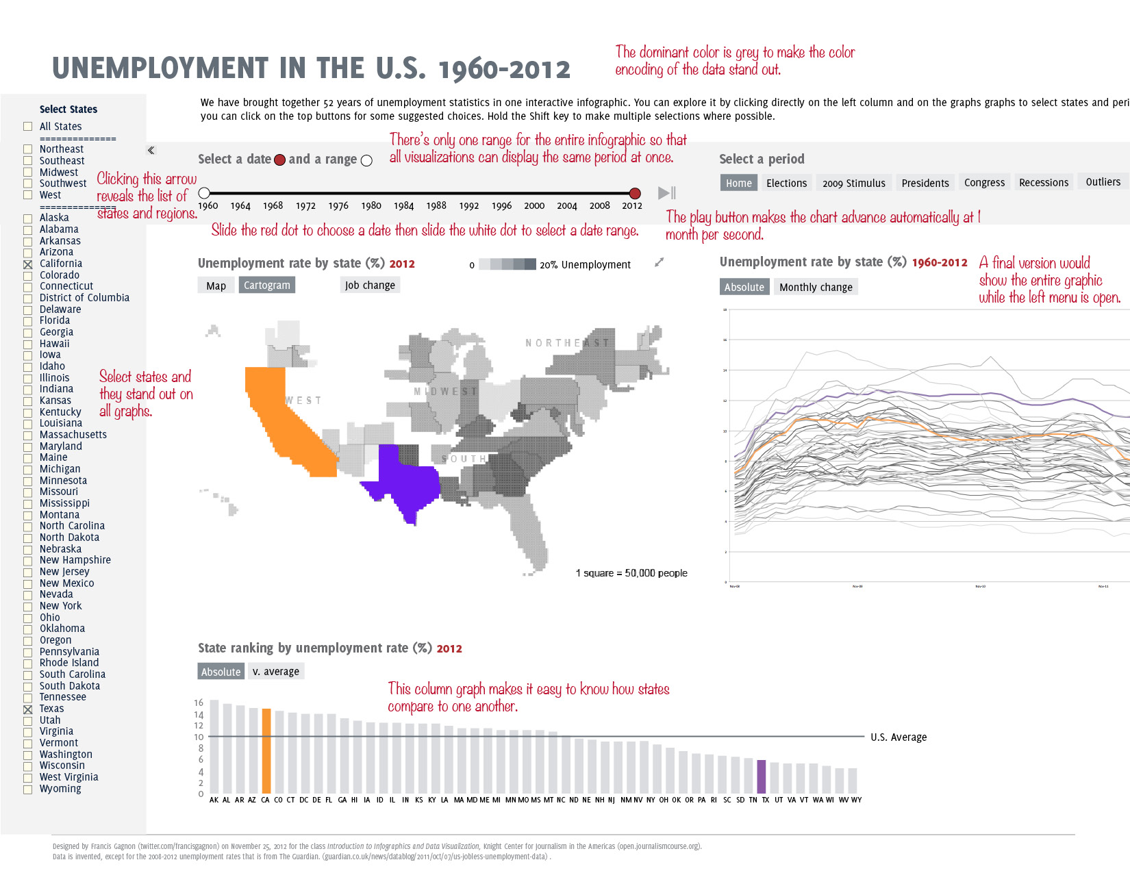
Data linked to population call for a cartogram because it is not based on the territory, contrarily to weather, agriculture and climate for instance. It seemed also natural to offer the option of comparing any set of states so I took my inspiration from the Google Data Explorer. The states are hidden in a drawer on the right and I’m not quite sure that the users would notice this.
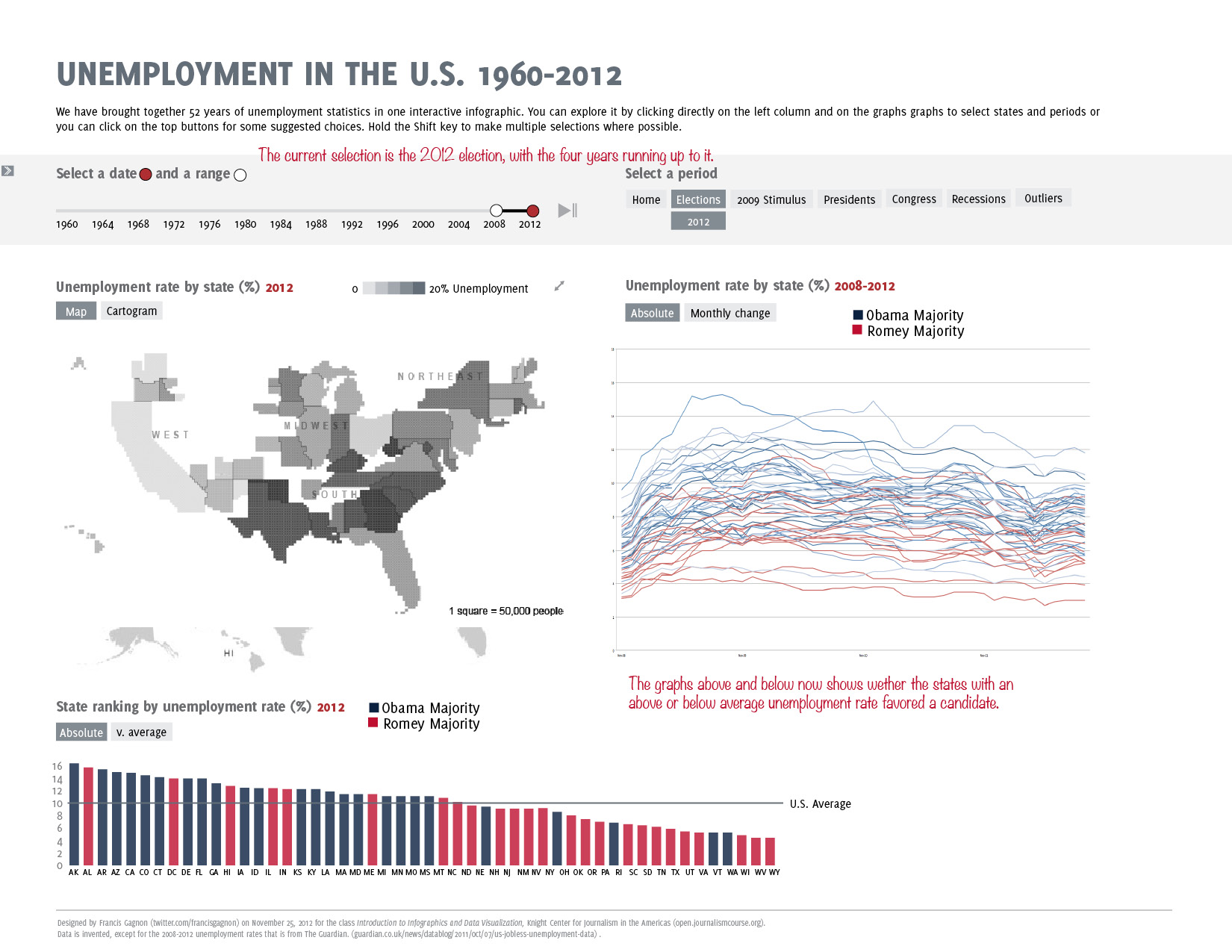
The closest I came from providing a narrative is in creating ready-made periods, on the top right. In the example below, the user has selected the results of the 2012 election and the lines, bars and states are colored according to each party. I’m not sure how it would really work on the map since I would end up with two color shading, making hard to compare levels of unemployment across parties.
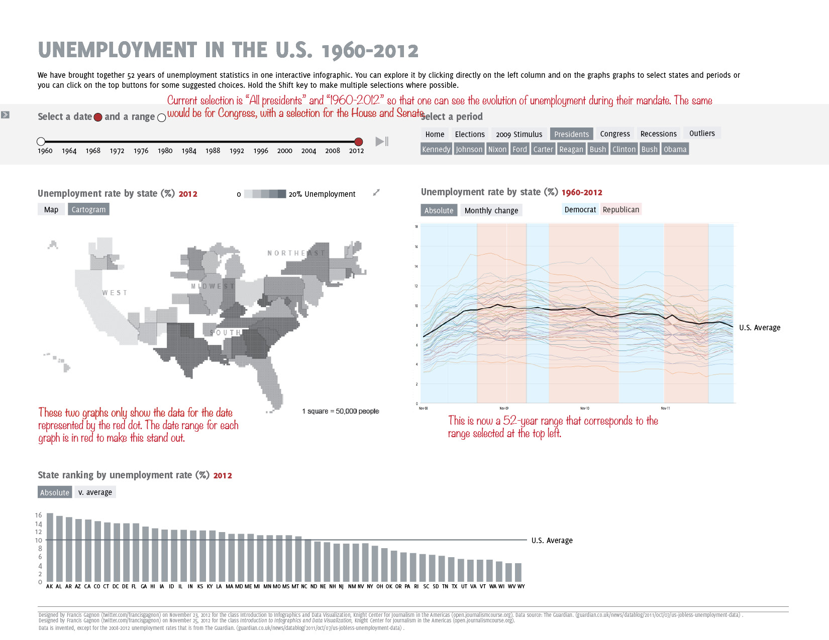
It seemed interesting to see the influence of the political system on the economic performance. It is unclear if presidents or even Congress can have an impact in the short run, but it is something that partisans constantly bring up. I thought that the users would like to know what happened while their party was in power.
Two variations in the next version. The most obvious is the circles representing jobs created and lost in each state. While circles are not very precise, I find it an interesting way to show four data points at once: losses, gains, differential and overall size. Also, it is unusual and eye-catching. Some users might need a minute to understand it, but it pays off.
The second variation is in the bottom graph where the data is now relative to the average national rate. It is less radically different than I expected. In fact, I’m not quite sure that it adds enough insight to justify the interactivity.
I went heavy on the interactivity and customization but I mostly missed the story. I did not look for hence I did not find one. My graph comes across as a source of raw data for people who are interested in economic data, but it does not draw in anyone new. Yet another lesson learned from this MOOC.

Francis Gagnon is an information designer and the founder of Voilà: (2013), a data visualization agency specialized in sustainable development.