For our last assignment of the MOOC, Alberto Cairo decided to give us enough rope to hang ourselves: “do whatever you want”. I proceeded to swiftly spend half the allocated time deciding on a topic. Returning to aid, the subject of week 3, was a natural fit and I knew the data would be available. After considering a few generic variations on the themes “where does aid come from” and “where does aid go”, I realized I needed an angle. The recent announcement by the UK that they are cutting their aid to India seemed intriguing enough and calling for some data. Then, I set as my goal to create one of these long, vertical infographic, but without resorting to some of the misleading and unhelpful techniques that plagues too may of them.
Let’s recap some of the lessons of the first four weeks.
- Look for a story in the data.
- Convey a narrative.
- Use good copy to draw the reader in.
- Combine several graphs.
- Present the same data in different ways.
- Use the appropriate graph for the data.
- Pick the color scheme carefully.
- Label and include legends.
Here is the result.
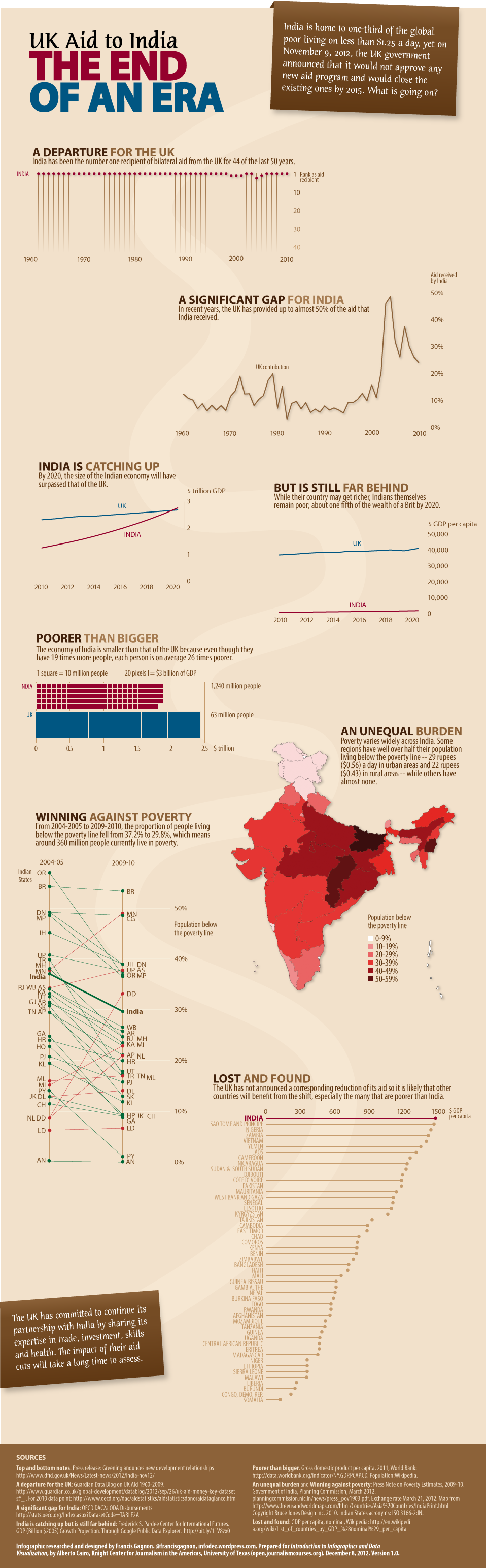
The story is that it is a big deal that the UK will cut its aid to India and there are many ways to understand the causes and consequences. It is a delicate topic and I did not want to turn the infographic into an editorial. It is rather designed to help the reader think about the issue and maybe open a few new perspectives, especially since some of the actors have strong opinions about this shift.
It starts by showing the reader how important this decision is: India is a top recipient of UK aid. Then it goes into a comparison of the two countries, to reflect on their relative economic health. This leads into an exploration of poverty in India and finally an overture towards the other potential beneficiaries of this change, showing this policy decision into a larger context. The sources are also an important aspect of an infographic and I wanted to provide them in a clear way to support the credibility of the data above.
This has taken much longer than anticipated. Dataviz nerds, look for a making-of in the coming days.
Francis Gagnon is an information designer and the founder of Voilà: (2013), a data visualization agency specialized in sustainable development.