While I’m working on the assignment for weeks 5 and 6 of the MOOC, let’s have a look back at week 2. We were asked to provide a critique of a graph about the words used by speakers at the Republican and Democratic conventions for the 2012 election. As with most of what the New York Times graphic department produces, it is outstanding although this one is more playful than usual, which might be why Cairo asked us to review it.
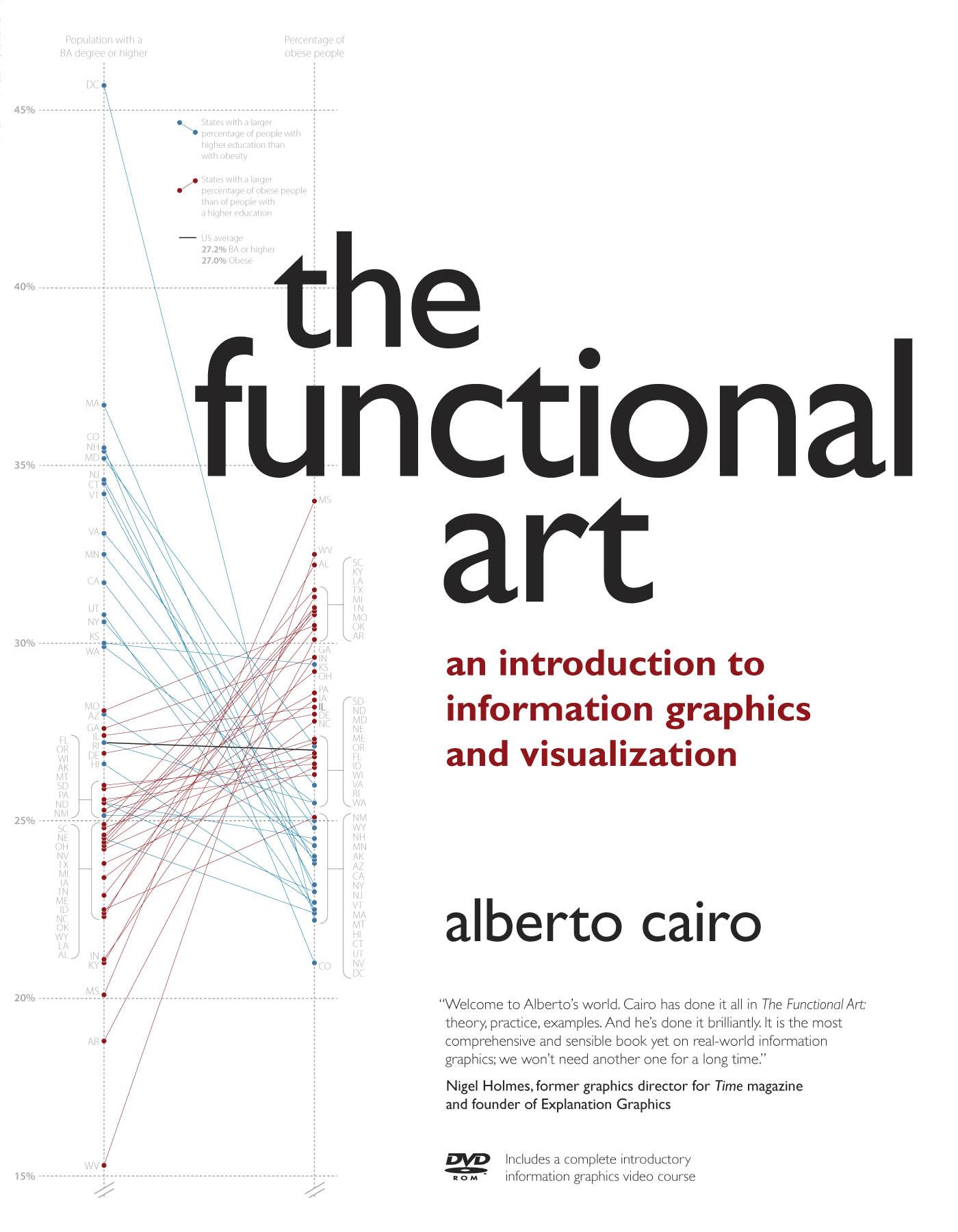
Edward Tufte recommends to steal a good design instead of inventing an inferior one so for my attempt I have copied the slopegraph from the cover of The Functional Art, the book of our professor, Alberto Cairo. Bar charts seemed the natural solution, but I wanted to go beyond my comfort zone and see whether some insights could be gained by a more unusual display of the information. It took me around four hours to produce the following in InDesign.
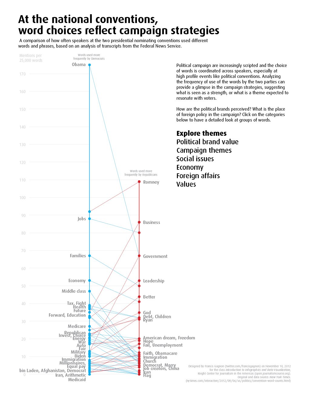
I had observed in the data that the word Obama was an outlier, something not so obvious on the NYT graph and I wanted to make it stand out. I cut out the top of the Republican axis on purpose to highlight the discrepancy. As for the wording, I used “frequency” several times because it seemed to be missing from the original and others than me thought that the numbers represented were absolute.
The infographic provides a few story headlines on the left. When clicked, they expand to show a short analysis and the graph adapts to highlight the relevant information. The picture below shows the result when a user clicks on “Political brand value”. Click on the image for a larger version where the text is visible.
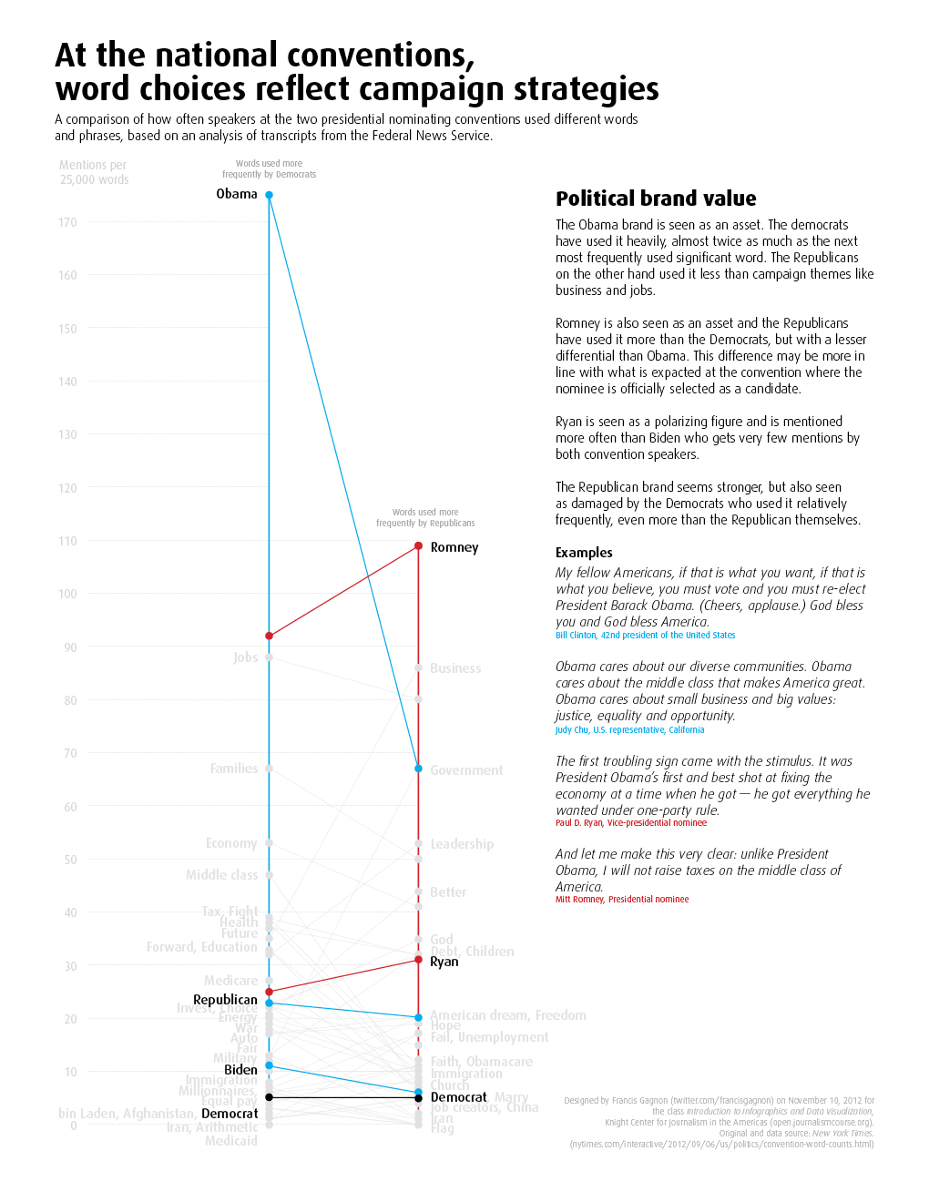
In the paragraph examples, I do not highlight the selected word on purpose, avoiding the temptation for the reader to start in the middle of a paragraph.
There are several problems with this graph and it is certainly not better than the original. The display of speech excerpts is now constrained by the design, the words at the bottom are bunched, and in certain cases I had to be careful to avoid unfortunate associations such as “bin laden, Democrat” or “China, Job creators”.
Most importantly, I’m no longer sure a slopegraph is an accurate tool to represent this data. In a discussion on Forbes about the graph makeover contest, Joe Mako proposed a slopegraph that just doesn’t seem right to me. Like another commenter, I see a continuum between the two sides. In my previous post, I blamed it on the sparse data, but I wasn’t convinced. Joe kindly provided references about slopegraphs and they shed some light on the issue. Charlie Park quotes Edward Tufte: “Slopegraphs compare changes over time for a list of nouns located on an ordinal or interval scale.” Then again, Cairo’s own graph is not a time series and it works. Why? I think because it is a multivariate analysis. The Wikipedia entry for parallel coordinates (slopegraph-looking) suggests that they are meant for such purpose, like scatter plots. This graph is not a multivariate analysis nor a time series. Was it wrong to even use a slopegraph?

Francis Gagnon is an information designer and the founder of Voilà: (2013), a data visualization agency specialized in sustainable development.