Minami Funakoshi | Graphics and development
Sam Granados | Illustrations
Jon McClure and Sara Ledwith | Editing
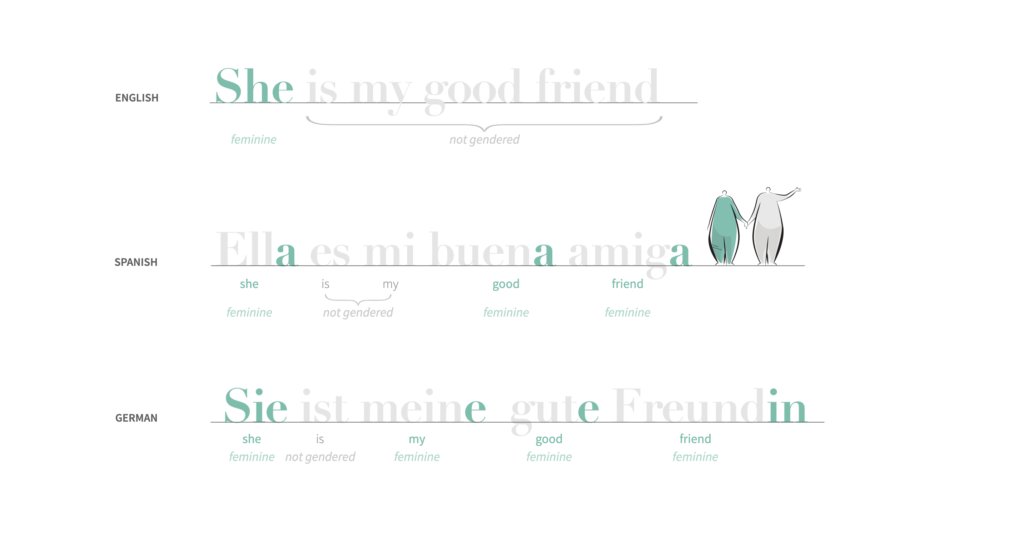
 Estelle says: “How do we talk about ourselves when the words don’t exist to name the gender we ascribe to ourselves? This poetic and beautiful scrollytelling shows how language can be problematic for people whose gender does not fit into the rigid binarity of masculine/feminine.”
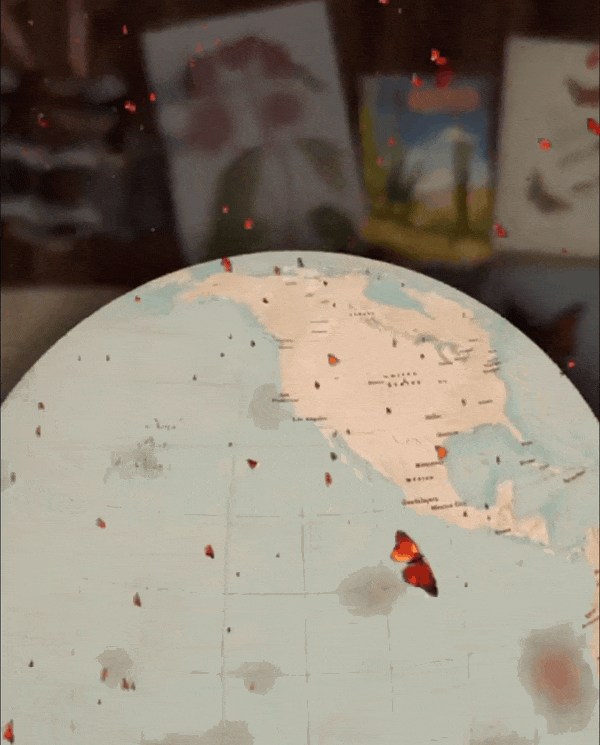
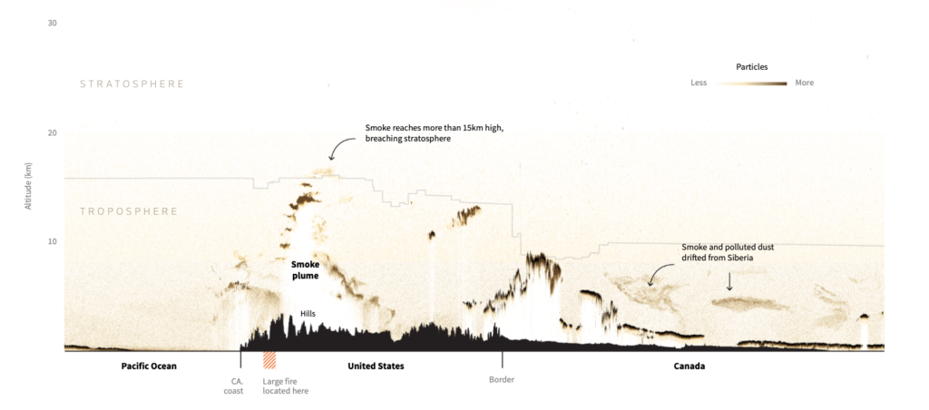
Western Monarch Butterfly Population Decline
Dipika Kadaba
Celia says: “No need to run the animation twice to get the gist and the sense of solitude of the two remaining butterflies in 2020. They are not dots but monarchs flying in the vastness of the California coastline. It’s beautiful and it goes straight to the heart.”
Data Beyond Vision
Rebecca Sutton Koeser | Project Lead, 3D Modeling and Printing Lead
Gissoo Doroudian | Researcher and Prototyper, Weaving Lead
Nick Budak | Researcher and Prototyper, Origami Lead
Xinyi Li | Researcher and Prototyper, Kirigami Lead
Timour says: “As someone who struggles with certain senses, I am thrilled to see the field of information design continuously experiment with new mediums that can bring clarity and insight in clever and elegant ways.”

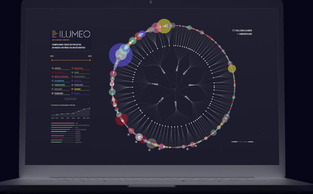
Ilumeo Projetos
Flávia Marinho | Lead infovis designer
Otávio Burin | Lead infovis designer
Ariel Tonglet | Web developer
Victor Tourais | Assistant Designer
Marie-Blanche says: “In this beautiful visualization, Datadot Estudio has compiled all the projects carried out by the Iluméo company since its inception in 2012. This achievement represents a tour de force on the part of the studio for several reasons. The amount of information and its complexity are simplified through the use of a clear graphic which takes the form of a hyperbolic tree. As for the interactivity, it allows us to enter in depth in the information. Finally, the aesthetics developed are engaging for an enriching user experience.”
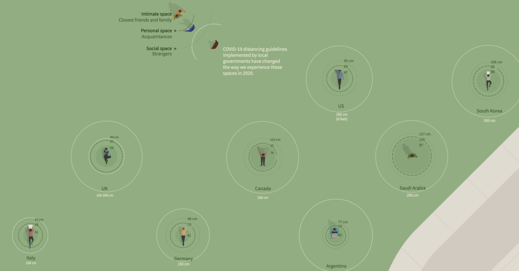
New normal: How far is safe enough?
Samuel Granados
Jon McClure, Tiffany Wu, and Simon Scarr | Editing
Maryanne Murray | Additional work
Patricia says: “As someone who has trouble imagining things in 3-D, I really appreciated how this piece used visualization and illustration to explain COVID-19 in physical spaces in a clear and tangible way. It covers complex topics like risk, cultural contexts, and public health knowledge, all while keeping it approachable, relatable– and beautiful, of course! It’s still very relevant today.”
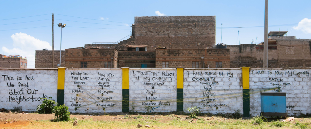
Life under curfew
Stephen Kinuthia Mwangi
Antony Adoyo
Happi Olal
Richie Uchenna | Data analyst
Frenny Jowi | Journalist
Surasti Puri | Designer
Evelina Judeikyte
Francis says: “This project has it all. There is a social cause, there is wide community engagement and impact, the parallel coordinates visual is both expert level and accessible, it has an interactive website, pictures and videos, and it’s in Kenya.”
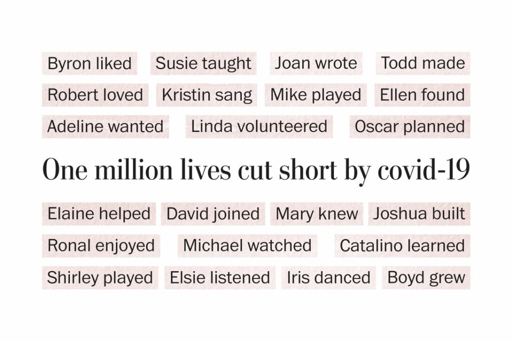
Cut short
Alyssa Fowers and Leslie Shapiro | Reporting
Kate Rabinowitz and Ann Gerhart | Editing
Frances Moody | Copyediting
Julian says: “This project communicates effectively the human cost of Covid-19, driving home the loss and sadness caused by each death.Visualizing the human cost of disasters is difficult. This project showcases that cost and highlights the loss while remaining respectful.“
Noémie Fortin-Brunet is a coordinator for Voilà:, an information design studio specialized in sustainable development.