After a decade of existence, Voilà: has had many adventures and witnessed encounters that have helped build its story. At the heart of our daily life in the company, it’s also the projects that we deliver that stimulate and challenge us. We’ve chosen ten of them for their outstanding role; make yourself comfortable, as we present them to you below ☕
1. First dollar, first honour
Incongruous as it may seem, the story of Voilà: begins with the layout of a children’s book. The check is addressed to “Voilà design d’information” and Francis Gagnon’s knees are shaking. Well, fairy tales didn’t turn out to be our specialty after all, so Voilà:’s real first project was… teaching.
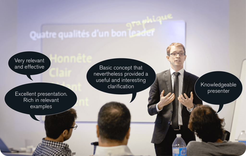
In 2013, Francis wore his best tie to train participants in a program at the Institut de Leadership en Gestion in data visualization. It’s a success, the feedback is very positive. His Four qualities of a good graph course is still, as of today, the most popular one.
2. The snowball effect
Two years later, the publication of a report gave Voilà: unprecedented visibility that would pay off over several years.
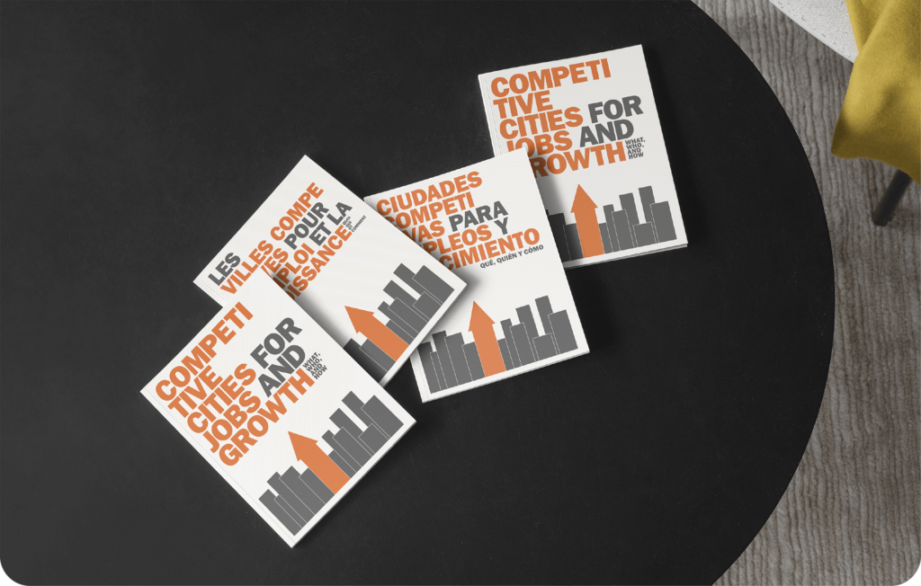
In early 2015, the World Bank Group’s Urban Development division asked Francis to visualize and do the layout of a report encouraging cities to develop their economic competitiveness in a sustainable way. The document will be distributed in three languages—English, Spanish and French—and will serve as an analytical framework for several subsequent projects. A bond of trust is established, and the collaboration with this division of the Bank will result in a dozen new reports entrusted to Voilà:. The latest, Thriving, was presented at COP27 on climate change.
3. Voilà: from 1 to 3
On a spring morning in 2019 (or thinking in the shower, the myth is unclear), Francis decides that it’s time to create a team. Perfect timing: an interesting project has just appeared in his inbox, and the need for reinforcements is felt.
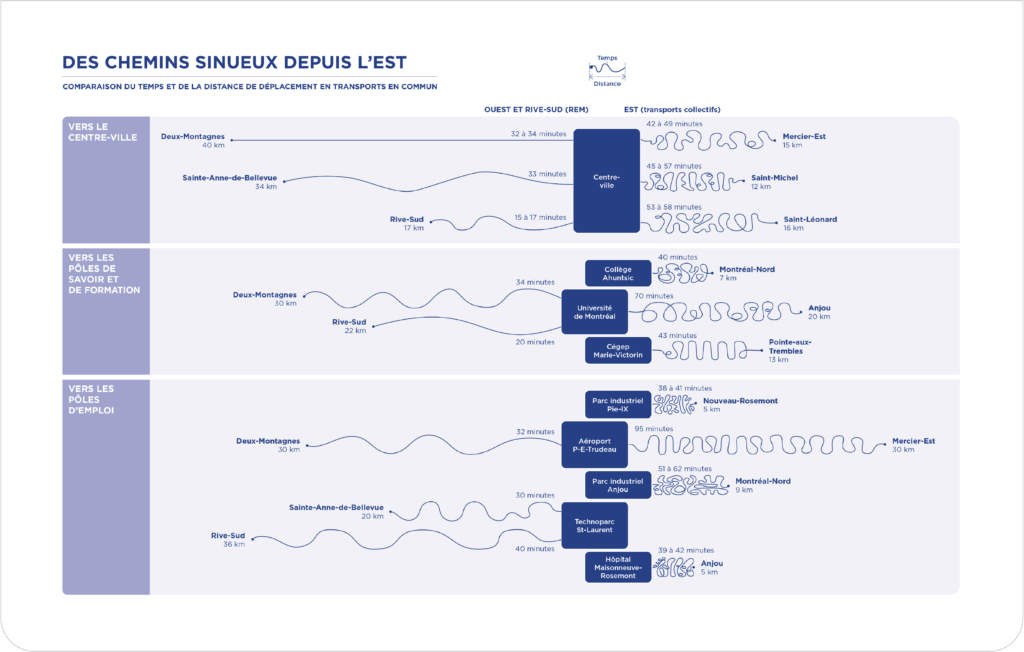
His first two hires began in August. Marie and I, graphic designers, joined the team and helped Francis with the layout of a report on the economic development in the East End of Montreal created by the CCEM. It was an uncomfortable start, as we had to learn to work together and create the agency’s very first team processes… But from this report was born a visualization that is still very popular today: a graph comparing commuting times between the East and West of Montreal towards common hubs.
4. All roads lead to success
Have you ever developed an interactive web page in PowerPoint? We have.
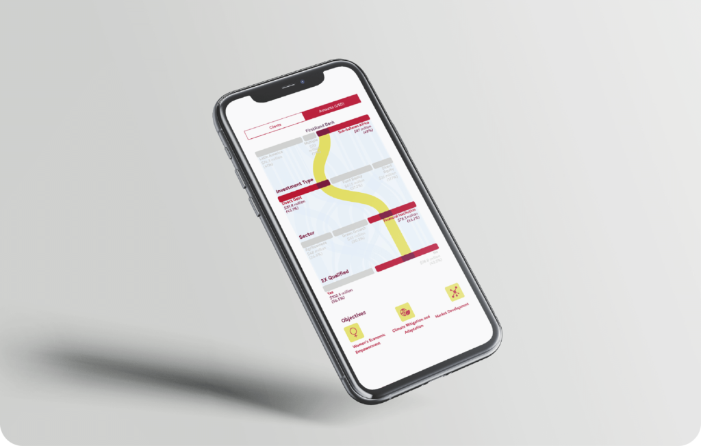
In 2020, FinDev Canada asked Voilà: to visualize its variety of projects in which they support their growth and sustainability. It was a dashboard that needed to be clarified and navigated by users. Our research had led us to the obvious conclusion: in the form of an alluvial graph, data comes to life. This is our first interactive project, and we created it with limited means: the concepts of navigation, animation and interactivity are developed from A to Z in PowerPoint (😬). Our former programmer, Olivia, took charge in programming them successfully.
5. A visit to COP15
May 2021 marks a new milestone for Voilà: with the design of our first flagship report by the World Bank Group.
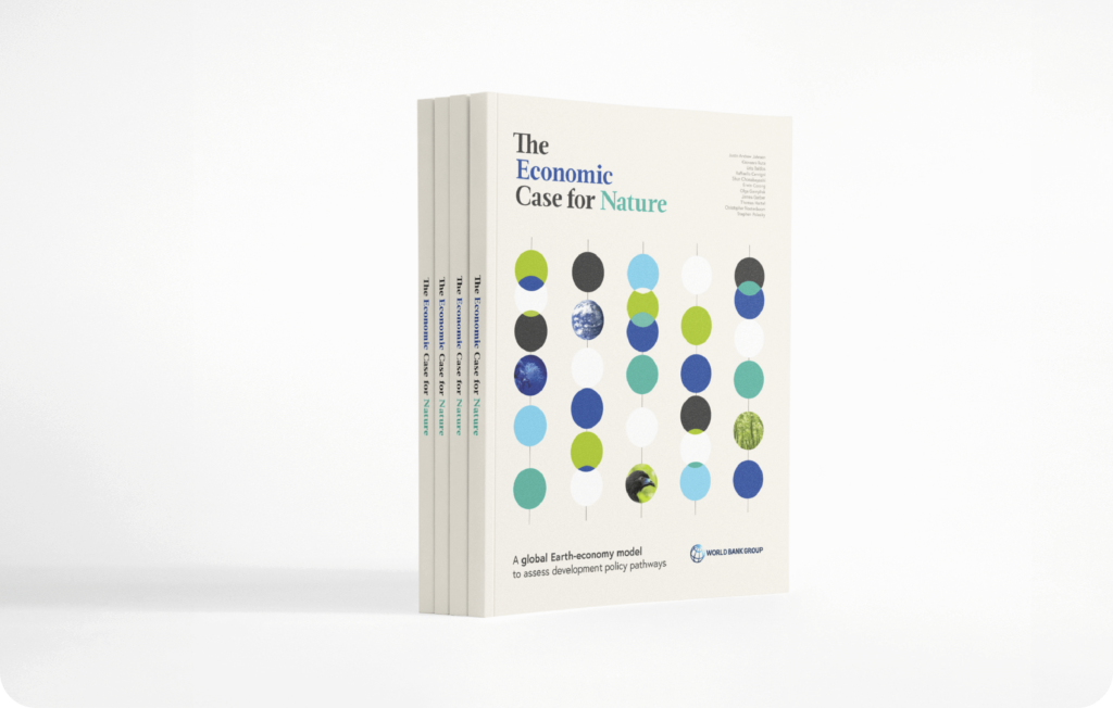
Flagship reports are more ambitious research projects that deal with global themes and are international in scope. In this case, the World Bank had just developed a new methodology for factoring the value of nature into economic models. This project was a real challenge for Timour, information designer, given the complexity of the data to be visualized. It was presented at COP15 on biodiversity.
6. ALL HANDS ON DECK!
We’ve been through several project marathons. But one of them remains at the top of the list: the one that mobilized all the team’s resources.
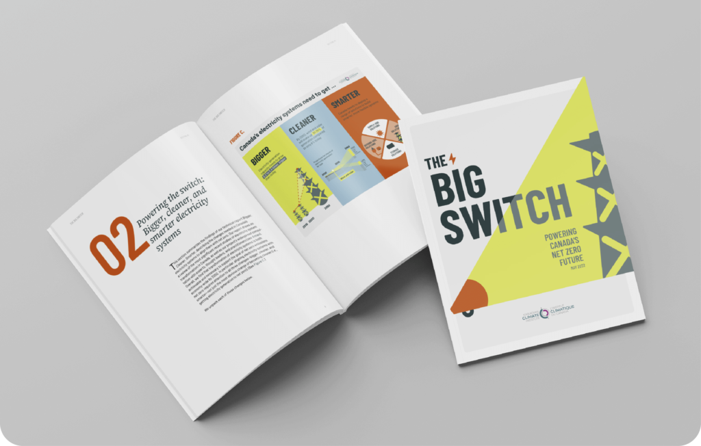
In 2022, the Climate Institute of Canada asked Voilà: to assist with the communication of its report on a new electricity policy in Canada. The mandate is ambitious and the pace is intense: the team designs in two languages—English and French—a summary report, two report covers, seventeen visualizations, four animations, a presentation, a web page mockup and an animated banner. At this point, Voilà: has eight members. The project is so big that everyone is fully mobilised to work hands-on.
7. Why sleep when you can work
While we’re mentioning marathons, let’s also write about the projects that sometimes keep us up late into the night to meet our deadlines.
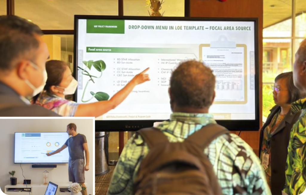
Such was the case with an interactive developed (despite ourselves) in PowerPoint for the GEF Secretariat, which required a lot of brain power to create an interactive navigation in over… 400 slides. On the day of the rendering, at 1am, the team was on Skype making final adjustments to the presentation. It turns out that Jonathan, our former project manager, has access to a TV in the right format at his sister’s house (yes, it wasn’t easy). We watch him test (wearing shorts in the middle of December) the live scaled deliverable, trying to manage the hazards of OneDrive synchronization, which has only one wish: to die.
8. Gold medallists
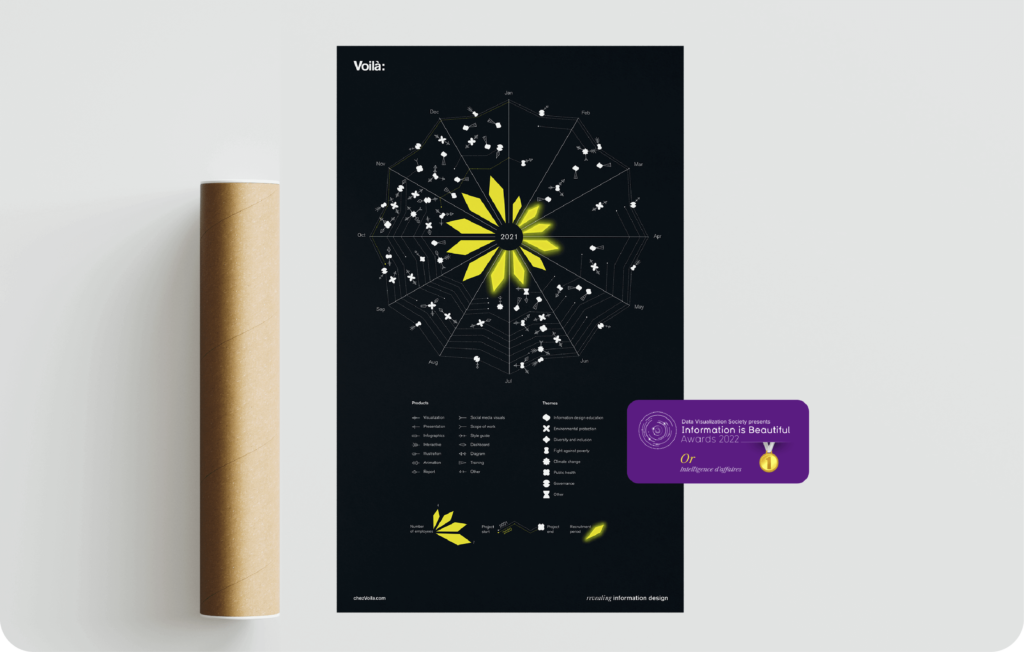
At the end of 2021, we sent to our customers and employees a greeting’s card visualizing our year in review. One year later, it wins a gold medal.
As the holiday season approaches, a brief lull in the activity allows the team to launch an original internal project: to visualize our projects during the year and our recruitment periods. Celia, graphic designer, took charge of developing the concept. Proud of the result, we submitted the project to the Information is Beautiful Awards, and the outcome is far from disappointing: we win the first prize in the Business Analytics category.
9. The most widely read issue at office
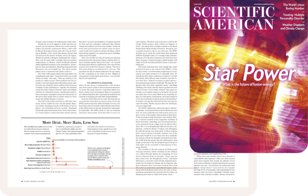
We were published in Scientific American. Is it really necessary to explain why this is a landmark project?
Ok, just a few lines. Beyond the pride we take in seeing our graphics in the pages of the famous magazine (they’re framed in Francis’ office, after all), this opportunity gave us an insight into the work processes involved in publishing. Working in pairs, Celia, pictured above, and Patricia, information designer, were able to create impactful visuals within the constraints of the project. The subject was a study of the influence of climate change on extreme weather events.
10. The icing candle on the cake
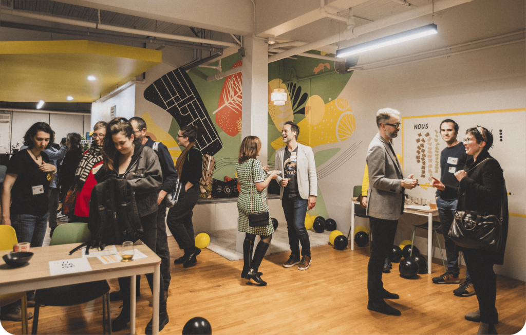
In October this year, we celebrated our 10th birthday surrounded by our customers, staff and friends. A very special celebration for a very special team.
2013-2023. Voilà: successfully completed its first decade by bringing together our network at our Mile-Ex office. A great opportunity to strengthen ties, create new ones, mix audiences and talk about data visualization. Although the cheese buffet was, in my opinion, THE key moment of the evening, we had a great time toasting with all the people who make Voilà: a great adventure to be part of.
Let’s take a moment to name them: thanks to Jessie, Mathieu, Julian, Noémie, Jonathan, Marie-Blanche, Celia, Patricia, Timour, Chloé, Olivia, Erica, Marie, I and, of course, Francis.
Estelle Villemin is a graphic designer and a scientific illustrator. Her role is to provide clear and aesthetic visual solutions that are tailored to the customer’s needs.
