For the first time in nine years of existence, we have submitted our projects to an awards competition. We sent six of them, covering the last three years, to the Information is Beautiful Awards, revived this year by the Data Visualization Society.
ALL SIX made it onto the longlist.
We were surprised and pleased, but not as much as when we heard the next news…
THREE of them made it on the shortlist.
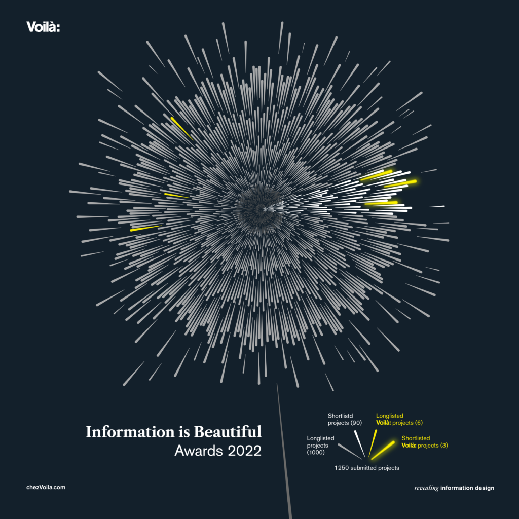
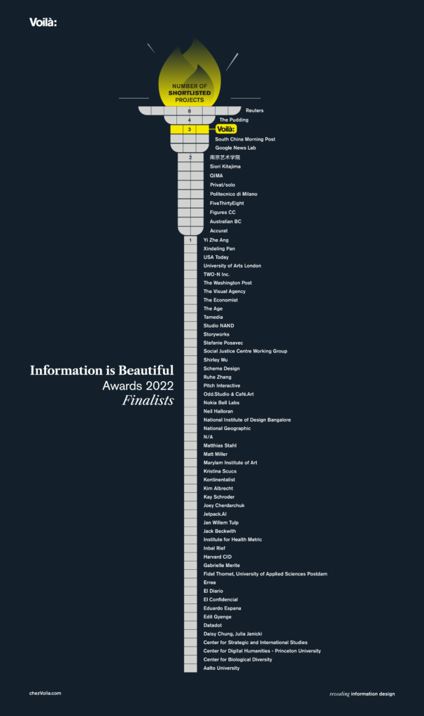
Out of 1250 submissions, only 90 projects are on the shortlist. We are elated to be represented three times in this select group. This places us in the top 3 of the organizations with the most nominations.
The next step is the ceremony in Washington DC on November 30th. Gold, silver and bronze medals will be distributed in each category. We will be attending and presenting one of the three projects to the dataviz community during the lightning talks.
Here are our three finalist projects:
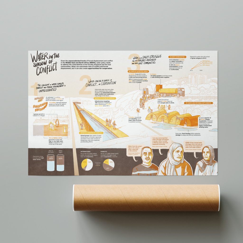
1. The misunderstood role of water in conflict
What’s started as a simple infographic request became an illustration interspersed with data visualization when it became clear that this topic had a strong human element.
Learn more
Complete story on our blog
Entry on the IIB website
Entry in our portfolio
Entry on Behance
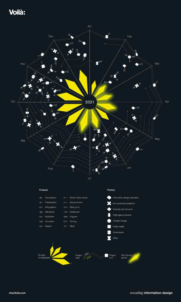
2. The star of our work
For the first time, we decided to share an overview of our work in 2022, with a focus on the themes of our projects, all related to sustainable development. It came out as something quite different from our usual client work.
Learn more
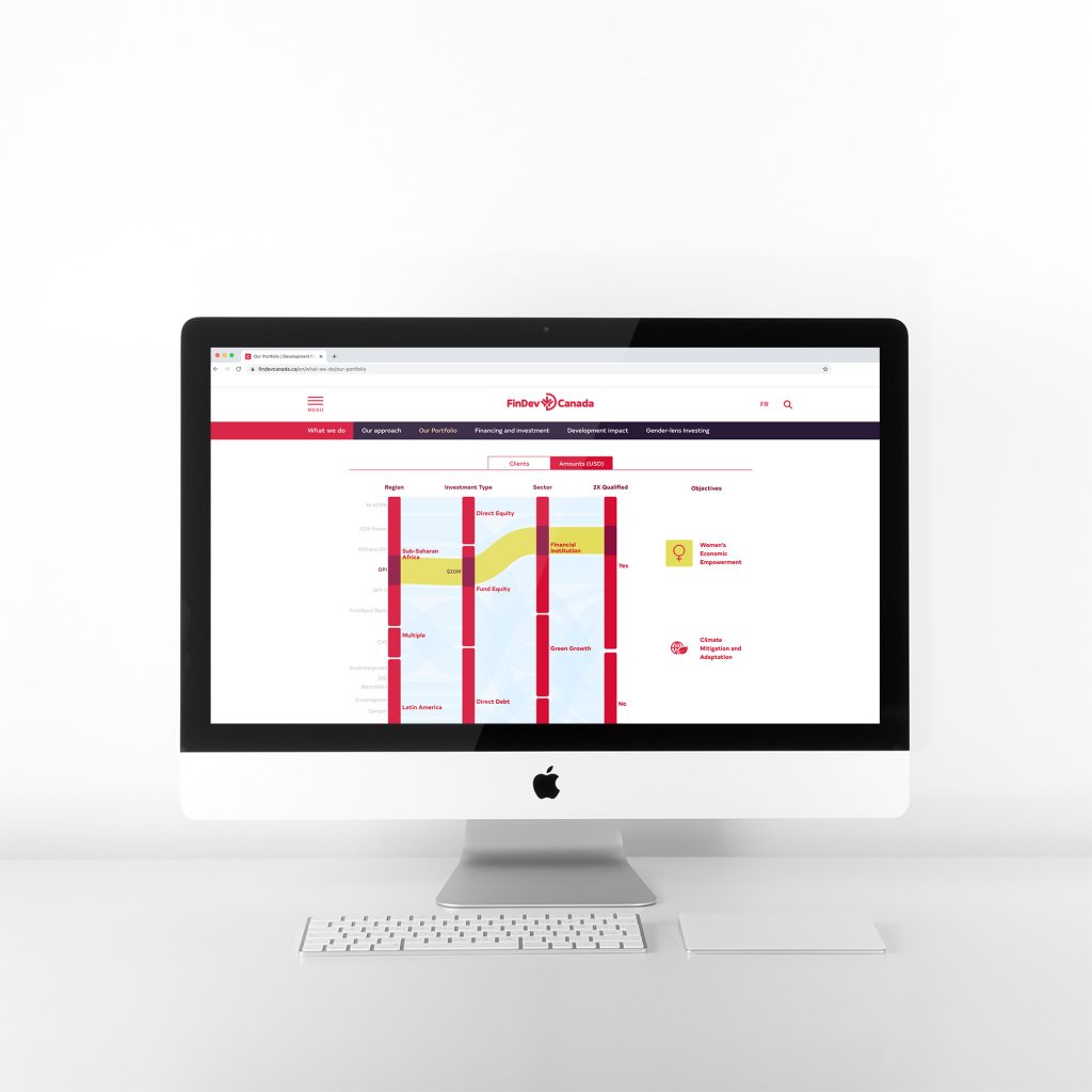
3. A portfolio of inclusive business
What if a dashboard didn’t look like a dashboard? This interactive portfolio has overview, details and filters, without any of the typical drop-downs and checkboxes.
Learn more
Entry on the IIB website
Entry in our portfolio
Entry on Behance
Blog post
We are also very proud of the three projects that are not finalists but made it onto the long list. Here they are.
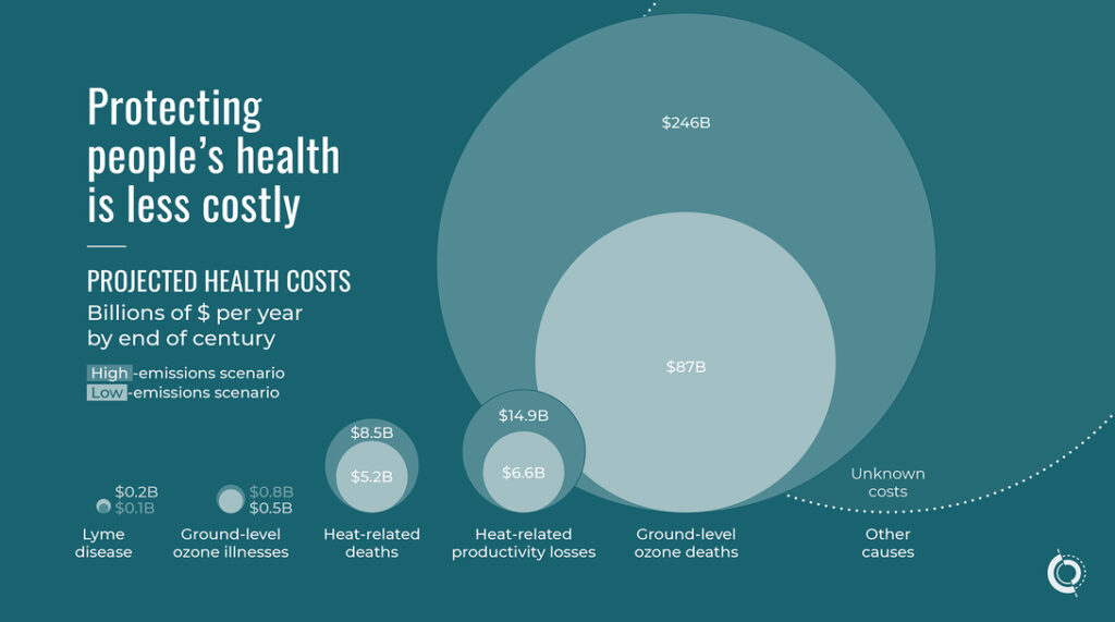
The health costs of climate change
Climate change will affect everyone, but not equally. Our client wanted to show how vulnerable people are at a higher risk. We build an interactive to show the principles at play and to show the numbers.
Learn more
Networking the start-ups
Our client studied the network of business start-ups in Tokyo and compared it to that of other cities. Then they passed on their analysis, report and graphs to us and asked us to clarify and improve them in any way we could. These beautiful network graphs, and more, came out of it.
Learn more
Entry on the IIB website
Entry on our portfolio
Entry on Behance
The transition to a low-carbon world
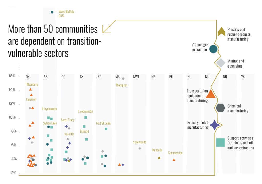
A greener world calls for a different economy. What does it look like in the Canadian context, who are the winners and losers, and how can we prepare for it?
Learn more
Entry on the IIB website
Entry in our portfolio
Entry on Behance
Getting this far exceeds all of our expectations. Because good work comes from good collaboration, we are grateful to each other and to our clients. Now let’s see what will happen on November 30th.
Francis Gagnon is an information designer and the founder of Voilà: (2013), a data visualization agency specialized in sustainable development.
