The latest project in our portfolio shows how an infographic request can lead to many places.
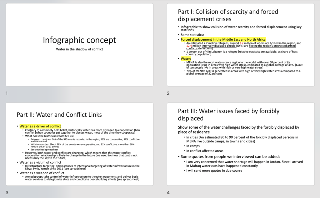
It started like most projects, with a report full of facts and figures about an important topic: the role of drinking water in conflict in the Middle East and North Africa.
The client came prepared with data and messages and it looked indeed like a few charts could fit the bill.
But upon a closer look, this data was about human tragedy and it wasn’t clear that a few computer-generated charts could quite convey the reality of these findings. Data is much more than numbers.
Estelle Villemin and I thought of approaching this with an illustration that would give a feel of the human experience. More precisely, we pitched the look and feel of a travel diary (something Estelle does when she travels and it’s wonderful! See an example below, on the right).
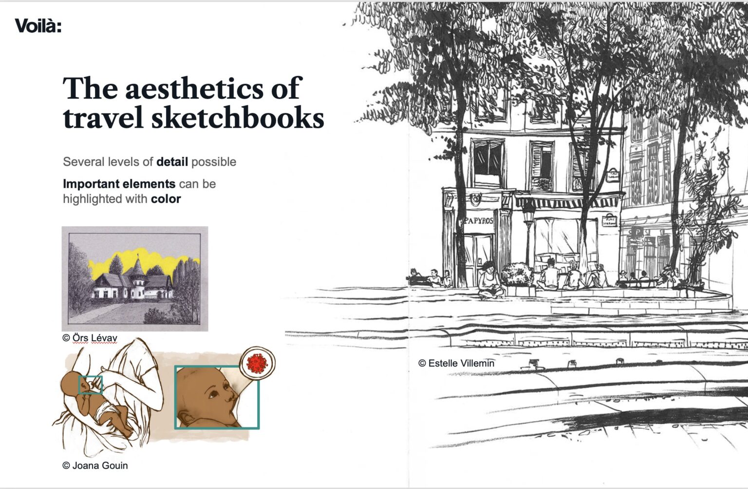
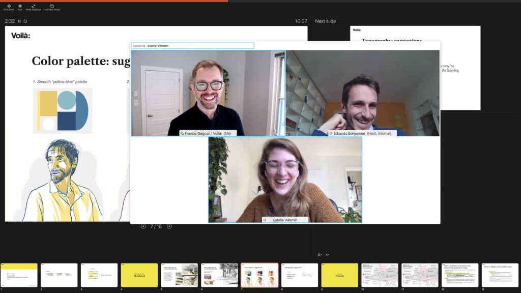
My favourite moment of the production came when we realized that the model we used to show the colour palette looked a lot like the client!
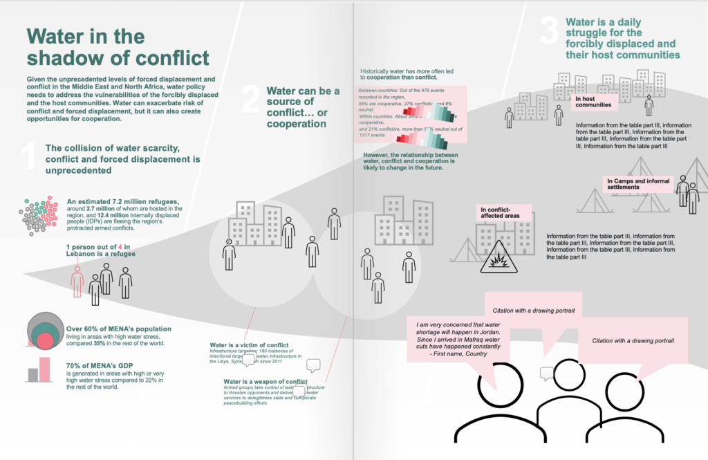
We even brought a sketch of the illustration to show how the messages would be distributed on the page, and to propose already a few ideas for approval.
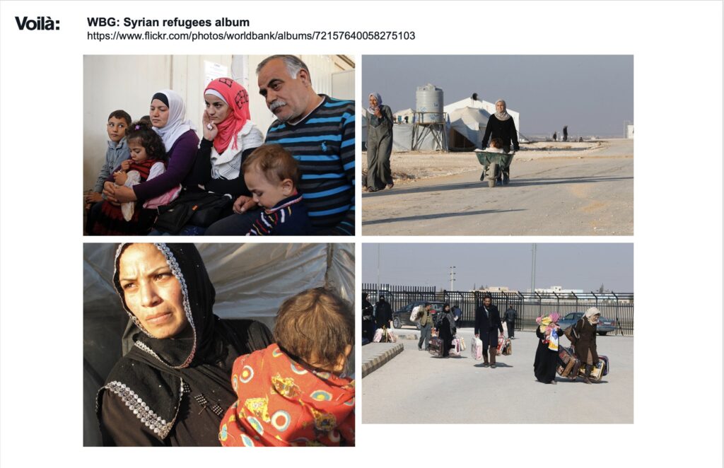
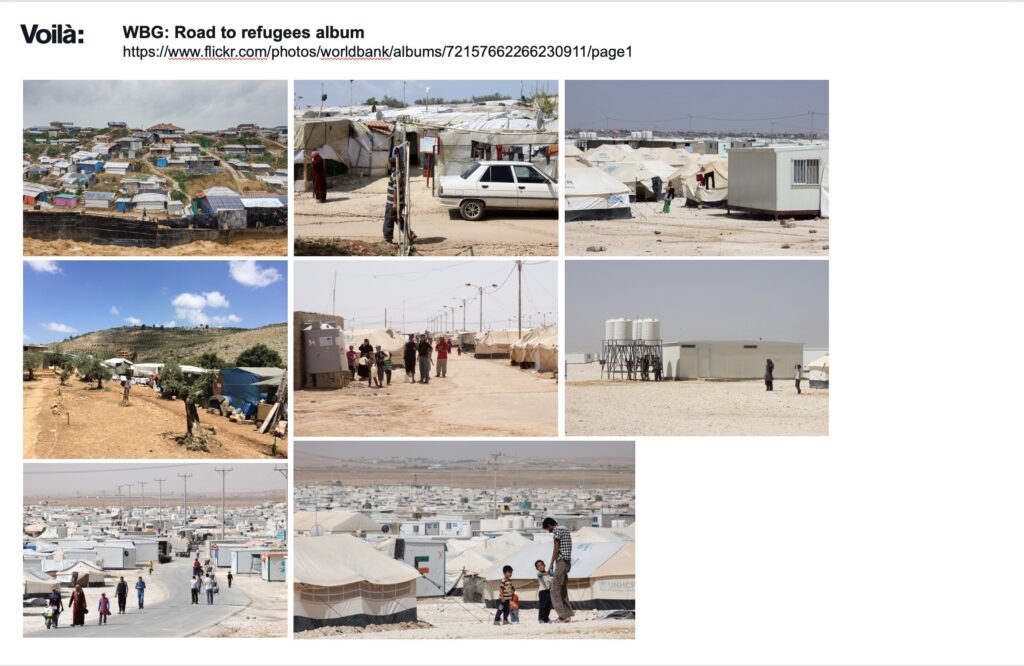
With the collaboration of the client, we did some research on the reality of refugees in the Middle East to make sure that our illustrations would be accurate and respectful of the people.
We then got to work, placing the text, thinking about visuals, composition, etc.
For the titles, we couldn’t find a font that worked for us, so Estelle ended up handwriting them herself.
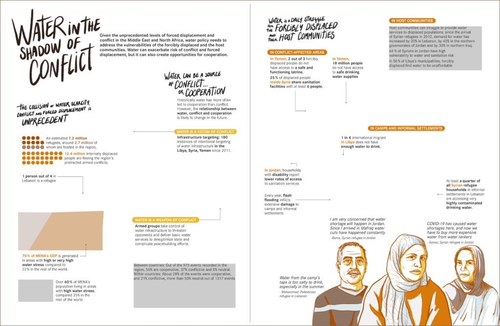
This is the first version that we shared with the client. I was surprised that Estelle created a unified scene as I had envisioned a collection of small ones. Her idea was much better.
The composition is there, the main elements too, but there’s a long way to balance the design for clarity.
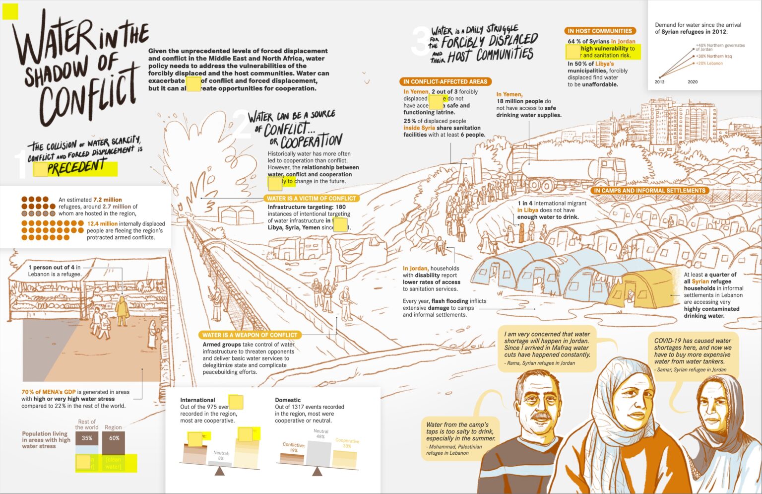
Here is a time-lapse of part of the illustration development…
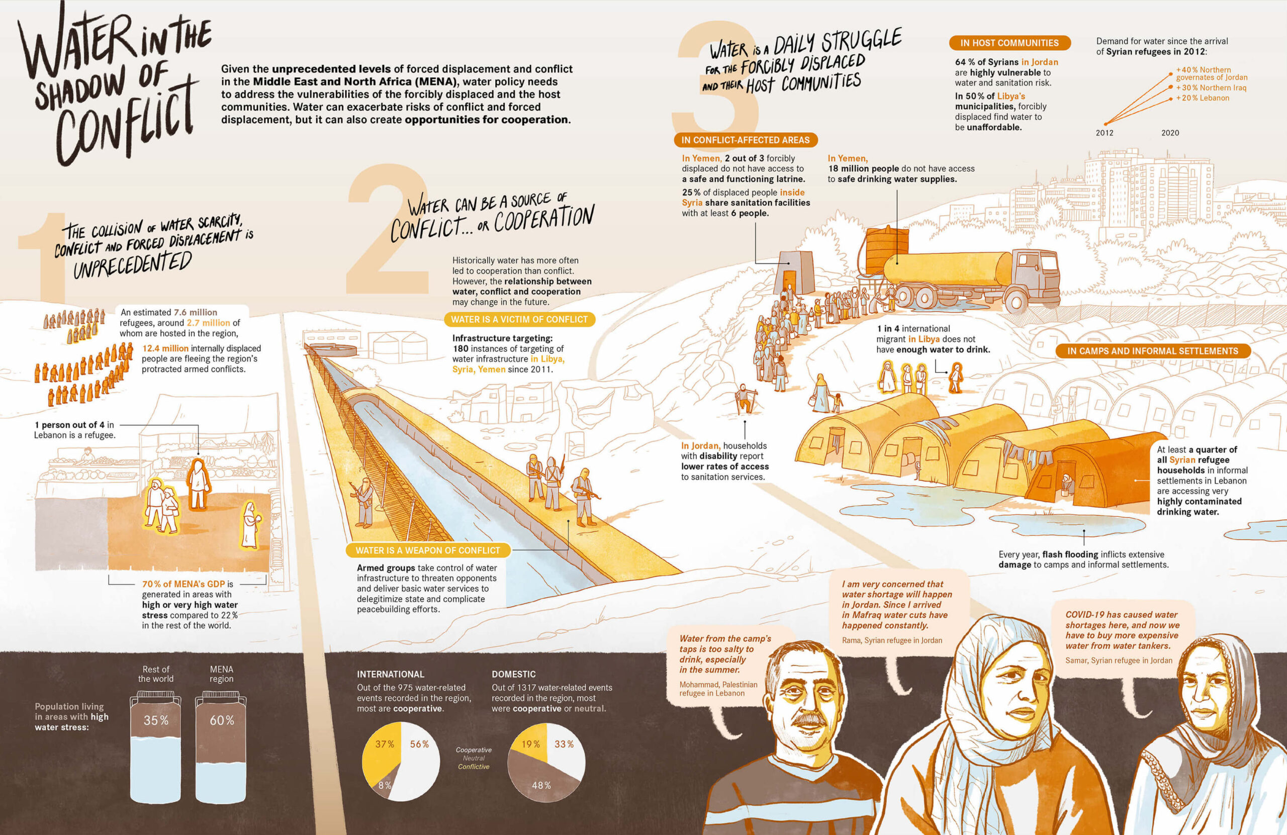
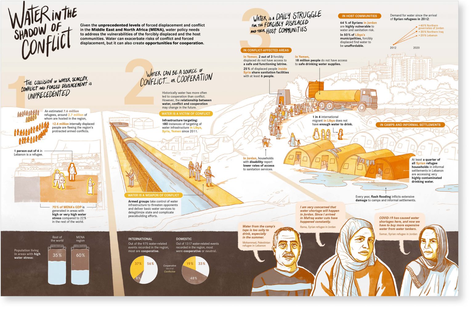
.. and here is the final version.
Most notable changes are the placement of the brown band at the bottom to highlight certain data points and the testimonies and the landscape that has receded to place more emphasis on the illustrated data points.
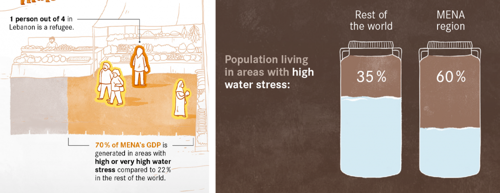
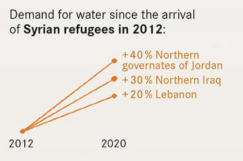
We used a mix of data illustration, like the people who represent “1 in 4” but also integrated graphs, like these water tanks reporting stats about water stress.
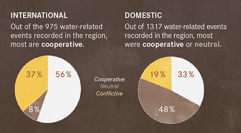
Sometimes, we also used normal charts, because we didn’t want it to become too gimmicky either.
You can now see the project in all its glory in our portfolio.
This is a topic impacting the lives of millions of vulnerable people, so we hope the important work by the World Bank will have a wide impact.
Francis Gagnon is an information designer and the founder of Voilà: (2013), a data visualization agency specialized in sustainable development.
