A portfolio of inclusive businesses for a sustainable future
FinDev Canada opened in 2018 with the goal of supporting the growth and sustainability of businesses in developing markets. After only two years of operations, they were ready to present their portfolio of projects to the world.
FinDev Canada therefore asked us to develop a visualization with a double objective: to inform the public of the nature of the projects in progress and to serve as a dashboard for their employees.
One of the challenges was therefore to make the visual sufficiently attractive to a large audience while being sufficiently technical to answer specific questions from staff on the distribution of projects.
Click here to go directly to the interactive visualization.
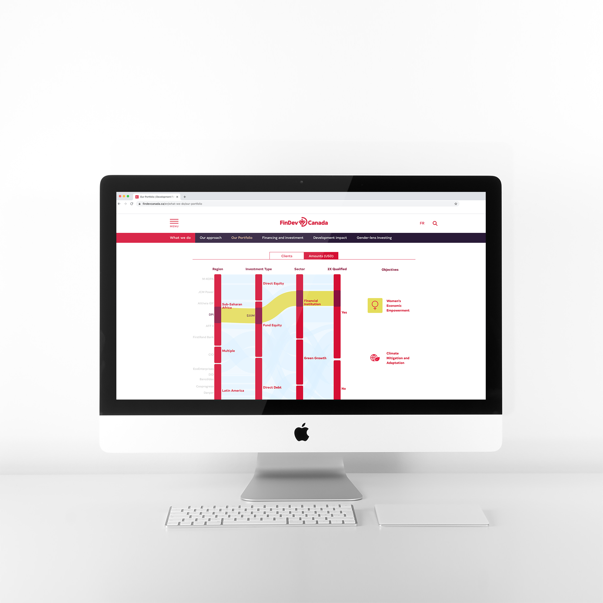
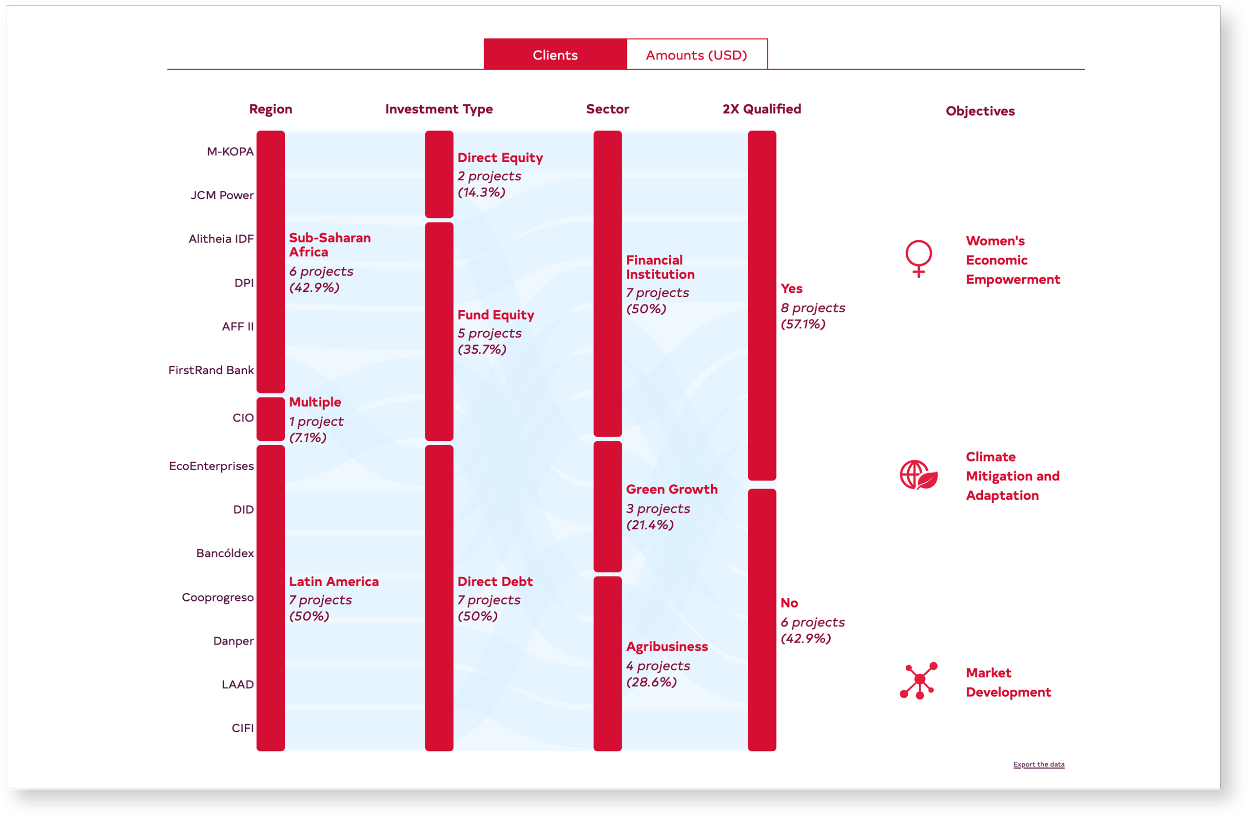
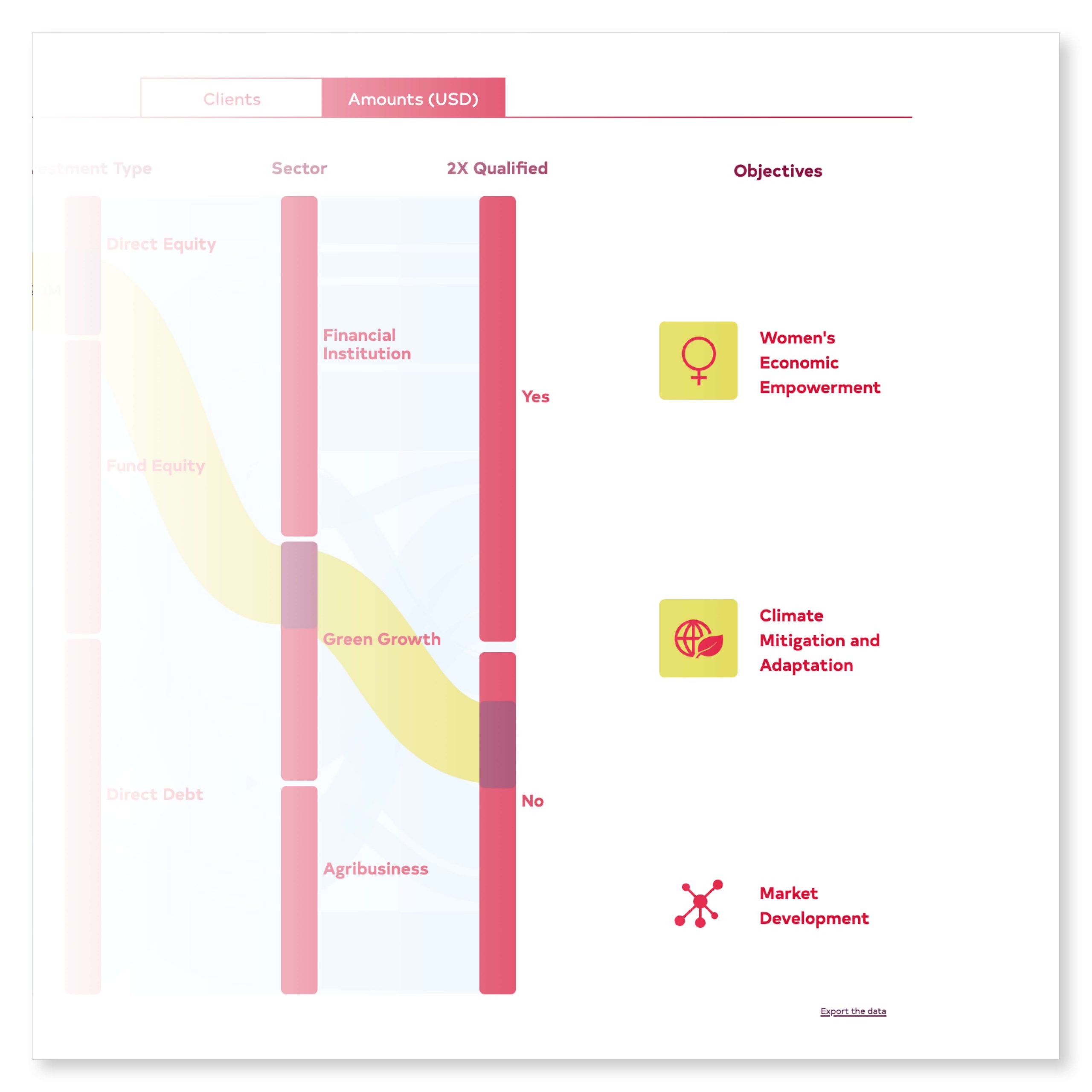
The choice of an alluvial
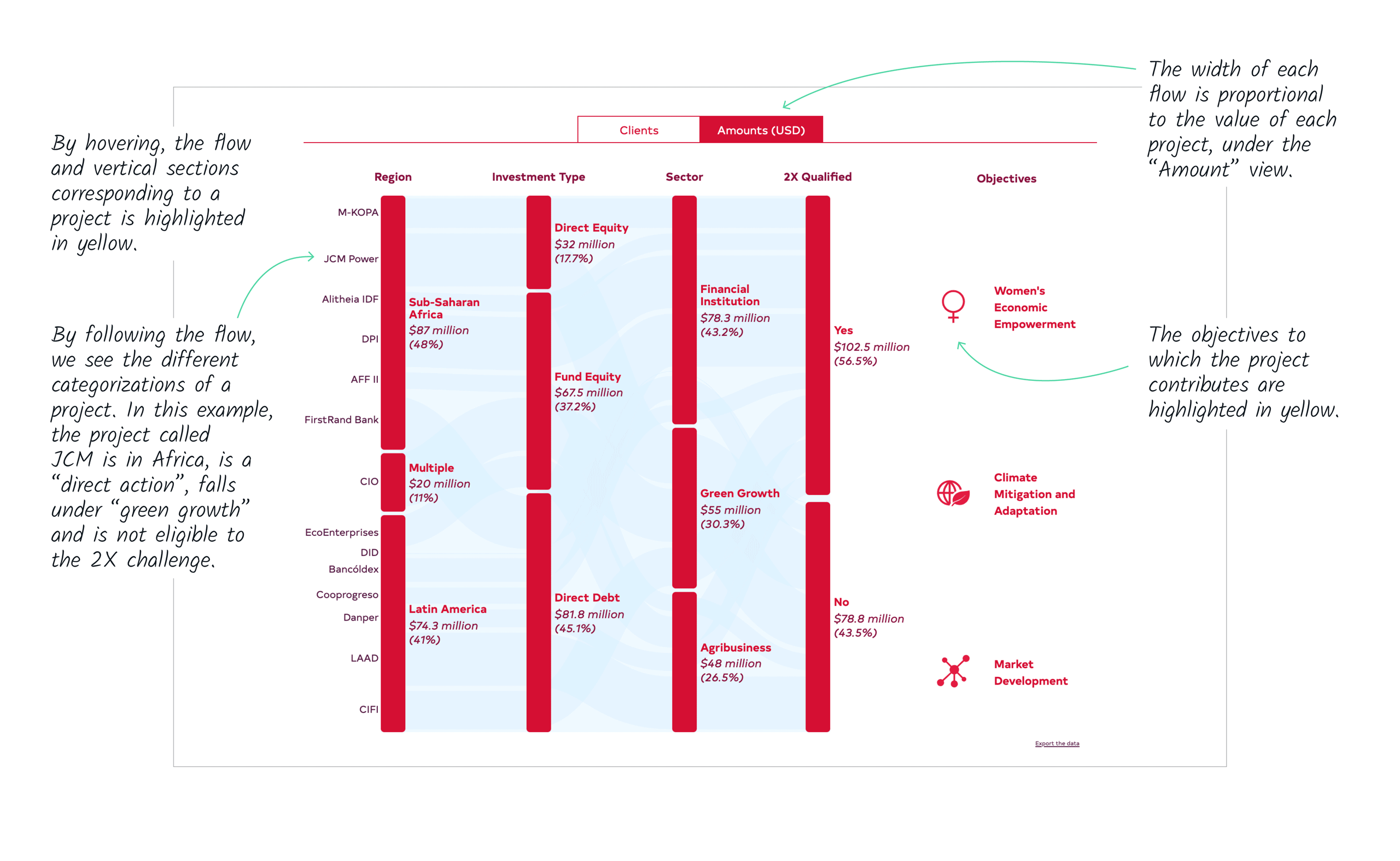
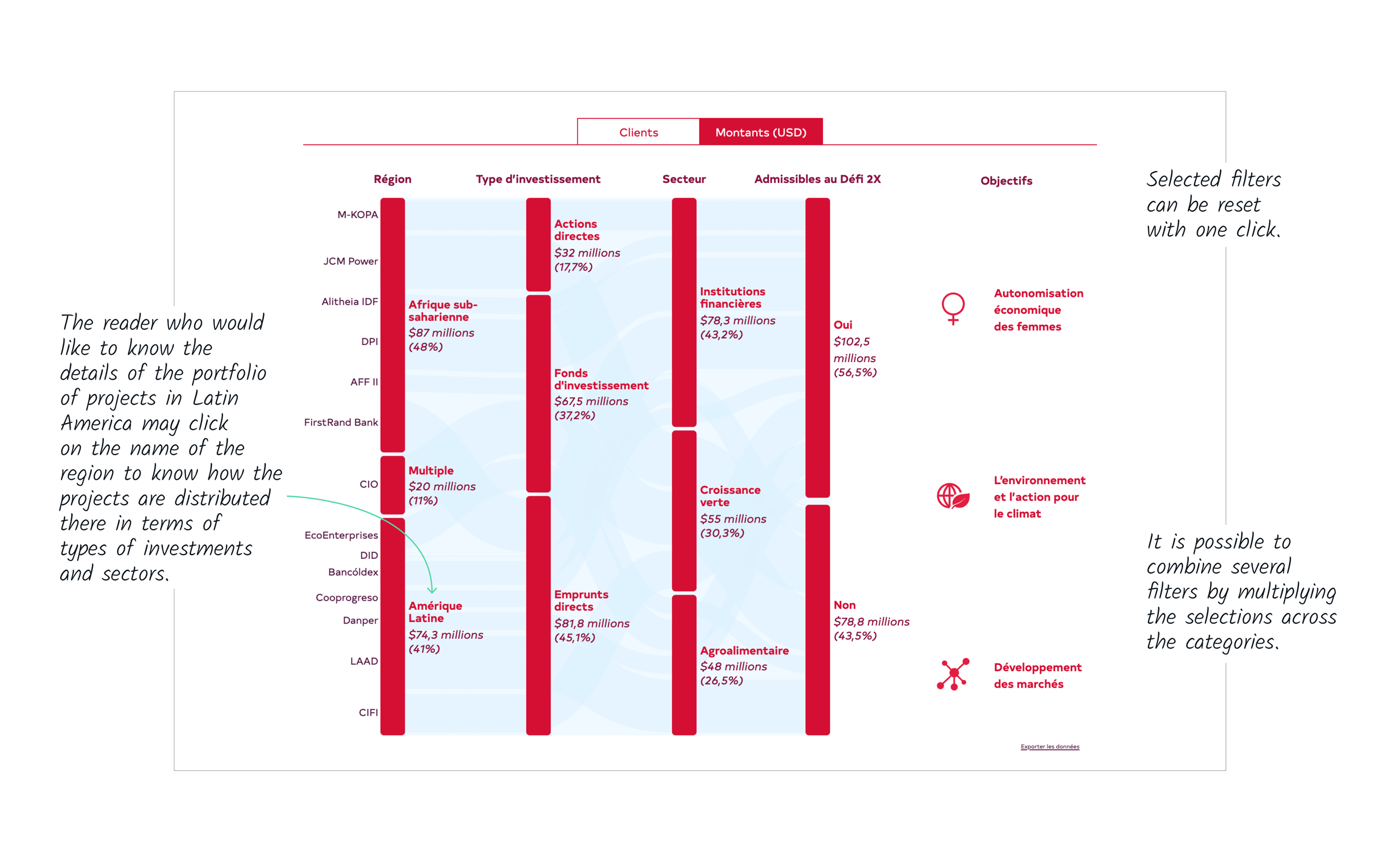
An alluvial chart presents the different distributions of the same variable. In this case, the variable is the financial value (or number) of projects, as distributed across regions, investment types, sectors and 2X eligibility.
Each column reveals a proportional distribution of projects between the categories.
Before
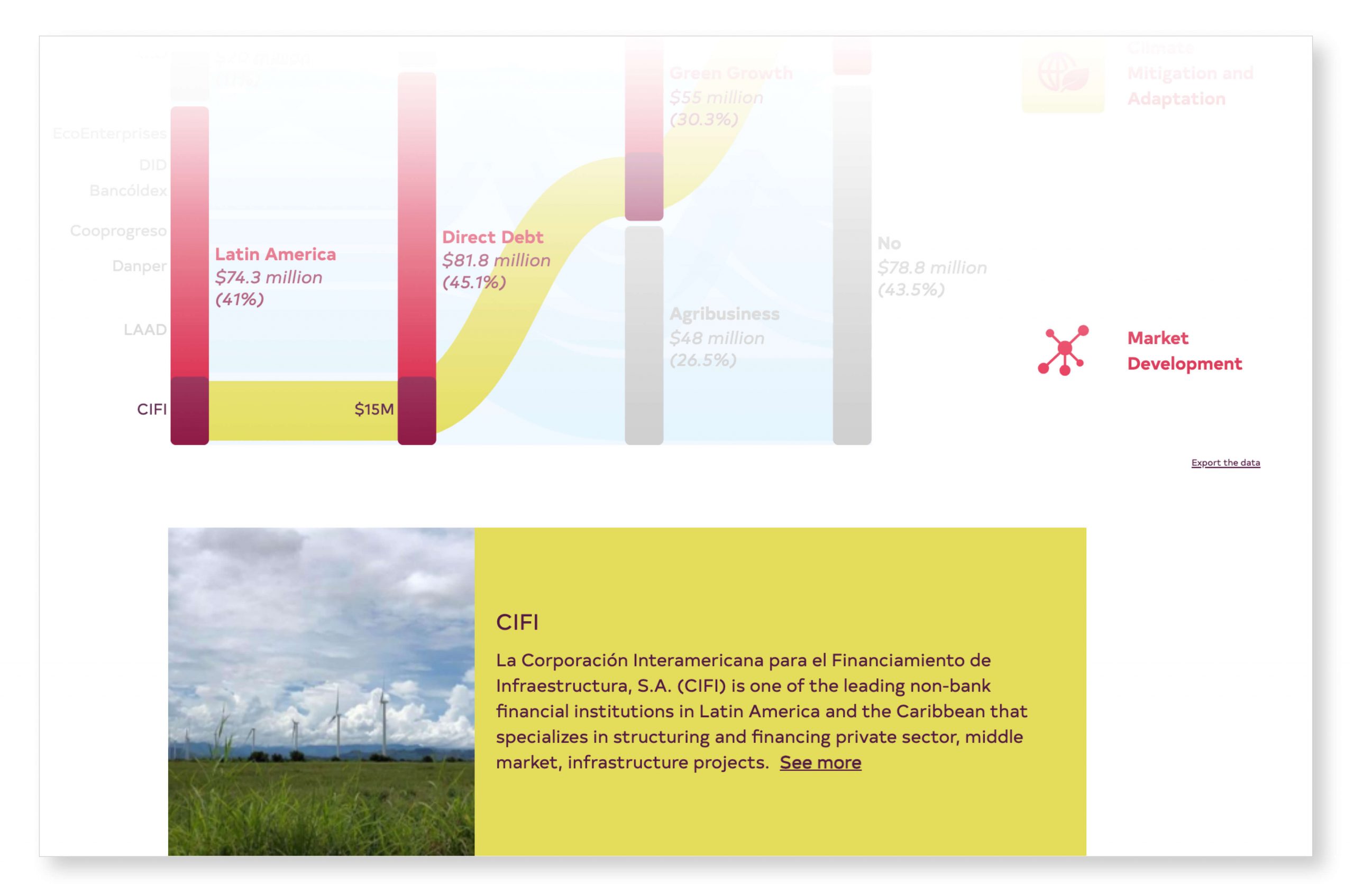
Each project is visible
As there are still few projects in the portfolio of this new organization, it is possible to make each project visible while hovering over the graph.
The exception confirms the rule
The objectives constituted their own challenge as they are not mutually exclusive: some projects may contribute to two or three objectives at a time. An alluvial is not adapted to such information. We have therefore used a different approach, illuminating the objectives to which the selected project contributes.
In this example, the project selected contributes to women’s economic empowerment and to climate mitigation and adaptation.
The hidden dashboard
We approach public dashboards with skepticism, as readers rarely have the patience to make selections from drop-down menus and lists. We have therefore integrated the interactivity into the interface in an intuitive way, offering the option of filtering within the labels rather than in separate menus.
Project details
Below the alluvial graph is a list of projects with a short description and a link to a page dedicated to each project. When a project is selected in the alluvial, its card moves to the top of the list, right below the graph.
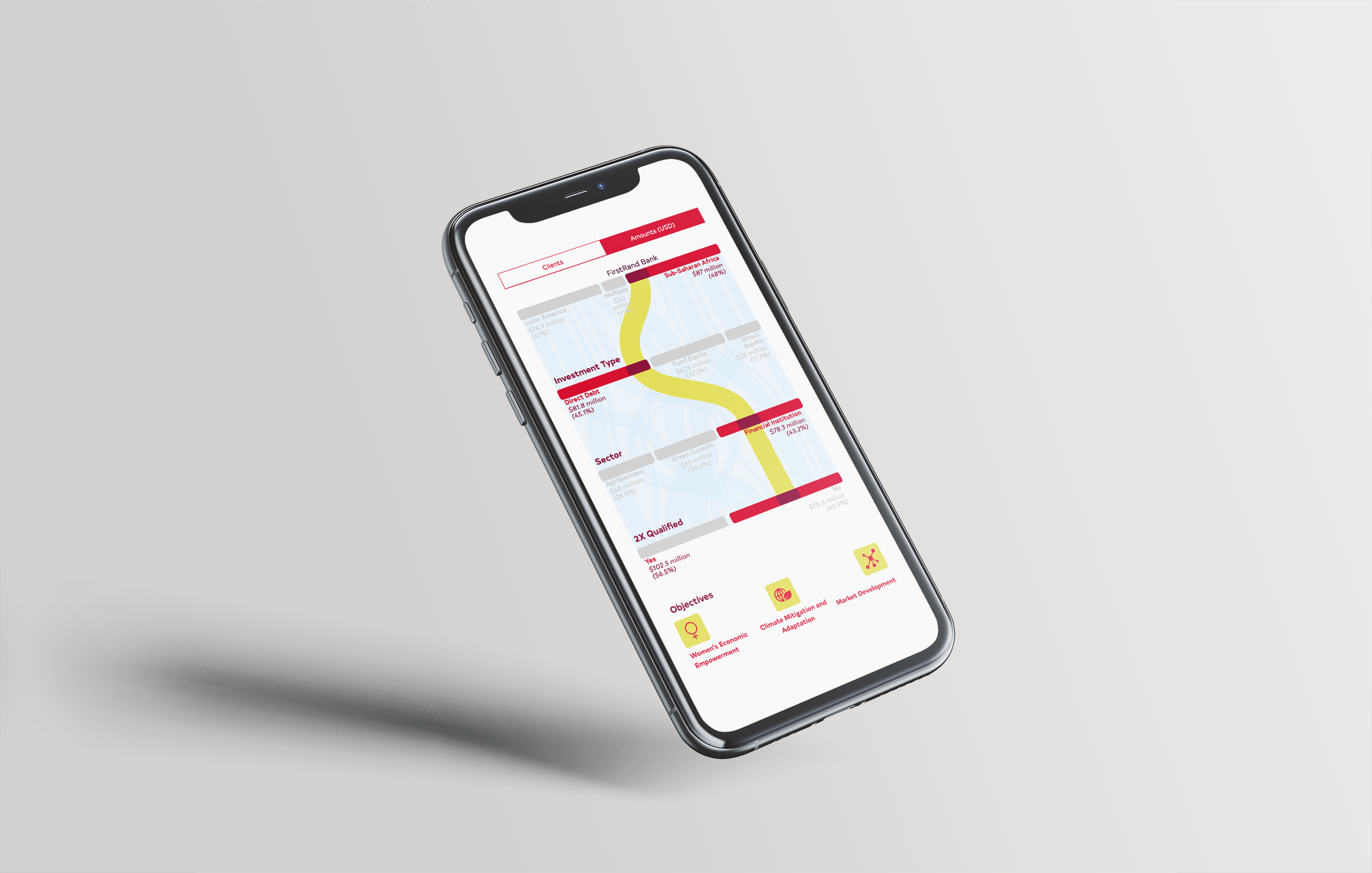
Mobile version
In the mobile version, the alluvial graph is presented horizontally. It nevertheless preserves all possible functions in a tight setting and on mobile.The only difference is that the name of a project is displayed only when selected.
Complete version
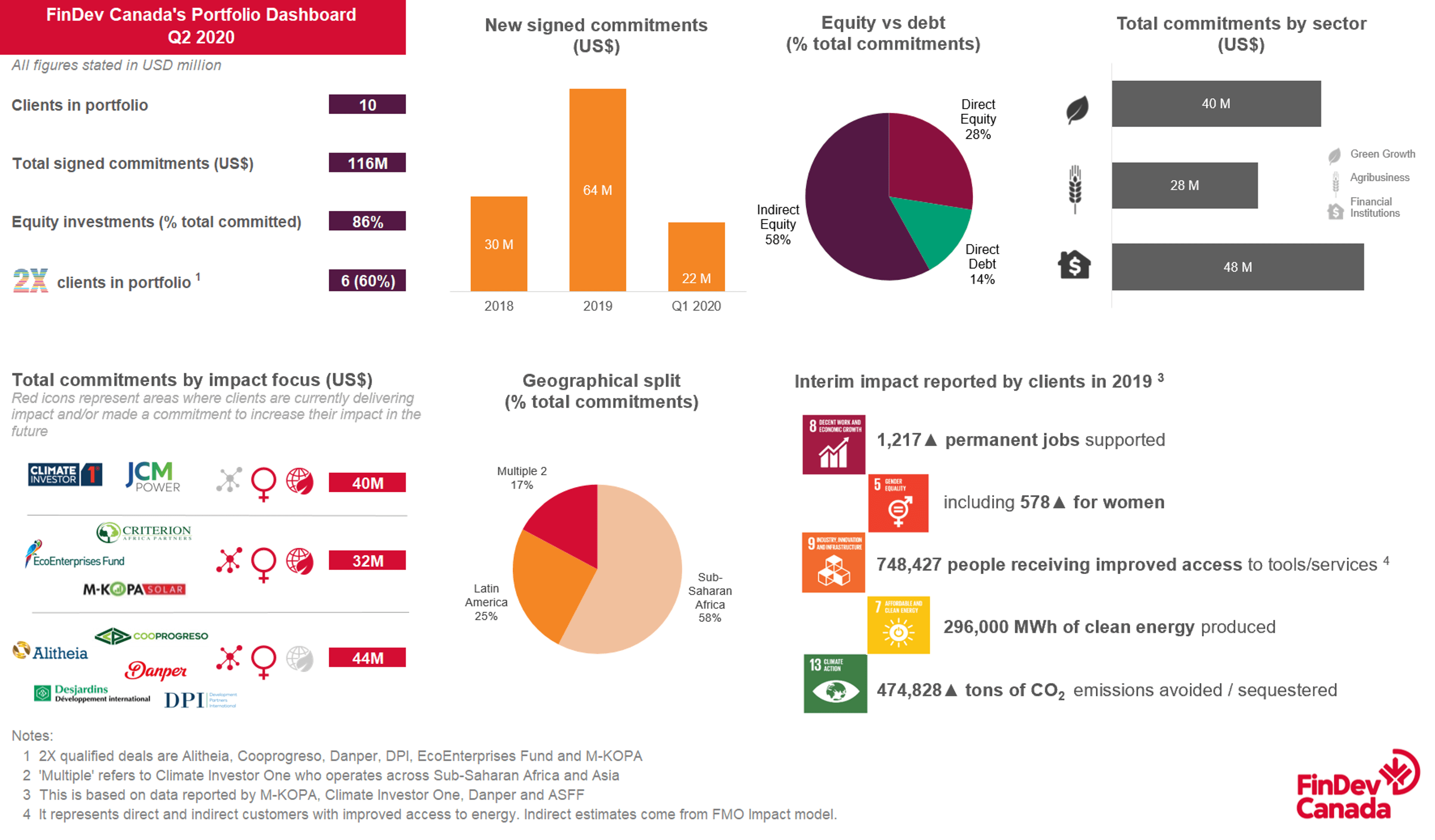
Here is the full and interactive presentation of the project portfolio. Before the alluvial graph, the impact results of the projects are presented with a short animation emphasizing their development. Have fun!