Below is our entry for the 2019 Human Development Data Visualization Challenge: Visualize Inequality of the United Nations Development Report.
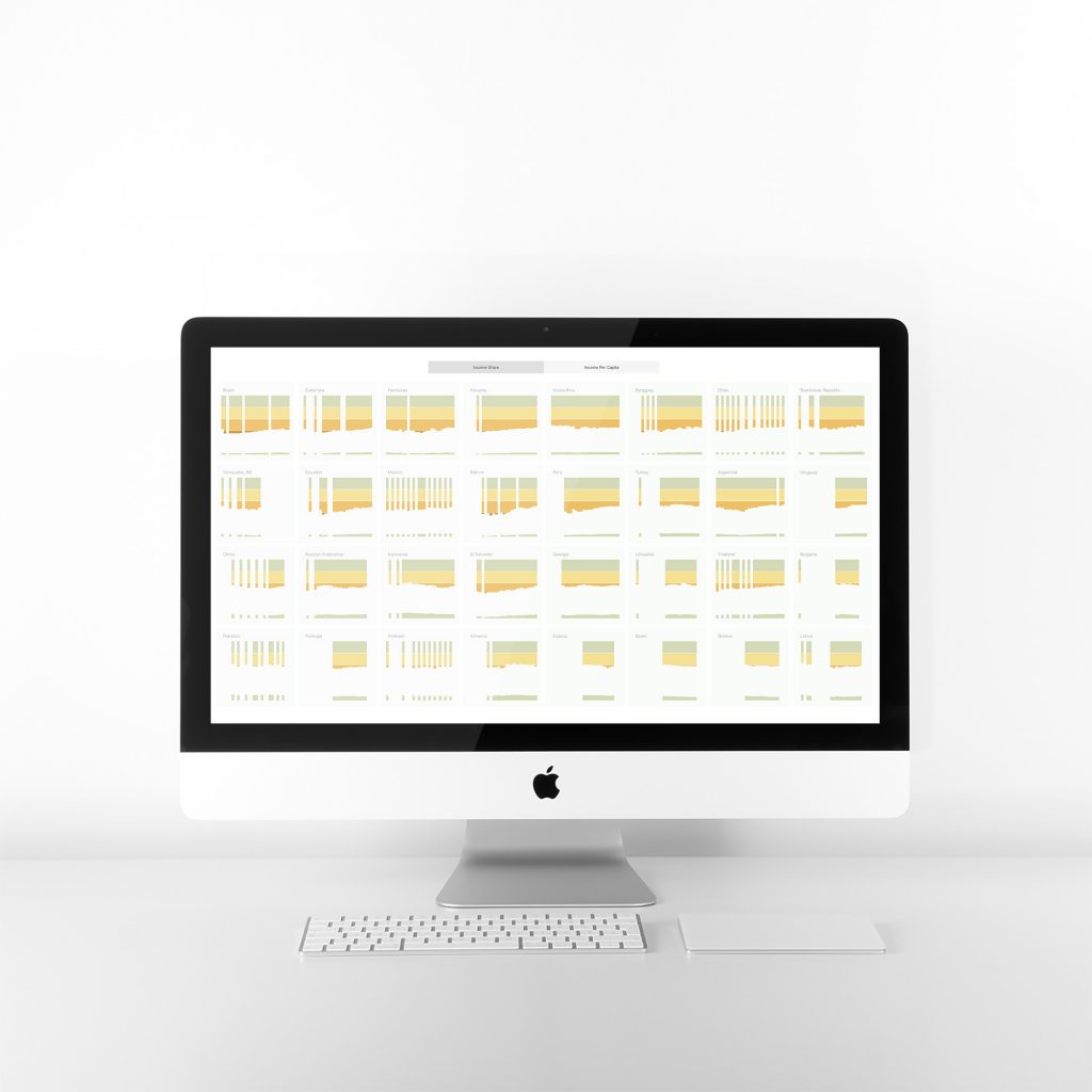
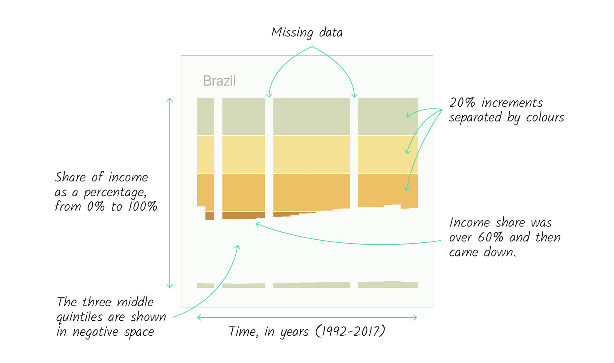
It is composed of two sets of charts. The first, titled Income Share, shows the share of income that is owned by the top quintile (20%) of the population and by the bottom quintile in 63 countries. The longer the bars at the top, the larger the share of the national income that is owned by the richest quintile. The shorter the lines at the bottom, the smaller the share of the poorest quintile.
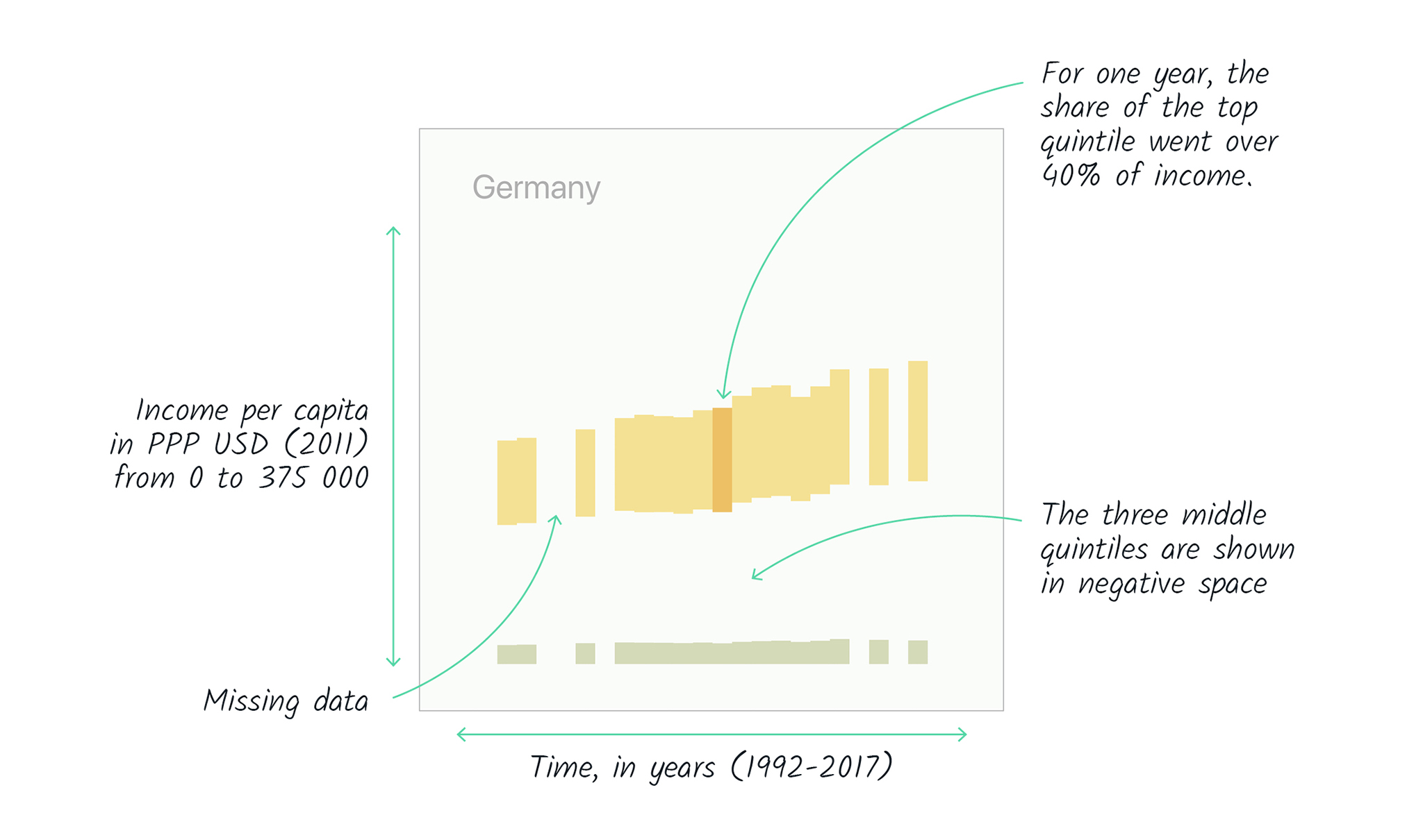
The second set, titled Income Per Capita, gives an idea of the income inequality between countries. It shows the average annual incomes of the top quintile, the middle three quintiles, and the bottom quintile. These values are coded as lengths and their corresponding bars are stacked to represent the data for that year. To remain consistent with the design of the income distribution charts, only the average incomes for the top and the bottom quintiles are visible.
See below the visualisation for some explanations of the analytical and design choices.
The evolution of national inequality
Income for the top and bottom quintiles, 1992 to 2017
We used the quintiles because they are an intuitive way to think about inequality. Some groups of people have more than their proportional share, some have less and this is what is represented visually.
The order of countries is that of the lowest concentration of inequality all the way to the highest, as of the last year available for each country. This allows the readers to find the extremes most easily and to see each country alongside the most comparable ones.
We only included countries that have at least 10 years of data available over the time period (1992-2017).
To allow for direct comparison of incomes between countries, we used the country’s gross national income (GNI) based on purchasing power parity (PPP) in constant 2011 international dollars.
Design choices
The design is intentionally abstract. We included no scale for time, share or income because we wanted the image to convey the general impression in a visually attractive way.
Using these simple stacked bar charts without representing the middle class, the readers can use their intuition that the richest quintile is at the top and the poorest at the bottom.
The panel chart allows to see several countries at once, rather than having to select countries with a drop down menu for instance.
A different colour, along with a white separator, is applied to each 20% share of income to clearly identify when the top quantile owns more than double or triple its proportional share of income.