Visualizing World Inequality

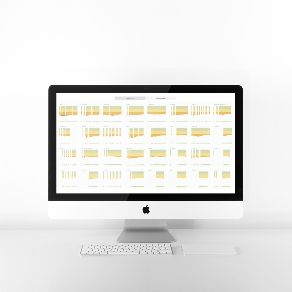
Visualizing World Inequality Below is our entry for the 2019 Human Development Data Visualization Challenge: Visualize Inequality of the United Nations Development Report. It is composed of two sets of charts. The first, titled Income Share, shows the share of income that is owned by the top quintile (20%) of the population and by the […]
Toward a clean world for all

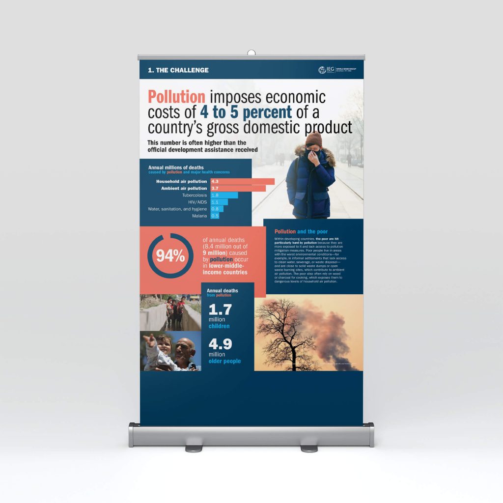
Toward a clean world for all The Independent Evaluation Office of the World Bank Group approached us to create posters from their report Toward a Clean World for All: An Evaluation of the World Bank Group’s Support to Pollution Management. The posters would be displayed at the IEG booth of the 2017 Environment Assembly organized […]
Women smallholders in the financial inclusion agenda

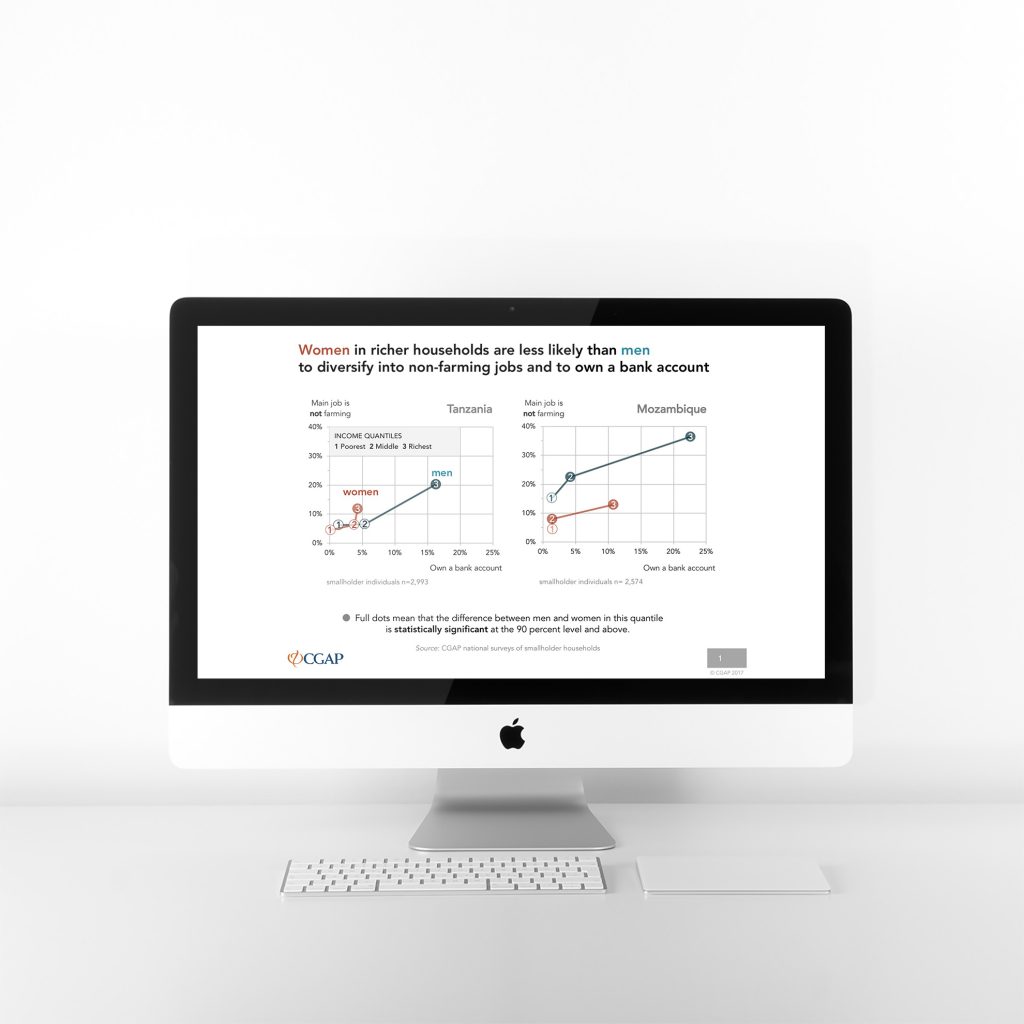
Women smallholders in the financial inclusion agenda The Consultative Group to Assist the Poor (CGAP) collected data on smallholder farmers in Mozambique and Tanzania. What they found was a gap between men and women, especially as they move up the income ladder. They approached Voilà: to visualize these findings. Connecting four dimensions The publication standards […]
The path to low-carbon, low-cost electricity grids

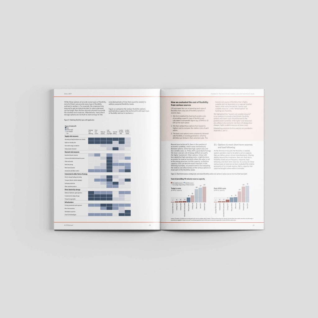
The path to low-carbon, low-cost electricity grids The Climate Policy Initiative, based in London, requested our services to create the graphs and do the complete layout of their report Flexibility: The path to low-carbon, low-cost electricity grids. They had written the report and drafted the graphs, so our role was to ensure that the graphs […]