The path to low-carbon, low-cost electricity grids
The Climate Policy Initiative, based in London, requested our services to create the graphs and do the complete layout of their report Flexibility: The path to low-carbon, low-cost electricity grids. They had written the report and drafted the graphs, so our role was to ensure that the graphs were clear and conveyed their main message in the optimal way. For the layout, we applied the CPI template.
They chose to work with Voilà: because of our data visualization expertise, our capacity to deliver the complete report ready for print, and our extensive experience in the field of sustainable development.
Below are some explanations of the key graphs and how we went from the draft to the final versions.
Cost stack
The “cost stack” is the featured graph of this report because it conveys its main message, namely that renewable energy will be equal or cheaper to non-renewable options thanks to flexibility improvements.
While at first sight the redesign may look similar to the original, many details were tweaked to make it clearer.
Before
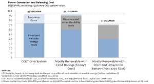
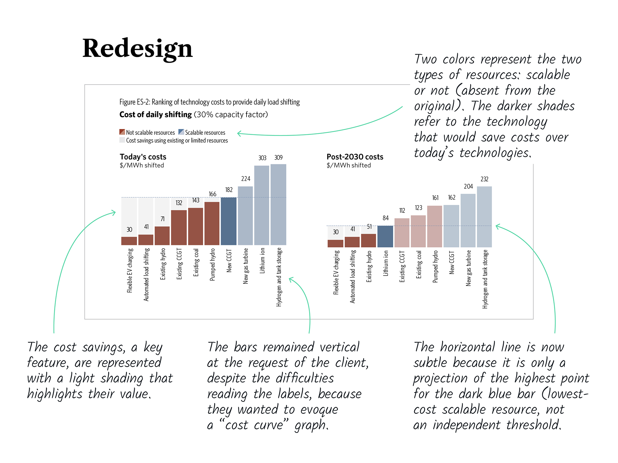
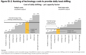
Technology costs
The initial issue with this graph was that it seemed to suggest the adoption of the most expensive option (yellow bar) under a certain threshold (horizontal line). The contradicting annotation (“lowest-cost”) was confusing.
It turns out that there were two types of resources represented in the graph: the scalable and the not salable resources. This is key to understanding the choice advocated by the graph so we added this information with color encoding.
Before
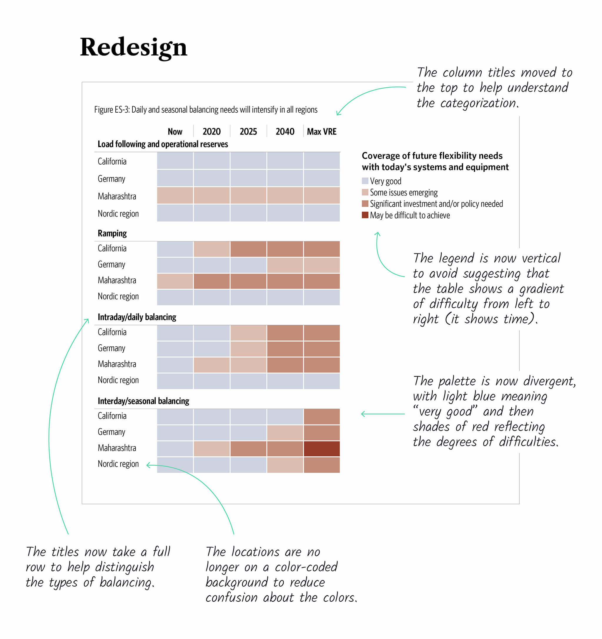
Balancing needs
This heat map shows the expected evolution of the balancing needs for four regions and whether each region will be able to meet their needs. The concept was sound so we made design tweaks to improve legibility.
Before
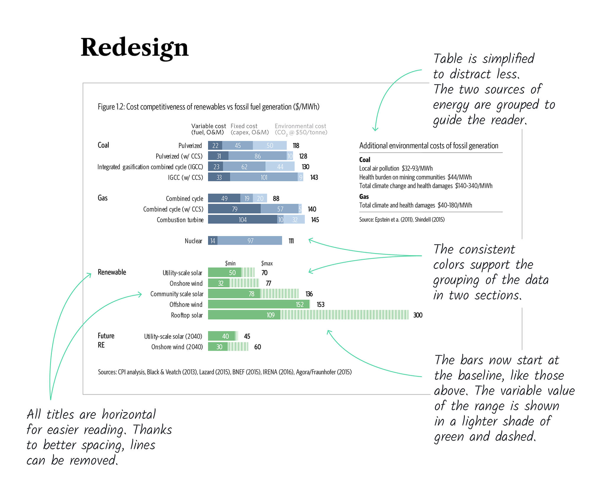
Cost competitiveness
At first glance, the original graph appeared to present data in two different ways. On closer inspection though, the top and bottom sections both present the cost of each energy source, except that the top section breaks it down in categories and the bottom one shows a range. The redesign attempted to make this clearer.
Before
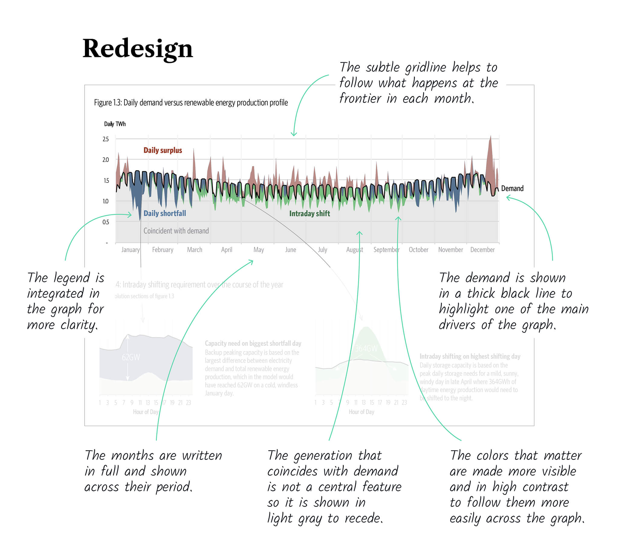
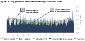
Shifting
The original graph was rich and well-thought-out. It was a matter of improving the color encoding and the legend to help the reader focus in the right places.
Before
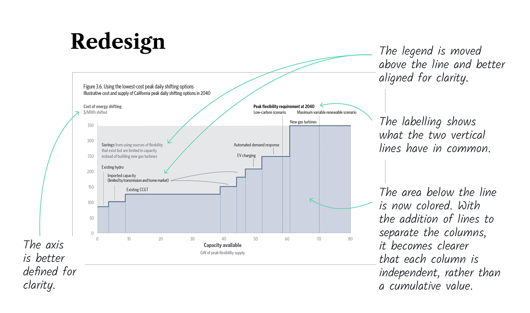
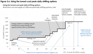
Cost and supply in California
At first sight, this graph seems to show a stepline graph. Upon closer inspection however, we can see that it is a variable-width column chart. The redesign is meant to make this clear.
Before
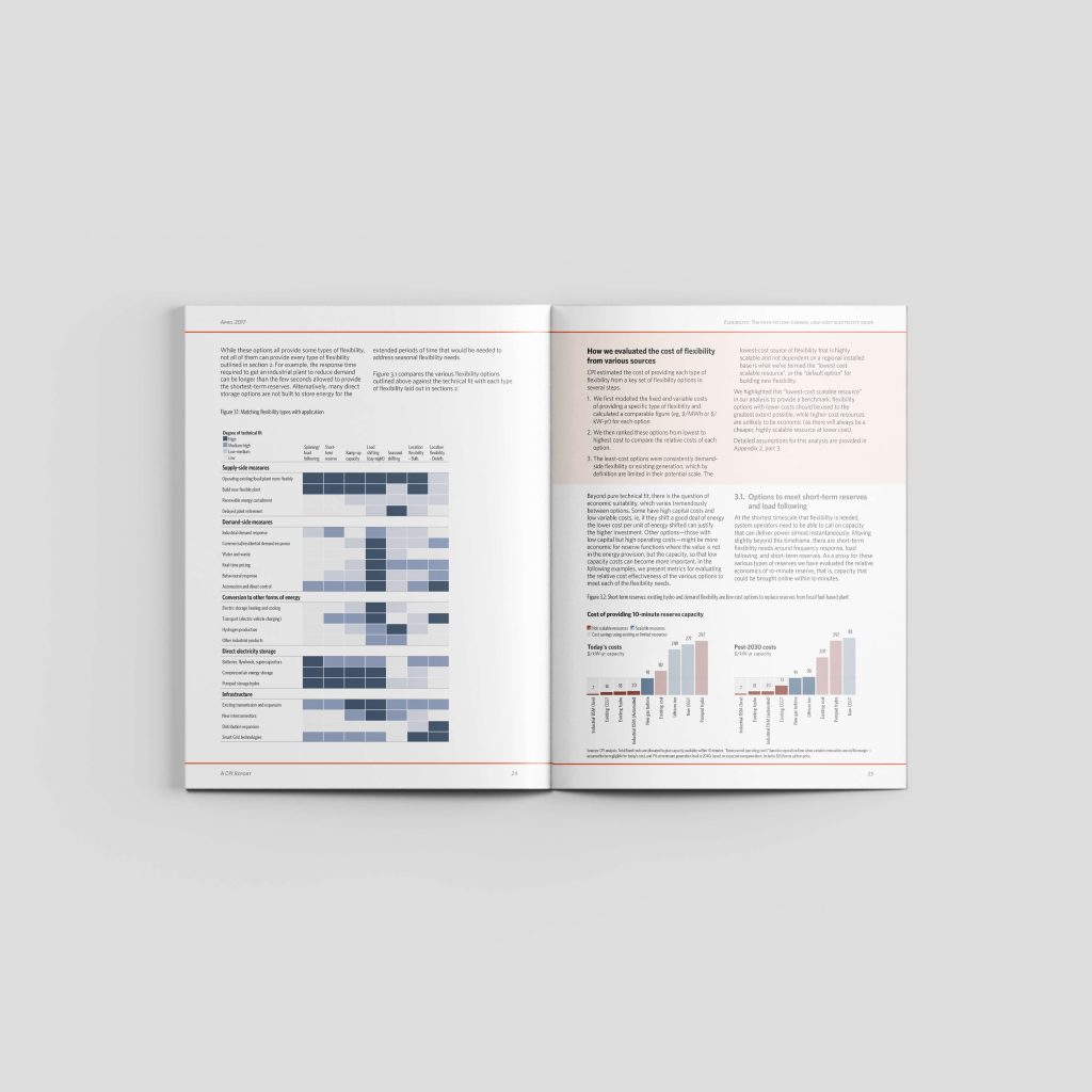
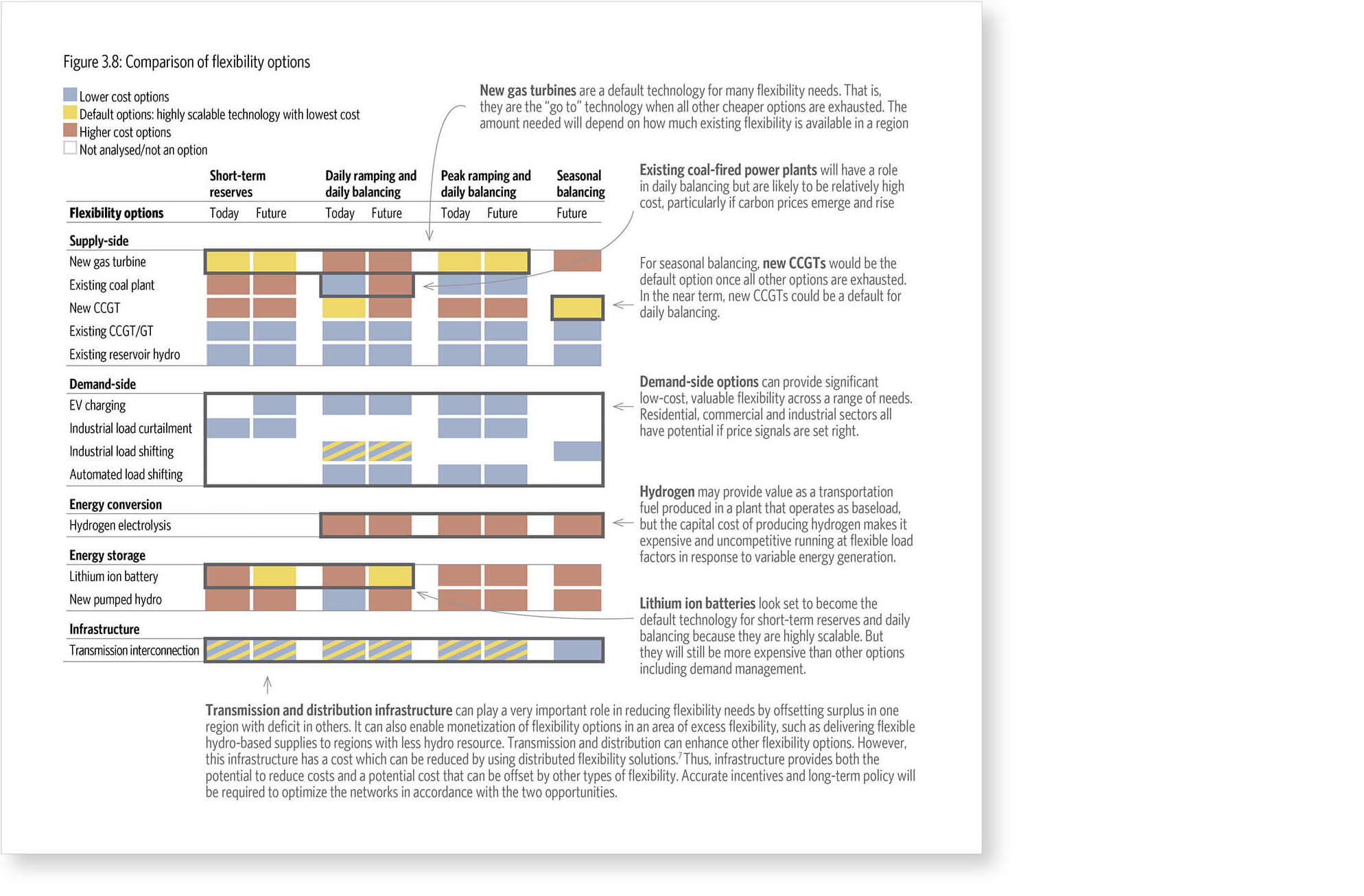
Comparison of flexibility options
Other than improving the appearance of this heat map, the most important change has been to integrate the annotations, replacing the numbered footnotes. Also, empty columns and rows delineate better the categories.
Before
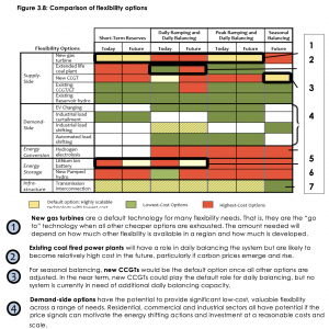
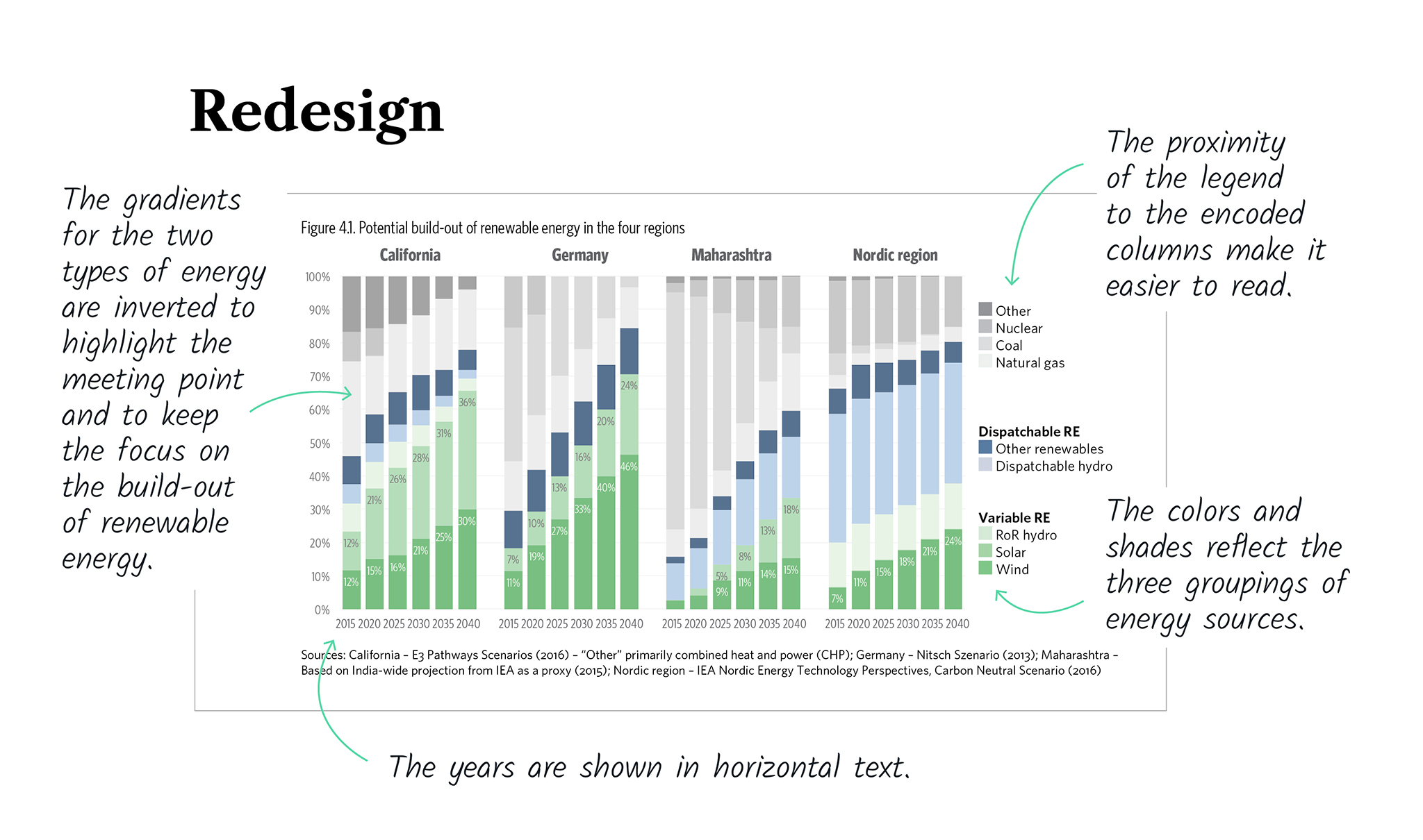
Potential build-out of renewable energy
This is a rare example of relevant use of a stacked bar chart because the focus is on the sum of several categories over time so we kept it but with a few design improvements.
Before
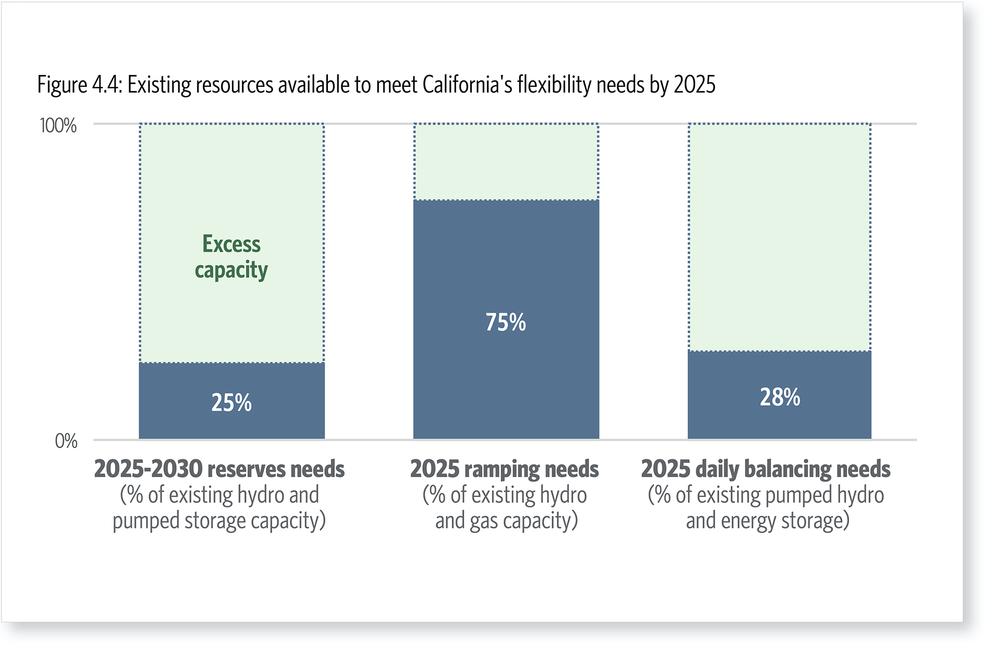
Existing resources available
This graph represents the expected demand on existing resources to meet the needs of the future.
To clarify its purpose, we mostly modify the text: title and labels.
We also used green to clarify the positive nature of the excess capacity.
Before
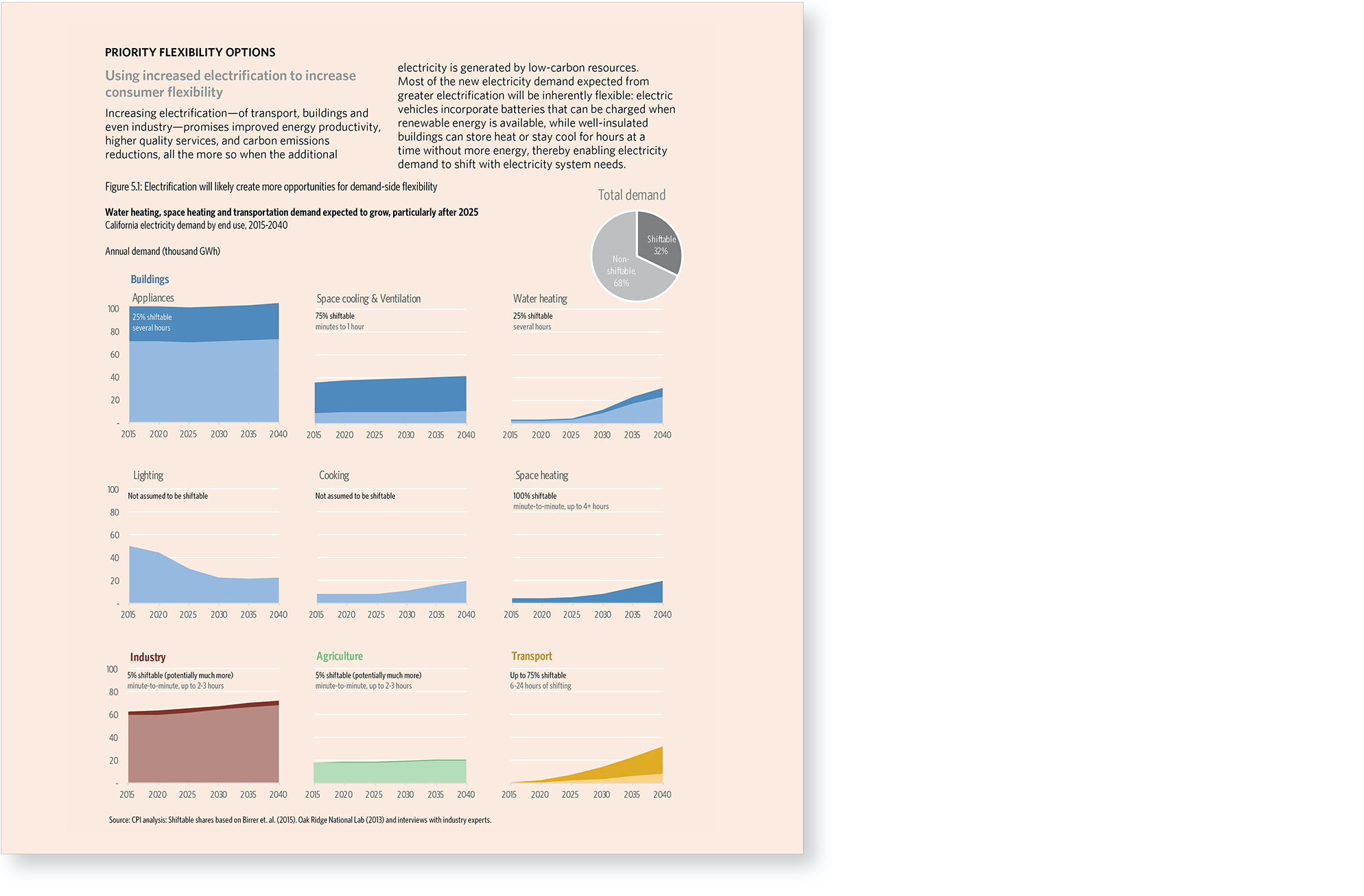
Demand-side flexibility
The original graph did not appropriately convey what is happening for each sector.
We replaced it with a small multiple of stacked area charts where each sector is shown independently.
We used a pie chart to show the sum of the shiftable demand. This replaced the bar on the right in the original.
These two changes allowed us to combine the evolution of each sector with its shiftable proportion, getting at the main message of the graph.
An independent evaluation found out that the World Bank Group is underinvesting in a major environmental problem. How to get this point across at a busy international conference?
Client: Independent Evaluation Group of the World Bank Group