Eureka! 5 information design solutions Where do good ideas come from? How do they show up — and when? Sometimes it’s obvious, sometimes it takes a long way… And that’s normal. As Ali Torban describes it so well in… Read the complete story
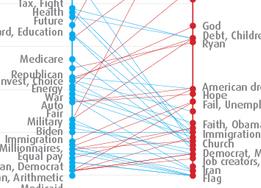
MOOC Week 2: The politics of words While I’m working on the assignment for weeks 5 and 6 of the MOOC, let’s have a look back at week 2. We were… Read the complete story
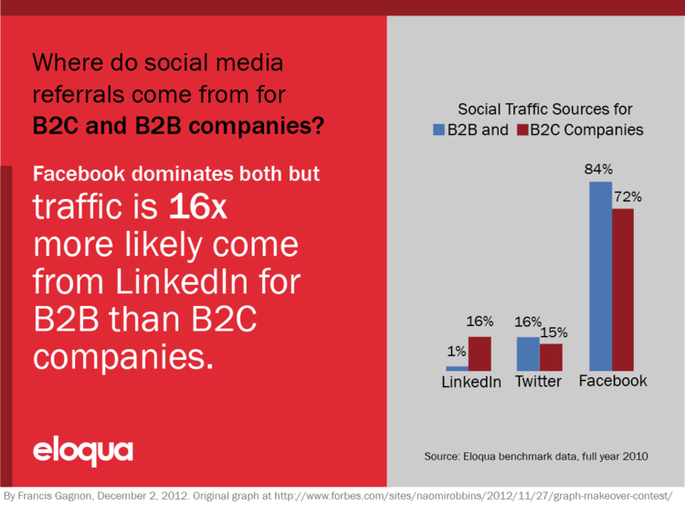
Show what you say Forbes has a makeover contest for this graph. Gavin McMahon, from Powerful Point, did this version and I explained in the comments what I… Read the complete story
Quote of the day This one is on my wall at the office. Clutter and confusion are not attributes of information, they are failures of design. Edward Tufte,… Read the complete story
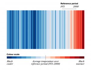
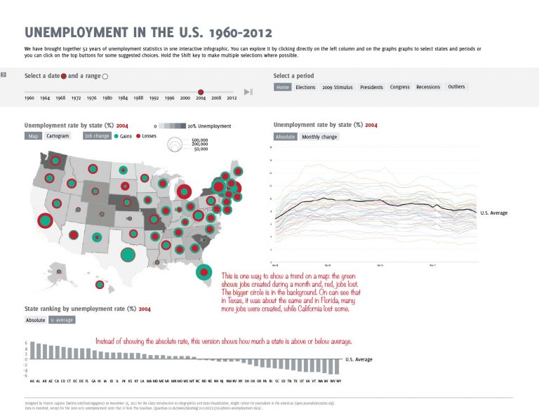
MOOC Week 4: Unemployment in the US 1960-2012 US unemployment data has been visualized over and over and over in the last year because of the election and recession. Not only is… Read the complete story
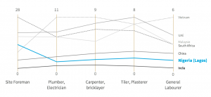
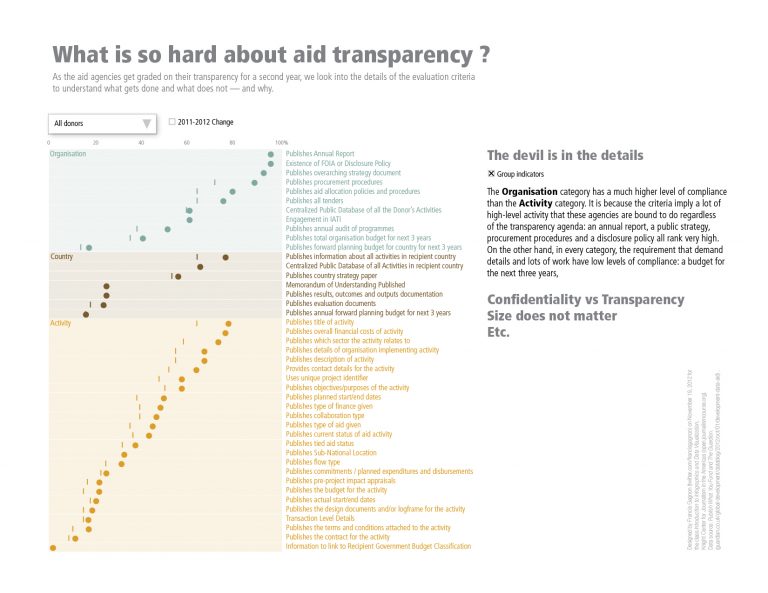
Week 3: Aid Transparency The third week’s assignment was right up my alley: aid transparency. It is even more disappointing then that I was not able to complete… Read the complete story
All aboard the MOOC When I first heard of the massive online open course on data visualization at the Knight Center of the University of Texas, it seemed… Read the complete story