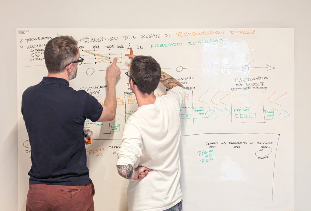
Where do good ideas come from? How do they show up — and when?
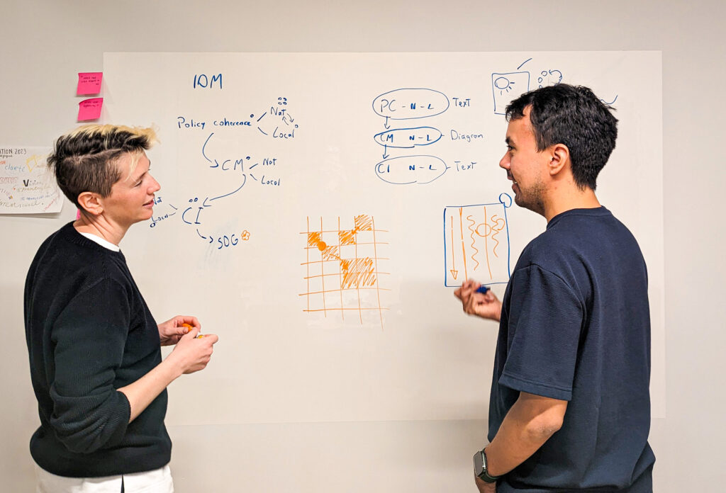
Sometimes it’s obvious, sometimes it takes a long way… And that’s normal. As Ali Torban describes it so well in her book Chart Spark, creativity often requires exploration, because we shouldn’t wait for a stroke of genius! At Voilà:, creating good visualization involves a series of trial-and-error experiments until we find the right solution. Without further due, here are 5 projects that gave us a hard time.
1. Unusual combination
How do we generate a spatio-temporal graph?
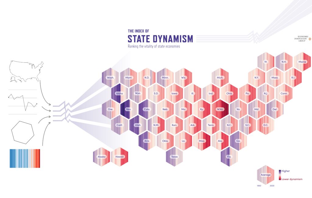
How to show 30 years of data on 8 indicators for 50 states… on a map? The collection of data points on Economic dynamism collected by the Economic Innovation Group could be well distributed on several charts, but they also needed to be displayed in a single overview.
First challenge: Is it possible to present 8 indicators on a single map? This proved impossible in itself and was resolved by using an average of the indicators, which is already used across the EIG report.
Second challenge: A line chart can easily show multiple years, but a map? It usually shows a single year at a time. Our inspiration came from the warming stripes that show several decades in one simple visual. The vertical lines were suited for a compact space. We chose to display them horizontally, in harmony with the convention in charts that time goes from left to right.
Third challenge: How to make the data for every state visible when some states are very small on the map? Thankfully, not every map is geographical. Hex maps were our tool of choice because they show every state at the same size, in a shape that allows all elements to fit together elegantly.
The result is a unique map, an eye-catching solution with several levels of reading. At a first glance, we can see regional and temporal trends. On closer inspection, each region and even each state can be studied in detail.
Read about the full project in our portfolio.
2. Letting the data out of the frame
How do we add an outlier to an already defined layout?
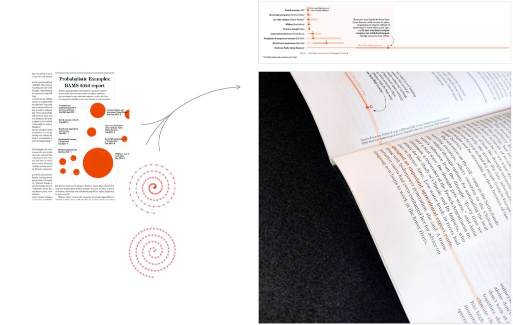
In June 2023, Voilà: collaborated with the Scientific American’s magazine to data visualize the impact of climate change on the repetition of extreme weather events.
One of the three visualizations showcased an outlier making other data more difficult to read because of its value that is significantly higher than the rest. It complicates creating a clear and proportionate visualization. How, at that point, can we ensure that all the data remains understandable without butchering the scale value?
Multiple ideas were explored over the type of graph to choose. Ultimately, the support itself became the solution. It was going to be printed in a magazine so why not simply take advantage of its double pages to break out of the frame? The outlier could then extend freely onto the second page, keeping the content readable while also adding visual appeal to the article.
Find more on our Instagram post.
3. Giving form to social inequalities
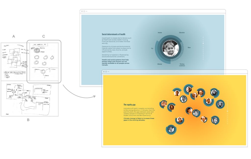
How can we visually explain that climate change does not affect people’s health in the same way?
This question tortured us for hours, since the concept we were looking for would influence the entire artistic direction of the project as we need to acknowledge vulnerability factors (adaptability, sensitivity, exposure to climate-related hazards) and social determinants (age, income, education, etc.) already at play.
The main issue was that climate change increase people’s vulnerability, but the visual needed to show that these impacts reduce their protection.
A reinvented Venn diagram with squares to visualize combinations of inequalities? Too abstract for the public to identify with. More figurative drawings to point out future sources of stress in our environment? Too visually heavy.
Then we had a breakthrough: instead of starting with nothing, our individuals would begin with a shield that was more or less complete depending on their conditions, and that shield would then be stripped away by climate change. This would make it clearer that climate change removes protection from people who are already vulnerable.
This solution finally let us turn qualitative content into a minimalist, impactful narrative.
See the full project in our portfolio.
4. Leading with a metaphor
How can we show that economic development perpetuates significant disparities?
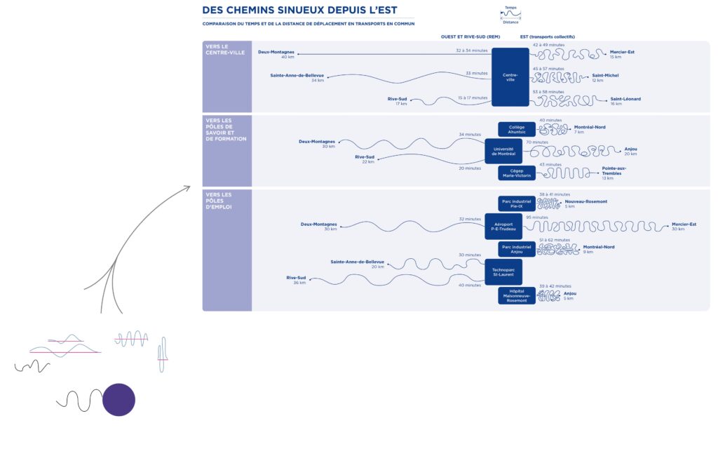
It takes much longer to travel by public transit in East Montreal than in the West, especially with new ongoing projects such as the REM.
Here, the challenge isn’t the data. Uneven travel times could easily be shown in a traditional bar chart. No, the challenge is how to be striking and memorable, to make a lasting impression. This inequality between two regions of the island of Montreal has persisted for decades without triggering the political response it requires. We therefore needed to go beyond a conventional graph.
The solution came from the physical reality of public transportation: we move from point A to point B at varying speeds. So we placed the starting points to scale, based on their actual distance. To represent longer or shorter travel times, our paths transition from gentle curves into spaghetti-like patterns, literally illustrating the often winding routes that part of the population must navigate.
Anyone who has traveled such routes knows how slow progress can feel. The visual speaks to the visceral and often frustrating experience of people in transit.
See the full project in our portfolio.
5. An interactive tool available to everyone
How to clarify and demystify information for consumers about heat pumps?
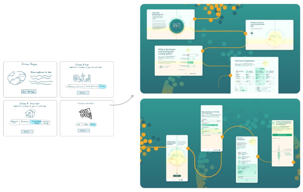
Much of our work is aimed at an audience of experts or decision-makers. But for this heat-pump cost calculator project, the Canadian Climate Institute was targeting the general public. The challenge, then, was to be above all accessible—while also being intriguing and even playful. After all, their attention and patience were far from guaranteed.
“A calculation dashboard that is user friendly”. Ironically that request lies a great deal of work to be fulfilled. Presenting a detailed and customizable comparison of the costs associated with different types of heat pumps in a clear and engaging way is no easy task.
Adding a quiz supported by animated illustrations caught our attention. The idea behind it? Throughout the questions, the illustrations add up to represent the accumulation of individual choices, but also their modeled cost. Thus easier to grasp, the data maintains the user’s interest throughout the experience.
How can we also enhance the user experience? Creating a continuous narrative thread was our solution. Minimalist line illustrations serve as a common thread throughout the experience. Crossing the screen, this vertical line takes on the features of a familiar symbol at each stage and answers the quiz’s questions. The animations maintain attention and offer a fun experience that leads to the unveiling of the results.
Once all aspects have been chosen, results are then displayed. This is an additional step toward understanding, before giving access to a comprehensive comparison. At the end of the experience, concrete information is available to help make more informed choices when purchasing a new heat pump.
To learn more about this topic, visit our portfolio.
Collaborate with us: a team that understands the complexity of your research while bringing visual solutions for a bigger impact.
Francis Gagnon is an information designer and the founder of Voilà: (2013), a data visualization agency specialized in sustainable development.
Jessie is project coordinator at Voilà: She is in charge of the internal management and ensures the smooth running of the team’s operations. She also takes care that our mission reaches a bigger community.
Julian Hernández was an information designer at Voilà:. He was responsible for creating engaging and insightful data visualizations that help viewers see the data from a different angle and consider new possibilities.
Celia was a graphic designer. She enjoyed the process of taking an idea and turning it into a beautiful and effective story. She analyzed as much as she created, adopting a big picture approach as she searched for the details that matter.
Estelle Villemin was a graphic designer and a scientific illustrator at Voilà:. Her role was to provide clear and aesthetic visual solutions that are tailored to the customer’s needs.
Marie-Blanche is a senior graphic designer at Voilà:. In her work, she brings an aesthetic eye for detail that foregrounds the meaning of the messages conveyed in visuals at Voilà:.
