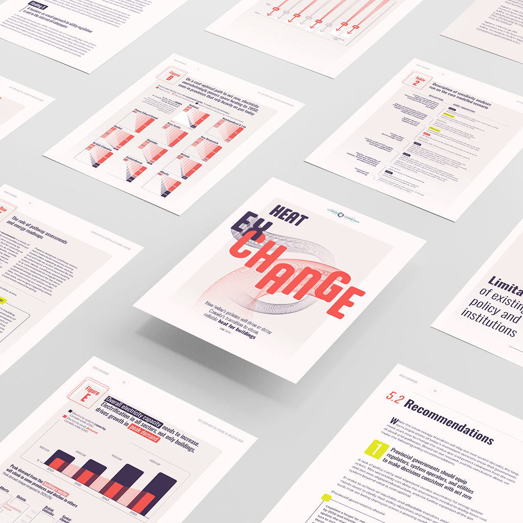
Heating our buildings without impacting the climate
In collaboration with Voilà:, the Canadian Climate Institute has developed a new report on the impact of today’s policies on the transition of buildings to a cleaner and more reliable heating system. The aim of this project was therefore to draw public attention to the invisible challenges associated with gas networks.
A shifting movement
The report is based on an ambitious scientific study that tackles the inertia of current political decisions. Its goal is intended to stir consumption habits, implying a drastic shift in behavior when it comes to replacing one technology with another.
We illustrated this principle of exchange and shifting movement in our design by seeking movement and balance between graphic elements. Given the Institute’s emphasis on the analysis, we developed a graphic proposal that conveys it visually through technical textures and patterns inspired by elements like heat flows, pipes or other distribution networks.
Visualize the transition
Transition, showing the shift from one reality to another, is the graphic concept applied throughout the report and adapted to each chart to powerfully convey the message. Here, intermediate shapes reinforces the idea of transition between two data points. It creates visual continuity and graphically supports a change in status over a 30-year time.
Re-defining error margins
By replacing usual box plots for visualizing error margins, the concept of intermediate shapes has been applied in two different ways in these charts:
In a fan shape, to illustrate the spectrum of multiple uncertainties;
In hatched textures, to evoke dotted bars.
Playing with visual metaphors
The heat flow and the movement concept developed for the cover were also applied in this chart about gas networks. These red and blue “air flows,” proportional in width and height, convey a powerful and visually memorable message.
A compilation of best practices
This report was designed for an expert audience and brings best practices in terms of accessibility and readability. The division of information into sections and highlights, the font size adapted to computer screens, and the streamlined layout make the information much more digestible for readers. Analysis and recommendations are the main topics read by policy makers. Therefore, we chose to present results as full-page charts to ensure optimal readability. Finally, complete navigation (external links, anchors, table of contents), accessible colors and consistency of graphic standards developed make this a truly exemplary report.
This project also turned into a PowerPoint presentation distributed by our client during its launch.
For more information on this project, click here to see the online version of our complete work.
Do you have conclusive data that you would like to communicate effectively? Contact us.
How can we demonstrate that there is a widespread culture of detention through the US court system, leading to record high rates of pretrial detention, and riddled with systemic biases.
Client: University of Chicago – Federal Criminal Justice Clinic