What good can data do?
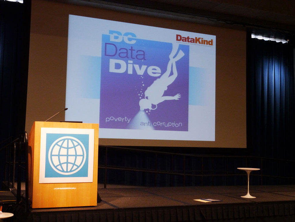
The World Bank and DataKind set out to further explore this question during the Data Dive held March 16 and 17 in Washington DC (#data4good). People who rarely work together — coders, quants, data visualizers, procurement experts, economists, lawyers, students, senior managers, open data evangelists — ended up at the same table for 36 hours of intense work, united by their love of data. The goals were attractive. How can we measure poverty more often and more accurately? Can we detect fraud by looking at the data?

It was my first participation and the first thing that I learnt is that bringing your desktop computer in the land of laptops makes for a good conversation piece and several tweets.
The second lesson is rather a reminder: all data visualization starts with data gathering and verification. Hold your horses, get the data right. Delayed gratification is the best anyway. And delay our gratification, we did.
The World Bank has some rich and reliable data sets and, indeed, they directed us to a file with 77 dimensions for 13,628 World Bank projects between 1947 and 2013. One million data points for your viewing pleasure. The list of disbarred firms was less enthusing: it had only firms currently disbarred, no historical data and the grounds for disbarment had typos and structure problems. Thankfully, the wizardry of Taimur, Sameer and Jayesh meant that about halfway through the day we had a historical list scraped from the Wayback Machine of Archive.org. The following morning, the grounds for disbarment were clean.
But the real problem was the missing link between these two data sets. The disbarment list contains no information about the project for which the firm or individual was disbarred. Without it, it is impossible to explore the characteristic of projects for which cases are detected. This information exists somewhere and in fact, it could be manually garnered from the determinations, made publicly available in scanned PDFs, a data person’s nightmare. Still, our three aforementioned wizards put their brains and digits to it, found some intermediary data set and, at the very end of the event, we had a debarment list with project names. I won’t link to it however as we did not have time to verify both the methodology and results, and this is delicate information to get wrong.
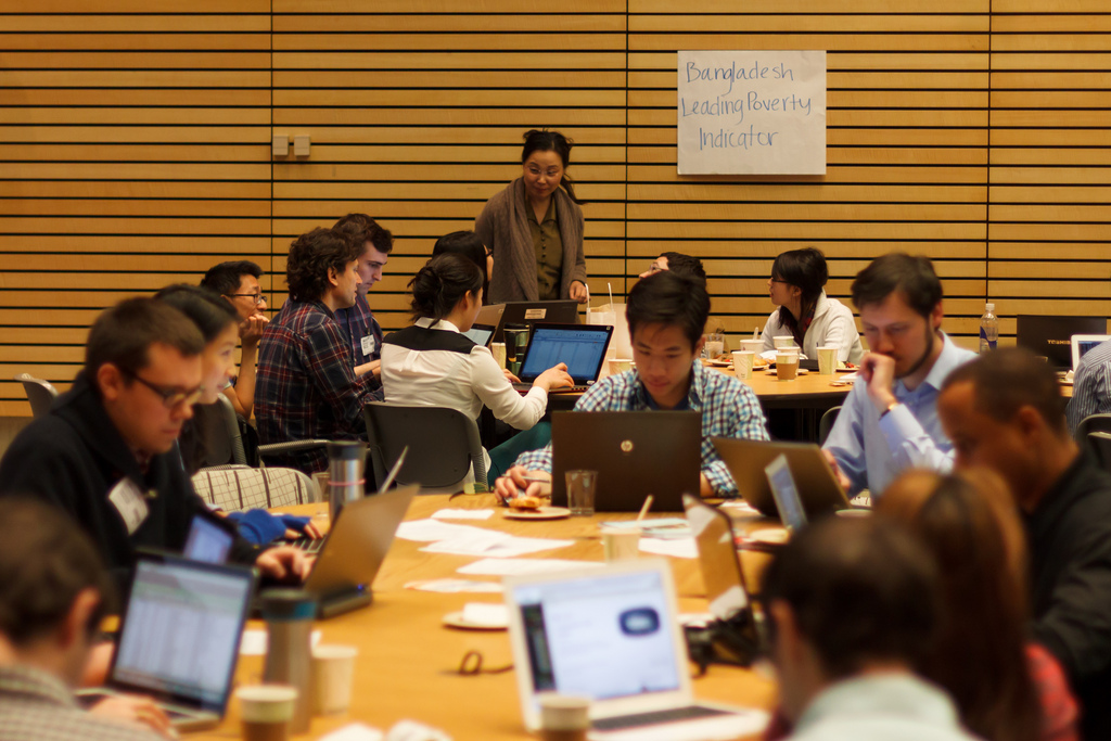
The event started Friday night, with some speeches and mingling, and finished Sunday morning with presentations. So it’s about 12-13 hours of work on Saturday, from 10 am to 11 pm. Receiving instructions, understanding the topic, seeing the data sets, thinking up questions for the data, figuring out the problems, brainstorming solutions, weeding out the wrong ones, implementing the promising ones, seeing and checking the results took our group most of this precious time. We never got to the point where we could ask the questions we had early in the day. Reflecting upon the experience now, maybe we should have limited our questions to a universe that could be answered by the existing data. Make that the third lesson.
The data providers that make the data public would benefit from releasing it in the right format, sparing users a lot of the scraping. Webpages like this were certainly created from a database in the first place and yet we had one person spend the whole day just recreating it. World Bank: share the database. Since it is public information anyway, keep the master file on the server, update it right there.
These data issues are commonplace at such events, we’re told. I can believe it from my personal experience with data. I’m sure it’s fun to be a data visualizer fed with perfect data, but I’m yet to encounter such a situation. Learning to test and clean the data is still, today, a skill that a data visualizer needs. Jon Schwabish recently started a discussion on Twitter concluding that data processing is a defining skill of a data visualization expert and I can only agree.

Francis Gagnon is an information designer and the founder of Voilà: (2013), a data visualization agency specialized in sustainable development.