2024 retrospective What did 2024 look like at Voilà:? Over the years, those retrospectives allow us to capture the progress that has been made…. Read the complete story
2024 retrospective What did 2024 look like at Voilà:? Over the years, those retrospectives allow us to capture the progress that has been made…. Read the complete story
Multidisciplinary at Voilà: Celebrating Voilà:’s 11th anniversary this month, we took a moment to reflect on what defines us. That’s why we chose to celebrate multidisciplinary as… Read the complete story
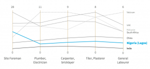
Same charts, different designers: learning from an experience What happens when two information designers who work in the same agency challenge themselves to rethink a set of charts they found on the… Read the complete story
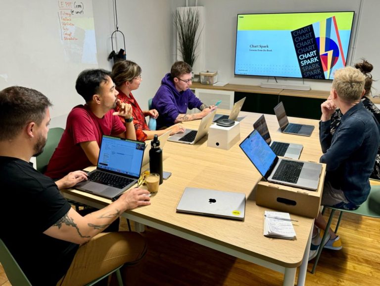
Chart Spark: Alli Torban’s tips to harness creativity and innovation Chart Spark is an amazing book by Alli Torban centered around creativity and innovation with tips on how to harness them. It is focused… Read the complete story
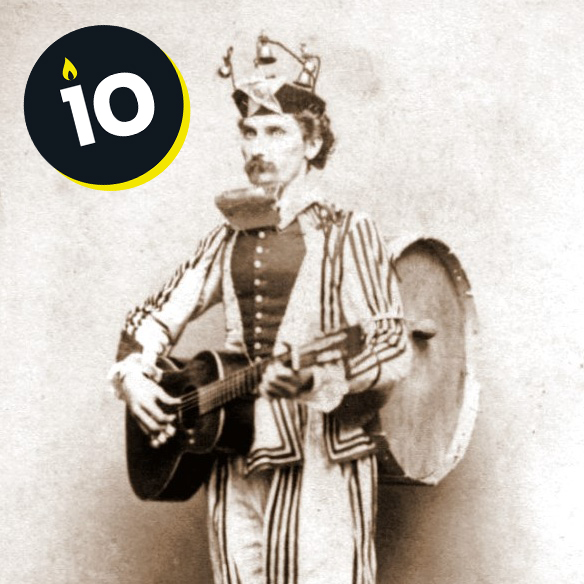
10 things I’ve changed my mind about To celebrate 10 years of Voilà:, here are 10 things I’ve changed my mind about since I started out as an information designer…. Read the complete story
Unveiling a Black Box: the “Traces of Disappearance” exhibition at La Tertulia Museum Earlier this year I visited my hometown, Cali, Colombia and some friends recommended that I visit the La Tertulia museum, to see “Huellas de… Read the complete story
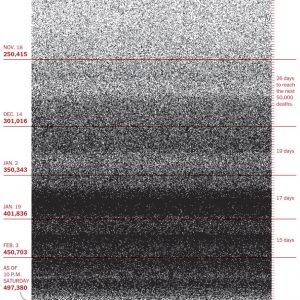
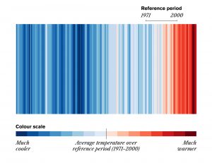
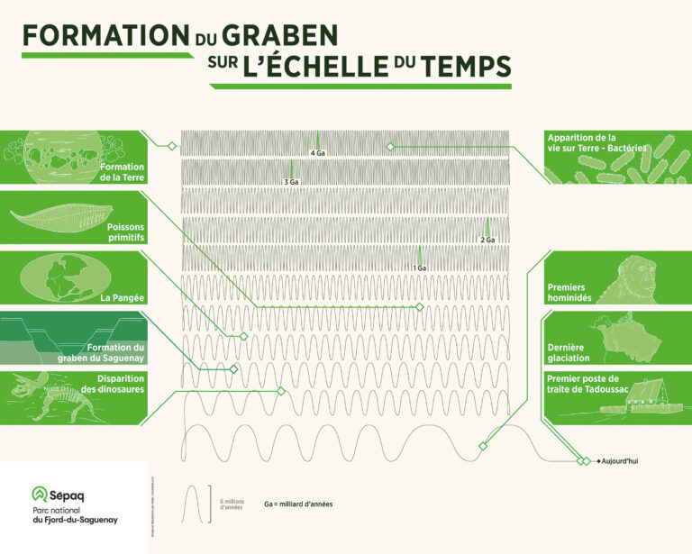
A data scale tested by time Most of the time, the choice of scale is based on the data. Sometimes, however, the exercise is more complicated, as it was… Read the complete story
A look at 2023 Since 2021, we’ve had a tradition at Voilà:. At the end of each year, we review our milestones and projects that we’ve worked on,… Read the complete story
2023 retrospective Every year, I write this retrospective for the future: I like to reread them a few years later to see how far we’ve come… Read the complete story
Information is Beautiful Awards 2023 Every year, we welcome the IIB Awards with great interest and delight. We discover some incredible projects and take the opportunity to give a… Read the complete story