Bringing transparency to international aid for women’s economic empowerment
Publish What You Fund is a non-profit organization ensuring international aid and development data is transparent and available, and actionable.
In October 2020, they launched a project aimed at improving transparency in the financing of women’s economic empowerment, tracking several key indicators. We partenered with them to translate complex findings into clear, engaging visuals, developing a unique artistic direction as well as a visual taxonomy to help navigate the projects’s multilayered data.
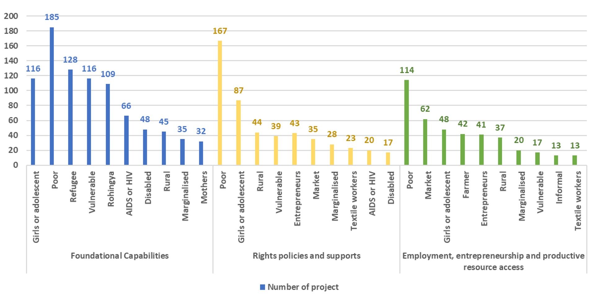
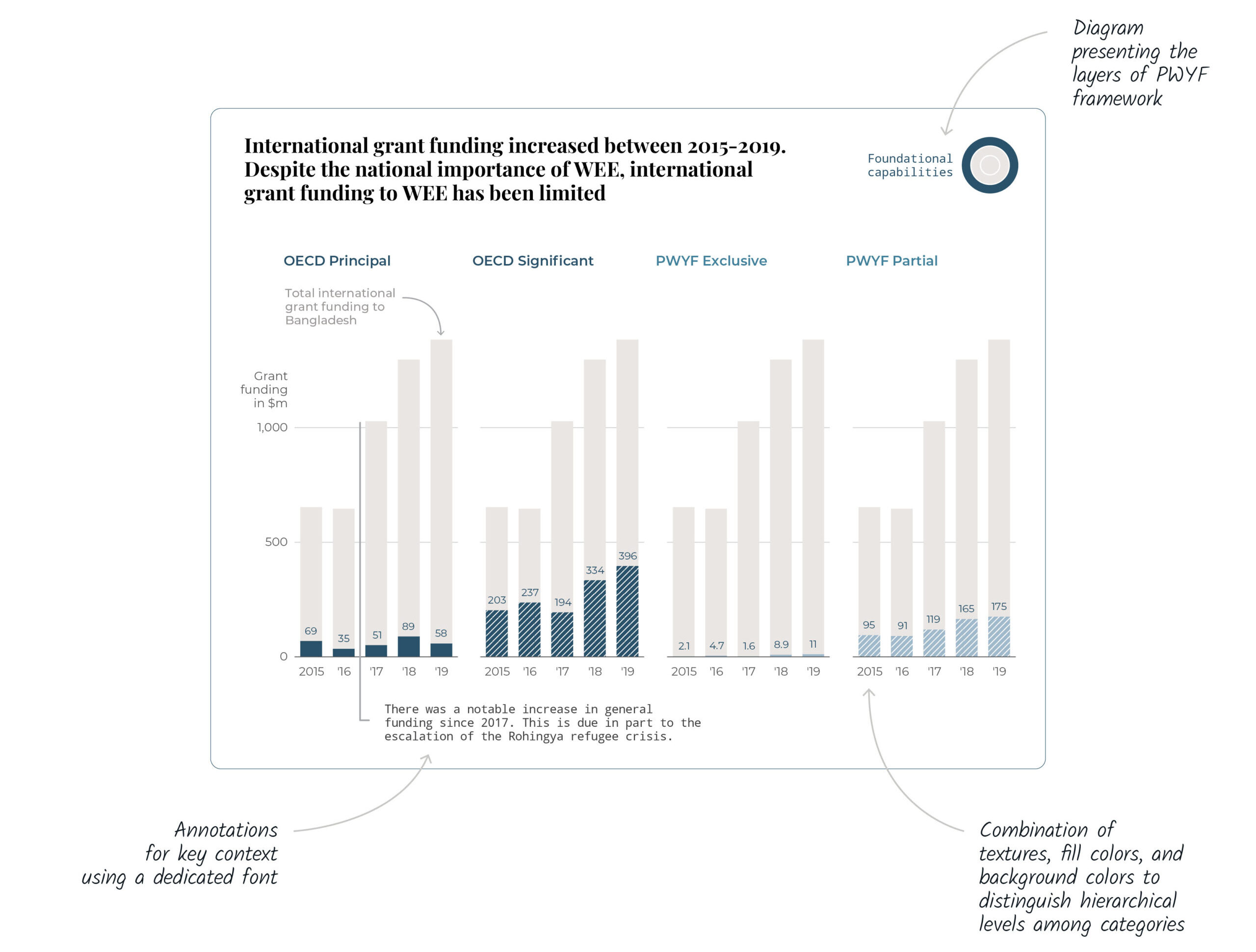
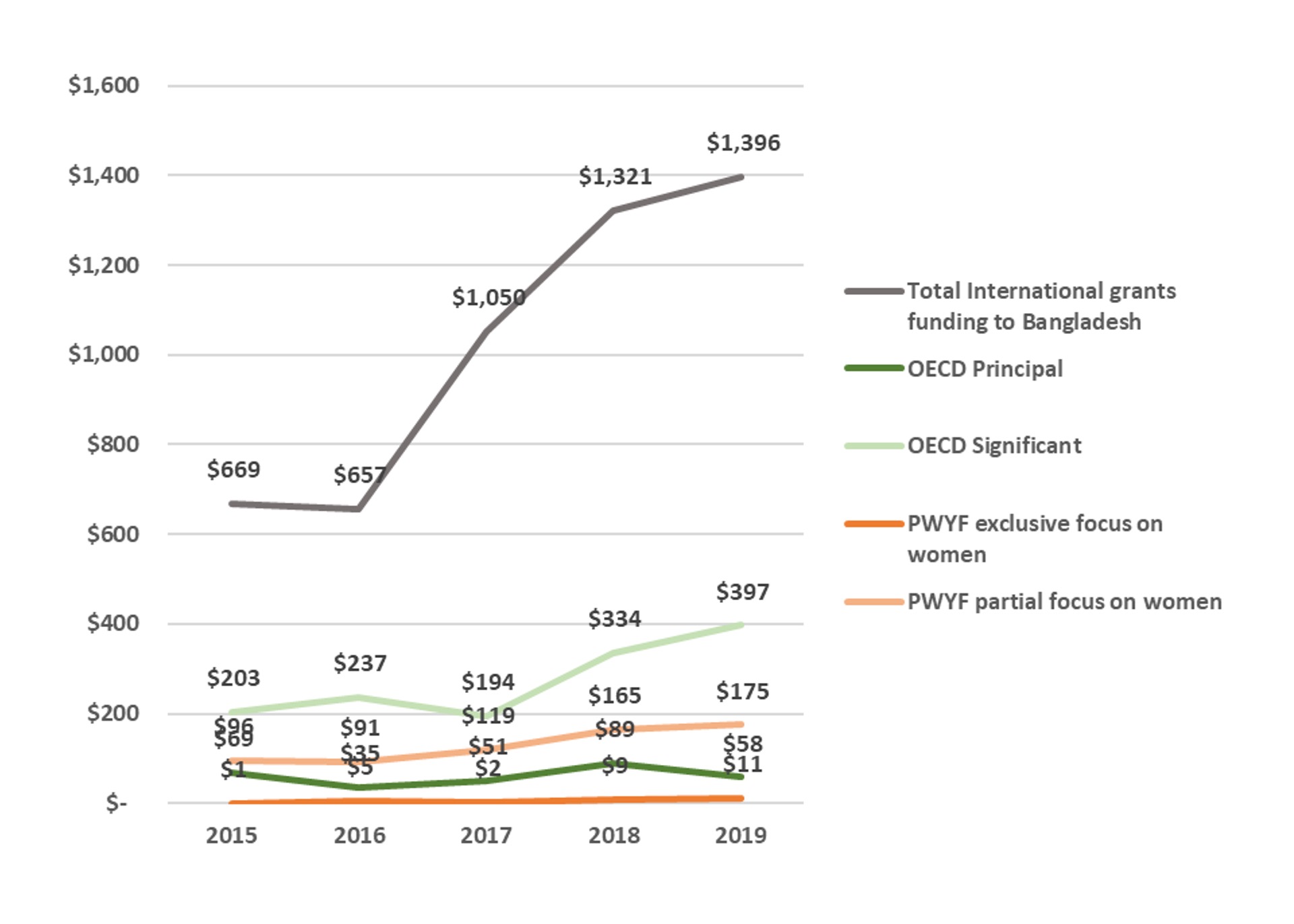
The charts show results related to three countries, which are Kenya, Nigeria and Bangladesh. They served as case studies for how well international aid supports women’s economic advancement.
Beyond columns and bars: creative data visualization choices
Publish What You Fund brought us a wide variety of datasets, each with their own message. They also requested us to develop a playful and creative approach whenever it was possible.
In order to bring it to life, we explored some unusual types of charts.
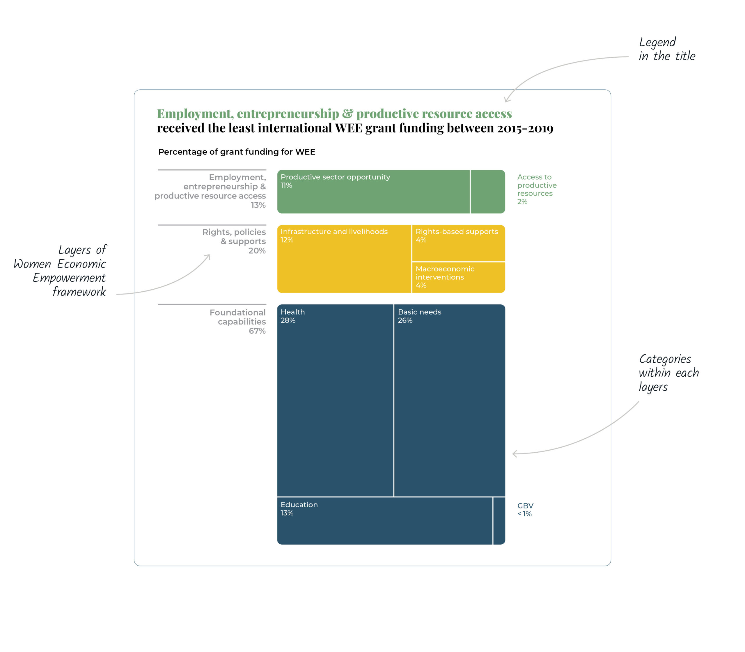
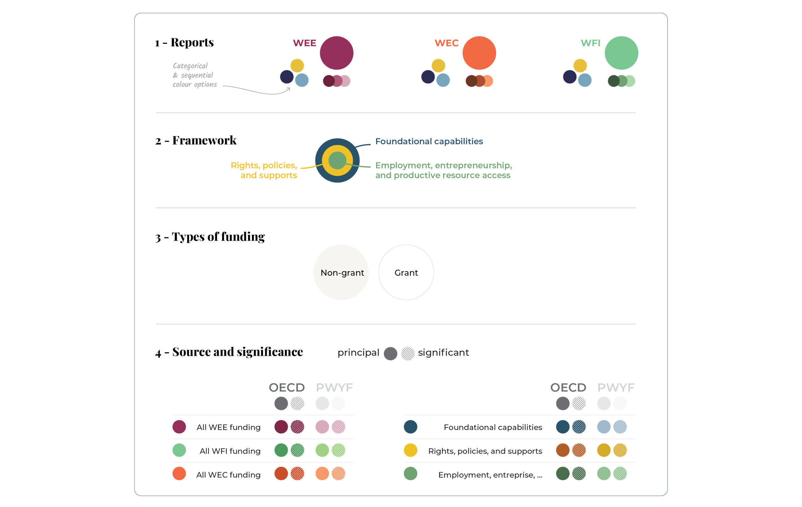
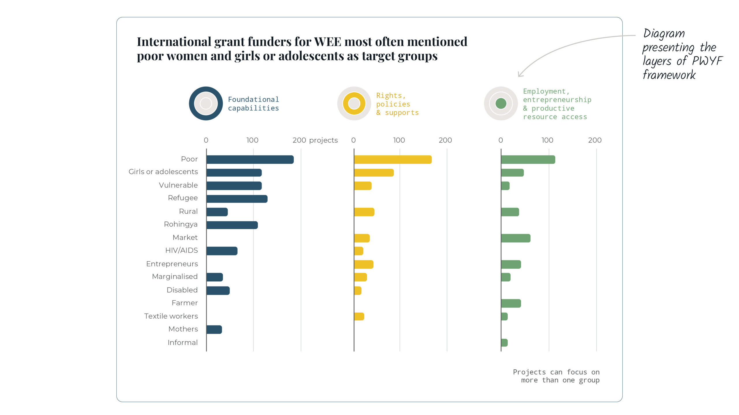
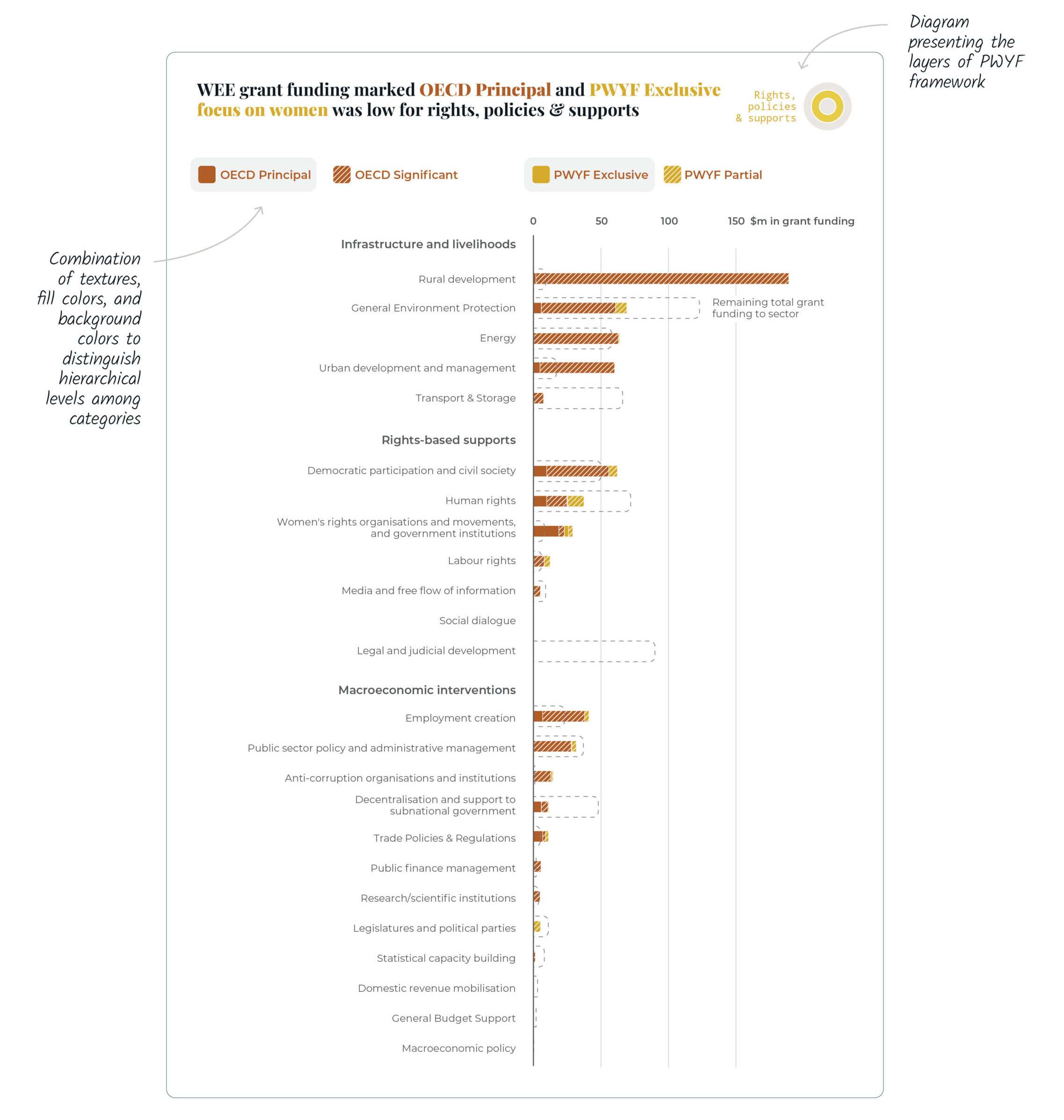
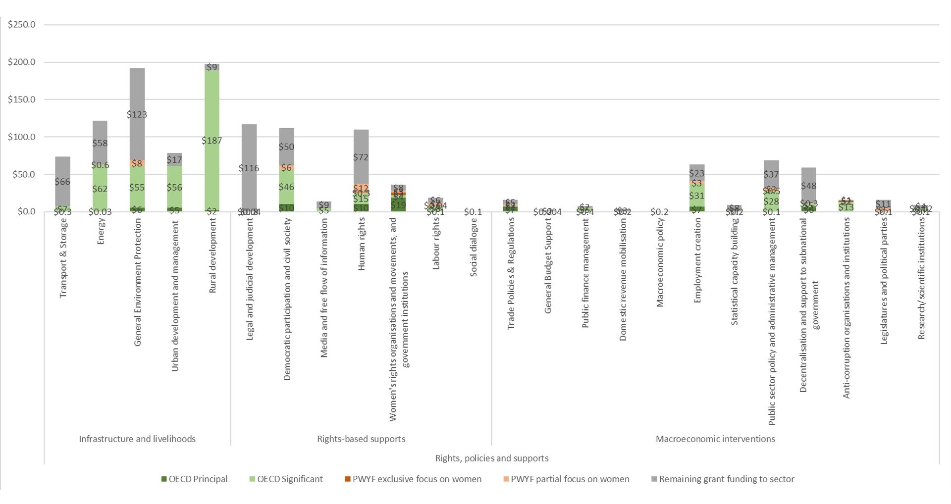
For example, we combined treemap and marimekko charts to represent the funding distributions through the categories analyzed by the organization, while emphasizing the three layers of their women economic empowerment framework.
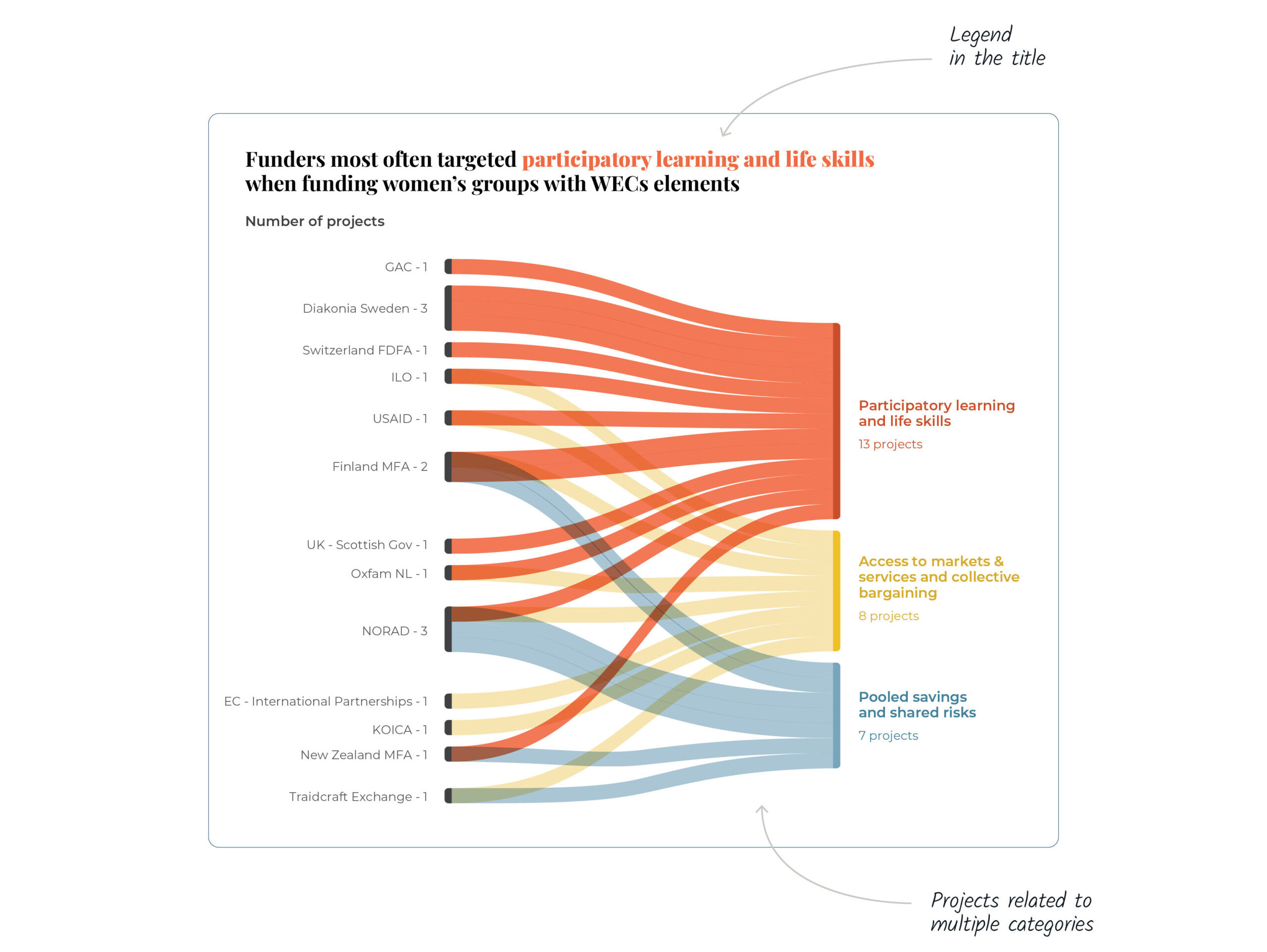
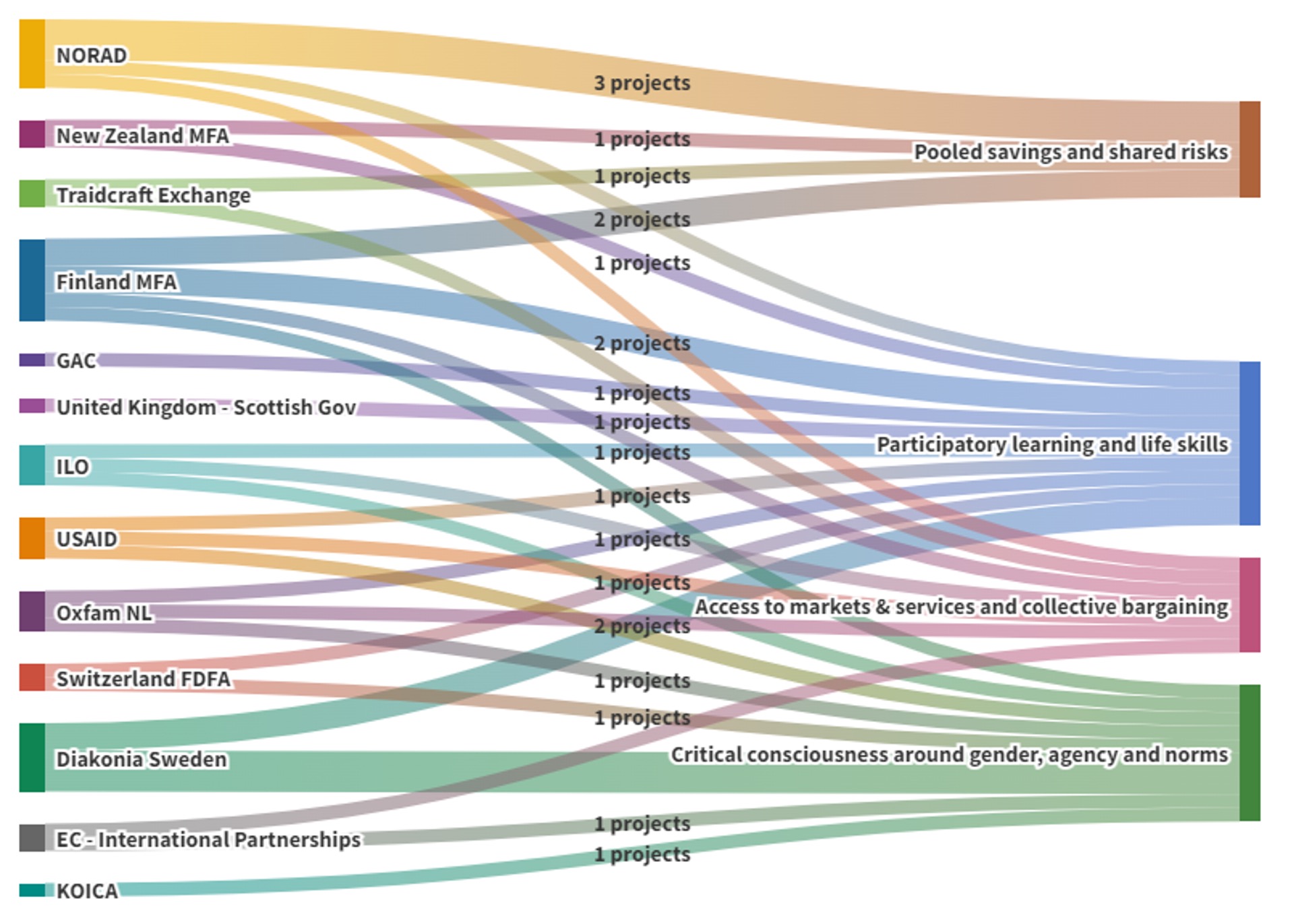
We also made some adjustments to the classic alluvial chart. Instead of being mutually exclusive, multiple projects could be related to various categories.
Before
Before
A visual identity that’s creative and accessible
One of our client’s wishes was to create a visual identity that would be “playful” and “creative”.
In addition to playing around with different types of charts, we also found that a small change could make a big visual difference: replace sharp corners with rounded ones across all charts. This makes it easier to read information and provides a more refined display.
Navigating complexity through a visual taxonomy
The complexity of this project comes from the multiple ways of organizing and analyzing the data which is categorized as follows:
Three Women Economic Empowerment frameworks (WEE, WEC, WFI);
Three countries (Bangladesh, Kenya and Nigeria);
Two types of funding (grant, non-grant);
Two sources of categorization (OECD vs Publish What you Fund)
Two levels of significance (significant, partial).
To make the complexity more manageable to the reader, we used relevant visual tools: