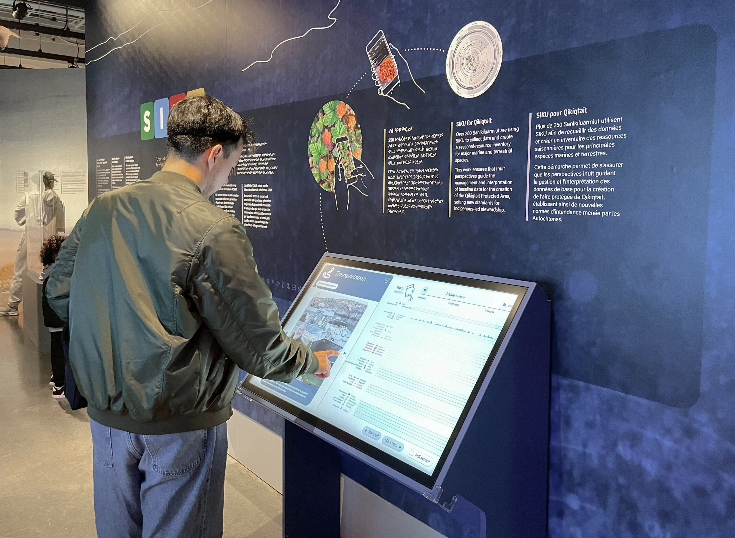
In 2025, Voilà designed and implemented an interactive seasonal harvest wheel for the Qikiqtait region. Commissioned by the Arctic Eider Society, the static wheel was later adapted into an interactive experience at the request of the Canadian Museum of Nature for one of its exhibitions. The harvest wheel allows visitors to explore the seasonal food resources of Inuit and Cree communities in the Hudson Bay region.
The origins of the wheel
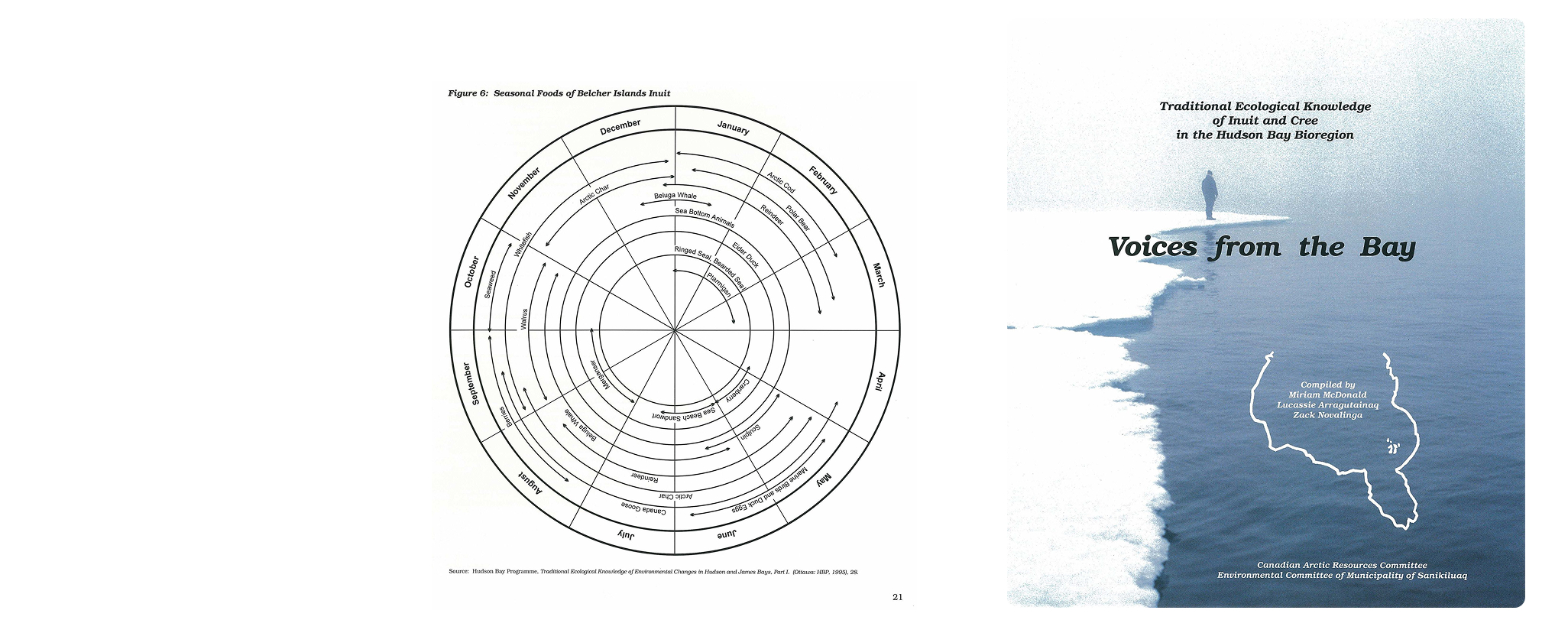
The original visual representing the seasonal food wheel was created in 1998 for the book Voices from the Bay. It illustrates ancestral knowledge about the seasonality of food resources in the Hudson Bay region. The Arctic Eider Society wanted to overlay new data collected as part of a community-led project, powered by the Sanikiluaq community. This community is the one who initiated the project and its vision, in which the SIKU mobile application allows land users to collect observations and record harvests for different species in the field.
Designing the wheel
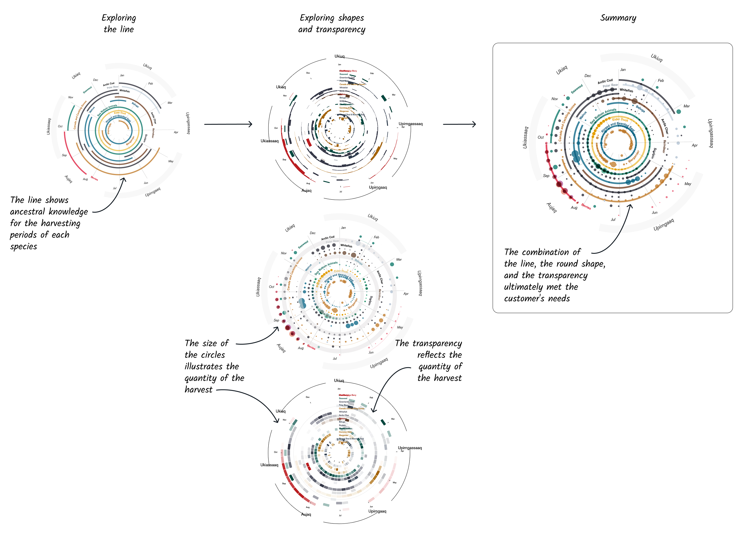
The main challenge was to combine two sources of information for each harvested species, while creating a tool that was both understandable and aesthetically pleasing. The client wanted the circular chart to show both the harvesting periods for several species throughout the year and the intensity of harvesting for each species during those periods.
We explored several designs before finding the ideal solution.
The interactive functions
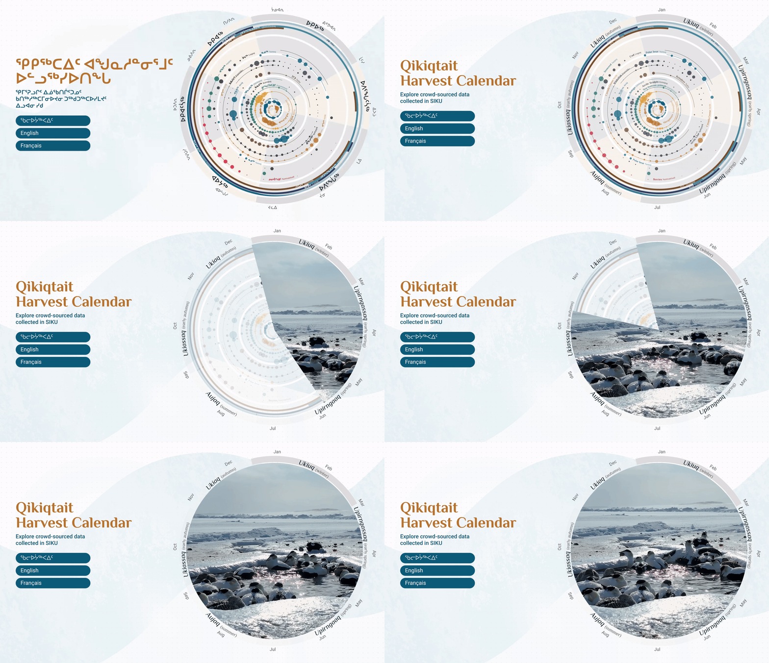
The interactive experience was designed in three languages—Inuktitut, English, and French—which can be selected on the home screen. It was designed to be appealing in order to capture the attention of passersby and invite them to interact.
A sequence alternating between images of the wheel and videos showing activities related to the different seasons plays every 5 to 10 seconds. Each video begins at the location of the season on the wheel itself. The other seasons fade in opacity, while the season in question remains more visible.
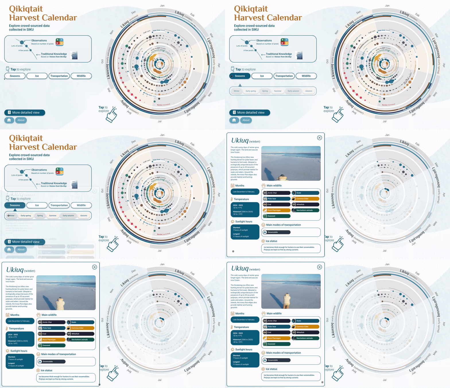
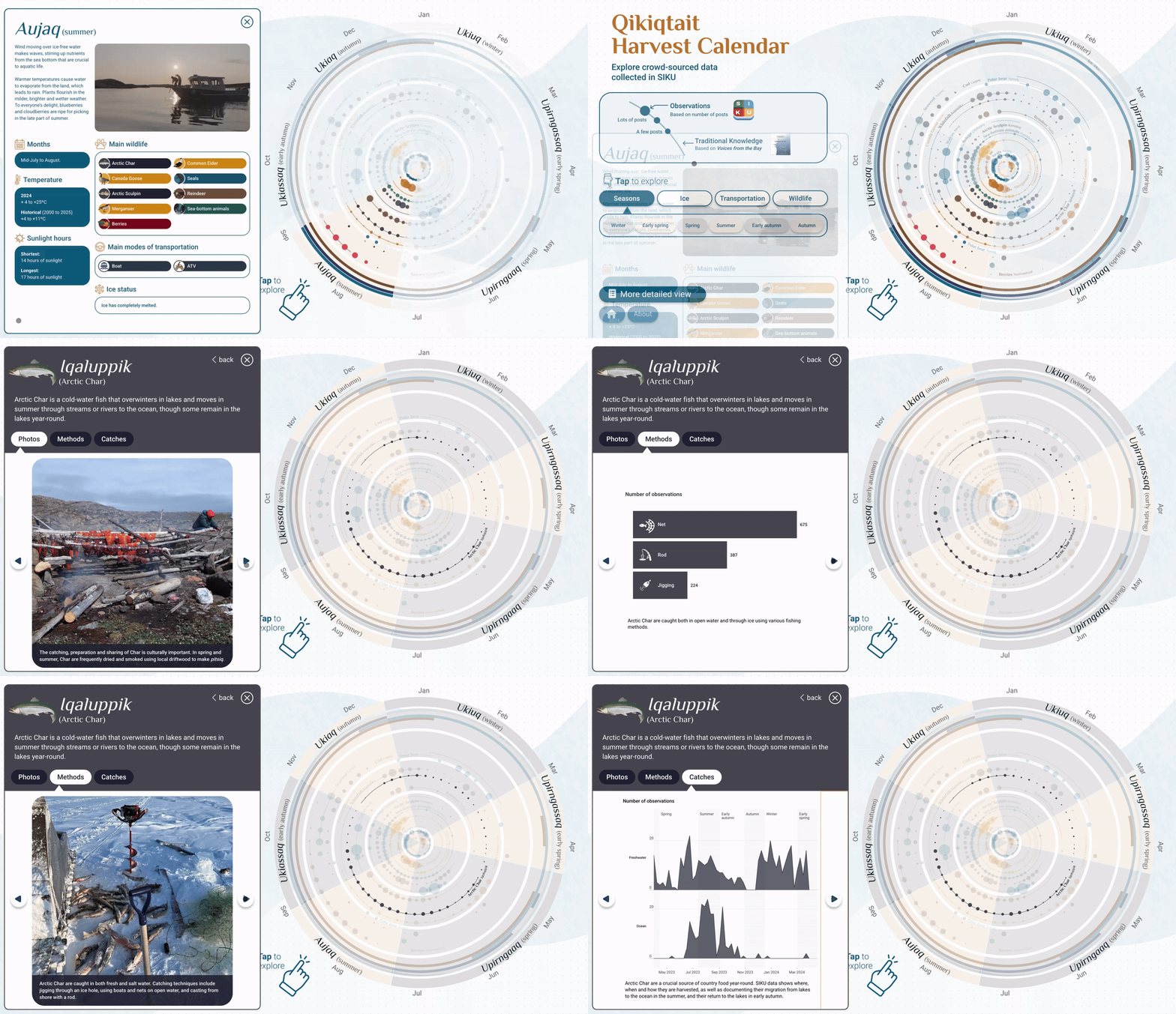
The experience first shows how the data was collected using the SIKU application. Then it is possible to explore the information in more detail. The “Seasons” button opens a drop-down menu offering a choice of six seasons in the region. Information is provided on the time of the season, temperatures, sunlight hours, ice status, main wildlife, and main modes of transportation used by communities.
Each of these topics can be explored in greater depth. Here is an example with additional information on Arctic Char.
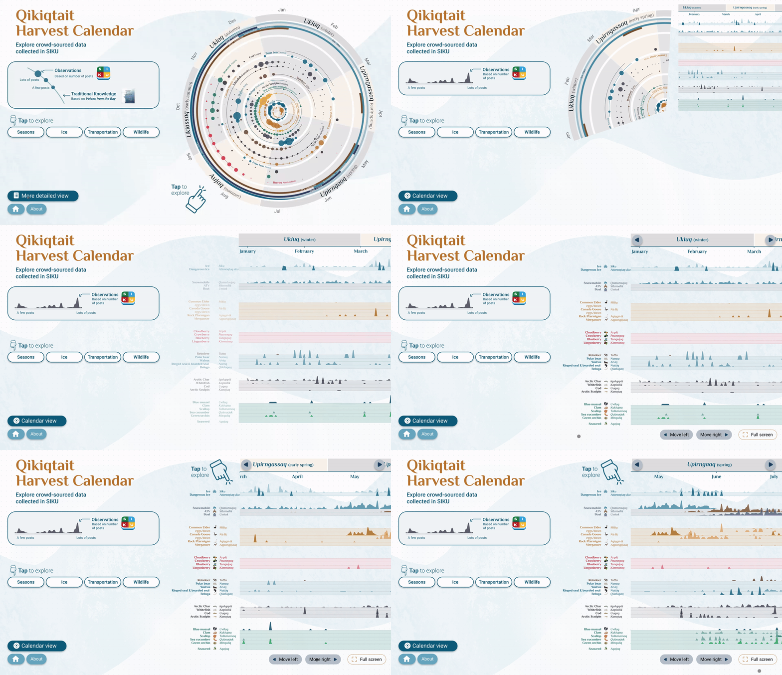
While exploring the tool, you can access more details about the harvests by clicking on the “More detailed view” button. The visitor will then see the wheel unfold and enlarge before their eyes, allowing them to access more information and details broken down month by month. Here again, the visuals remain clickable for further information.
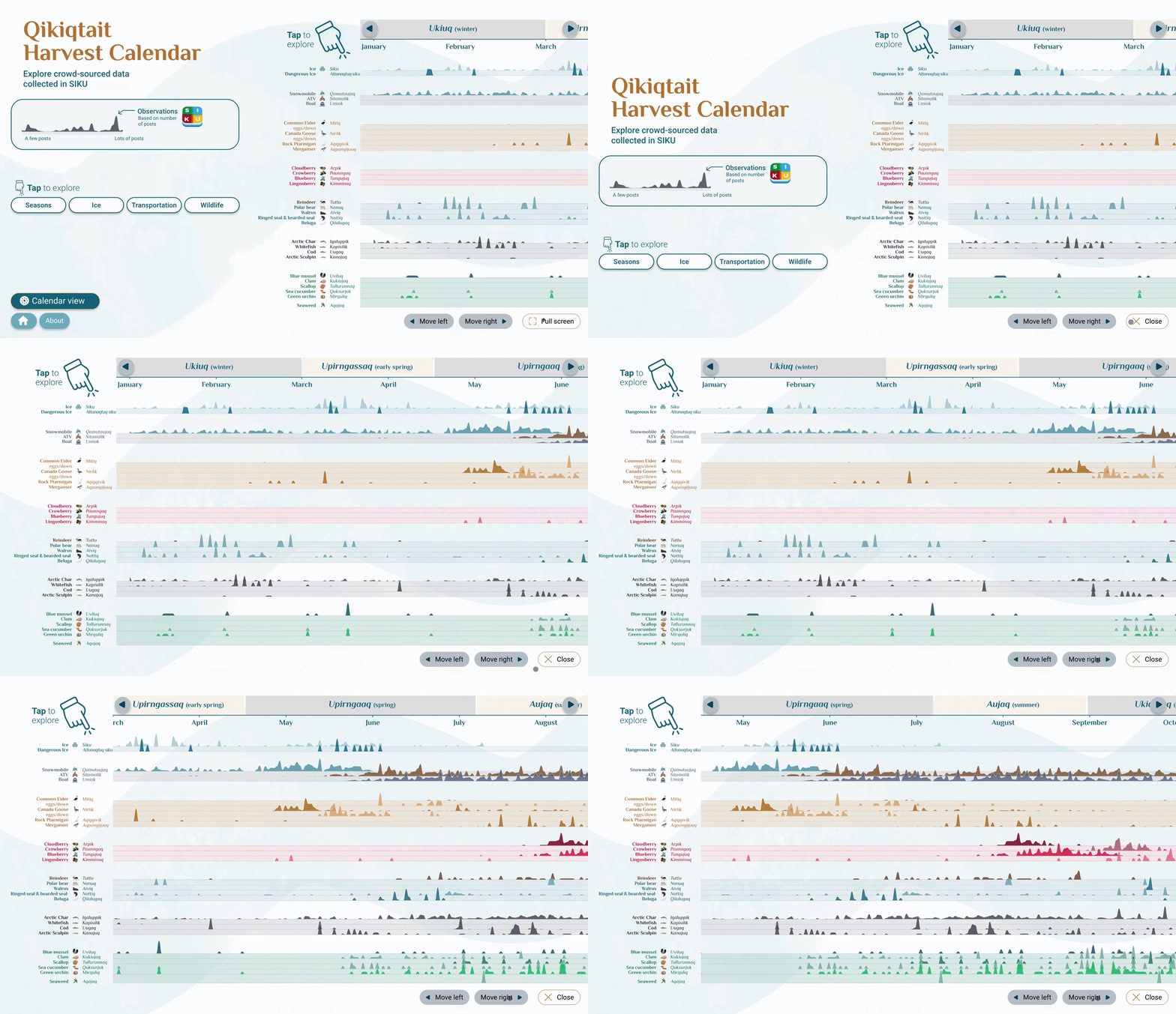
By clicking on “Full screen” the view expands to fill the entire space.
A positive impact
This project has successfully integrated harvest data and condition observations from Indigenous-led projects using SIKU with traditional knowledge, resulting in a high-impact data visualization tool. The resulting Qikiqtait Resource Calendar facilitates the interpretation of data collection and the relevant use of data for wildlife management, stewardship, and decision-making led by and for Inuit. It has also fostered significant engagement from the community, other Indigenous organizations, government representatives, academics, and stakeholders around the results of the ongoing project.
For more information about the exhibition and the project, click here.
Want to see your ideas come to life before your eyes? Contact us.