Jorge Cameos blogs about pie charts over at ExcelCharts.com. He doesn’t like them. Indeed, pie charts do not get much love in the data visualization community, as popular as they are outside of it. I’m fascinated by this discrepancy, trying to understand if it yields from ignorance, naivete, instinct, snobbery, expertise, science, else or all of it. I need to: I work in an environment where they receive much love and I don’t like them very much.
Jorge’s point is that pie charts are not good to make comparisons beyond one category against a whole. Have a look, he makes a compelling case. I especially agree with the problems of comparing data points across pie charts.
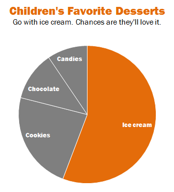
Still, here I come in defense of pie chart’s capacity to compare more than two categories (I agree with Mark Stacey that it’s more accurate than saying “one” category). A pie chart can allow you to compare the proportion of one category against another or a group of other categories. Here is an example.

The trick is to group the other categories to make one stand out. We still compare ice cream against the whole of children’s favorite desserts, but we add information that the rest is divided in many portions. It seems better than grouping them under an “Other” category. Using one color, with dividers, is sufficient. It is not the place to compare other desserts amongst themselves, of course.
My point does not go against that of Jorge. It remains one category against a whole. But I thought that this nuance (and this field is full of nuances!) could help people think about using pie charts and not automatically exclude them when they have more than two categories of data. Try isolating the one you want to highlight and visually group the others.
Because we can visually estimate quarters and halves, pie charts are good to show when we reach certain thresholds, such as when a plurality becomes a majority, in ways that bar charts are not. Notice how I don’t even need to write percentages on the chart and yet, you know ice cream is a little above 50%. In many data sets where plurality and majority are important – think of electoral politics or demographics for instance – this can be useful.
So, here’s to pie charts! *running for cover*
Francis Gagnon is an information designer and the founder of Voilà: (2013), a data visualization agency specialized in sustainable development.

