The third week’s assignment was right up my alley: aid transparency. It is even more disappointing then that I was not able to complete something worthy.
The source data comes from the Transparency Index of Publish What You Fund and takes the form of a ranking of aid agencies according to their transparency score. I expected the students to visualize this ranking, making more apparent the comparison between agencies, highlighting their strengths and weaknesses. I decided to try something different by visualizing the indicators themselves. I thought that it could be a nice way of explaining data transparency by detailing how it is measured. Here is my entry.
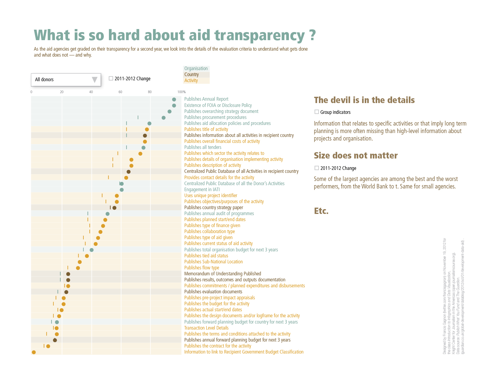
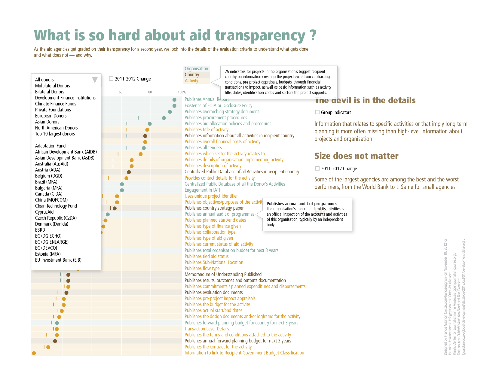
The assignment was for an interactive visualization, so the image below shows some of the interactivity that could be prompted by the users, namely a series of definitions and the capacity to select a subset of indicators.
Using Adobe InDesign, means drawing every data point and this took way longer than it should, mainly because it does not add so much to the graph to have very precise data. Most people just give a quick look and are mostly interested in the ways in which the data is visualized, more than the result of the visualization. This point was driven home by the multiple hand drawn sketches of fellow students that did not approach accuracy, but that sometimes conveyed clearly enough their concept. The next week, I wouldn’t be caught.
Given the call for a narrative, I spent some time finding and writing some analysis. Again, this is not something that I expect anyone to read — at least, no one has ever commented on the text — so it does not seem like a good investment of time.
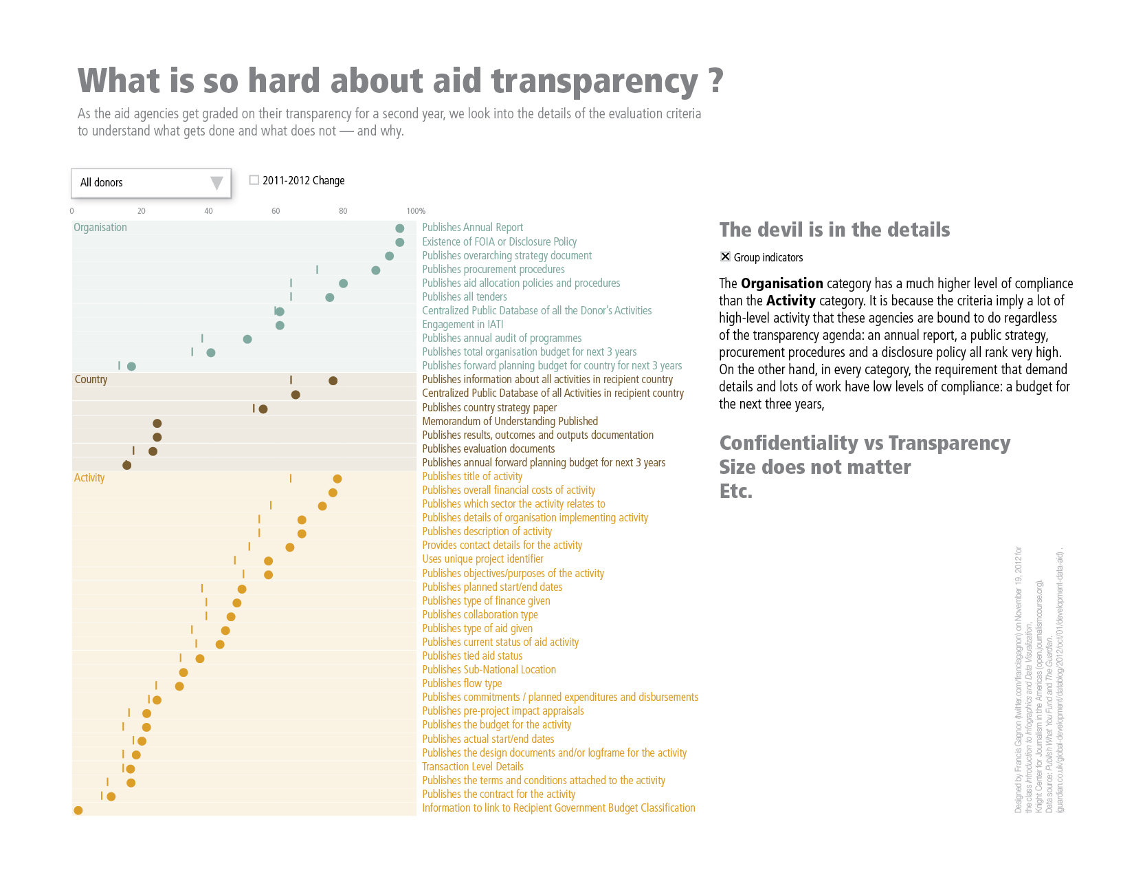
In general, I like to use colors to visually group things, but more than once my audience has been more interested to see things grouped by subcategories, so that’s what I have done here with the three categories of transparency. See how the colors are grouped. I have to say that it worked better than I had anticipated.
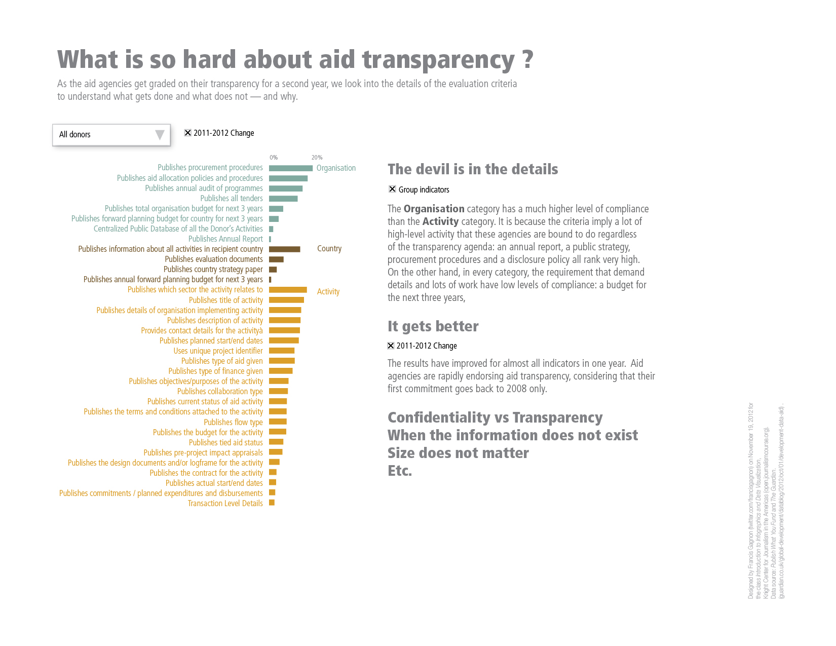
This slide shows only the improvement of each indicator. The main message is that all indicators have improved over the last year, although some much more than others.
In the end, I did not get to produce something of the quality I was hoping for. I picked my colors at random, I did not include a legend, I did not push the analysis, etc. But the week was over and another assignment was waiting. The point is not so much to create a perfect infographic, but to learn and this goal was already achieved.
Francis Gagnon is an information designer and the founder of Voilà: (2013), a data visualization agency specialized in sustainable development.
