In the coming months, we will finally be updating our portfolio to better reflect what Voilà: has become over the last couple of years. Today, we are adding what was then our first interactive, developed in late 2020, for FinDev Canada, an international development agency.
This was a breakthrough for our team of four at the time: Olivia Gélinas, Estelle Villemin, Chloé Cousin and myself.
I’m not that good at design, I don’t know how to code and this was a very complex project to coordinate. This was truly only possible as a team. Merci!
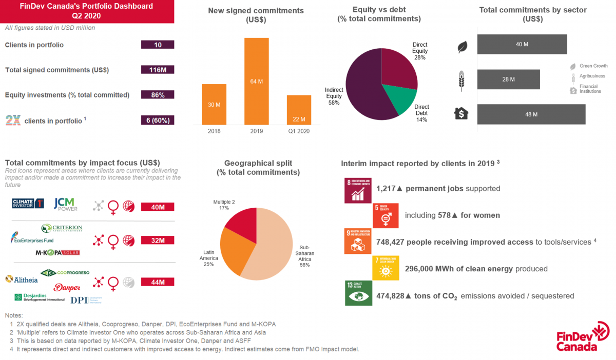
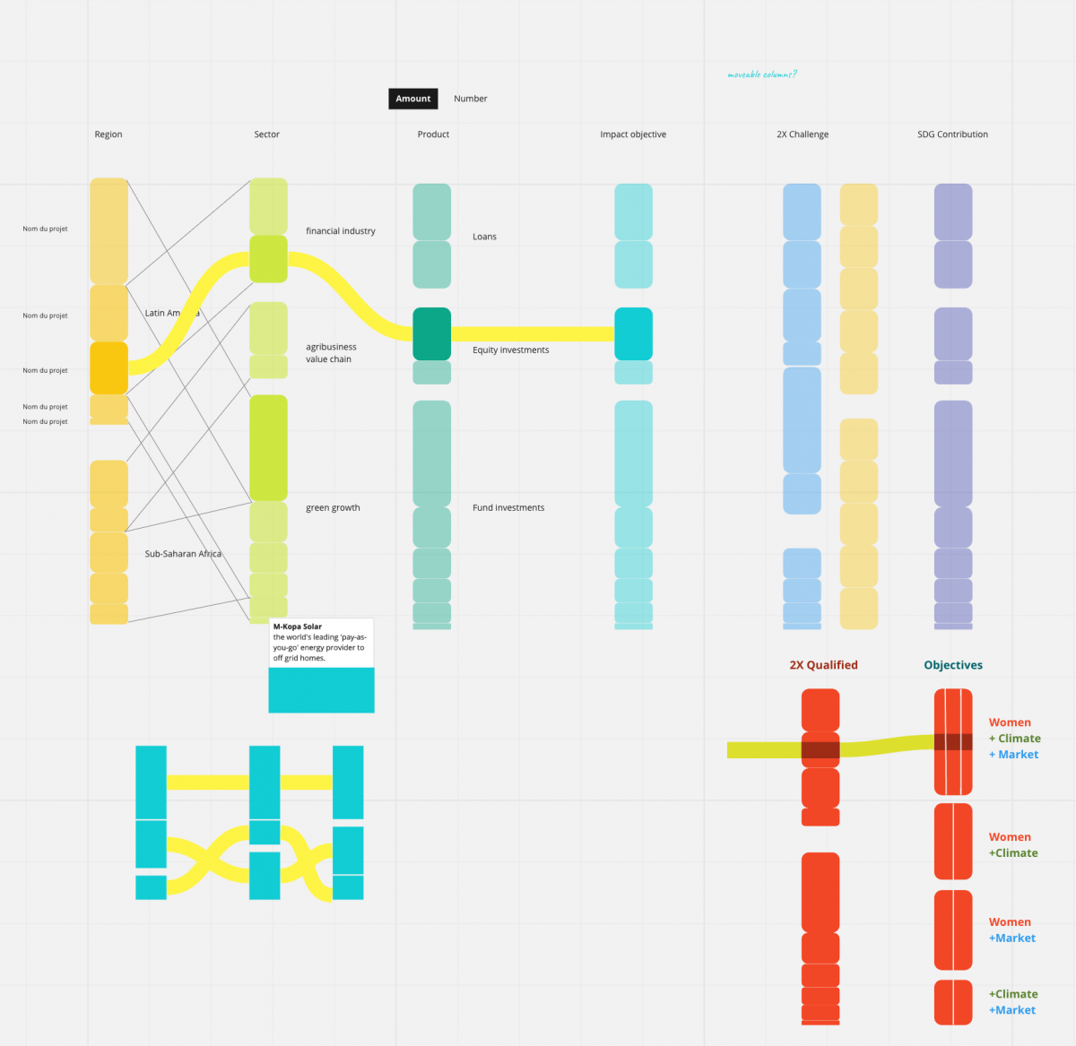
I’m especially pleased that the solution — an alluvial — may appear obvious… because it is not. Here was our starting point: a collection of data points that seem unrelated.
Below is the first sketch of the alluvial. The insight was that many of these categories were actually reorganizations of the same data: the projects’ value in dollars. We wanted a design that clarified this continuity and hence communicated the nature of the data.
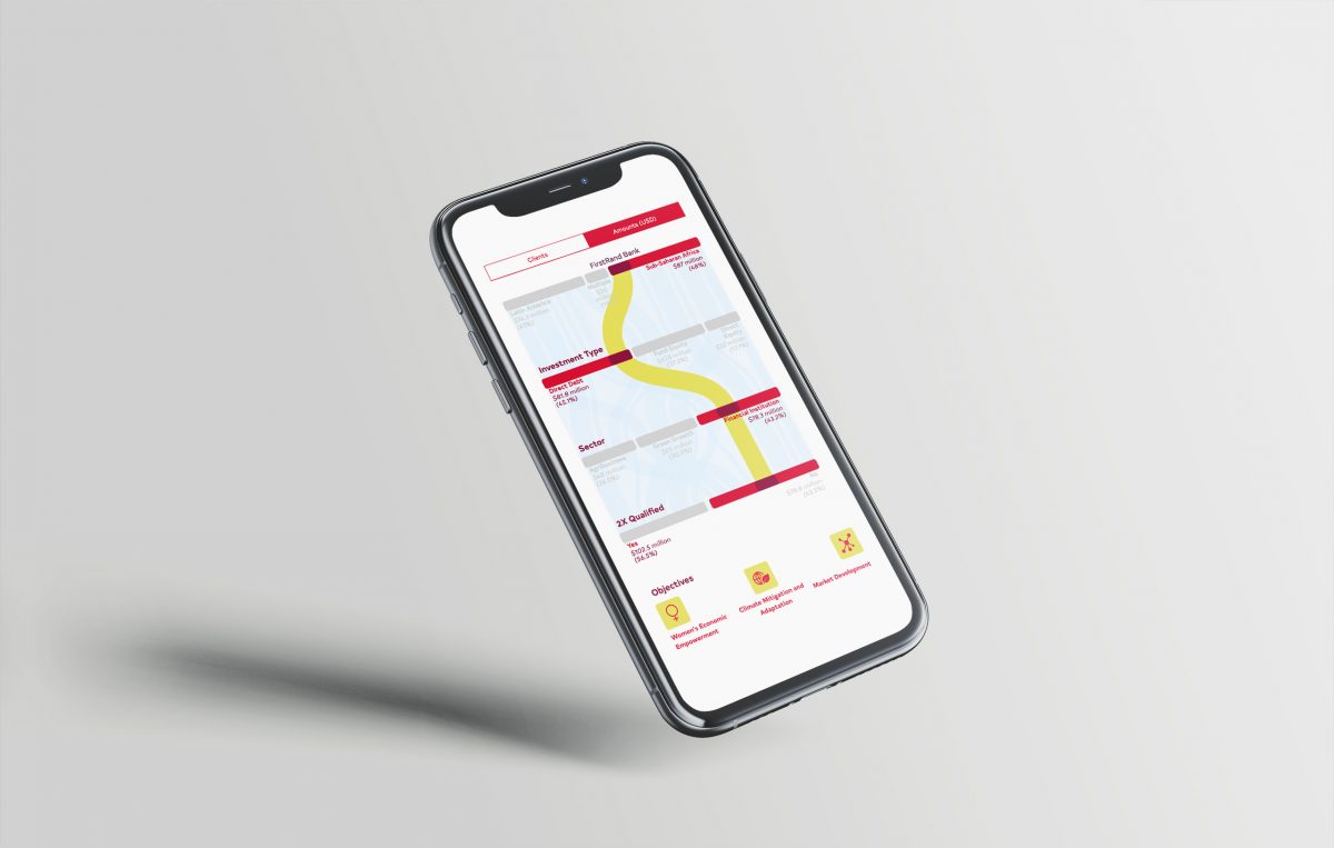
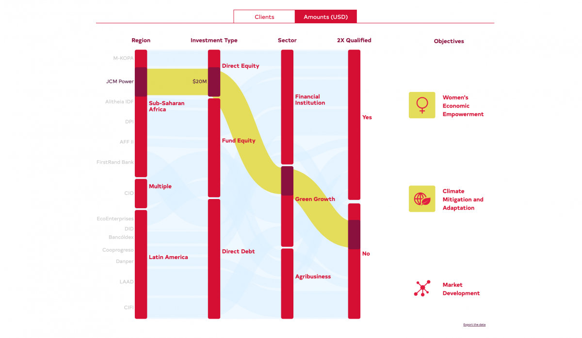
This is what the final version looks like.
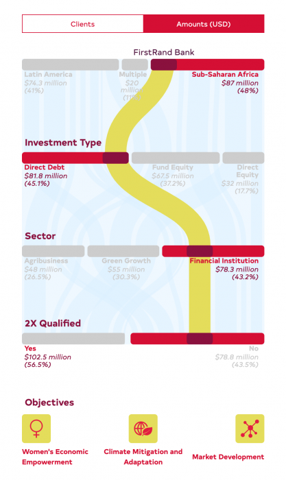
We are especially happy that it works on mobile without losing functionalities.
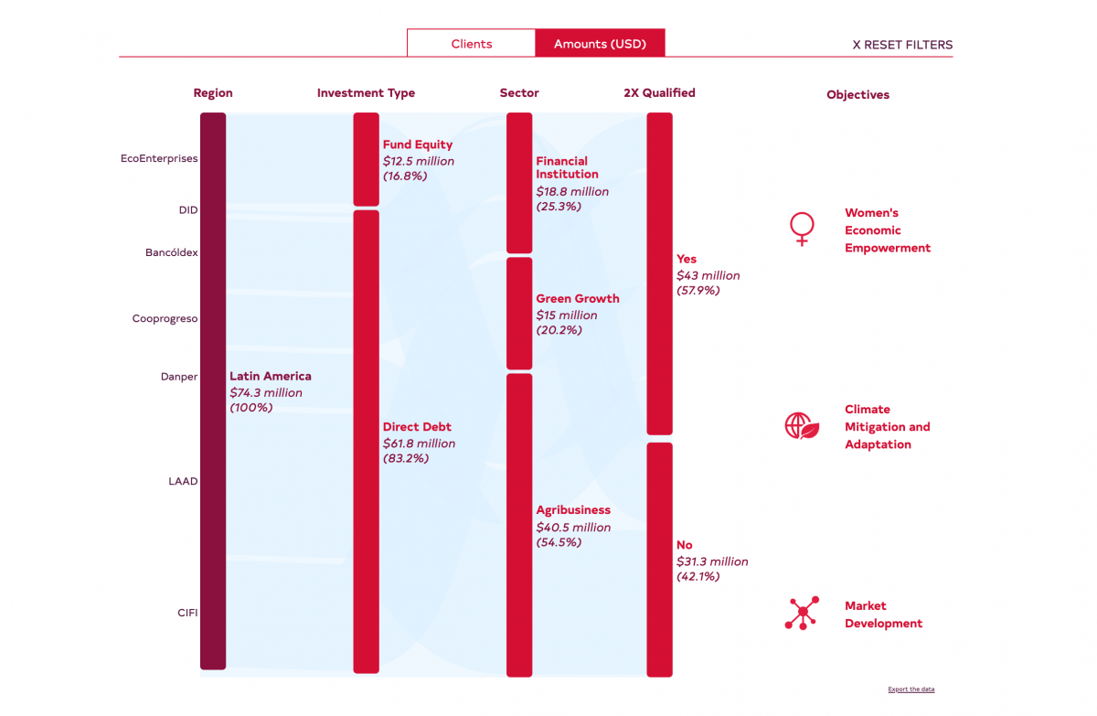
Another aspect that we like is that it is a dashboard that doesn’t look like a dashboard. Instead of a drop-down menu, the user clicks on any category to filter the data. Here is an example that filters only projects in Latin America. Every other column only displays projects in that region, making it possible to see the portfolio of a given region, investment type, sector, etc. in one click.
Since then, we have done more interactives and this one is revealed a little late (where is the time to update portfolios?), but we’re really happy with it.
Francis Gagnon is an information designer and the founder of Voilà: (2013), a data visualization agency specialized in sustainable development.
