Last year, the World Economic Forum published an article by Dr. Blake Shaffer (University of Calgary) about key findings related to fuel consumption of vehicles in Canada. The findings came from a report published by the International Energy Agency.
Given that we’re focused on the topics of sustainability and climate change (and based in Canada), this article recently caught our eye on Twitter. We started discussing the data visualisation and then thought it could be interesting to share our thoughts publicly. So here is what we thought of three of the six graphs, and how we would have tweaked them.
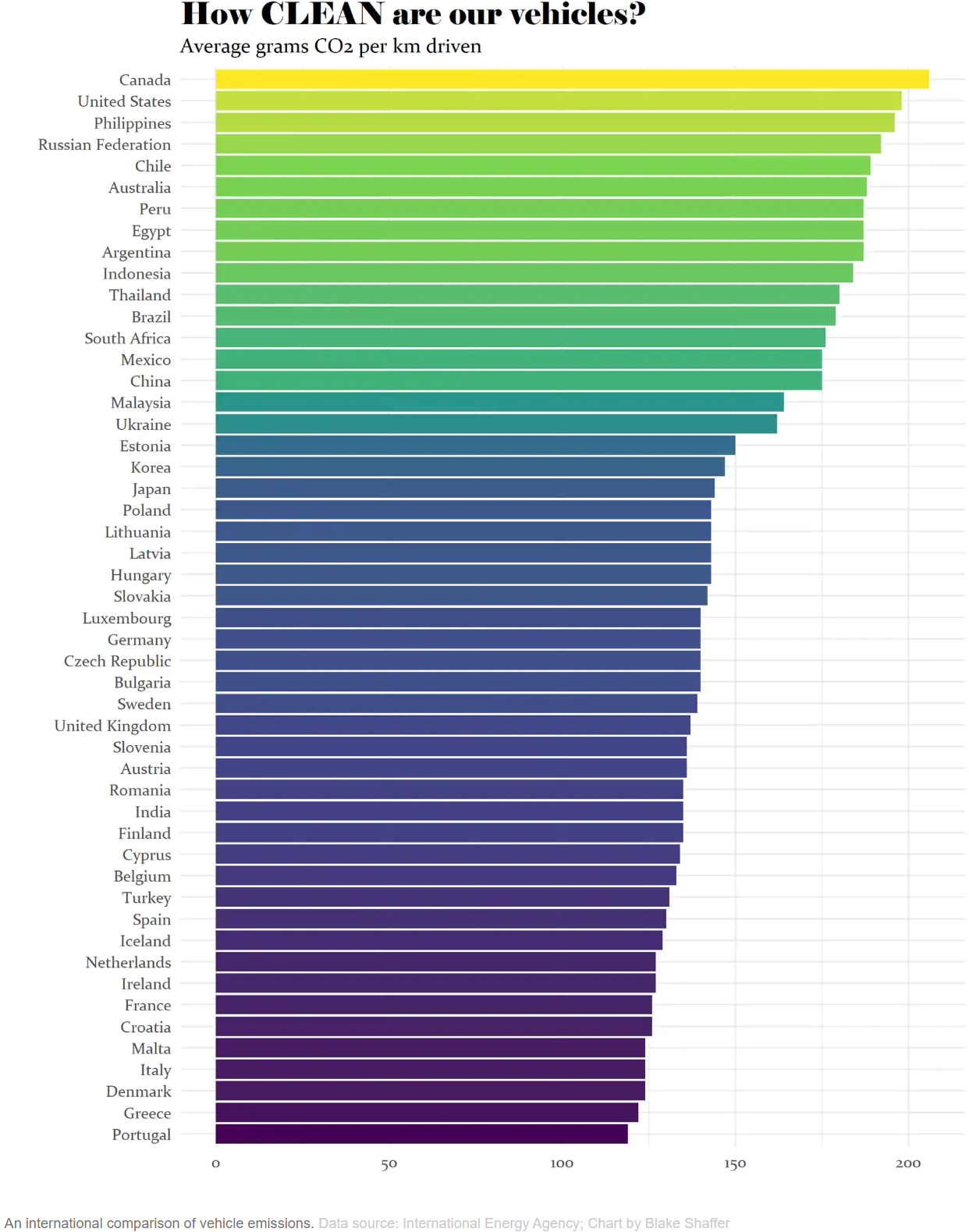
Chart 1: Vehicle emissions
The original chart is below. There are a few things we liked immediately.

Visual hierarchy is used to direct the eye
Good visual hierarchy
The size and placement of the text encourages us to look towards the most crucial information first. Good visual hierarchy helps you quickly understand what you’re looking at and to not get confused or lost.
In this chart, the visual hierarchy directs us to read the title (which explains what the chart is showing), then the subtitle (which explains how to interpret the data), and finally the data itself.
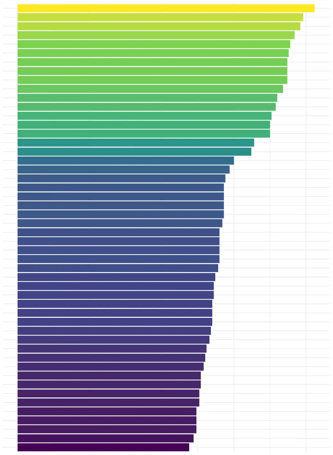
That being said, one quick improvement would be having the axis labels at the top of the chart instead of at the bottom so that we immediately know the values of the first bars.
Bars in a useful order
Ordering the bars based on length is another good design choice because that makes it much easier to understand and analyze the data in the chart. You can quickly identify the extremes, the approximate distribution, items with similar values, etc.
When working with a larger number of bars, the reflex is often to organize the data in alphabetical order to make it easier to find specific items when reading the chart. In reality, unless the number of items is very very long (think scrolling through your contact list), the analytical advantage that comes from ordering items by value is usually well worth the extra time it takes to find a specific item.
Horizontal bar chart
This chart type is a great choice here because there’s room for longer data labels. Also, the labels are horizontal text which is faster and more comfortable to read than diagonal or sideways text.
Possible improvements
Better coherence between title and chart
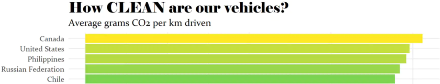
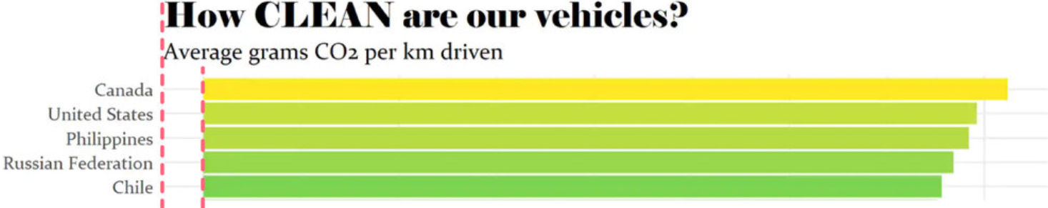
There is some dissonance between the title, the bar colours, and the content of the graph. When we first look at the chart, we read this title:

Wording and capitalization suggest that this is a graph about cleanliness. The colours reinforce that impression, with the long green bars are the top looking the cleanest.
Then the subtitle “Average grams CO₂ per km driven” reveals that the chart shows the opposite: how much a vehicle pollutes. The bright green lines at the top are the countries with the vehicles that pollute the most.
The difference in the messages sent by the title, the colour scale, and the data make it harder to understand the chart’s message and to remember the core message behind the chart. It can also make it more difficult to remember how you’re supposed to interpret the data on the graph.
A couple options for improving this would be flipping the order of the bars or changing the title to match the bar order, and using more intuitive colours.
Add a point of reference
It’s likely that most people reading this graph don’t know what is considered reasonable in terms of car emissions. Adding relevant context, such as fuel economy standards, can help viewers interpret the data.
Specify the year
Mentioning the data’s time period (and also when the chart was made) helps viewers determine if the chart is relevant and up to date.
Minor layout and style nitpicks
The horizontal grey gridlines in the chart are probably used to clarify which title is associated with which bar, but bringing the titles closer to the bars would create a strong visual association and allow us to reduce noise by removing the horizontal lines.
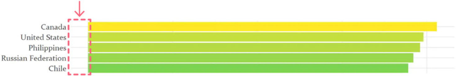
The bars are not aligned with the title and subtitle which creates two visual lines. Aligning everything makes the graph cleaner.
Proposed redesign
The redesign below tries to improve upon the above points and puts emphasis on Canada through a descriptive title and colour choice. The oranges and reds reinforce the message that high emissions are bad.
The emissions targets give an idea of who has “excessive” or “acceptable” emissions. Adding an emissions recommendation made by an independent organization could also have been interesting.
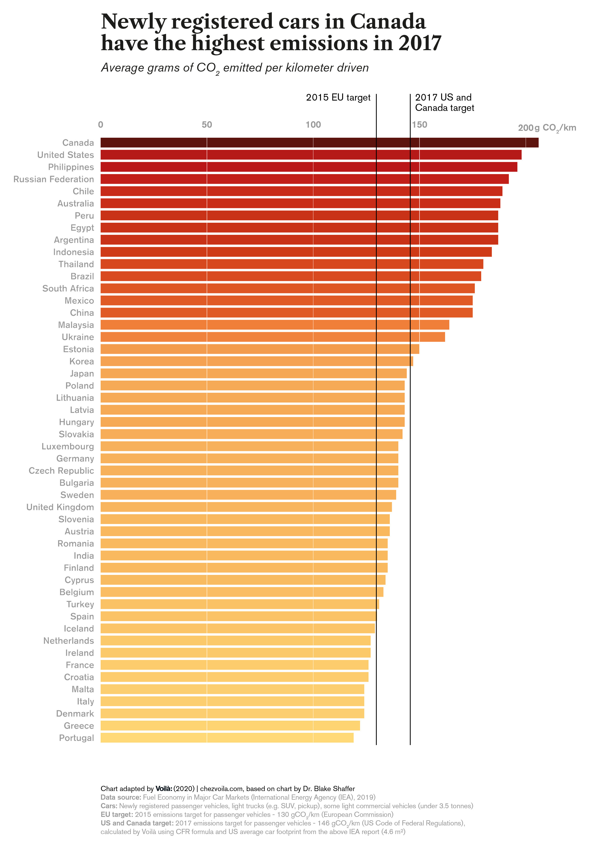
Chart 2: Canadian fuel consumption
Overall, the original graph is quite good and there are some nice details that support the viewer’s understanding.
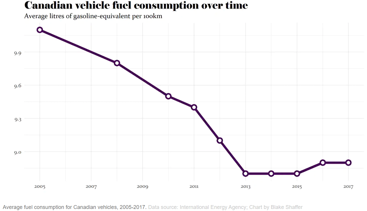
In this case, not having a visible baseline is good because the vertical axis doesn’t start at zero.
Marking each data point with a white dot makes it clear that the data for some years is missing.
Possible improvements
Leave the bottom third of the graph empty
The vertical axis starts at 8.7, but because there is no space left below the curve the line can give the impression that it’s dropping to zero. Leaving the bottom third empty encourages the viewer to look towards the y-axis for a reference instead of assuming the line drops to zero. Our blog post on this “golden ratio” goes into more detail about this principle.
Add a point of reference
This graph could benefit from some context so that we know how Canada is doing in comparison with other countries.
Communicate the message with the title
The title is very descriptive of the data, but not of the message. The title of a graph can clarify what is interesting about the data and tell us what we should look at.
Proposed redesign
The redesign presents the fuel consumption data for all available countries while putting emphasis on Canada and a couple others for more specific comparison. This context provides a rich picture of where Canada stands as well as an idea of global tendencies.
Empty space is left between the data lines and the x-axis so that the chart doesn’t visually suggest that the lines drop to zero. The title conveys the message.
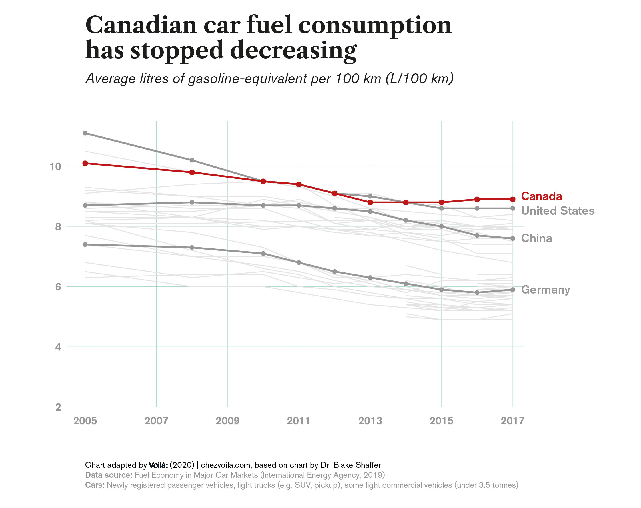
Chart 3: Fuel prices and fuel consumption
This chart is also fairly successful.
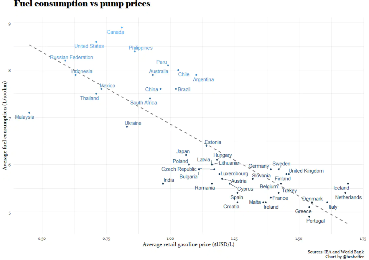
The dotted line emphasizes the correlation between higher fuel prices and lower fuel consumption by visually suggesting how we should read the chart.
Once again, not having a line for the axes makes sense for this chart because neither axis starts at zero.
Possible improvements
Label some points, but not all
Labelling all the points in a dense scatter plot adds a lot of competing information. The text and the lines required to link labels with their points also create visual noise.
Since the chart’s main goal is to communicate a correlation between price and consumption, we can stick to labelling a few countries for reference. Removing most of the labels makes the chart more visually comfortable while still clearly showing the correlation. Outliers and extremes can also be labelled because we’re often curious about them.
Minor layout and style nitpicks
Using horizontal text to label the y-axis instead of sideways text would make the label easier to read. Your gaze tends to glide right over sideways text until you intentionally go back and read it. Horizontal text anchors the eye immediately and is read reflexively.
The points and their labels seem to be coloured based on the country’s average fuel consumption. Using colour to emphasize vertical position does draw your eye up towards Canada, but simply using a contrasting label would be an an easier way to catch the eye.
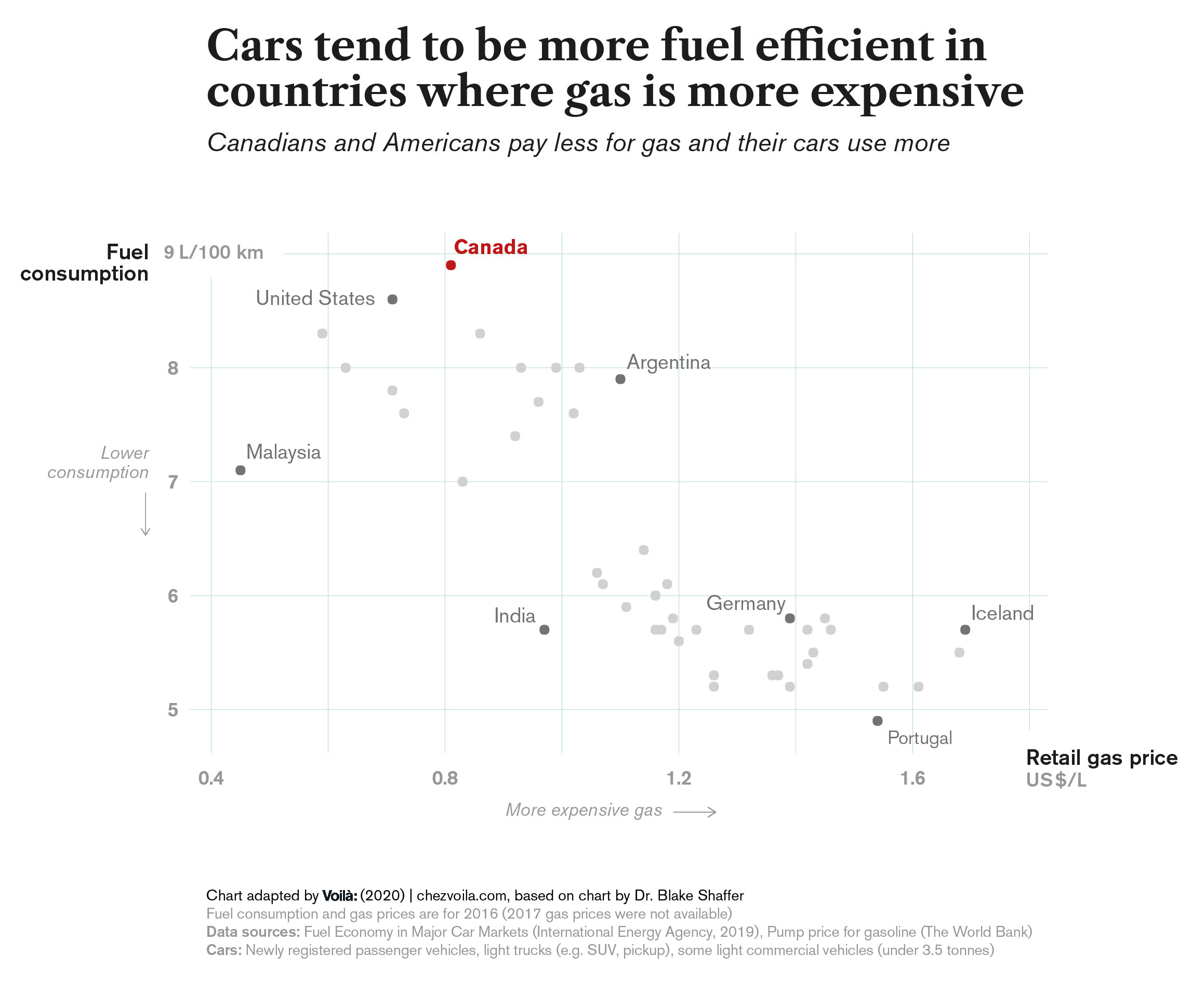
Proposed redesign
The redesign has a title that communicates the chart’s message. It also has some axis annotations that are technically redundant, but they make reading more comfortable. We labelled a few points people might be curious about and colour is used to emphasize Canada as well as the other labelled points. The data’s year is also specified in the chart notes.
We love to see articles like this from the scientific and academic community because they illustrate how certain groups contribute to climate change. Needless to say, we’re happy that the author of this particular article used abundant visuals to communicate the data.
Technical details
To create the redesigns, we first used Plotly’s Python Graphing Library to generate the base chart elements: bars, dots, grid, etc. The code for this part is available on GitHub. Then we exported to PDF so that we could manually add details and polish using Adobe Illustrator.
Erica designs and develops visualisations and proposes improvements for existing ones. She also researches and writes about information design, along with helping to organize activities and formalize processes at Voilà.