For International Women’s Day 2020, we published a series of seven charts (Facebook, Twitter, LinkedIn, Instagram) on social media that illustrate the situation of women, especially in Quebec, but also in Canada and elsewhere.
As we sometimes do, here we explain a few key steps in our chart development process. We chose to present three of the most complex graphs, all of which were developed using Excel, although some in the original series were made with Datawrapper.
Research
We chose the topic about a month in advance and looked up data from l’Institut de la statistique du Québec and Statistics Canada from within the past five years.
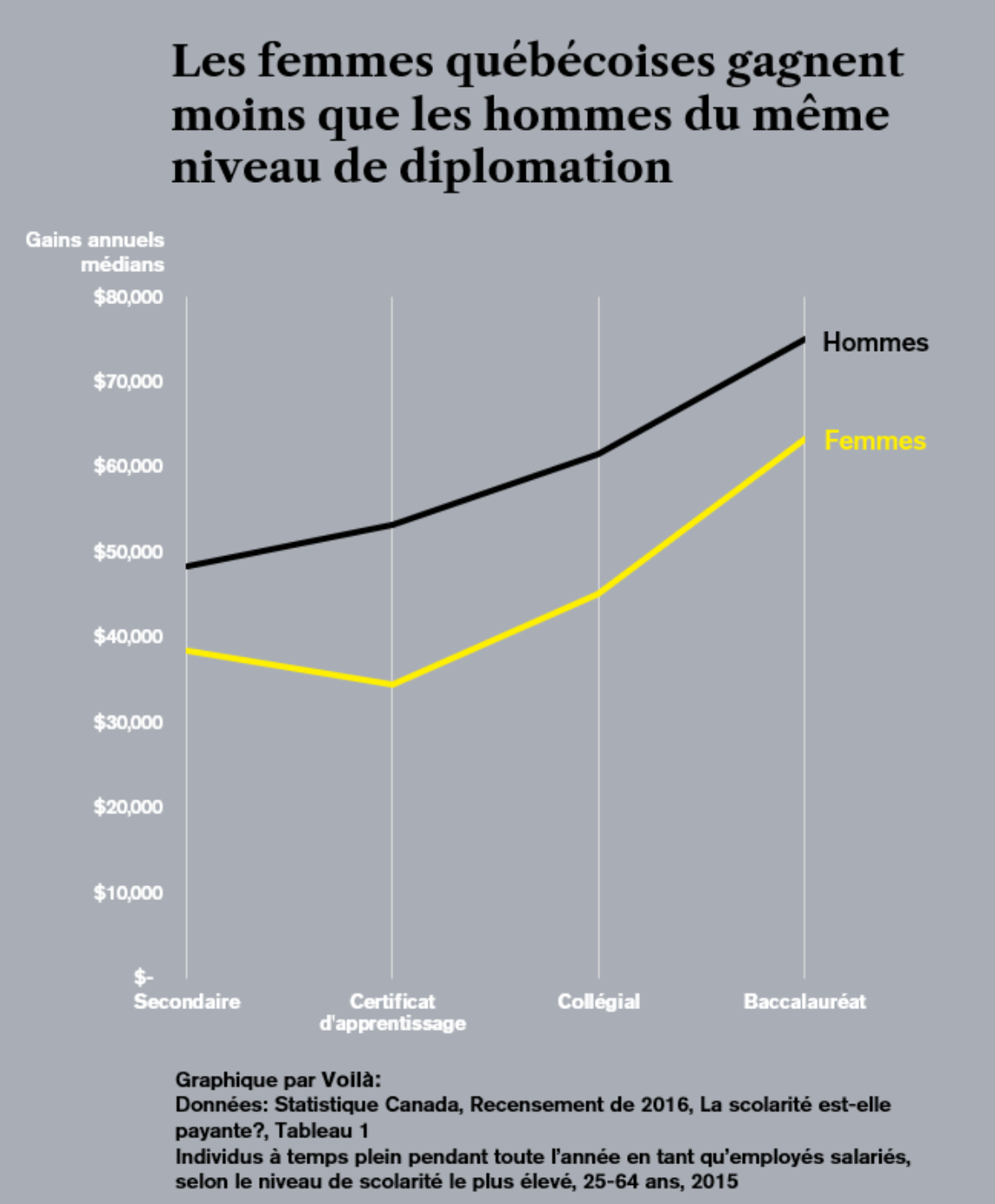
Chart 1: Income by level of education
We came across this graph published in a report by the Institut de la statistique du Québec (Niveau de scolarité et revenu d’emploi, 2018, Figure 1).
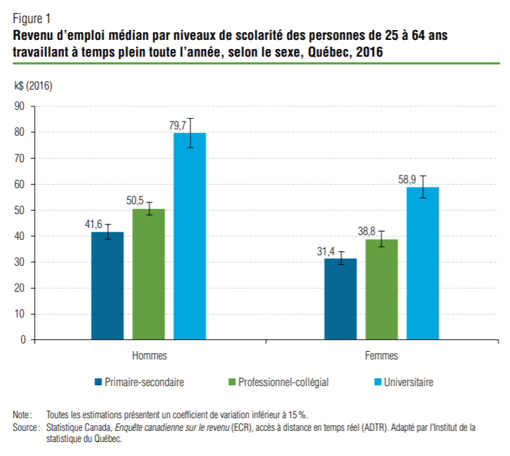
This data suggests that there’s a surprisingly large wage gap between men and women. This graph makes it difficult however to see the extent of the gap for each level of education since the bars for each sex are far from each other. In addition, the education levels are represented by a colour legend that isn’t necessarily intuitive, rather than labeling them directly.
So we sketched a few charts that would make it easier to compare women and men.
Dumbbell chart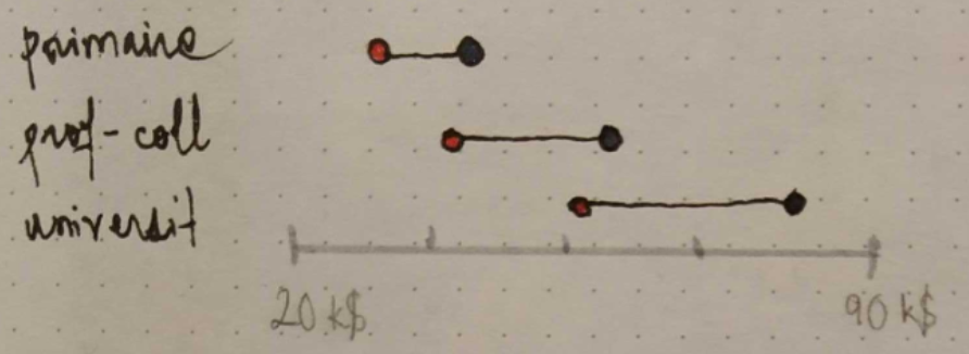
Slope chart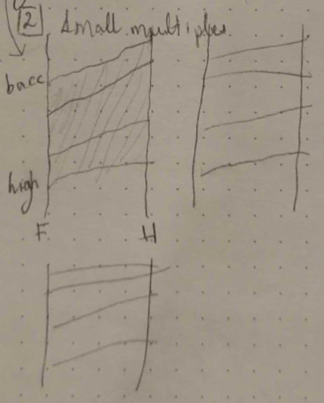
Parallel coordinates: One point per level of education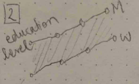
All three sketched charts present the data clearly, but the third — the parallel coordinates — has the nice plus of being a less typical visual.
In this first version (below) we can compare the income of women (red) with that of men (blue) for Canada (bold lines) and for some provinces.
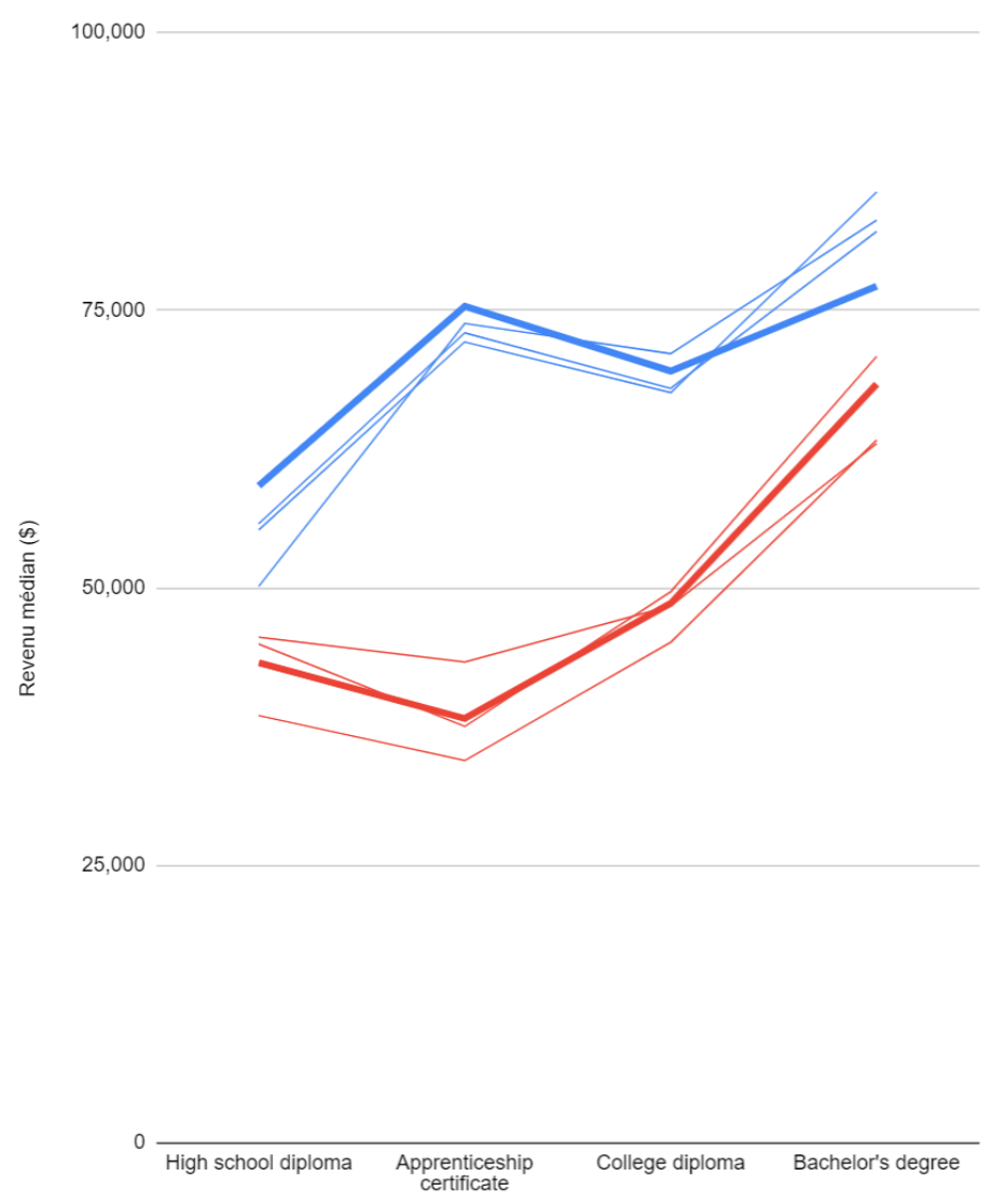
This project gave us a chance to apply Voilà:’s new branding. Below is an intermediate version with the colors and fonts. The graph focuses on the situation in Quebec and the vertical grid lines draw attention to the categories. These lines could also clarify that each level of education is a different case and that the graph does not represent the same group of people evolving over time.
After making some adjustments to improve the visual, here is the final version.
The axis titles are at the top so you see them immediately. Representing the data with square points reinforces the fact that the graph compares 4 different populations.
Data: Statistics Canada, Census in Brief: Does education pay? A comparison of earnings by level of education in Canada and its provinces and territories, Table 1.
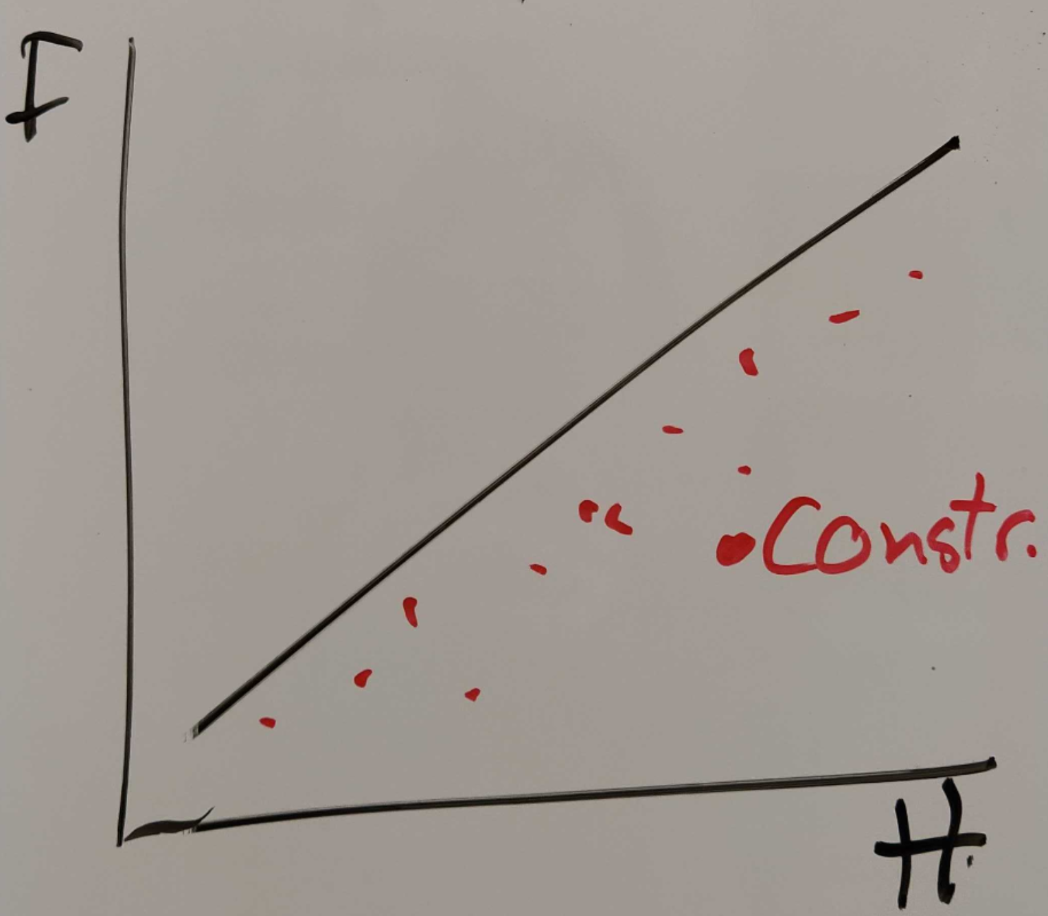
Chart 2: Income by industry
The data shows that women earn less than men in almost all job categories. We can visualize this difference with a scatter plot. A diagonal line placed at forty-five degrees emphasizes equal pay for men and women. This was sketched on the white board during an initial discussion about how to represent this data.
Here is an intermediate version with the real data:
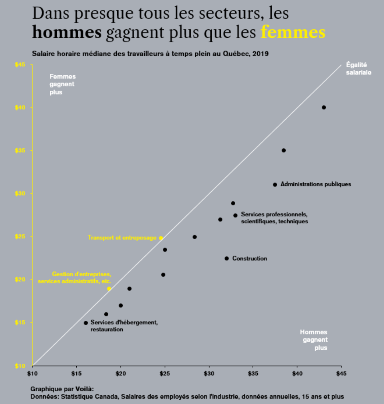
Only a few industries at the extremities are labeled (smallest and largest gender difference). The trend is visible, but it is not possible to explore all the data. The definition of each axis is communicated by the colors in the title and the axes, which requires more effort to understand than labelling the axes directly.
The final version allows exploration of all the data. The round dots have also been replaced by squares that are more in line with our brand image. We also made a bunch of little adjustments to the title alignment, the data label colour, the size of the axis labels, and the chart footnote formatting.
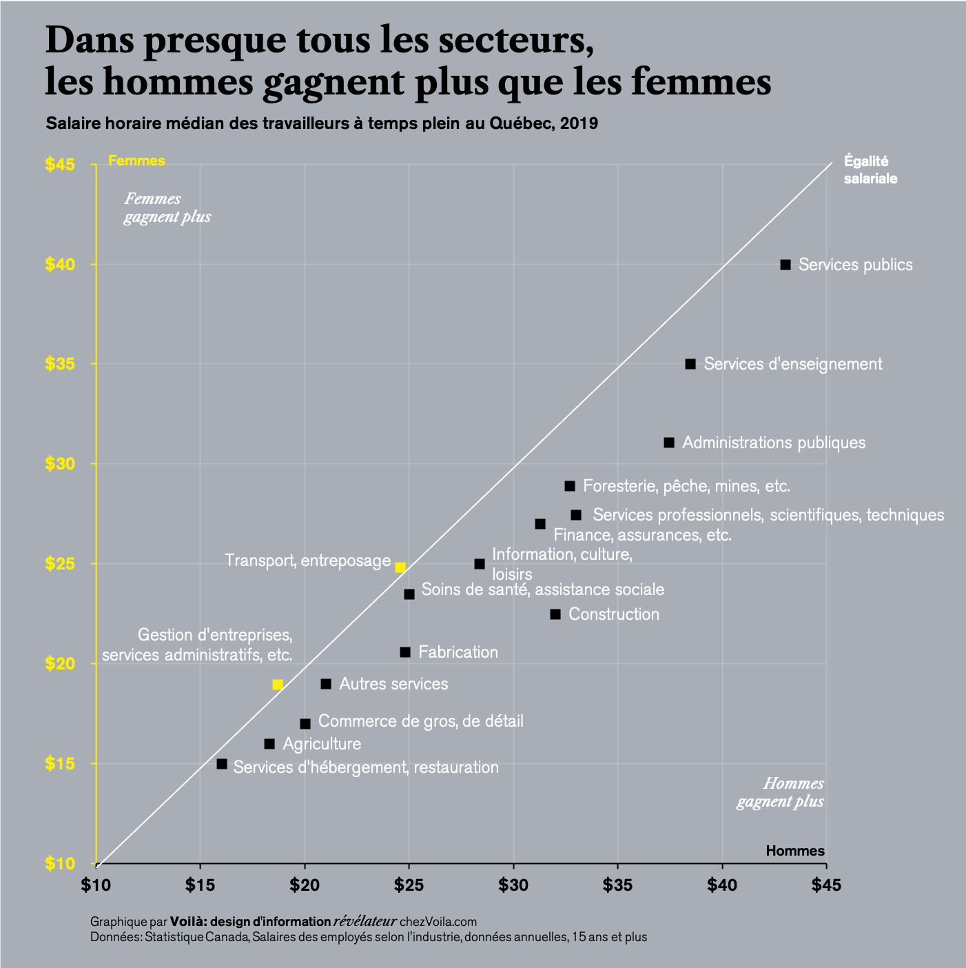
Data: Statistics Canada, Employee wages by industry, annual data, median hourly wages, full-time workers, 15 years and over.
Chart 3: Hours of paid and unpaid work
Here’s a visualization by Statistics Canada that shows the typical distribution of paid and unpaid hours of work for women and men in different countries.
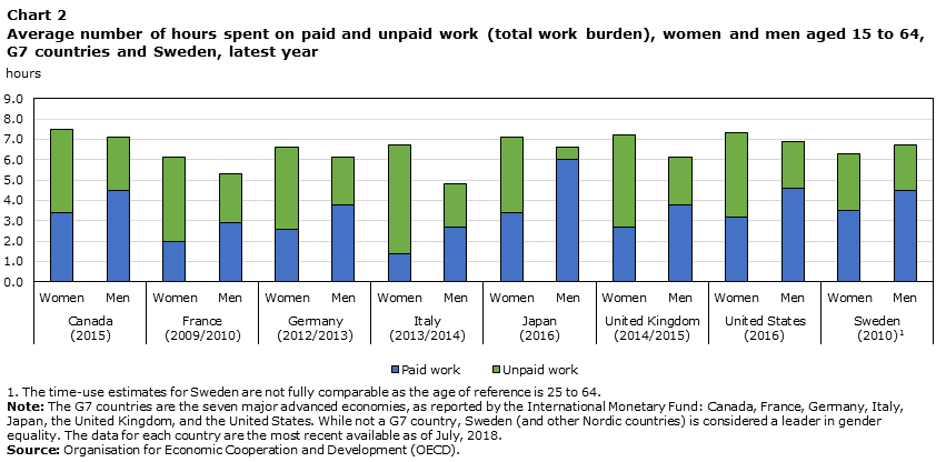
This representation makes comparison difficult. The evenly spaced stacked bars make it difficult to compare the length of the green sections for a particular country, for the women represented, etc.
Since we have two variables to represent (paid work and unpaid work), we can facilitate comparison by representing the data with a scatter plot. Each country is represented by two dots – one for women, one for men – linked by a line.
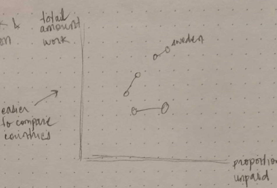
Initially, we considered a scatter plot that showed total hours worked to emphasize that women tend to work more than men.
However, it seemed potentially confusing that one of the two variables (percentage of unpaid work) was derived from the other (total work). Finally, we decided that it was more intuitive to compare paid hours with unpaid hours.
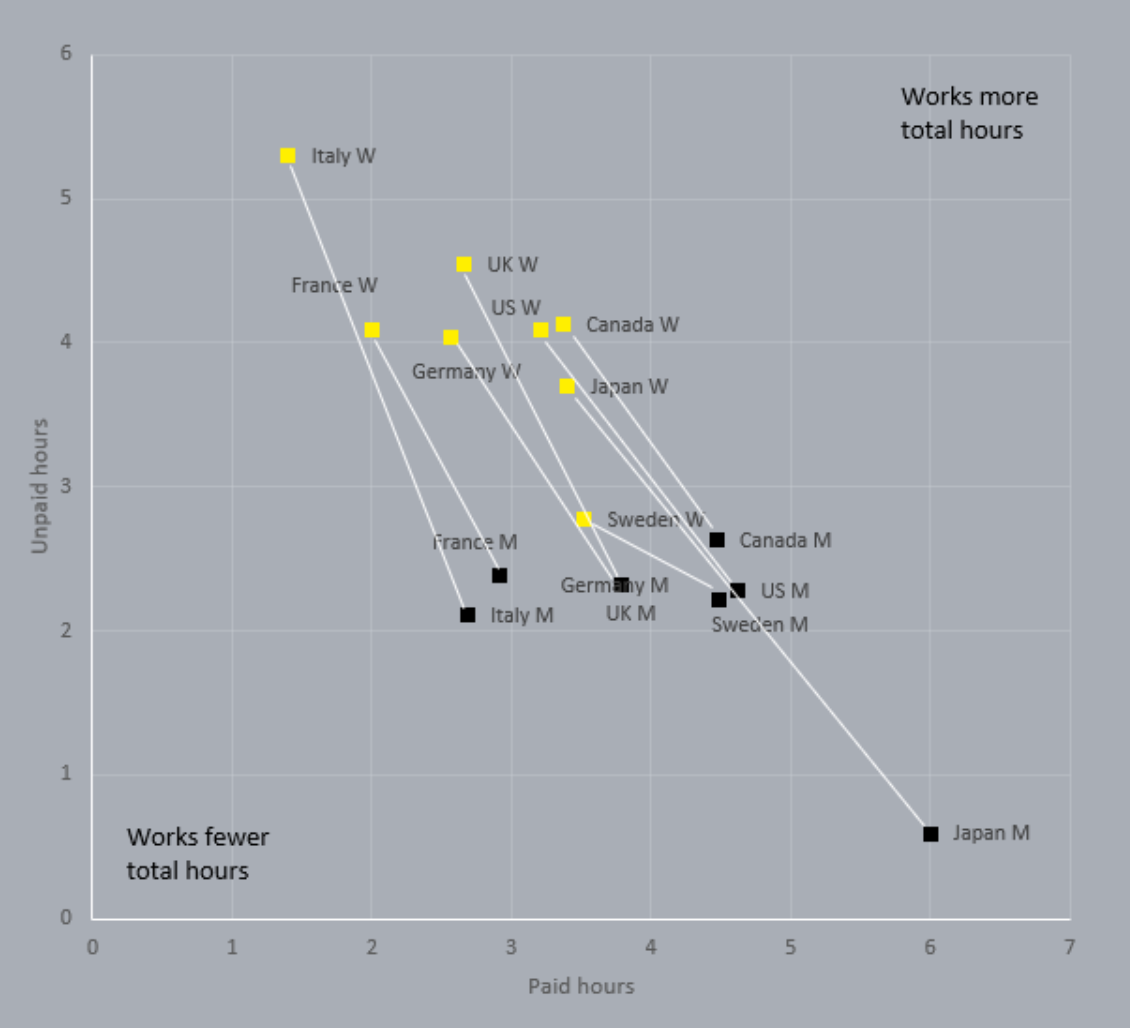
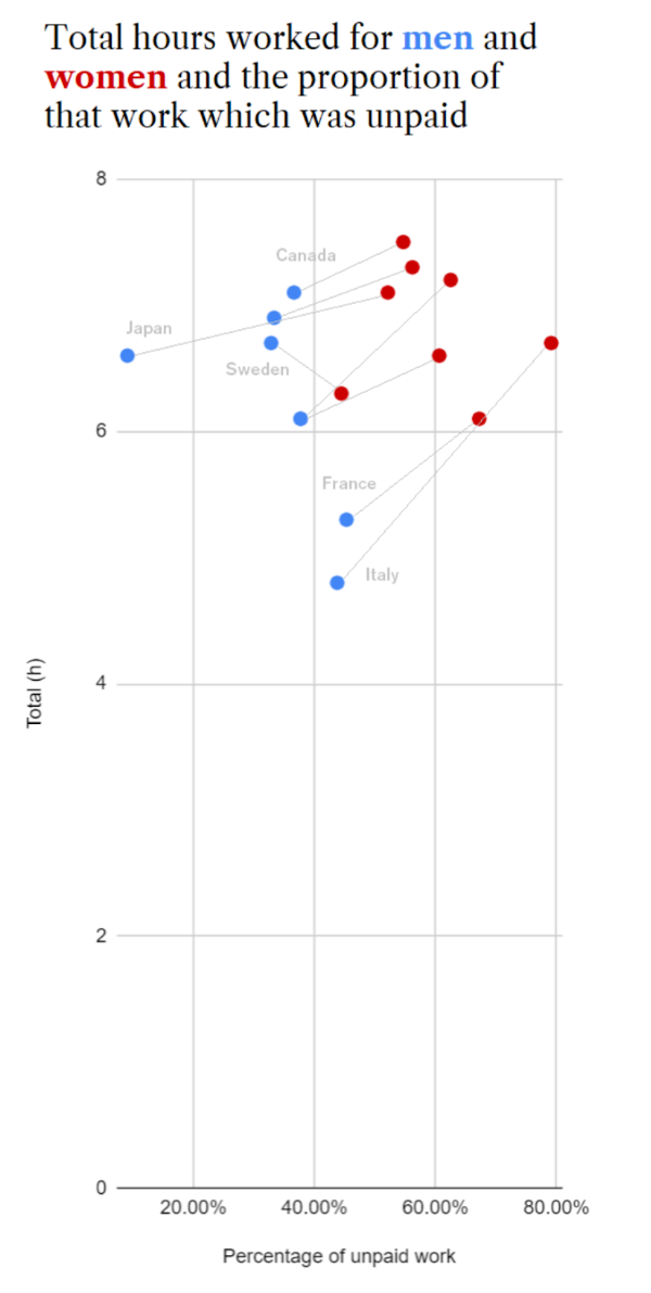
The final version includes diagonal lines to clarify that the points on the same diagonal worked the same number of hours in total (paid plus unpaid). So women in Canada work the longest total hours on a daily basis.

At first glance, our redesign is definitely more intimidating than the original. But this new version rewards reading effort and makes interesting analytical details more visible. For example, we now see that the men in all countries represented do a similar amount of unpaid work (horizontal alignment of black squares), except in Japan.
Data: Statistics Canada, Time use: total work burden, unpaid work and leisure, 2018, Chart 2.
Common to all charts
Each chart has a title that communicates its main message. Relevant details on the data (population, selection criteria, year, etc.) are indicated in the subtitle or at the bottom of the graph.
Since the charts are published as images, which prevents us from including links, we have included sufficient detail in the description of the source to allow the original data to be easily found on the Internet. This kind of transparency is important for a subject that raises many questions, especially for charts that could be distributed without context.
What’s next?
Considering the complexity of the factors that influence inequality, it’s not surprising that this series of graphs raises more questions than it answers. We hope these visualizations pique people’s curiosity and encourage them to seek answers to their questions.
A good place to start would be the fascinating (yes really!) Statistics Canada report on the population of Canada’s time use.
Erica designs and develops visualisations and proposes improvements for existing ones. She also researches and writes about information design, along with helping to organize activities and formalize processes at Voilà.