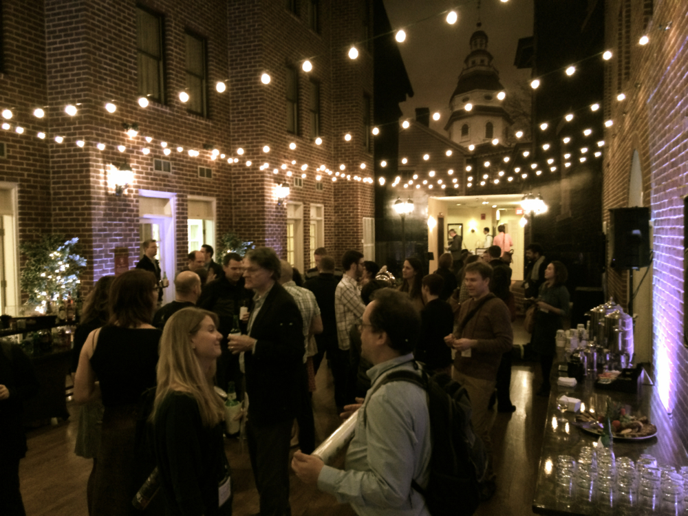
The data visualization community seems to be looking for a bone to pick, but it hasn’t found one yet. At Visualized, it tried storytelling; at Tapestry, visual flourishes. In both cases, there was no real area of conflict between the different views and no blood was shed.
Santiago Ortiz provided the reason why distinct approaches can coexist when he talked about visualization as a new language. A language has rules but it can be used to write songs, poems, newspapers, novels and ransom notes. English has evolved over 1500 years to develop a grammar and a dictionary, with many styles, regionalisms, purposes and conventions. Visualization only appeared some 200 years ago and its codification, 50 years ago.
Visualization grammar and spelling are already emerging; rules that need to be followed to do visualization and not something else. For instance, the data points of a given chart need to follow the same scale, legends need to correspond to the chart encoding, and pie charts can only show parts of a whole. A website like WTFViz.net can only exist when there are fundamental rules to break.
Then there are the elements of style, the good practices that make communication minimally effective. In journalism, there is the inverted pyramid and the five Ws (who, what, when, where, why). In visualization, it includes the data/ink ratio and the war on pie charts. These things are not mandatory to write in English or to visualize, but they are useful to do it well for a given purpose. Ignore them only if you know what you’re doing. Jon Schwabish was refining these elements of style when he suggested better ways to create meaningful comparisons.
In this context, Alberto Cairo’s keynote was not about visualization but about journalism. He was enumerating rules of the newsroom that apply across languages. News visualizations are better off following them, much like news in French, Russian and Vietnamese. Giorgia Lupi and Santiago Ortiz were not contradicting him when showing their different approaches: they were talking about different purposes.
Emma Coats’ storytelling techniques also transcend languages. Even though they came from her experience at Pixar, not once did she mention animation. She was speaking of truths as universal as we know them at the moment. She was reminding the audience that this recent language is entering a field with codes that experts can borrow to be more effective.
In a nice coda, visualization as a language was at the heart of the closing keynote. Fernanda Viégas and Martin Wattenberg compared different visualization formats to literary genres: maps as love stories, pop science as infauxgraphics, and so on. It was playful, yet enlightening to explore the communication conventions other languages are already using.
Viégas and Wattenberg suggested that conventions can hurt as much as they can help, which is a topic to explore further. Some maps were criticized for being old news, just a few years after they first appeared. This might be the sign that the conventions of visualization are evolving as fast as its technologies. If so, how to discern a cliché from what’s familiar to only a few experts? Can practitioners trust their instincts or are they getting bored with things that their audiences have not yet mastered?
There is work to do to develop the grammar, the elements of style and the genres of visualization. But there is no point in setting limits to what can be done with the language. There are poets, novelists, singers and agitators among visualization practitioners and they can all be heard — or seen. Visualization is a language. It has rules, but no boundaries.
Congratulations to the organizers at Tableau for a successful event and many thanks for inviting me. I got to hear and meet for the first time many of the people whose work I admire: Alberto Cairo, Andy Kirk, Naomi Robbins, Hannah Fairfield, Ben Shneiderman, Gavin McMahon, Erik Jacobsen, Bryan Connor, Kat Downs, Rob Simmon and many more, plus those that I had already met at Visualized. It’s an honour to be part of this welcoming tribe.
Francis Gagnon is an information designer and the founder of Voilà: (2013), a data visualization agency specialized in sustainable development.

