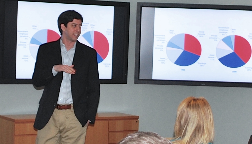
There are many reasons you might know Jon Schwabish. He’s an economist at the CBO whose graphs have been shown in Congress, a freelance trainer in data visualization and presentation techniques, the creator of HelpMeViz.com, and one of the organizers of the DC Dataviz Meetups. He tweets and blogs regularly, his guest posts have been featured on VisualisingData.com, AllAnalytics.com and The Why Axis, his infographics have been picked by the staff at Visual.ly, his work is also on Visualising.org and Slideshare. He’ll attend Visualized in New York this week, speak at Tapestry at the end of the month and give a class in executive education at Georgetown University this summer. Forgive me if I missed anything.
That makes him what? The Ezra Klein of data visualization? In any case, he’s one person you need to know if you’re in the field and he’s a personable chap, so let’s hear what he has to say.
How did you become interested in data visualization?
My formal training is in economics and, until I became really interested in data visualization, I never thought too carefully or strategically about the best way to present results visually. But a few years ago, I attended Edward Tufte’s one-day course. Although I had heard about him in my undergraduate days, I hadn’t seen his books or lectures. At the time, I was working on a CBO report about possible ways to change Social Security. We had 30 or so options in the report, and the main table included a slew of information for each: outlays (spending), revenues (taxes), the balance between the two, the balance over 75 years, and a few other things. Together, the initial presentation was a big, complex mass—a giant spreadsheet, essentially. When I heard Tufte talk about sparklines, it struck me that I could incorporate that simple visualization technique. All I had to do was replace some of the numbers with a “spark-area chart” to give the reader an immediate visual impression of the impact of each policy over time.
From there, I started investigating the field of data visualization and found this incredible community of designers, artists, writers, programmers, statisticians, journalists, and all sorts of thinkers and practitioners trying to figure out better ways to present data and information. I was immediately intrigued by two facets of the field: First, I discovered that improving the visual display of information is not entirely subjective—for example, there are lots of people examining how our brains perceive and understand information and how best to present it. And second, I found an outlet for my creative side, which, as an economist, I hadn’t really been able to tap into. So I took a 10-week class on the Adobe Creative Suite and started combining my economics research and new design skills to create infographics and other types of visualizations.
What is the role of data visualization in your job as an economist for the CBO? Is this something that other government employees could emulate?

At its core, data visualization is about communication and CBO’s mission is to communicate relatively complicated concepts about the federal budget and the national economy to members of Congress and their staffs. Data visualization is a very important and effective tool for helping those efforts. In addition to my research on immigration, food stamps, Disability Insurance, and inequality, for example, I also help colleagues at CBO with data visualization—both on the data analytics side and on the presentation side. On the analytics side, I try to help people find tools that help them better understand their data or their models: mapping tools like TileMill or StatPlanet and interactive tools like Tableau; or other kinds of tools, like R and Excel. On the presentation side, I try to help colleagues create more effective visualizations and, in some cases, create other graphic products—like infographics and Snapshots—to accompany longer reports. More recently, I’ve become more interested in improving the ways economists and analysts more generally present their work orally. In that vein, I try to serve as a resource for colleagues at my agency—and analysts at other agencies and policy organizations—who want to think about their presentations.
I think it’s easy for a government employee with a quantitative background to emulate my approach. Being able to work with data and to understand the challenges that the data and analysis present is the first—and, arguably, the most important—step. From there, it’s about carefully and strategically considering how to effectively communicate information. That is, even if the scatterplot I use to explore my data ultimately ends up in my paper, I have to think about the font, color, and annotation I use to present it to my audience because my job as a writer or presenter is to convey an argument or information, not simply to hope that the audience will somehow follow the story.
Through your data visualization workshops, you’ve worked with multiple government agencies. What opportunities do you see for government to use data visualization? Where does the resistance come from, if any?

A senior economist once told me that he didn’t need to worry about “selling” his research, so creating more effective visualizations isn’t worth his time. That sentiment typifies much of the resistance—it’s that line of thinking that considers it the responsibility of the reader or the audience to somehow “figure out” the important results. But that view is misguided, I believe—making research accessible and more comprehensible is what will ultimately lead to better understanding of the complex issues that researchers are attempting to communicate.
All the same, in my experience, the vast majority of government analysts want to present information efficiently and effectively—even if they are not sure how to get started. The main impediment is that lots of analysts think they don’t have enough background in design to be creative with their data and to present information more effectively. But you don’t need a degree in graphic design to create effective basic charts. Three short steps—getting away from default colors and layouts, integrating text and graphics, and reducing clutter—can generate major improvements. The next level—creating more complicated graphs or infographics or slidedecks or interactive visualizations—may require more training in design, layout, and storytelling. But those are skills, as I’ve demonstrated in my own career, that can be acquired and honed.
You started HelpMeViz.com as a platform to “facilitate discussion, debate, and collaboration from the data visualization community,” Are you happy with the first few weeks? How would you like to see it evolve a couple years from now?

The first few weeks have been terrific! People from all kinds of fields are excited about the site and the discussions and relationships it might encourage. I’ve heard from economists, health analysts, medical doctors, research assistants, people in communications and marketing—as well as programmers—all looking for advice on how to improve their work. At this point, the site has more than 10 visualizations seeking help and the number of submissions continues to grow. My hope, of course, is that as more material shows up on the site and more people comment and offer suggestions and advice, even more people will send in their work.
I do want to emphasize one important aspect of HelpMeViz: It is designed for anyone to submit or comment. The purpose of the site is not to simply give experts in design or data visualization or programming languages the opportunity to provide feedback and advice. Instead, it is designed to encourage all types of analysts, designers, writers—whomever—the opportunity to lend their thoughts and their expertise to challenges they or others face.
Right now, I’d like to see more discussion among the visitors to HelpMeViz. I also would love to get people to send in finished products and say, “This is what I made, but now I’m curious to see what others might have done.” I’d also like to see whether I can get some coding or programming challenges on the site. I’m not exactly sure how that would work—HelpMeViz is not meant to be a Github knock-off—but I think it would be an interesting challenge to get to work.
In the long-term, I can envision a variety of directions for HelpMeViz: badges for contributions, forking paths for different suggested solutions, remake contests, sponsorships, and tutorials from contributors. Success will be determined by the community and whether people see it as a constructive place to receive feedback and help rather than a negative place to criticize and bring down people’s work. Asking for critical feedback isn’t easy for anybody, but if the site can maintain the positive, constructive focus it has had so far, I’m excited about the prospects for success.
With all these side projects and your job, what’s in your future as a data visualization expert?
Ah, the great “where do you see yourself in 5 years” question. You know, I’m not exactly sure. Right now, I am enjoying combining my economic research interests in important policy areas with my interest in figuring out better ways to communicate that information to more and more people. There are still great strides to be made in figuring out better ways to communicate complex analyses and making those results meaningful for people. I would like to continue my data visualization workshops and extend my teaching to formal settings: I have some workshops coming up, but I am also scheduled to teach a two-day executive education course at Georgetown University this summer. I’m working on plans for a possible data visualization course at the University of Maryland-College Park next fall.
UPDATE: On April 21, 2014, Jon announced that he will soon be leaving the Congressional Budget Office to move to the Urban Institute. He promised to update his answer to the last question — stay tuned.
If you want to keep up with Jon, Twitter is a good place to start.
Francis Gagnon is an information designer and the founder of Voilà: (2013), a data visualization agency specialized in sustainable development.

