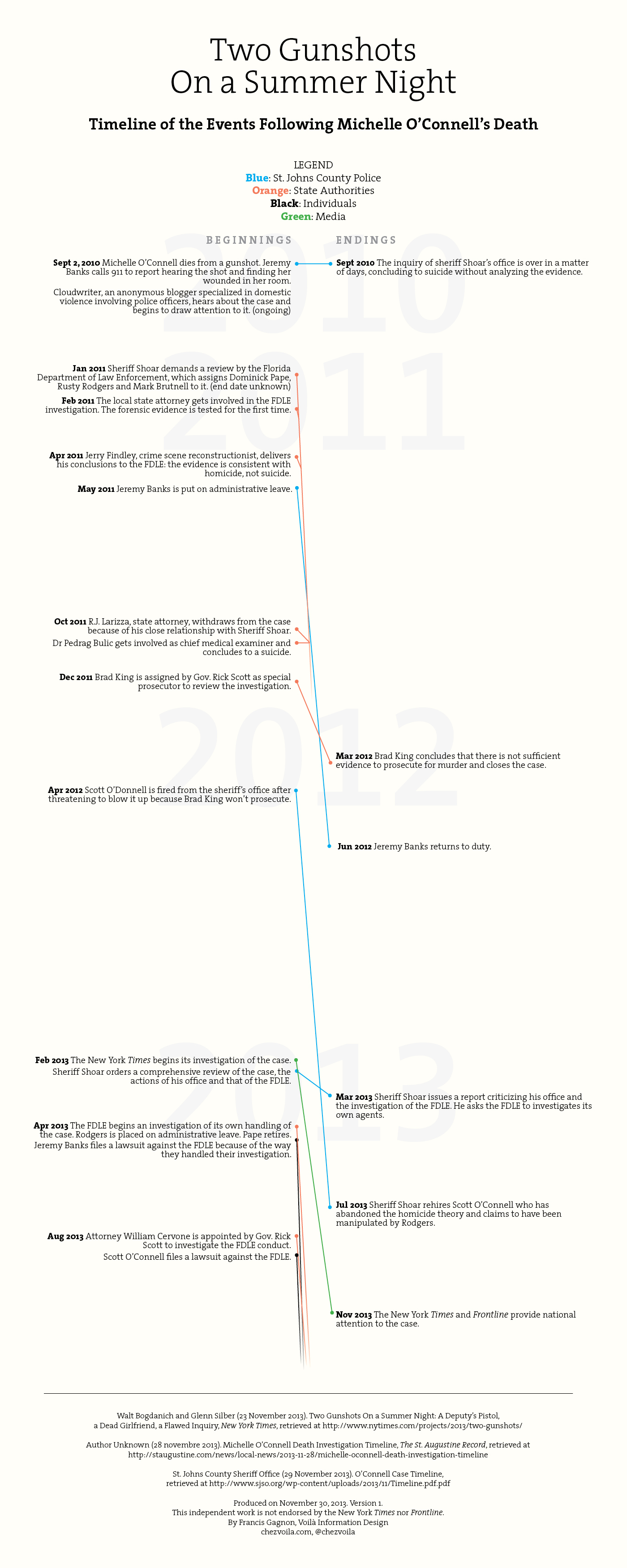
After completing a visual summary of the protagonists’ favored explanations in the death of Michelle O’Connell, I produced this visual timeline because it seemed that the timing of certain events might matter. I used the text from the original New York Times article, a timeline put together by the local paper, the St. Augustine Record, and that of the sheriff’s office. I decided to link beginnings and endings to help clarify the intricacies of the different procedures started successively or concurrently.
It turned out to be even more difficult than the protagonists’ summary, in part because the exact dates are not always specified in the articles. A newspaper article focuses on the narrative, dropping details that might be useful in an investigation, but that would make an article even more difficult to understand. The sheriff’s timeline was helpful in clarifying a few points. Still, I can’t quite figure out when the FDLE investigation completed. Anyone?
It is not as clear what comes out of the visual timeline. It is clear that this case has been reactivated by the New York Times investigation. Nothing had happened for nine to ten months and the case seemed closed. A flurry of activity, most of them bad for the FDLE and the homicide case in general, have taken place. It’s interesting to know if the article will revert this trend.
Francis Gagnon is an information designer and the founder of Voilà: (2013), a data visualization agency specialized in sustainable development.


